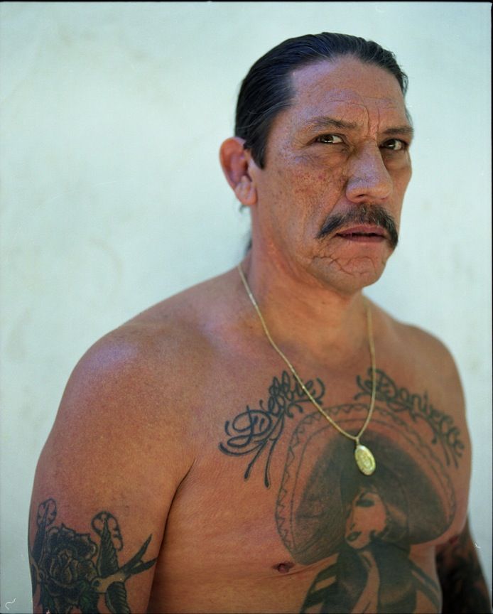
Danny Trejo’s tattoos were part of his look long before Hollywood made him one of the most recognisable tough guys on screen. The films made the ink famous, but they didn’t create it. His chest piece, family lettering and older arm work came from an earlier life, including time in prison, and that history still shows in the way the designs look.
The centre of the collection is the big woman in a sombrero across his chest. Around her are roses and heavy black lines, while the names above the design bring the whole thing back to family. His arms carry a rougher mix of older prison-made marks and smaller symbols. It’s a busy set of tattoos, but the main details are pretty easy to follow once the images are spaced out and each piece gets its own look.
Some stories about Trejo’s ink have picked up extra drama over the years. The woman has been called a Mexican woman, a charra and a Virgen de Guadalupe-inspired figure, depending on the source. The safest place to start is with what the photographs clearly show and what Trejo has actually explained. That gives the tattoos a real story without inventing a meaning for every rose, line or shadow.
The sombrero woman is still Danny Trejo’s signature chest tattoo
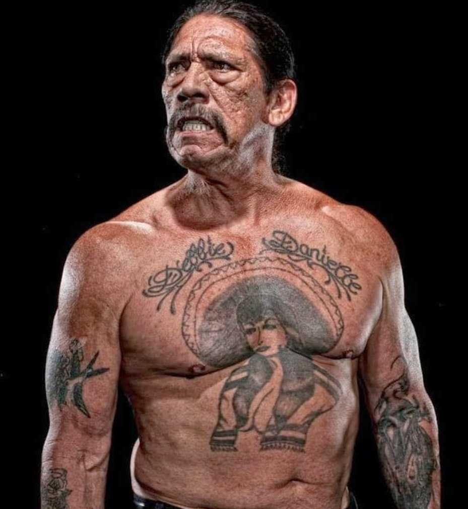
The sombrero woman is the tattoo most people recognise first. She sits across the chest with a wide hat, a strong face and roses worked into the surrounding design. The lines are bold and the whole piece has the slightly rough, old-school look you’d expect from tattooing done with basic equipment rather than a modern studio setup.
Trejo has said the tattoo started in prison and was completed over time. One account says the work took place in three different penitentiaries, using Indian ink and a needle. He has also connected the design with a friend he had known since he was fourteen. Those details matter because they explain why the piece doesn’t look like a single carefully planned appointment. It feels built up in stages.
The woman is sometimes labelled as a version of the Virgin of Guadalupe, but that description isn’t used consistently. There’s a difference between saying the design has been described that way and saying Trejo has given one definitive explanation. The photograph supports the woman, the sombrero, the roses and the Mexican-American visual feel. Anything more specific needs to be tied to a direct comment rather than repeated as fact.
The tattoo also became part of Trejo’s screen identity. Directors could reveal it quickly in a film, and viewers immediately understood that the actor’s tough look wasn’t just wardrobe or makeup. Trejo didn’t need a temporary tattoo to play a hard man. He already had the chest piece, the moustache, the scars and the lived-in look that casting directors wanted.
That’s part of what makes the design more interesting than a standard celebrity chest tattoo. It wasn’t picked from a catalogue to match a role. It was already there, and the roles borrowed from it. The central woman is bold enough to read from a distance, while the roses and smaller lines give the piece a little more depth when you get a clearer view.
Salma Hayek later told the funny story that the woman in the tattoo looked like her. That coincidence became one of the better-known bits of trivia around Trejo’s chest. It’s a memorable story, especially because the two actors worked together, but it shouldn’t replace the older history. The prison-made process and Trejo’s connection with the friend who tattooed him are the solid parts of the story.
The prison-made process gives the chest piece its rough edge
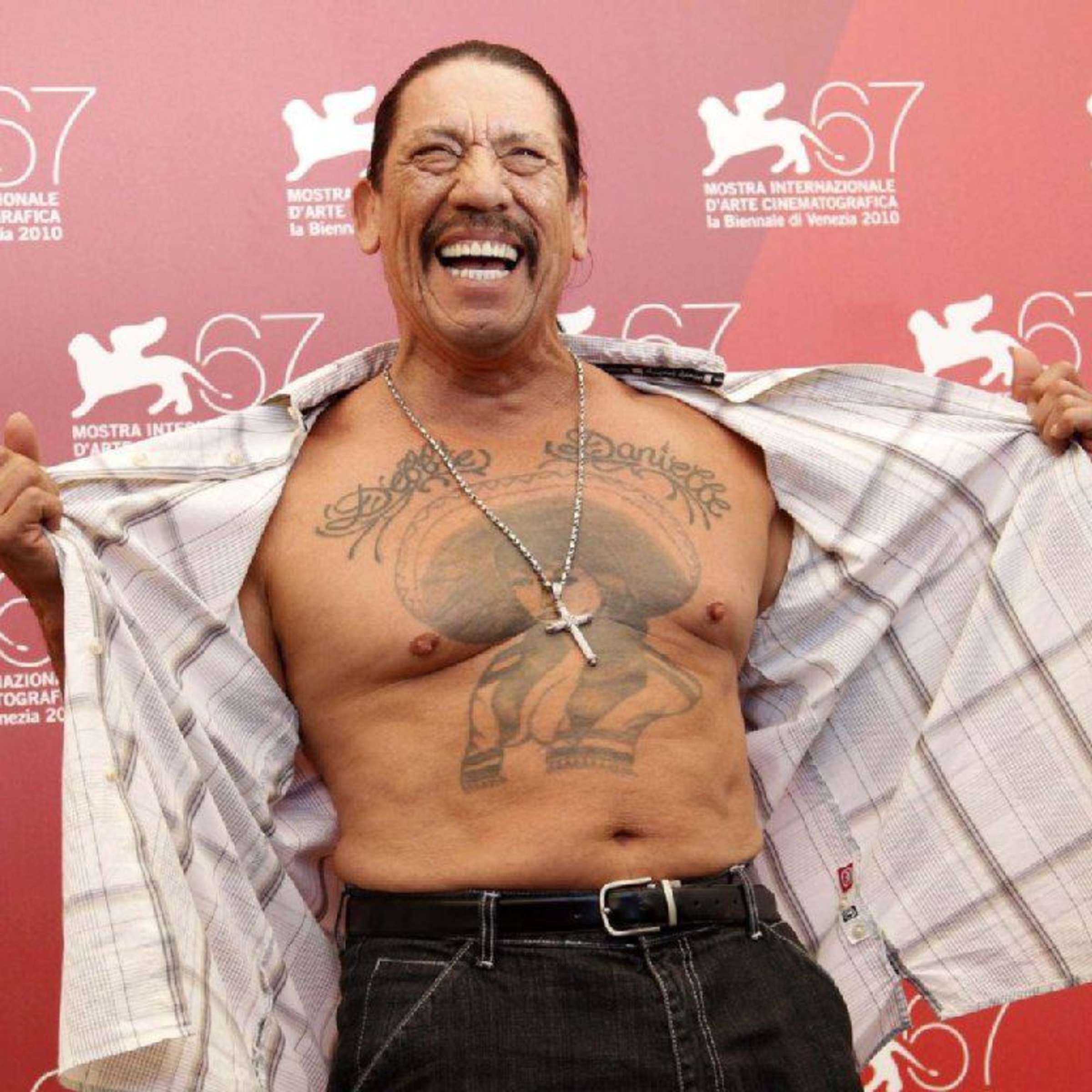
A wider photograph from Venice shows how much of Trejo’s chest the design covers. It also makes the texture easier to appreciate. The tattoo has the kind of uneven weight you often see in older prison work: some lines are thick, some areas are darker than others and the roses don’t have the polished, perfectly even finish of a brand-new studio piece.
Trejo has spoken about using Indian ink and a needle, which sounds basic because it was. There was no comfortable studio chair, carefully controlled lighting or row of modern machines. The work was done in difficult conditions, over separate periods, and the final design carries those marks. That isn’t a flaw to hide. It’s part of why the tattoo looks like his rather than like a generic chest flash piece.
The design was apparently built up as Trejo moved through different prisons. That helps explain why the chest can look slightly different from one photograph to the next. Light changes the balance between the black outlines and the skin, and the angle of the body can make one side of the woman or one rose look heavier. A picture from one year shouldn’t be treated as a perfect record of every line that came later.
The story also gives the tattoo a different feel from the way it was used in movies. On screen, the chest piece can look like a costume detail that tells the audience Trejo’s character is dangerous. In real life, it’s tied to a much longer timeline. It was there before the famous roles and it stayed with him as his career changed.
There’s no need to turn the prison history into a romantic legend. The simple version is strong enough: a friend worked on the tattoo, the piece developed over time and the tools were basic. That gives readers useful context without pretending that every part of the design has a secret code. The rougher lines are evidence of the process, not automatic proof of a deeper meaning.
The Venice image is useful because it shows the tattoo in a more natural setting than a tight crop. You can see the woman, the roses and the way the ink sits across the chest instead of looking at one dark patch in isolation. That wider view also makes it easier to understand why the tattoo became such a powerful part of Trejo’s public image.
Debbie and Danielle bring the family story into the design
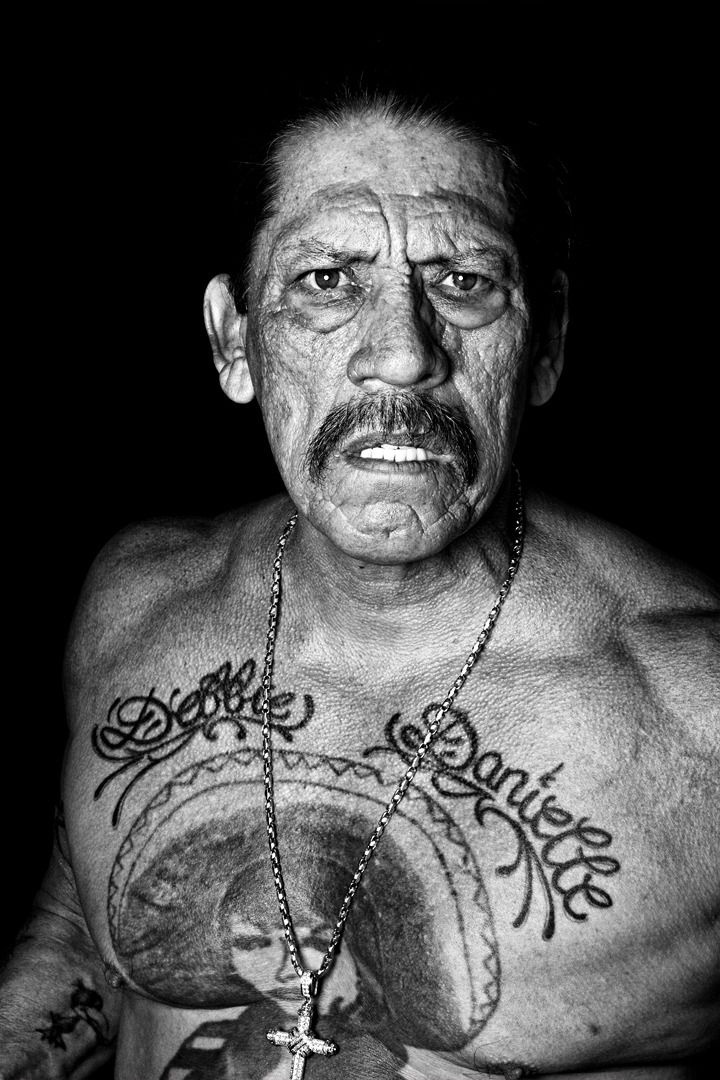
Above the central figure are the names “Debbie” and “Danielle”. They’re usually identified as Trejo’s wife and daughter, and they’re among the clearest personal details in the whole collection. The lettering is smaller than the woman and roses, but it changes the tone of the piece. This isn’t just a dramatic chest image built around a tough-guy persona. It has family names sitting right at the top.
The names are easiest to read in a close portrait with even lighting. In a film still, a dark interview shot or a photograph taken from an angle, the lettering can blend into the black lines around the figure. That’s why a single general portrait doesn’t do enough work. A wider image shows placement, while a closer image lets you see the actual letters.
The family lettering also gives the tattoo an interesting contrast. Trejo’s public image is often built around violence, danger and hard characters, but the names are quiet and direct. There’s no need to attach an elaborate explanation to them. They appear to be a clear dedication, and the people they refer to have been identified in descriptions of the tattoo.
The placement matters too. The names sit above the woman rather than being hidden on a shoulder or forearm. They’re part of the first thing people see when the shirt comes off, even if the central figure still grabs most of the attention. It makes the chest piece feel more personal without taking away from its bold visual impact.
Photographs from different periods can make the family names look darker, lighter or slightly blurred. Skin changes, camera quality and film lighting all play a part. That doesn’t mean the tattoo has been replaced or redone every time the lettering looks different. It just means the words need a clear image before they can be described confidently.
The names are a good example of why Trejo’s tattoos shouldn’t be reduced to one big symbol. The woman is the headline image, but Debbie and Danielle give the design its most obvious family connection. They’re small enough to miss in a crowded photograph and important enough to deserve their own visual attention.
A second chest portrait shows how the ink changes with light and angle
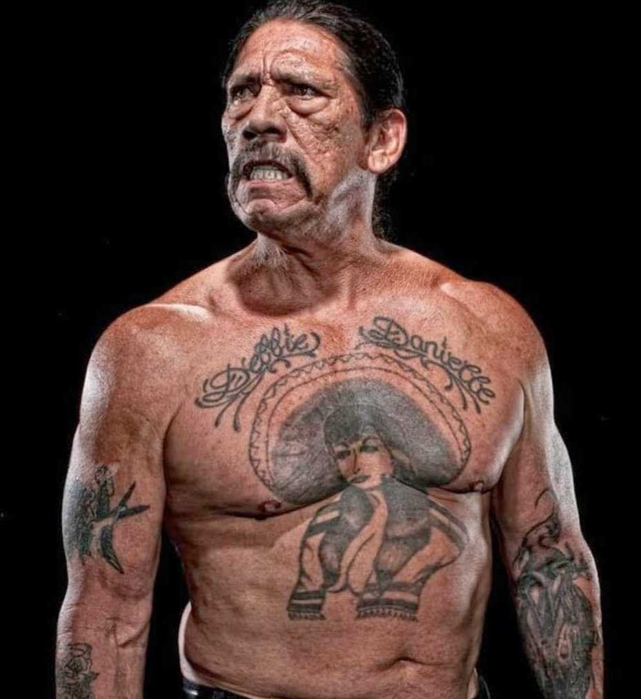
A different chest portrait helps fill in the gaps left by the wider Venice photograph. The basic design is the same, but the light falls differently across the woman, the roses and the lettering. That matters with older black ink. In one photograph, the chest can look like one solid dark composition. In another, the separate parts become easier to pick out.
The central woman still carries the visual weight, but the surrounding roses stop the piece from feeling like a single flat block. They frame the figure and help the eye move toward the family names. The design is busy, yet it isn’t random. The big shapes are easy to recognise, while the smaller lines become clearer as the photograph gets sharper.
This is also where the famous Salma Hayek story tends to come up. Hayek has spoken about recognising her own face in the tattoo, and the coincidence became part of the public story around it. It’s a fun detail, but it doesn’t prove that the tattoo was designed as a portrait of her. The timeline and Trejo’s own background point to a much earlier piece.
The better reading is that the tattoo already had its own place in Trejo’s life. The film connection made the design more visible and gave people a funny story to repeat, but it didn’t create the chest piece. That distinction keeps the article grounded. Trejo’s ink is interesting because it predates the roles that made him famous.
The second portrait also shows why it’s risky to identify every shadow around the chest as a separate tattoo. Some dark areas are part of the roses or the woman’s outline. Some could be small older marks, but the photograph doesn’t always give enough detail to name them. The main design is well supported. The smaller shapes should stay described as smaller shapes unless the evidence is clear.
Used alongside the other chest photographs, this image gives the reader a much better feel for the tattoo. It isn’t there as a duplicate of the first chest shot. The angle, lighting and framing are different, and each view answers a different question. One shows the full piece in context; this one makes the relationship between the figure, roses and lettering easier to follow.
The arm tattoos carry a rougher, older feel
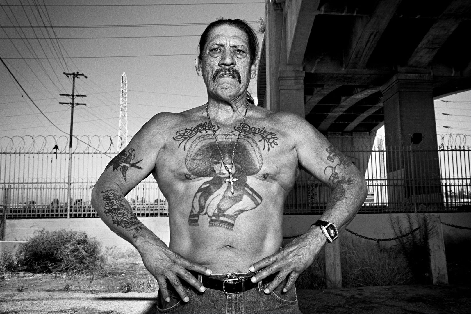
The chest piece gets the headlines, but Trejo has additional ink across his arms, hands and torso. The arm work is harder to catalogue because it appears in different settings and is often partly hidden by clothes, film wardrobe or the angle of the photograph. What is clear is that the collection isn’t one perfectly matched sleeve. It has been added to over many years.
Trejo has talked about hand tattoos made with simple equipment, including the same Indian-ink-and-needle method connected with his older work. That helps explain why some of the arm marks look rougher than a modern studio tattoo. The uneven edges aren’t necessarily damage or poor photography. They can be part of the age and the original process.
Some images show smaller symbols, lettering and a peacock-like design around the arms. Those descriptions need a little care. A clear photograph can prove that there is more ink on the forearm or hand, but a soft image may not be sharp enough to identify an exact bird, flower or symbol. The best approach is to name what can actually be seen and leave the uncertain details open.
The arms also show how Trejo’s tattoos grew in layers. A name, a rose, a small symbol or a darker patch can sit beside older prison work without matching it perfectly. That mixture is part of the look. The tattoos don’t read like a single modern sleeve planned in one sitting. They feel collected over time, with different pieces carrying different ages and levels of detail.
Film roles made those tattoos familiar to a huge audience, but the ink still has its own story outside the movies. The chest woman connects to prison, friendship and family. The arm pieces show the smaller, rougher side of the collection. Together they explain why Trejo could walk into a scene already looking like the character a director wanted.
That’s why the photographs need to be spread through the article. A close chest portrait can show the names. A wide frame can show the full design. An arm photograph reveals work that disappears under a jacket. None of those views should be forced to cover every tattoo at once, because each one is useful for a different part of the story.
Trejo’s tattoos are best understood as a mix of survival, family and visual identity. The woman in the sombrero is the unmistakable centre. Debbie and Danielle keep the chest piece tied to people close to him. The arms carry the rougher marks of earlier years. The evidence is strongest when the writing stays close to those clear details and doesn’t turn every blurry line into a dramatic mystery.
There’s no need to make the collection tidier than it really is. The tattoos have different textures, different sizes and different levels of certainty. That’s what makes them feel lived-in. Trejo’s ink wasn’t designed to look like a matching catalogue page. It grew with him, and the photographs show that history in the lines.
So, if you’re looking at Danny Trejo’s tattoos as a whole, start with the chest woman, then look up at the family names and move out toward the arms. The main design tells the biggest story, but the smaller pieces are what make the look feel personal. They’re not just decoration for a movie character. They’re part of the real person audiences were seeing before the camera ever rolled.