Jeff Hardy has never treated tattoos like background decoration. He has spent long stretches in the chair, designed parts of his own work and talked about the process with the same kind of restless energy he brings to a match. His collection is big, colourful and a little chaotic, but there is a clear thread running through it. Nature, movement, family, danger and personal control keep turning up in different forms.
The strongest explanations come from Hardy himself. He has talked about the roots running up his arm and neck, the Japanese writing on his arm, the dragon he got when he was eighteen and the way his wife’s initials became a small matching mark. Other pieces are easier to see than to explain. This guide separates the tattoos Hardy has actually discussed from designs identified through clear photographs, so the visual detail stays useful without inventing private meanings.
The roots climb from Hardy’s right arm toward his neck
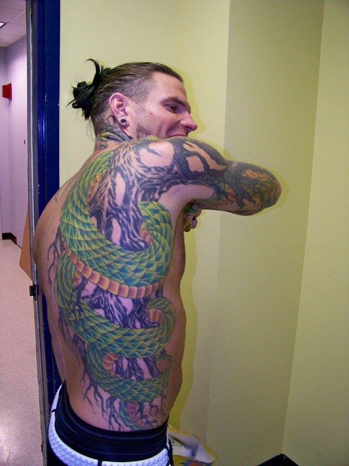
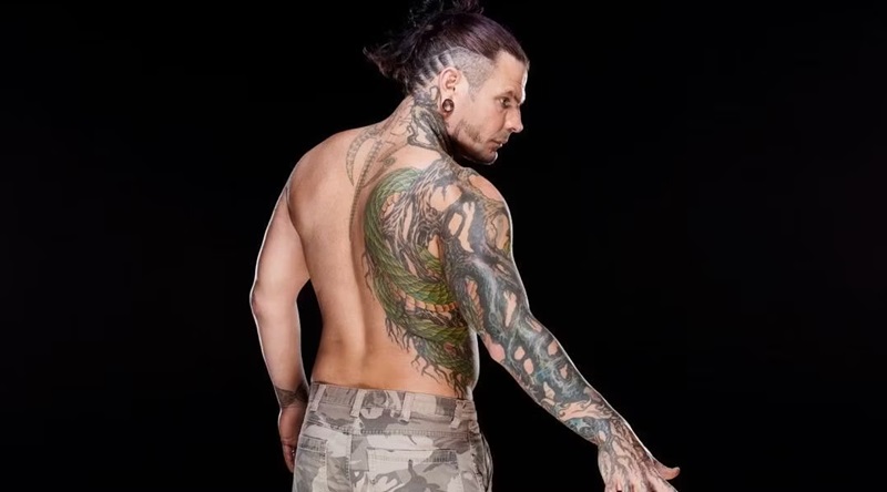
The roots are the most recognisable part of Hardy’s collection. They begin around the right hand and arm, spread across the shoulder and continue toward the neck and side of the body. In photographs, they look like dark, twisting branches rather than a neat sleeve built from identical panels. The lines curl around the arm and leave pockets of skin between the thicker sections, which gives the work a living, uneven shape.
Hardy has explained this one clearly. He compares roots with veins, saying that water moves through the ground in the same way blood moves through the body. He has also described himself as a landscaper at heart and said he likes plant life. That makes the roots more than a random nature image. They are his way of connecting the body to the earth, and the design grew outward instead of ending at one obvious border.
The placement changes how the tattoo reads. A front-facing wrestling photograph may show only a strip on the arm, while a shirtless portrait reveals the roots travelling toward the back and ribs. The neck section can also disappear under hair or a collar. It takes several angles to understand the scale, especially because later work sits over and around the original lines.
Hardy said he wanted something different from the tribal bands many men were getting at the time. That comment helps explain the style without reducing it to a trend. The roots use heavy outlines, but they are not arranged as a simple band or a symmetrical emblem. They look more like a system spreading across the skin, which suits Hardy’s interest in drawing, landscaping and self-made artwork.
Japanese lettering and the unfinished dragon belong to Hardy’s early years
The Japanese writing on Hardy’s right arm is one of the few pieces where he supplied a direct translation. He said it means “health, good or bad, but hopefully good”. The phrase sits within a heavily worked area, so it can be missed when the arm is turned away from the camera. It also shows how Hardy mixes lettering with larger images instead of keeping words in a separate text-only section.
His first tattoo was a dragon on the outside of his left leg. Hardy has said he got it at eighteen, when he was still living with his father, who was not a fan of tattoos. The story is funny because the design was done behind his father’s back, but it also gives the dragon a clear place in the timeline. This was not a late-career addition made after the famous sleeves. It was the piece that came first.
The dragon has remained a slightly different kind of tattoo from the roots. Hardy has described it as an outlined design that he would like to colour one day, while the roots became a much larger, more developed system. In older photographs, the dragon can look relatively plain beside the coloured work on his upper body. That contrast is part of the collection’s history. Not every tattoo was planned as one complete visual package.
It is tempting to give a dragon an automatic meaning such as strength or fearlessness, but Hardy’s own story is more useful. He talked about his age, his father’s reaction and the decision to get the tattoo anyway. Those details tell us more than a generic symbol list does. The image confirms the design and location; Hardy’s explanation gives the piece its personal context.
The neck demons sit beside the roots, hands and wrist work
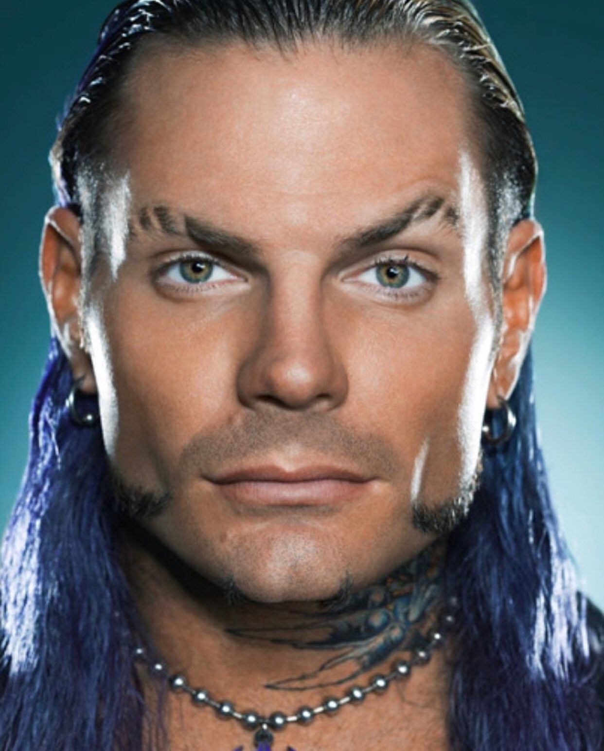
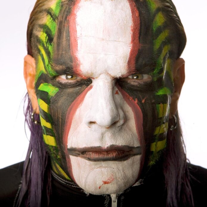
Hardy’s neck tattoos are easy to confuse with his face paint because both have been part of his look for years. The permanent work sits on the sides and back of the neck, while the paint changes from match to match. Close portraits show darker shapes and demon-like faces tucked beneath the jaw and around the neck line. A distant ring photograph can make them look like shadows, especially when his hair is loose.
Hardy has spoken about the demons as something he did not fully plan in advance. He said that once he could see both sides of the neck, the images took on a personal role connected with control and the parts of himself he has had to manage. That does not mean every later tattoo should be labelled as an addiction symbol. It means these particular images have a context that came from Hardy’s own words.
The neck is also where his tattoo style becomes most theatrical. The roots push upward from the arm, while the darker faces create a sharper edge around the head. Add the piercings, long hair and changing paint, and the result is visually intense even before he steps into the ring. The tattoo is part of the look, but it is still worth separating permanent ink from performance makeup.
Photographs from different years show why dates matter. Hair can hide one side of the neck, paint can cover the other and lighting can flatten the darker sections. A portrait that clearly shows the neck is more useful than a full-body image where the same designs become tiny marks.
This is one of the places where a close photograph does real work for the reader.
Hardy’s back piece brings together the devil, flames, snake and octopus work
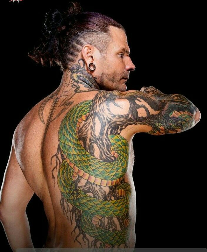
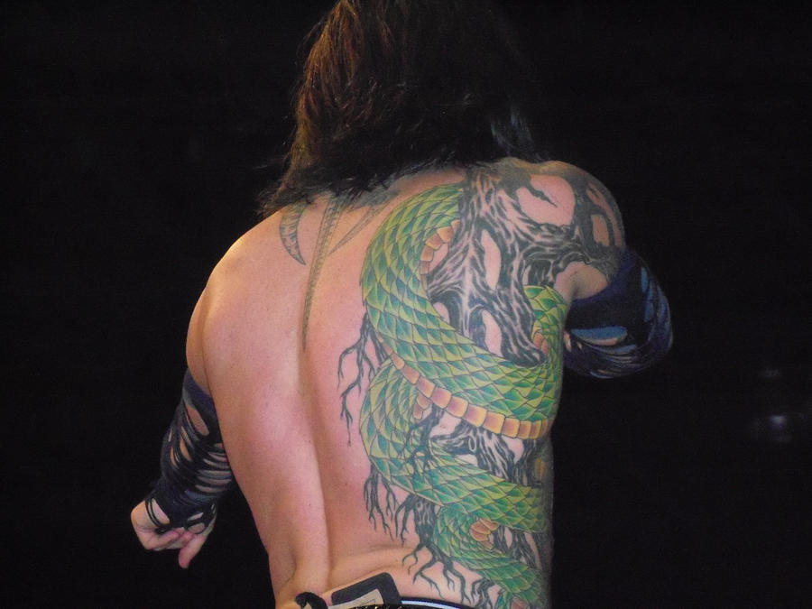
Hardy’s large back work is a later chapter in the collection. The piece includes a demonic face, strong blue and grey shading, flames and a green snake winding around the surrounding forms.
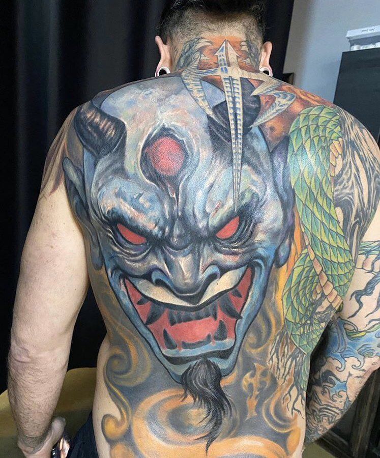
It is much denser than the early dragon and much broader than the original roots. The back gives the design room to become a full scene rather than another small symbol added to an already busy arm.
When Hardy revealed the back piece, he described it as a newer version of himself and talked about how difficult the sessions had been. He had started the work earlier and could not finish it all at once because the process was so painful. That detail matters because a big tattoo can look like one finished image in a photograph even when it was built over several sessions.
The snake is connected to the roots on the right side of the body. Hardy said people had mistaken parts of the coloured roots for a snake, which helped push him toward adding a real rattlesnake to the design. He has also said he is afraid of snakes, so the choice was not simply a favourite-animal tattoo. The tension between fear and fascination is part of why the piece feels so alive.
The devil face and flames should still be described carefully. The photograph makes the imagery obvious, but it does not automatically prove a single biography for every colour or expression. Hardy’s comments support the idea of a major personal artwork and connect the snake to the roots. The safest description keeps the visual inventory detailed while leaving any extra symbolism open.
Hardy’s hand and wrist tattoos are smaller but more personal.
The smaller marks on Hardy’s hands and wrist are easy to miss beside the back and arm work. He has talked about faint green lines around the right thumb and about buying equipment because he wanted to experiment with tattooing himself. He admitted that working on his own right hand with his left hand was difficult, which gives the hand pieces a very different origin from a professional studio session.
His left wrist carries a combined cursive J and lowercase e linked to his wife’s first tattoo. Hardy said she had the design on the back of her neck and that he put the same idea on his wrist so they would be connected.
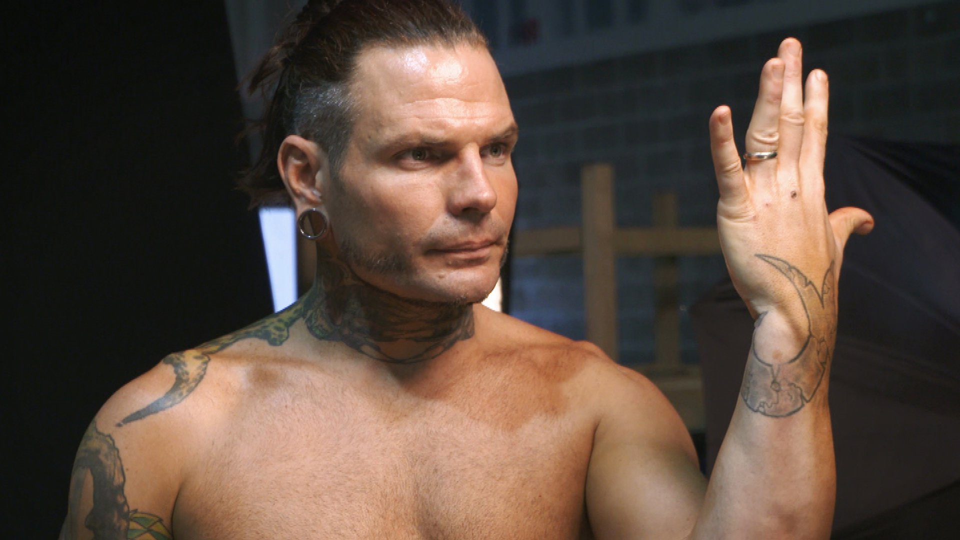
This is one of the clearest relationship tattoos in his collection because he explained both the letters and the reason for the matching placement.
The hand work also shows why scale can be misleading. A small symbol may be sharp and obvious in a close-up but disappear entirely when Hardy is wearing gloves, wrist tape or a long sleeve. It should not be treated as a new tattoo every time a different photograph reveals an extra line. The date, angle and quality of the photograph all matter when the designs are this compact.
The octopus, bunny and smaller leg work add a stranger edge.
Hardy has also had an octopus tattooed around a bunny on his leg during an Ink Master appearance. The image is playful and unsettling at the same time, which fits his habit of mixing bright colour with darker or surreal subjects. Reports say the session took close to six hours and was completed by Jesse Smith. The design is not part of the roots system, so it works better as its own entry rather than being folded into a general sleeve description.
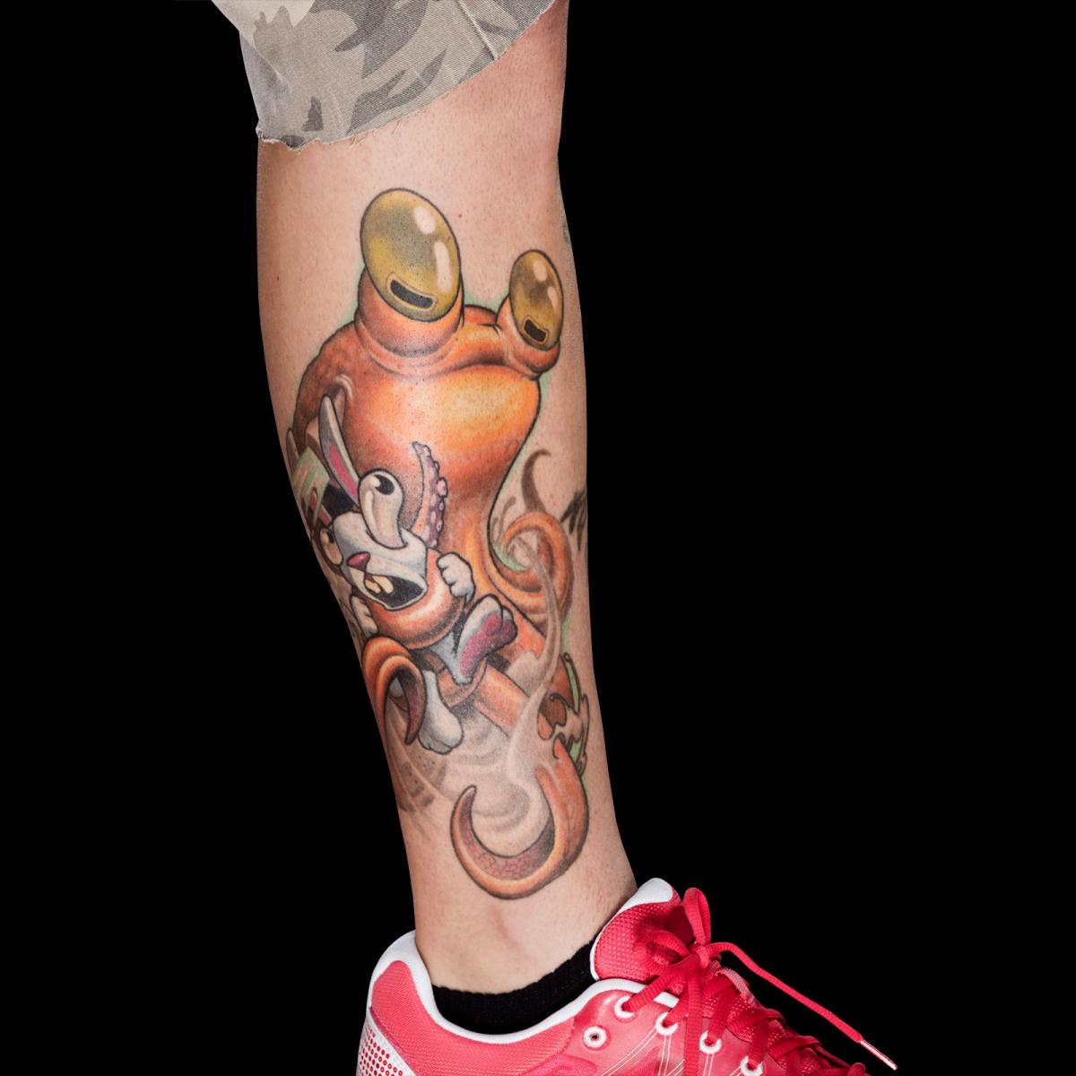
This is where Hardy’s collection becomes less predictable. The dragon is an early piece, the roots are tied to nature, the Japanese writing carries a clear wish for health, and the octopus and bunny bring a deliberately odd storybook quality. There is no need to force all of them into one style. Hardy has always approached tattooing as drawing on the body, and the designs feel like separate ideas that happen to share the same person.
Seen together, the tattoos move from a first dragon on the leg to roots across the arm, lettering, neck demons, a huge back scene, a snake and smaller marks connected to his wife and his own experiments. Some meanings are confirmed in interviews. Some designs are simply clear in photographs. That difference is useful, not a weakness. It lets readers enjoy the artwork without pretending that every line comes with a published explanation.
What makes Jeff Hardy’s tattoo collection different.
Hardy’s tattoos feel personal because he talks about the decisions behind them. He remembers getting the dragon at eighteen, explains the roots through veins and water, translates the Japanese writing and describes the matching wrist initials. He has also been open about the pain, the time involved and the way some ideas changed once they were on his skin.
The images show the scale that words alone miss. The back piece needs a full-back photograph. The roots need an arm or side view. The neck demons need a close portrait. The hand and wrist designs need a tighter frame. Using one generic shirtless picture for all of them would flatten the collection and hide the placement details that make each tattoo worth discussing.
There are still marks that cannot be named confidently from a distant photograph, and that is fine. A careful guide can list the roots, dragon, Japanese writing, neck demons, snake, devil face, flames, matching wrist letters and octopus scene without turning every shadow into a new design. Hardy’s own explanations do the heavy lifting. The photographs let readers see the work clearly, and the remaining uncertainty stays labelled instead of being dressed up as fact.