
Keke Palmer’s tattoos make more sense as a set of distinct choices than as one neat visual theme. Her collection moves between a large illustrated side piece and short pieces of lettering placed where clothes can hide them. The photographs are not equally sharp, and a visible phrase does not automatically explain why she chose it. This guide sticks to the designs that can be checked against tattoo-specific photographs and Palmer’s own public clarification, and leaves the guesses out.
One detail worth keeping in view is scale. The side design takes up a substantial area of her ribcage, while the lower-back and under-bust tattoos depend on close framing to read. That difference changes what a useful photograph looks like: a red-carpet image may establish that a tattoo is present, but a closer source image is needed to describe its lines or wording. The four sections below use separate photographs for separate designs, rather than recycling one general portrait to stand in for the whole collection.
The butterfly and flower cover Palmer’s right side
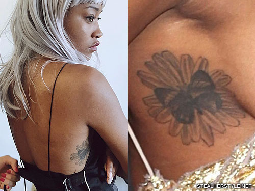
The largest clearly documented design in this group is a butterfly resting on a flower along Palmer’s right side and ribcage. TattooFilter describes the subject as flowers and butterflies on her side; Steal Her Style’s tattoo-specific page identifies the composition as a butterfly on a flower and notes the black-and-gray treatment. Those descriptions agree on the essential visual facts: an insect-and-flower pairing, placed on the side of the torso, with the butterfly providing the most immediately legible shape.
The arrangement matters more than an invented symbolic reading. A butterfly is often assigned a stock meaning in celebrity roundups, but the sources used here do not establish that Palmer selected this particular design to represent transformation, grief, or a turning point. The flower and butterfly can be described as a composition without claiming access to a private explanation. Its scale also gives the tattoo a different presence from her small lettering: it occupies a broad area of skin and is visible in some fashion photographs when the cut of a garment exposes her side.
Recent coverage again drew attention to a large rib-cage tattoo when Palmer appeared in a sheer Versace look at the 2025 Vanity Fair Oscar party. That report helps establish that the side work remained visible years after the older tattoo-specific photograph. The event photo is not a substitute for a close image of the exact flower-and-butterfly design, so this guide relies on the dedicated tattoo photograph for the design description and treats the red-carpet report as date-and-placement context only.
“Renaissance Woman” sits across the lower back
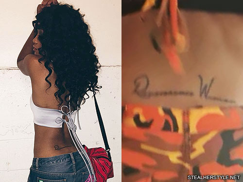
Palmer’s lower-back lettering reads “Renaissance Woman.” The phrase was not left to guesswork: after people questioned what the script said, Palmer corrected the reading publicly. She also supplied the sense she intended, describing a woman with knowledge or ability across more than one field. The tattoo’s text therefore has stronger evidence behind it than a phrase inferred from a soft event photograph.
The wording suits the range of work Palmer has taken on as an actor, singer, dancer, host, and performer. That connection is not only an editor’s clever caption; it follows the explanation attached to the phrase when she showed the fresh tattoo. Still, the article does not turn a line of lettering into a complete autobiography. The source supports a self-description and a placement. It does not prove that every later project or public reinvention was planned around the tattoo.
Lower-back tattoos are often photographed casually, with clothing, posture, or distance obscuring part of the lettering. The image placed here is a tattoo-specific source image, which is why it is more useful for reading the phrase than a general portrait. Even then, the sensible description is simply the words and their location. The design is typographic rather than pictorial, and the statement does its work through the language Palmer chose rather than through elaborate ornament.
A proverb runs beneath the bust
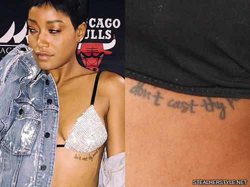
A separate tattoo sits beneath Palmer’s bust and carries the phrase “Don’t cast thy pearls before swine.” The source photograph is close enough to show that this is a line of text, not a decorative flourish. It is an old proverb, commonly used to describe the choice not to offer something valuable where it will not be appreciated. The phrase can be explained in ordinary terms, but no cited interview ties it to one particular relationship or episode in Palmer’s life.
That distinction is useful because tattoo coverage often takes a familiar saying and immediately turns it into a personal confession. Here the placement and visible wording are supportable; a detailed private backstory is not. The tattoo can be read as a compact statement about discernment without claiming that Palmer meant a specific person, project, or public disagreement. Keeping those limits clear makes the guide more informative, not less: readers get the exact design and do not have to sort fact from a made-up origin story.
The placement also explains why it is absent from many ordinary photographs. Clothing usually covers the area, so the tattoo appears only in images with a particular neckline or crop. The dedicated image is therefore important to the section; a photograph of Palmer’s face or a generic red-carpet appearance could not document a design positioned beneath the bust. It is a different piece from the larger side tattoo, and it should be understood on its own terms rather than folded into one broad “body art” description.
The inner-arm quotation is a different kind of lettering
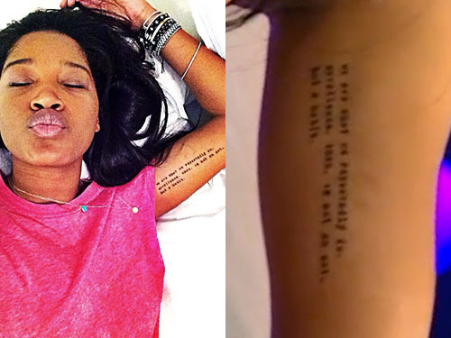
Palmer has another text tattoo on her inner arm, a line commonly circulated as “We are what we repeatedly do. Excellence, then, is not an act, but a habit.” The dedicated photograph records the placement and the wording as reproduced in tattoo coverage. The familiar attribution to Aristotle needs more care: the sentence is widely associated with him, but it is a later summary of an idea connected with his writing, not a verbatim line from the surviving Nicomachean Ethics. Naming that distinction avoids repeating an attractive but misleading attribution as a fact.
Palmer has discussed encountering the quotation and responding to its message. That offers a modest, relevant piece of context: the words resonated with her enough to be carried on her arm. It does not require a grand claim that the tattoo predicts her career or explains every success. Its placement is practical as well as personal. The inner arm can be shown deliberately and covered in everyday clothes, a different kind of visibility from the exposed side design.
These two pieces of lettering also work differently from each other. “Renaissance Woman” is a short self-description, while the longer inner-arm text states a principle about practice and repetition. Their locations give each phrase room to be read, but the designs remain visually restrained. In photographs, the exact line can be harder to inspect than a bold illustration, which is why a close tattoo image matters more than a distant event shot. The article keeps the quoted wording in its own section and does not use it as a catch-all explanation for the rest of Palmer’s tattoos.
Taken together, these four documented pieces show range rather than a single fixed motif: one large natural illustration and three text designs, spread across the side, lower back, under-bust, and inner arm. Their visibility depends on clothing and camera distance, and the strongest evidence is not the same for every item. Palmer’s public correction makes the lower-back lettering unusually clear; the side design is documented by tattoo-specific image records; and the two smaller inscriptions are best handled as visible wording with no invented private story. That is a more accurate map than a list that assigns a symbolic meaning to every line of ink.
The placement makes these tattoos easier to read as a group. The butterfly and flower work covers a broad area, while the lettering pieces need a closer look. A wide photograph can establish the overall shape, but it will not always show the small words clearly. That is why the close-up images belong beside the sections that name them.
Keke’s collection also has a useful mix of decorative and personal ink. The flower and butterfly design is visually busy, the back lettering is direct, and the quotations depend on the exact wording. None of those pieces needs an invented backstory. The photograph establishes the design, and the reported context explains only what the sources actually connect to it.
Older photographs should be read alongside newer ones rather than treated as a permanent final count. A cover-up, a faded line or a change in styling can make the same tattoo look different. Keeping the dates and locations visible gives readers a much better guide than a list that treats every image as if it came from the same session.
That balance is worth keeping in the finished article. Readers can see the larger shapes first, then use the close photographs to check the words, placement and changes. It keeps the page useful without pretending that every mark has a documented meaning.
A later portrait confirms the side placement

A later public photograph confirms that the side tattoo remains part of Palmer’s visible tattoo map. It is not a replacement for the tighter image used to identify the butterfly and flower, because the crop shows less fine detail. It is still useful for scale and placement: the tattoo sits along the side of the torso and reads as a large piece rather than a small mark hidden near the waist.
That difference between a detail photograph and a wider portrait is worth keeping. The close image tells readers what the design looks like, while the newer photograph shows how the tattoo sits with Palmer’s clothes, posture and overall styling. Neither image needs an invented meaning added to it.