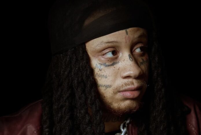
Trippie Redd has one of the most recognisable face-and-neck tattoo setups in modern rap. The cross, the numbers, LOVE SCARS lettering and the 1400/800 marks all sit close together, while smaller symbols fill the gaps around his eyes and cheeks. His hair and styling change a lot, so the tattoos can look different from one photo to the next.
This guide keeps the main groups separate and uses different photographs for each view. The ink is easy to spot, but the meaning is not always explained in public. Where Trippie or a strong source has given context, it is included. Where a photo only shows a mark, the description stays with the design and placement.
The cross and numbers set the tone for his face tattoos
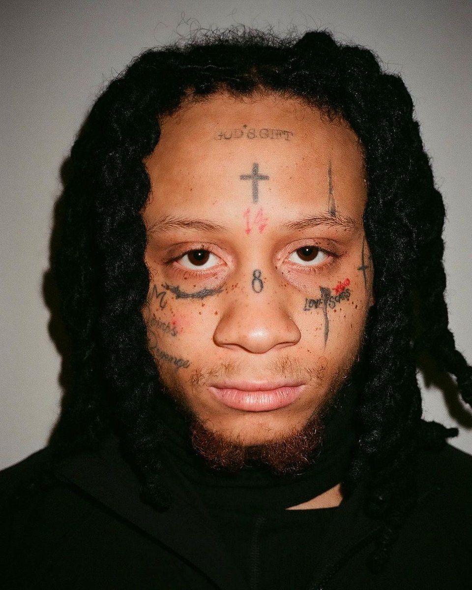
Trippie Redd’s face tattoos are the first thing people notice, and the small cross high on his forehead gives the whole group a strong centre. Around it are numbers, short marks and script that sit close to the eyes and brows. The designs are packed together, but the close-up photographs still let you separate the main shapes.
The red 14 is one of the most recognisable marks in his look. The blue or dark 8 appears in another spot between the brows or around the nose depending on the photo and the time period. Older and newer images do not always show the same colour or placement perfectly, so dates and camera angle matter.
A face is a tight space for tattooing. Even a small number changes the expression, which is why Trippie’s ink feels so immediate. The cross, numbers and words are not hidden on the shoulder or chest. They sit where every interview, music video and red-carpet picture can show them.
The images do not prove a private meaning for every number, so this guide keeps the claims close to what is documented and visible. There is enough detail in the ink itself without turning every mark into a secret code.
The 1400 and 800 numbers continue down onto the neck
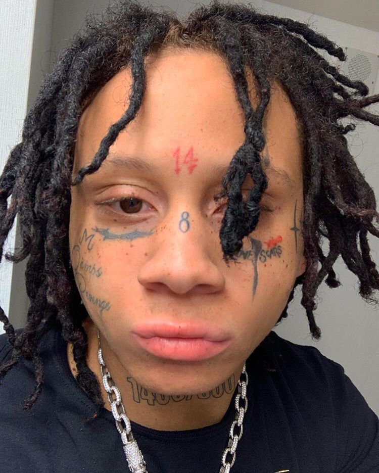
The tattoo story does not stop at the jawline. Trippie has 1400 and 800 lettering on his neck, and the numbers appear in several photographs beneath the face work. They are part of the public identity linked with his music, so they read differently from a random decorative symbol.
The neck numbers are easier to see in a straight-on portrait where hair is pulled back. In a side angle, the dreadlocks can cover half the lettering and make the group seem smaller than it is. That is why a separate neck view earns its own place rather than being treated as background in a face section.
The numbers also give the tattoos a bridge between the face and the rest of his style. His jewellery, hair and clothes change often, but the neck lettering keeps a fixed visual anchor. It is bold enough to read in a performance image, yet close enough to the jaw that it still feels like part of the facial design.
There are other small marks around the neck, including script and symbols, but not every line is named in reliable coverage. A good description can say that the neck is heavily tattooed without inventing translations for writing that is too soft to read.
LOVE SCARS and the cheek lettering make the face read like a diary
The words LOVE SCARS sit beneath one eye in many photographs and have become one of Trippie’s most recognisable tattoos. The phrase fits the emotional language around his music, but the design works visually too. The letters are short, clear and placed where a camera will catch them straight away.
Other lettering and small symbols spread across the cheeks and near the eyes. Some pictures show a heart-like mark, small numbers or extra words that are difficult to separate from shadows and facial hair. Those details can be mentioned as reported or visible without pretending that a single image gives a perfect count.
The close placement makes these tattoos feel more personal than a large chest piece. They travel with him in every portrait. Even when the expression changes, the words stay in the same place and become part of the face people recognise.
The phrase should still be handled plainly. It is a visible tattoo and a known part of his style. The photograph cannot tell us every emotion or event behind it, so the article sticks with the wording, location and the connection fans have made with his music.
A different portrait shows how the same tattoos change with hair and light
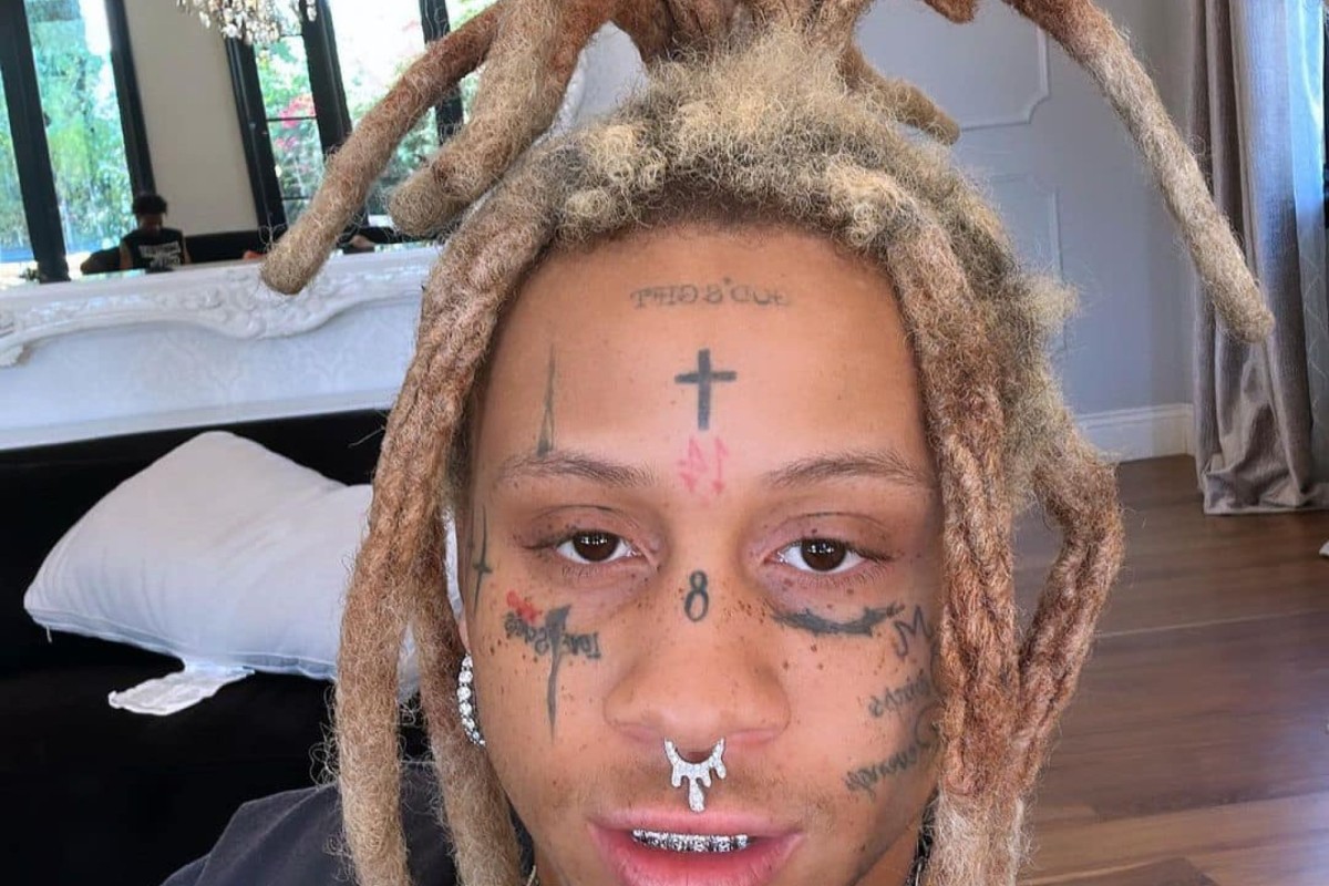
A separate indoor portrait is useful because it shows the same general tattoo groups under different conditions. The dreadlocks fall around the forehead, the light is softer and the neck is partly shadowed. That changes what a reader can see without changing the underlying tattoos.
The cross is still visible, as are the number marks around the centre of the face. The nose and cheek designs look heavier in this light, while the neck lettering fades into the background. It is a reminder that tattoo coverage should not be based on one perfect-looking photograph.
The changes in hairstyle matter too. Trippie has worn red, green, dark and lighter dreadlocks, and the hair can cover the temples or the sides of the face. A photo with the hair pulled back helps with placement, while a relaxed portrait shows how the tattoos look in normal public life.
This is also where duplicate-image checking matters. Two photos can show the same tattoos but still be different photographs. What should be rejected is the same photograph cropped or zoomed and uploaded again. A genuinely different angle can add useful evidence without pretending it reveals a new tattoo.
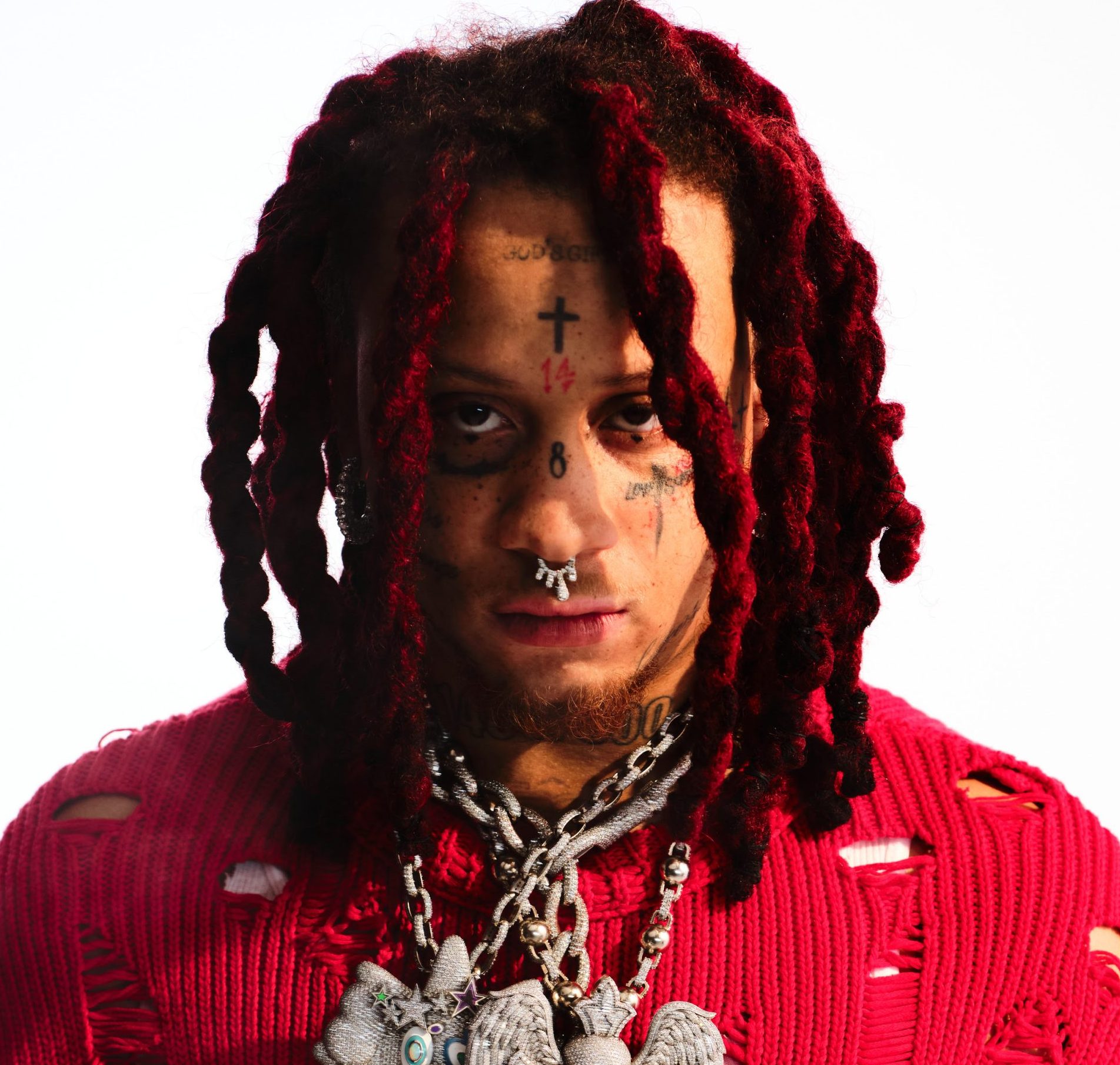
The red-dread portrait gives the clearest wide view of the tattoo layout
The large promotional portrait pulls the whole face and neck into one frame. The cross, numbers, eye lettering and neck marks sit in a clear vertical line, while the red dreadlocks frame the sides. It is the best overview image in the article, but it still does not replace the close-ups used for individual groups.
Trippie’s tattoos have changed as his career has moved forward. New lettering appears, colours get refreshed and some marks become easier to see as the styling changes. A current portrait can show the present layout, while an older social photo helps explain why fans sometimes describe the same area differently.
The face and neck work also connect to his stage identity. He has built a look around intense colour, heavy jewellery, red hair and emotional song titles. The tattoos are not separate from that image, but they are still real designs with their own placement and line work.
The simplest way to read the collection is to start with what is certain: the cross, the 14, the 8, LOVE SCARS, 1400/800 and the smaller surrounding marks. Everything else needs a sharp photo or a direct explanation before it should be stated as fact.
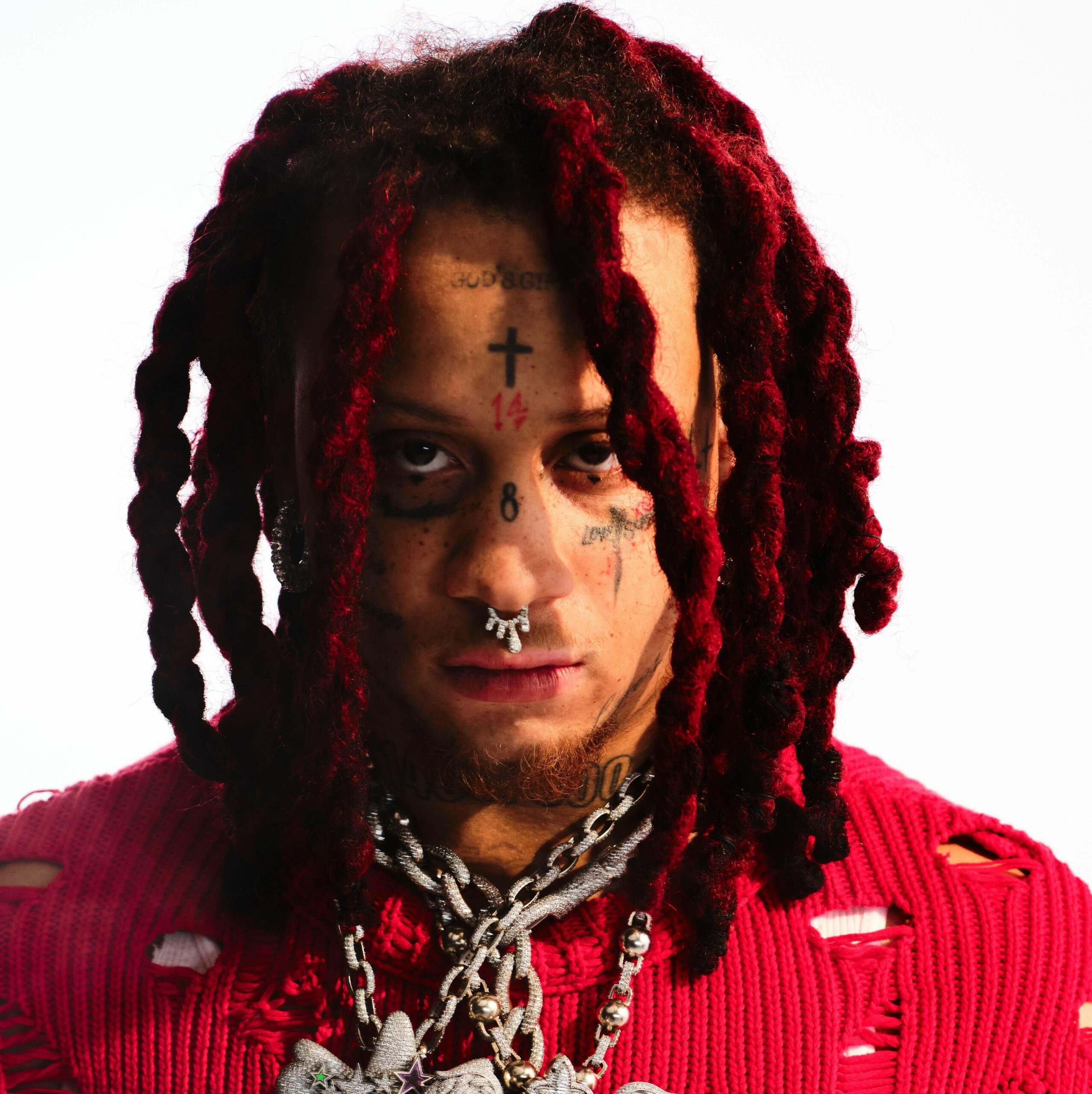
There are plenty of smaller marks that appear around the main designs, and more may have been added since some of these photographs were taken. That is normal for a heavily tattooed musician. The useful approach is to name the clear pieces, show them with different photos and avoid pretending that a blurry patch near the hairline is a confirmed new tattoo.
Put together, the cross, numbers, LOVE SCARS and neck lettering give Trippie’s face a strong visual rhythm. The designs are bold, but the details still reward a close look. That is why the article needs several tattoo photographs rather than one generic portrait at the top.
The numbers and words also show why Trippie’s face works best when it is read in layers. The forehead gives you the first hit, the cheeks add the emotional wording, and the neck carries the larger group that ties the whole look together. None of those parts needs to be treated like a separate personality. They just sit at different distances from the camera.
Photos from different years can make the ink look surprisingly different. Hair covers the temples, chains cover the neck, and colour grading changes how dark the lines seem. A careful guide should compare the placement, not count every fresh angle as another tattoo. The same cross can look sharp in one image and softer in another without being replaced.
The smaller script around the eyes is also why wide portraits are not enough on their own. A full face shot gives the overall layout, but a close frame is what lets readers see whether a mark is a number, a word or just a shadow. That extra detail is the difference between a useful tattoo guide and a generic celebrity profile.
It also keeps the descriptions honest. When the lettering is clear, it can be named and placed. When a lock of hair or a hard shadow blocks it, the sensible answer is to leave that detail open instead of filling the gap with a guess. The strongest tattoo guides are specific about what the photographs really show.
One thought on “Trippie Redd’s Tattoos: Face Ink, Love Scars and 1400/800”