
Liam Payne’s tattoos are spread across a visual map of arrows, words, symbols and small objects. The best-known design is the group of four chevrons on his forearm, which he has connected with the four other members of One Direction. Around that piece are longer lines of script, a feather, Egyptian hieroglyphics and the phrase Only time will tell. The collection is varied, but the strongest entries are easy to locate because Payne and the photographs supply useful detail.
The GQ Tattoo Tour is the most valuable source for the designs Payne discusses himself. Published tattoo catalogues then fill in the pieces that appear in older photographs. They should not be treated as equally strong evidence: a close image can establish lettering and placement, while Payne’s explanation is needed before a writer assigns a private meaning.
Four arrows keep One Direction on Payne’s forearm
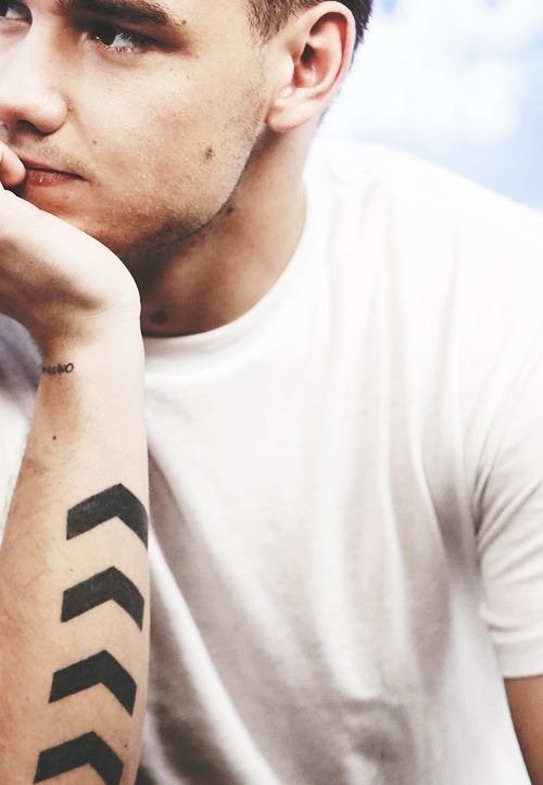
Payne’s four-arrow tattoo is the clearest example of a design whose meaning has been stated directly. The arrows sit together on the forearm and have been described as references to the four other One Direction members. The design is simple enough to read in a stage photograph, but the grouping matters: these are not four unrelated chevrons placed near one another.
The arrows also suit Payne’s career at the time they became familiar. The band was built around five members, and the tattoo turns that number into a compact black-ink motif. The shape is directional without being elaborate, which lets it work as a band reference while remaining visually clean on the arm.
Published photographs show that the arrows can look heavier or thinner depending on lighting and camera distance. A close view gives the reader the best sense of the linework, while a stage image establishes how the design sits when Payne performs. Both forms of evidence are useful, but neither should be used to claim that every other mark on the forearm belongs to the same tattoo.
The design is also a reminder that a small tattoo can carry a very specific group reference. Payne did not need portraits or names to identify the band. Four repeated shapes were enough, and his explanation supplies the relationship behind them.
Long script lettering gives the forearm a private register
One of the longer pieces associated with Payne reads Everything I ever wanted but nothing I’ll ever need. Published tattoo guides place the script on his left forearm. The sentence is visually different from the short arrows because it runs as a line of handwriting rather than a compact emblem.
Quoted wording should be reproduced carefully. The source photographs make the letters readable, but they do not automatically explain whether the line came from a song, a conversation or a private moment. Keeping the text literal is more useful than attaching an invented origin to it. The phrase has emotional weight on its own.
The forearm location makes the tattoo visible when Payne wears short sleeves or holds a microphone. It can also disappear when his arm turns, which is why older photographs sometimes show only a partial line. A good tattoo guide should keep the placement beside the transcription so readers understand why different images appear to show different lengths.
The lettering sits within a wider collection that includes symbols and smaller words. It is tempting to use one meaning for the entire arm, but the sources do not support that shortcut. The arrows have a reported band connection; the long script is best presented as wording with an unconfirmed private origin.
Hieroglyphics and a feather add smaller visual chapters
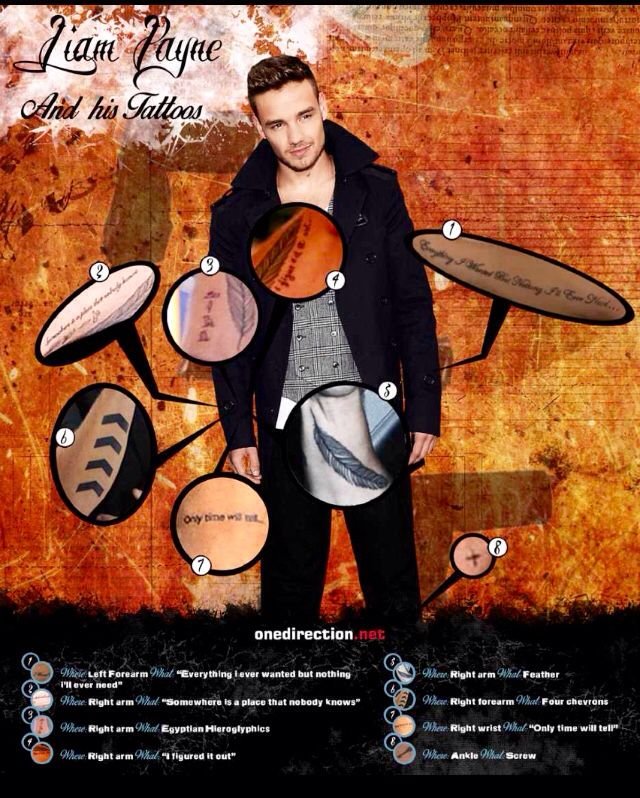
Older tattoo callout images identify Egyptian hieroglyphics on Payne’s right arm and a feather elsewhere in the collection. The visual guide also lists Only time will tell on the wrist, along with a screw and other small designs. These entries are more dependent on close photography than on first-person explanation, so the wording should stay descriptive.
Hieroglyphic imagery needs particular care. A photograph can show that Payne wears a group of Egyptian-looking characters, but a writer should not translate them without a trustworthy source. The shape, location and visual treatment are safe to record. A definite sentence-level meaning is not.
The feather provides a different kind of image. Its outline is familiar, but the published callout helps separate it from the surrounding arm work. It should be treated as its own tattoo rather than as decoration attached to the script or arrows. The same principle applies to Only time will tell: the phrase is a separate wrist entry, not an explanation for every design above it.
These smaller pieces make the collection feel less like one planned sleeve and more like a set of additions made across different stages of Payne’s life. The exact chronology is not equally clear for every design. That is why a location-led inventory is more reliable than a confident timeline built from scattered photographs.
What Payne’s tattoo record can establish
The documented collection supports several firm descriptions. Payne has four arrows linked to his One Direction bandmates. He has long script on the forearm, hieroglyphic-style imagery on the arm, a feather and additional wording at the wrist. The GQ interview gives the strongest personal context for the arrows and other pieces he discusses directly.
The sources do not support a complete official count or a private explanation for every mark. Some tattoos may have changed, faded or been photographed from angles that hide part of the design. A careful guide therefore separates direct comments from visual evidence and keeps uncertain translations out of the finished article.
That approach makes Payne’s tattoos more interesting, not less. The arrows show a clear band connection. The script carries a sentence that readers can inspect. The hieroglyphics and feather add shape and texture without requiring the article to assign meanings that Payne has not made public. Each design can stand beside the image and evidence that justify including it.
The visual record also shows why separate sections matter. The arrows, script, hieroglyphics and feather are not interchangeable images. Each has a different shape and a different level of documented context. Showing the right close-up beside the right passage helps readers compare the work without mistaking a nearby mark for part of another design. It also leaves room for future interviews or clearer photographs to add information without forcing an older description to carry more certainty than it can support.