Actors

Jared Leto’s Real Tattoos: The Orbis Epsilon and the Ink Behind the Myth

Jared Leto’s tattoos are unusually easy to confuse with the character work built for his film roles. The ink most firmly tied to Leto himself is the large geometric design on his upper back, while much of the imagery associated with his Joker was makeup and character styling. A careful guide therefore has to separate what was photographed as permanent body art from what belonged to a production.

The Orbis Epsilon back tattoo is the clearest confirmed piece
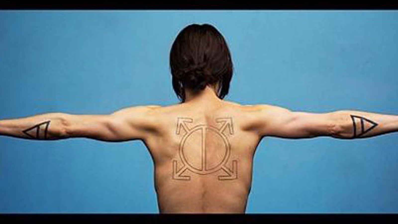
Jared Leto showing the Orbis Epsilon back tattoo

The best-documented Jared Leto tattoo is the Orbis Epsilon design between his shoulder blades. Aftonbladet reported that Leto promised to reveal a new back tattoo when he reached one million Twitter followers, then posted the image as promised. The design is a circle divided into two sections, with four arrow-like projections extending from it. It is not a random abstract pattern: Orbis Epsilon is a recurring Thirty Seconds to Mars symbol used across the band’s visual identity.

The reveal also explains why this tattoo appears so often in fan discussions. It has a clear public origin story, an identifiable shape and a direct connection to Leto’s music career. That is stronger evidence than a caption that simply labels a photographed mark as meaningful. The public record supports the design and the band connection. It does not require us to invent a more intimate explanation that Leto has not supplied.

Forearm triangles are reported, but their meaning needs care
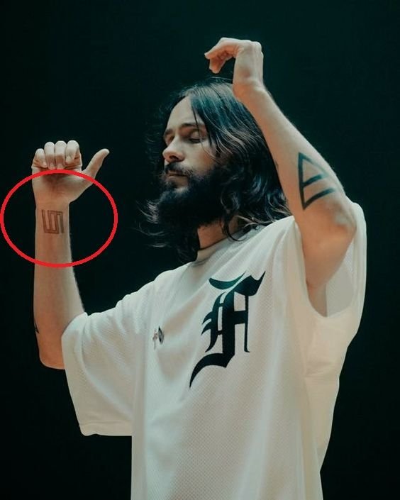
Jared Leto showing forearm triangles and glyphs

Specialist tattoo references describe solid black triangles on Leto’s forearms and associate them with the alchemical symbol for air. The geometric marks fit the visual language of his better-known back piece, but the source trail is not the same as the direct reveal reported for the large back design. There is no comparable Leto interview in the reviewed material in which he explains each triangle in his own words.

That difference matters. It is reasonable to describe the shapes and the reported symbolism. It is not reasonable to present the air interpretation as a private statement from Leto. Photographs can establish that a design appears on skin; they cannot automatically establish why it was chosen. The triangles are therefore best treated as documented designs with a limited interpretation rather than as fully explained personal tattoos.

The Thirty Seconds to Mars glyph and the language of the band
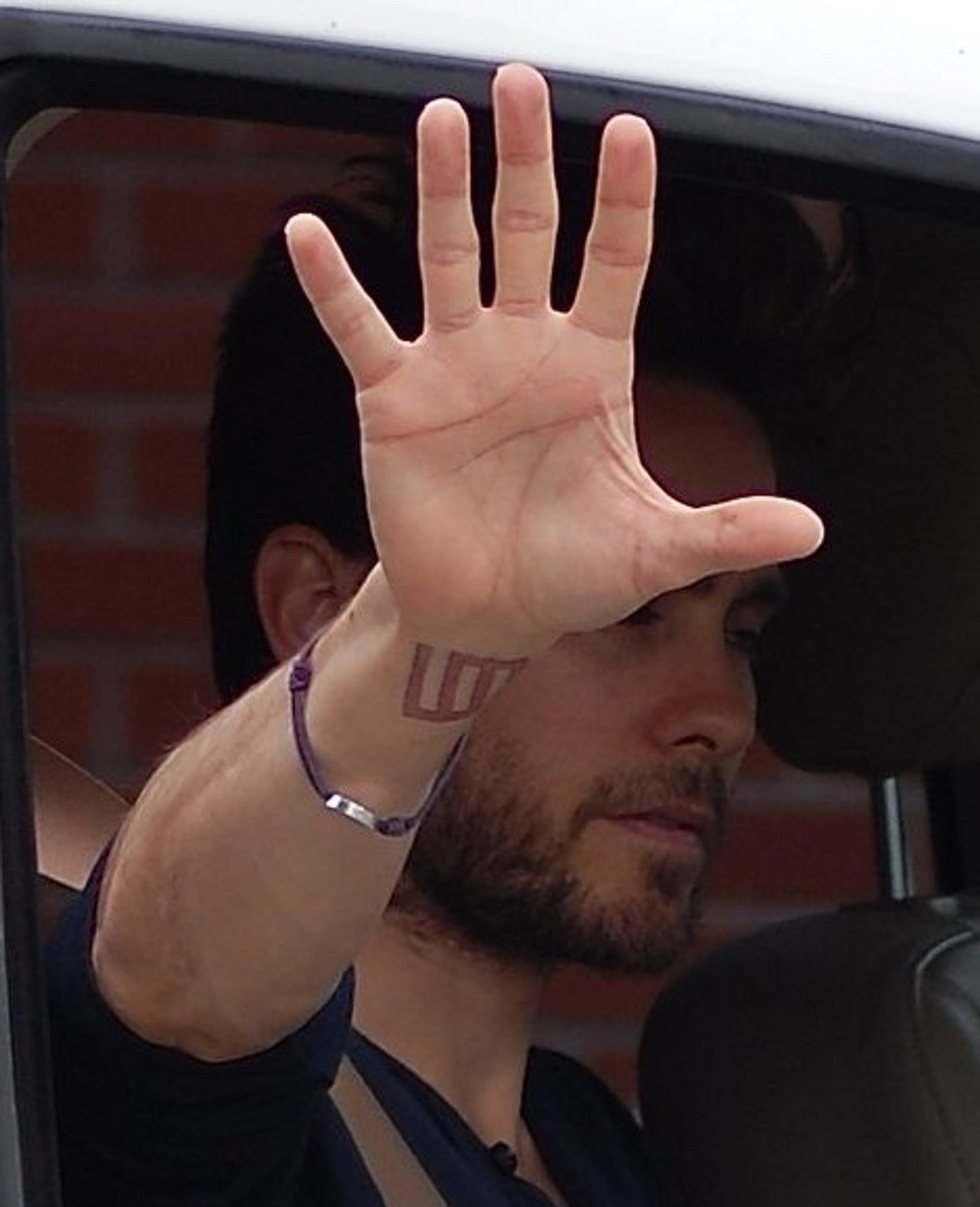
Jared Leto showing the Thirty Seconds to Mars wrist glyph

Another design repeatedly associated with Leto is the first Thirty Seconds to Mars glyph, reported around the wrist. The band’s symbols have appeared on album artwork, merchandise and fan material, so the connection is plausible and visually consistent with the large back design. Still, the exact visibility of the wrist mark changes from one photograph to another, and the public references do not provide a detailed first-person explanation.

This is a useful example of how to read celebrity tattoo coverage. The band relationship can be reported when the design is identified in a specialist record, but the article should avoid turning a logo into a biography. Leto’s work with Thirty Seconds to Mars gives the glyph context. It does not prove a specific event, relationship or private memory behind the tattoo.

What is known about the collarbone phrase
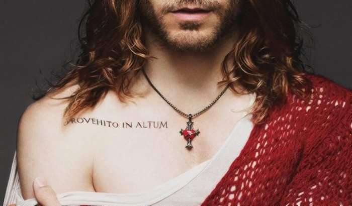
Jared Leto collarbone phrase Provehito in Altum tattoo

Reference material also lists the Latin phrase “Provehito in Altum,” commonly translated as “launch forth into the deep,” around Leto’s collarbone. The phrase is strongly associated with Thirty Seconds to Mars and is familiar to the band’s fan community. Its reported presence fits the larger pattern of music-linked symbols in Leto’s tattoo record.

The lettering is not consistently clear in the source photographs reviewed for this article. That makes the phrase a reasonable catalogue entry, but not a good candidate for a confident visual claim about every letter or its current condition. It is also a reminder that tattoo lists can preserve an older observation after cover-ups, fading or changes in visibility. The safest wording is that the phrase has been reported and associated with Leto, while the available image record does not establish every detail.

The cross or Echelon X mark remains less fully explained
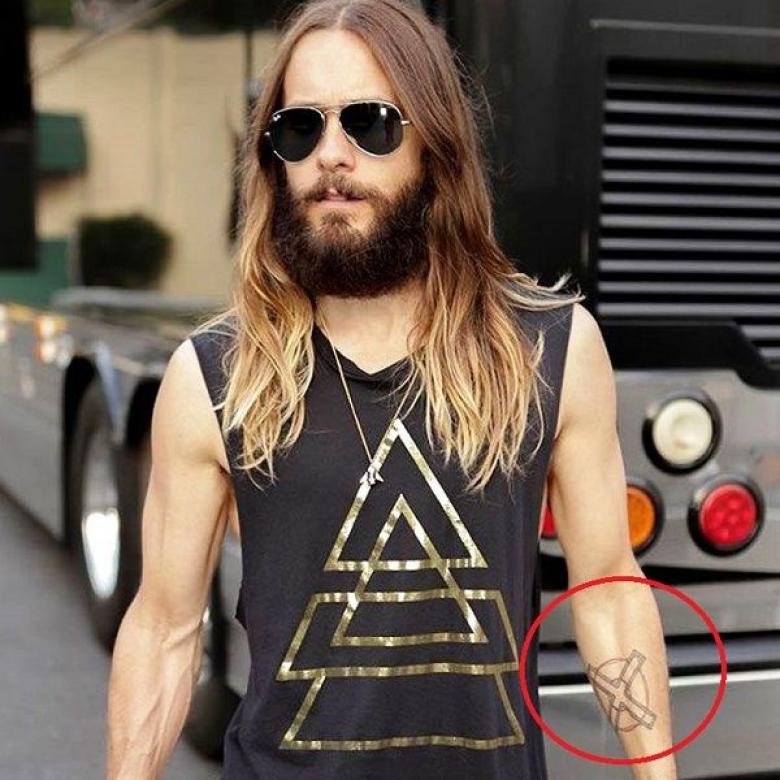
Jared Leto Echelon X forearm tattoo

A small cross or Echelon-style X on the forearm is included in specialist descriptions of Leto’s ink. It belongs to the same broad family of symbols connected with his band, but it has not been accompanied by a direct explanation from Leto in the sources reviewed here. It should therefore remain a secondary entry in the inventory, not the headline claim.

That distinction keeps the article useful without overstating the evidence. Readers can learn which designs are commonly catalogued, where they are said to sit and how they relate to the band’s imagery, while still seeing the boundary between observation and interpretation.

Jared Leto’s Joker tattoos were character design, not a personal collection

The tattoos seen on Leto’s Joker in Suicide Squad belong to a different category. “Damaged,” the lettering across the forehead, the hand smile and the other graphics were created for the film’s version of the character. They helped communicate a specific fictional history and were discussed by director David Ayer as part of that story. They should not be added to a list of Leto’s permanent tattoos simply because they appeared on his body during filming.

This distinction is especially important because Joker photographs dominate image searches for Jared Leto tattoos. A search result can look like proof while actually showing prosthetic makeup, temporary lettering or a role-specific design. A real guide should identify those images as character references, not use them to pad a biography of Leto’s own ink.

Reading the record without overclaiming

Leto’s tattoo record is smaller and more selective than the online Joker galleries suggest. The large back piece has the strongest documentation, while the arm and wrist designs are reported with less consistent first-person explanation. Their meanings and current visibility are not equally confirmed. That uneven evidence is part of the story, not a gap to fill with invented symbolism.

For readers comparing photographs, the practical takeaway is simple: start with the geometric back tattoo, then look for the band-linked marks on the arms and wrist. Treat the Joker imagery as a film reference. Where a design is visible but unexplained, describe it plainly. That approach produces a more accurate account of Jared Leto’s tattoos than a longer list built from character makeup and repeated internet claims.

Frequently asked questions

What is Jared Leto’s most clearly documented tattoo?

The Orbis Epsilon geometric design on his upper back has the clearest public reveal and the strongest connection to Thirty Seconds to Mars.

Are Jared Leto’s Joker tattoos real?

They were character designs used for his portrayal of the Joker, not evidence of a permanent personal collection.

What do Jared Leto’s tattoos represent?

The documented designs are closely linked to Thirty Seconds to Mars, but several individual meanings have not been explained directly by Leto.
Tom Hardy Tattoos: The Stories Behind Leo Knows All and His Older Ink

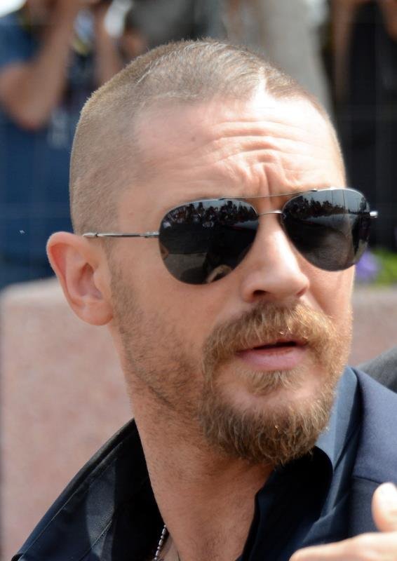
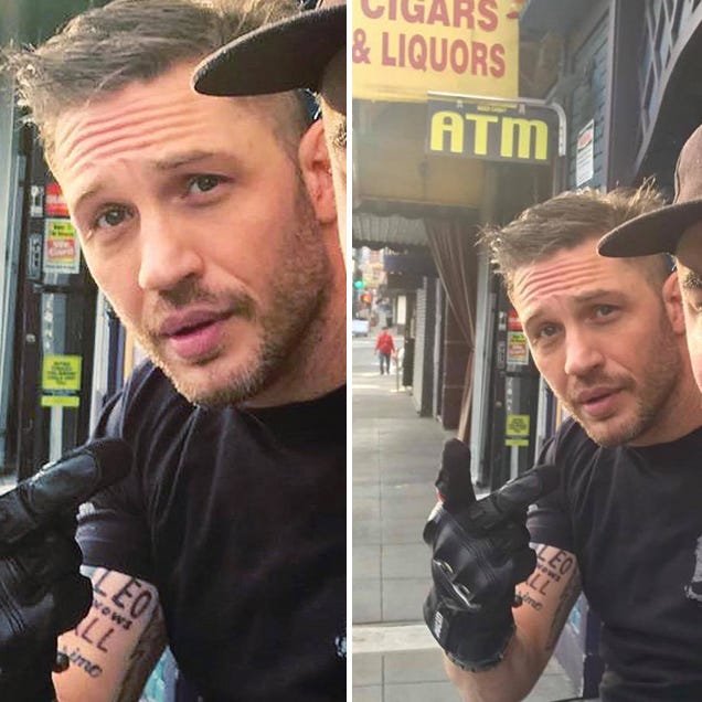
Tom Hardy’s tattoos are documented through a mixture of interviews, close-up photographs and entertainment reporting. The strongest entries are not guesses based on a distant red-carpet image. They are designs that can be named, placed on the body and tied to a source that explains how Hardy got them or what the design represents. The famous Leo Knows All piece has the clearest origin, while older work needs more careful wording because Hardy has never published a complete catalogue.

Tom Hardy’s Leo Knows All right bicep tattoo

Tom Hardy showing the Leo Knows All right bicep tattoo

The Leo Knows All tattoo began as a wager between Hardy and Leonardo DiCaprio during the period around The Revenant. Hardy agreed that he would get a tattoo chosen by DiCaprio if he received an Academy Award nomination. DiCaprio predicted the nomination correctly, and Hardy eventually followed through. The phrase was first associated with a rough handwritten suggestion, but the version photographed on Hardy reads Leo Knows All.

The design is placed on Hardy’s right bicep, making it easier to identify in close public photographs than many of his older pieces. TIME reported the bet and the wording, while Men’s Health published a photograph in which Hardy points toward the fresh lettering. The story is unusually well documented because it includes the agreement, the predicted nomination and the final visible design. It does not require a larger claim about Hardy’s entire tattoo philosophy.

The Padre Fiero chest tattoo

Tom Hardy showing the Padre Fiero chest tattoo

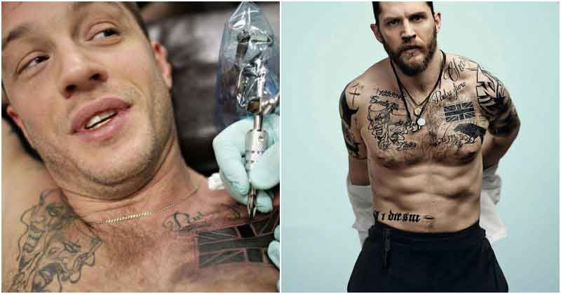
Padre Fiero is one of the phrases identified in coverage of Hardy’s torso tattoos. The lettering appears on the left pectoral and is commonly translated as proud father. That reading fits the phrase and the fatherhood context reported alongside it, but this guide should keep the wording tied to the source rather than inventing a private anecdote that Hardy has not given publicly.

Chest lettering is easy to misread when a photograph is compressed or the body is turned away from the camera. The useful fact is the visible phrase and its location. The design sits among older chest and shoulder work, so a crop that shows only one part of Hardy’s torso should not be presented as a complete view. The best image for this section is the torso photograph that makes the lettering readable enough for readers to understand why the phrase is listed separately.

Hardy’s wolf and raven tattoos

Tom Hardy showing wolf and raven designs

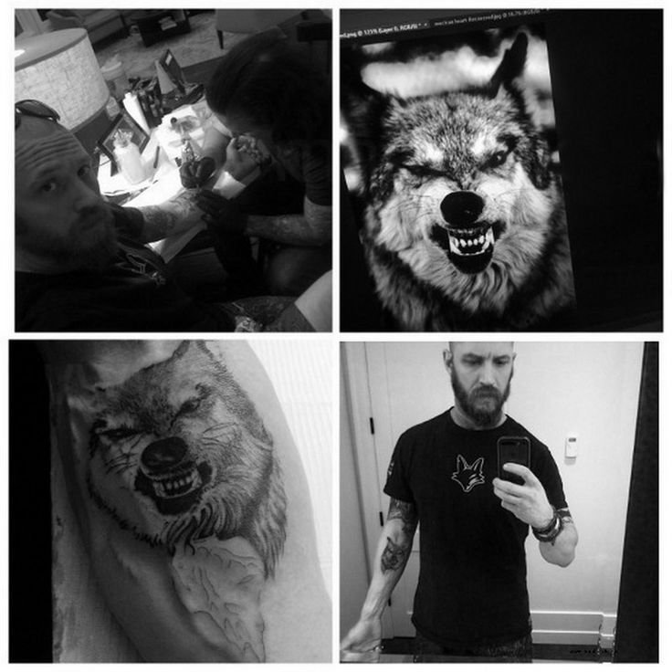
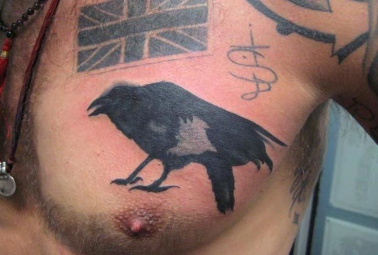
GQ interview coverage has connected Hardy with wolf and raven designs in his broader collection. These are not the same kind of evidence as the Leo Knows All tattoo. The bet story gives a clear date and a public explanation, while the animal designs are discussed as part of Hardy’s older personal ink. A careful guide can identify the animals and their upper-body placement without assigning a symbolic meaning that the interview does not establish.

The distinction matters because animal tattoos invite automatic interpretations. A wolf can be called loyal, solitary or protective, and a raven can be assigned ideas about death or intelligence, but those are conventional readings rather than Hardy’s own explanation. The image should therefore establish the visible animals and their location. The prose should separate visual description from confirmed biography.

Tom Hardy’s wider torso tattoo collection

Tom Hardy showing his wider torso tattoo collection

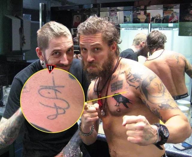
Hardy’s older collection extends across the chest, shoulders and arms, with coverage describing a mixture of romantic, religious, tribal and personal designs. Some photographs show several marks at once, but a wide image should not be used to claim that every line can be identified. The collection is best understood as a group of separate pieces gathered over time rather than one single sleeve or one unified project.

That wider view supplies context for the individual sections. Leo Knows All is a later, clearly explained addition. Padre Fiero belongs to the chest lettering. The wolf and raven designs sit within the older upper-body work. Readers can compare those categories while remembering that light, body position and image quality change what can be seen in any one frame.

What the documented interviews can and cannot establish

The available sources firmly support the wager behind Leo Knows All, its wording and the right bicep placement. They also support the identification of Padre Fiero and the presence of wolf and raven designs in Hardy’s wider collection. They do not establish a private meaning for every older mark, a complete artist list or a definitive count of every tattoo.

That boundary improves the guide. A tattoo can be visually clear while its meaning remains unconfirmed, and a reported meaning can be precise even when an old photograph is soft. Tom Hardy’s tattoos are therefore best read through the combination of close imagery, direct interview material and cautious location notes. Every design in this article is kept beside the image and evidence that justify including it.

The photographs also show why section-by-section treatment is necessary. The Leo lettering can be isolated in a close view, while the older chest work is more often presented as part of a larger torso image. One photograph may be useful for orientation without being detailed enough to prove every design. The guide therefore keeps the close lettering, the animal designs and the wider collection as separate visual subjects.

There is also a difference between a tattoo’s origin and its later public visibility. Hardy may have worn older work for years before a particular interview or fan photograph made it easy to discuss. The date a design becomes news is not automatically the date it was tattooed. That is especially important for the older chest and shoulder pieces, where coverage often describes the design without giving a precise appointment date.

Readers should compare the image with the heading before drawing conclusions. The bicep section concerns the wager lettering. The chest section concerns Padre Fiero. The animal section concerns the wolf and raven references. The collection section provides a broader view, but it is not a substitute for a close tattoo photograph. This structure keeps each visual claim tied to the tattoo it is meant to document.

The evidence stays specific.

Chris Farley Lives On in These Fan Tattoo Tributes

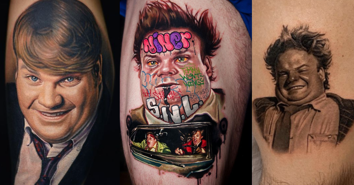
Chris Farley died in 1997, but the affection for his work has never been limited to reruns and favourite clips. Fans have carried that affection into tattoo studios, choosing portraits, characters and phrases that make the tribute visible on their own skin. These are fan tattoos, not designs Farley was known to wear himself. That distinction matters because the subject here is the way viewers remember a comedian whose physical timing and generosity made even a short scene memorable.

The examples gathered in tattoo galleries and memorial features fall into a few strong groups. Some fans choose Farley’s face in realistic black-and-grey or colour portraiture. Others pick a character such as Tommy Callahan from Tommy Boy or Todd O’Connor from Saturday Night Live. A third group leans into comic lettering, props and scenes, including the kind of visual joke that could identify a film without needing Farley’s name underneath it. The images show how different a tribute can look while pointing back to the same performer.

Realistic portraits keep Chris Farley’s face at the centre

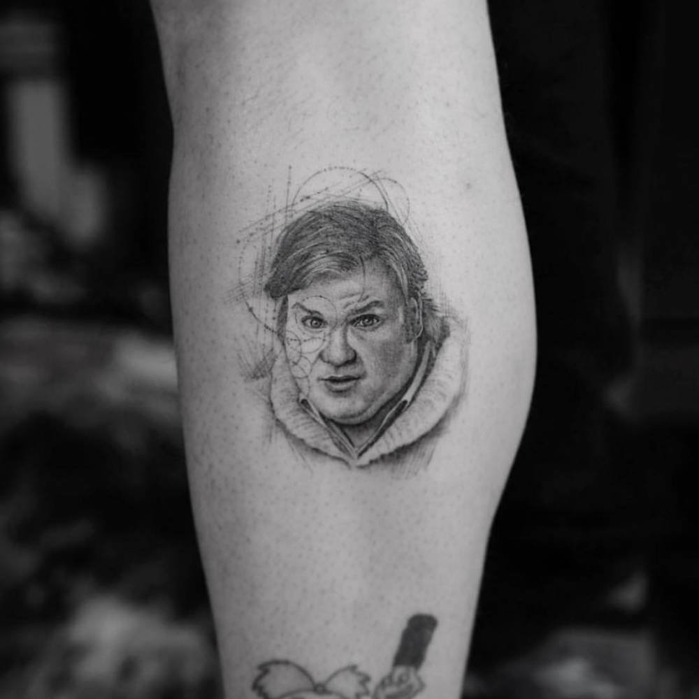
Realistic Chris Farley portrait tattoo on a fan's calf

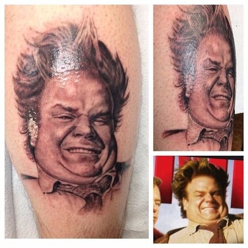
Portrait tattoos of Chris Farley are the most direct form of tribute in the documented examples. Tattoo Filter features a fine black-and-grey micro-realism portrait credited to Dr. Woo, while the Mike DeVries gallery presents another realistic likeness made for a fan. The work depends on recognisable expression: the eyes, cheeks and open grin have to survive translation into ink, otherwise the design becomes a generic face rather than Farley.

Portrait scale changes the result. A calf or forearm gives the artist room to build a jawline, hair and expression, while a small design has to simplify those features. The Tattoo Filter image is useful because the face remains the focal point and the surrounding skin does not compete with it. A portrait like this works through likeness before it relies on text. Someone who knows Farley’s screen presence can recognise the reference from the expression alone.

The meaning is also unusually easy to describe without inventing private details. The fan is honouring Farley and the pleasure his performances provided. That is enough. The source pages identify the subject, artist or gallery context, but they do not give permission to claim that every portrait represents grief, a particular film or an undisclosed personal event. Tattoo writing is stronger when the visible likeness and the documented tribute remain together.

Tommy Boy turns a favourite character into a calf tattoo

Chris Farley as Tommy Callahan from Tommy Boy in a fan tattoo

Tommy Callahan gives fans a different route to Farley. Tattoodo’s gallery includes a black-and-grey tattoo of Farley as the central character from Tommy Boy, credited to Jay Cunliffe. The design is not a generic celebrity portrait. It points to a role, which means the viewer can connect the tattoo to the film’s scenes, wardrobe and comic personality before reading an explanation.

Character tattoos often carry more visual information than a face. Clothing, posture and props help identify the source, while the expression can recall the frantic optimism that made Tommy memorable. The calf is a practical placement for a vertical figure because it gives the image room to breathe. A portrait that would feel cramped on a wrist can keep its silhouette and costume readable on the leg.

The choice also explains why Farley remains such a strong tattoo subject. His performances were physical, but they were never anonymous. Tommy Callahan has a particular stance and a particular kind of panic. A fan can therefore choose the role as a shorthand for the whole film, or simply for the feeling of watching Farley lose control of a scene and then win the audience back.

It is safer to call this a Tommy Boy tribute than to assign a deeper meaning that the gallery does not report. The image establishes the character reference and the artist. The fan’s private reason belongs to the fan unless they have stated it publicly.

Comic lettering and scenes preserve Farley’s loudest jokes

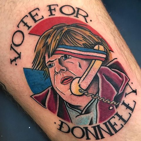
Colourful Chris Farley Vote for Donnelly fan tattoo

Some Farley tributes choose a joke rather than a realistic face. Ultimate Tattoo Supply’s memorial feature shows examples that use colour, lettering and recognisable comic references, including a Vote for Donnelly design associated with Farley’s political parody work. Inked Magazine also gathered several fan tattoos, including pieces that combine Farley with fellow performers, graffiti-style words and scenes built around a famous line or character.

This approach suits Farley’s particular kind of comedy. A phrase can carry the rhythm of a sketch, while a prop or costume can identify a film in seconds. Colour adds another advantage: the design can feel as loud and playful as the performance it references. That does not make the tattoo less serious as a memorial. It means the tribute preserves the part of Farley’s work that made people laugh rather than turning him into a solemn portrait.

The lettering and scene designs also show why exact wording matters. A fan may choose a phrase because it was repeated in a favourite scene, but a photograph alone cannot establish which moment the wearer intended. The safest description names the words or visible subject when the source does, then identifies the broader Farley connection. That keeps the article grounded in the tattoo rather than guessing at a private story.

These pieces can include more than one reference in the same composition. A face beside SNL lettering, a character next to a prop or a film phrase under a portrait can work like a compact memory board. The danger is visual clutter, so strong examples give one subject a clear focal position and use the surrounding words to guide the eye.

SNL characters make the tribute about performance as well as identity

Another documented route is the Saturday Night Live character. Tattoodo features a fan tattoo of Farley as Todd O’Connor from the Bill Swerski’s Superfans sketches, with the page tagging both Farley and the Da Bears reference. That choice remembers a performance rather than treating Farley only as a photograph from later in his career.

A character-based tattoo gives the wearer a way to honour timing, voice and movement. Todd O’Connor is recognised through the sketch’s exaggerated sports-fan world, so the design can work with pose and costume as much as facial likeness. That makes it especially different from the quiet realism of a portrait. Both designs point toward Farley, but they ask the artist to solve different problems.

The SNL examples also underline how a fan tribute can be tied to one era. Someone who first saw Farley in the Superfans sketches may choose that reference because it captures the moment he became unforgettable to them. Another fan may prefer Tommy Boy, Billy Madison or Beverly Hills Ninja. There is no need to rank the choices. The tattoo records the viewer’s entry point into Farley’s work.

That is why a responsible inventory names the character where the source identifies it. The public image can show clothing, pose and general subject. The gallery page supplies the connection to Todd O’Connor. Together they support a precise description without claiming that every fan chose the same meaning.

What Chris Farley fan tattoos have in common

The strongest examples share recognition rather than one fixed design style. A realistic portrait depends on expression. A Tommy Boy or SNL tattoo depends on character detail. A colourful phrase or comic scene depends on words and props. Each route gives fans a different way to keep Farley’s work present.

These tattoos should therefore be read as tributes made by viewers, not as a hidden catalogue of Farley’s own ink. The sources document the images, artists and character references. They do not reveal every private reason behind the commissions, and they do not need to. Farley’s face, characters and jokes already provide enough material for a tattoo that feels specific.
For anyone considering a similar tribute, the practical lesson is to choose the memory first and the style second. A portrait needs a strong reference photograph. A character design needs a pose that remains readable. A quote or scene needs lettering that does not overwhelm the focal image. The best fan tattoos are not interchangeable celebrity portraits. They point to the exact performance, line or expression that made Chris Farley matter to the person wearing it.

Norman Reedus’s Tattoos Keep Family, Music and Mystery Close

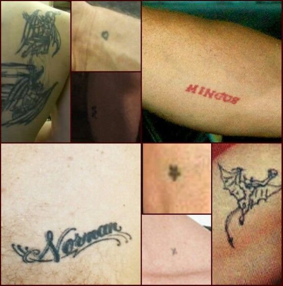
Norman Reedus keeps most of his tattoo symbolism to himself, which makes his public ink more interesting to document and easier to overstate. The reliable material gives us a small group of clear designs: Norman on the chest, Mingus in red on the forearm, demon figures on the back, a small Lemmy tribute made during a motorcycle-and-music shoot, and smaller work on the hand, wrist and leg. The photographs establish the placement. Reedus’s interviews establish when he is willing to explain a piece, and when he is not.

That distinction matters because his screen image invites speculation. Fans connect the back designs to The Walking Dead, while Reedus has treated the tattoos as his own rather than as a Daryl Dixon code. The cleanest guide keeps the actor’s body art separate from the character he plays. It also gives the rare first-person stories, especially the Lemmy tattoo, more weight than guesses about hidden symbolism.

Norman on the chest keeps his father’s name close

Norman Reedus Norman chest tattoo and surrounding ink

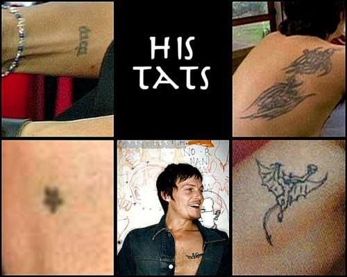
A script tattoo reading Norman sits on Reedus’s left chest in the most widely circulated reference images. Tattoo coverage connects the name with Norman Reedus Sr., the actor’s father. The placement gives the report a simple visual logic, but the evidence still distinguishes a strong family attribution from a longer private story Reedus has not published.

The chest is a deliberate location for a name tattoo because it stays close to the heart without requiring a large composition. In photographs, the lettering can be partly hidden by a shirt, a leather vest or the angle of the shoulder. That is why the clearer over-shoulder and mirror images are more useful than a distant event photograph.

This piece also sets the tone for Reedus’s collection. It is small enough to remain personal, yet legible enough to become part of his public image. The tattoo does not need a theatrical explanation. The name, the location and the family connection already provide the documented account.

Mingus gives the forearm a red family tribute

Norman Reedus showing the red Mingus forearm tattoo

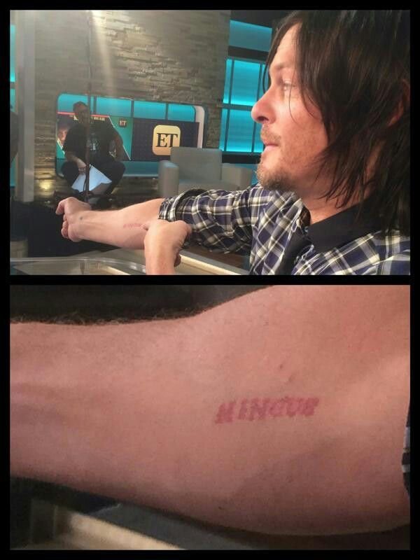
The red script Mingus appears on Reedus’s forearm and refers to his son. Entertainment interview imagery shows him rolling up his sleeve to reveal the lettering, and reference coverage repeatedly identifies the name in the same position. The red ink makes the piece stand apart from the darker line work visible elsewhere on his body.

Reedus has also told the story of showing the tattoo to Mingus and of his son reacting to seeing his own name on his father’s arm. That small exchange gives the design an unusually direct piece of context. It does not turn the tattoo into a public performance. It shows a private family reference becoming visible during an interview.

Forearm lettering is practical as well as emotional. It can be seen when Reedus rides a motorcycle, works on a project or wears short sleeves, but it can also disappear beneath a jacket. The red script remains one of the easier tattoos to identify because the word is distinctive and the placement has been photographed repeatedly.

The demon figures on Reedus’s back remain deliberately unexplained

Norman Reedus showing a demon back tattoo

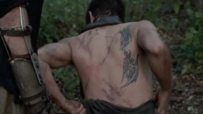
Photographs show demon-style figures across Reedus’s back and shoulder-blade area. Inked Magazine and fan reference archives list the designs as part of his established tattoo group, while many viewers first noticed them in Walking Dead-era images. The visual fact is clear: the back contains dark, winged or horned figures. The private meaning is not.

That gap is worth preserving. A demon tattoo does not automatically describe a person’s beliefs, and a character who fights walkers does not turn the actor’s back ink into a plot clue. Reedus has often been guarded when interviewers ask what his tattoos mean. The most accurate writing names the figures, gives the location and states that the symbolism has not been confirmed in the sources used here.

Back tattoos also need the right camera angle. A front-facing portrait may show no ink at all, while a shirtless mirror photograph can reveal the placement but flatten the detail. The image and the source description work together, with neither one asked to prove more than it can.

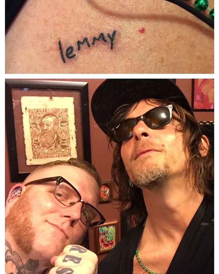
A five-minute Lemmy tattoo records a sudden music tribute

Norman Reedus showing the small Lemmy tribute tattoo

The Lemmy tattoo is one of the few pieces Reedus has explained with a full story. While filming Ride with Norman Reedus in New Orleans with Mastodon’s Brent Hinds, he learned that Motörhead frontman Lemmy Kilmister had died. Reedus recalled that they had only a few minutes, ran into a tattoo shop and asked for the tribute. Reports from Blabbermouth and Men’s Journal preserve the account.

The rushed timing is part of the design’s meaning. This was not a long appointment built around a private iconography plan. It was a response to news, friendship and music. Reedus described the tattoo as small, which fits the evidence and separates it from the larger demon figures on his back.

Small tribute tattoos can carry a strong timeline. The image records the mark, while the story records the moment that produced it. That combination is more useful than a generic claim that Reedus likes rock music. The sources identify Lemmy, the New Orleans setting and the short window in which the tattoo was made.

Hand, wrist and leg pieces fill out the smaller map

Norman Reedus showing hand wrist and smaller tattoos

Reference coverage also lists a small star on Reedus’s hand and a snake on his left thigh, alongside other compact marks around the wrist and arms. These pieces matter because they show that the collection is not limited to the headline tattoos fans recognise first. They are smaller, easier to miss and less often accompanied by a public explanation.

The correct approach is descriptive. A star can be identified as a star. A snake can be identified by its form and location. The sources do not support assigning each small mark a private meaning, and Reedus’s general reluctance to decode his ink is itself useful context. Readers can still study scale, placement and line weight without a fictional backstory.

Seen together, the smaller pieces create a different rhythm from the chest name or the demon back. They appear during gestures, motorcycle photographs and close-up interviews. That makes them a good reminder that tattoo coverage is shaped by clothing, lighting and pose. One image can reveal a wrist while hiding a shoulder, so a complete guide needs several kinds of photographs.

Why Reedus’s tattoos resist a single explanation

Norman Reedus’s tattoo map combines family names, a music tribute, dark figures and small symbols, but the collection does not need one grand theme. The best-supported meanings are the father-name chest tattoo, the Mingus forearm tribute and the Lemmy story. The back demons and smaller pieces can be described accurately without claiming a private code.

For design readers, the useful lesson is restraint. A name can stay small and close to the body. Red lettering can separate a family tribute from darker work. A rushed music tattoo can remain meaningful because the moment matters, while a large back design can retain mystery. Reedus’s tattoos are strongest when the photographs are allowed to show the ink and the sources are allowed to stop where the evidence stops.

Billy Bob Thornton’s Tattoos Tell Stories in Hearts, Ink and Memory

Billy Bob Thornton’s tattoos make the most sense as a timeline rather than a checklist. His first piece was a small heart and arrow from 1973, while later work brought in a cross, an Om symbol, family names, a mushroom linked to the Allman Brothers and an Alamo tattoo connected to one of his films. Some details are well documented because Thornton has discussed them himself. Others come from tattoo references and photographs where the design is visible but the private meaning is not.

That distinction matters with Thornton. Stories about Angelina Jolie’s name tattoo are often repeated without separating his ink from hers. Jolie famously wore his name on her arm; Thornton had an arm tattoo connected with her that he later covered. The useful account is about a cover-up and a changed relationship, not a licence to invent a complete map from distant red-carpet photographs.

The first heart tattoo began Thornton’s collection in 1973

Billy Bob Thornton heart and arrow first tattoo on forearm

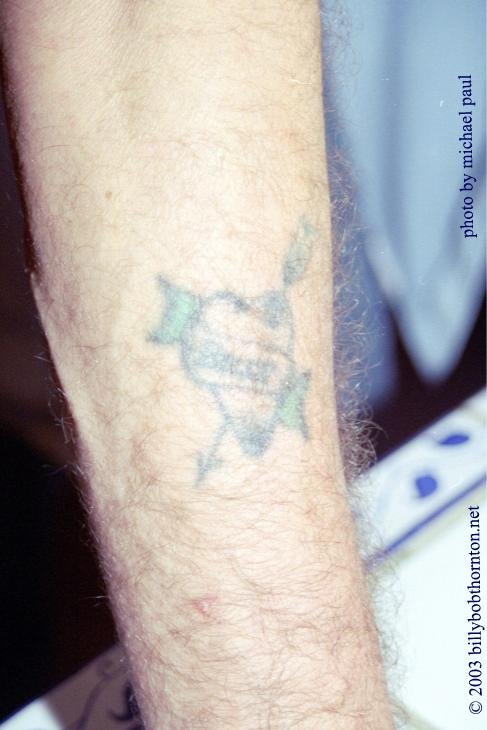
Thornton’s first tattoo was a heart and arrow on the right outer forearm, chosen from flash in 1973. Vanishing Tattoo identifies it as the starting point and preserves an image of the design. The piece has the softened look of older ink, which is part of its story: it is not presented as a recent, polished symbol but as a mark that has stayed with him for decades.

The heart is sometimes treated as a clue to Thornton’s later relationship tattoos, but the evidence does not require that leap. It was his first tattoo, and that fact is stronger than a speculative meaning. The forearm placement also made it easy to show in short sleeves, so the design became one of the more recognisable pieces in photographs of his arms.

Cross, Om and family lettering build out the arm tattoos

Billy Bob Thornton showing visible arm tattoos

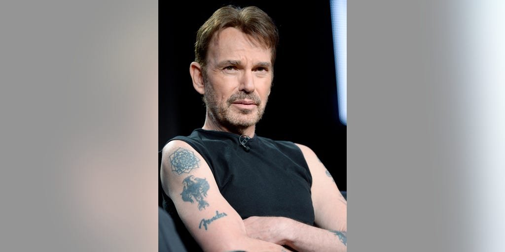
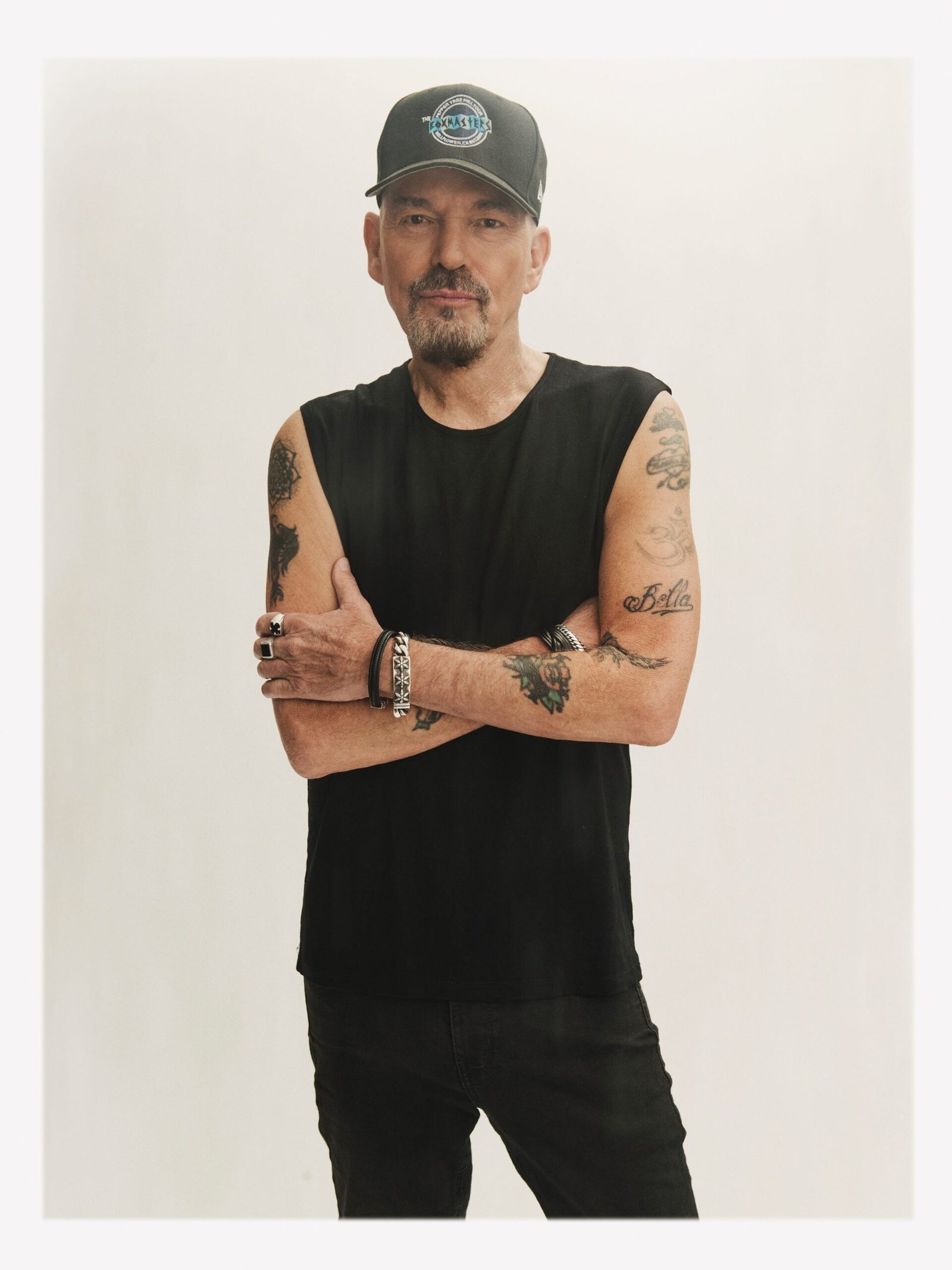
Reference coverage places a winged cross on Thornton’s right arm and an Om symbol on his left arm, with the Om tattoo dated to 1999 in published tattoo lists. A separate Bella tattoo is linked to his daughter Connie Angland. These designs are not interchangeable. The cross and Om are identifiable symbols, while Bella is a direct family reference whose significance is supplied by the name itself.

Public photographs do not always show every line clearly. A sleeveless panel portrait can reveal the arm placement while hiding the lower edge, and a close view may make one design look larger than it is. The honest description is therefore visual first: a cross on one arm, an Om symbol on the other and family lettering among the collection. A private explanation should only be attached when Thornton or a strong source actually provides it.

The family work also gives the collection a quieter centre. Names and short words do not need a dramatic symbol to carry weight. They can sit alongside larger imagery without becoming filler, and they remain readable even when an older photograph has lost contrast.

The magic mushroom carries an Allman Brothers connection

Billy Bob Thornton in a sleeveless portrait with visible tattooed arms

Thornton has described a magic mushroom tattoo on his calf and connected it with the Allman Brothers, explaining that the musicians had similar mushroom tattoos. Music Recall Magazine preserves that first-person account, which gives this design a firmer meaning than a guess based on its shape. The mushroom is not only a colourful novelty in the inventory; it is part of Thornton’s relationship with a band and the music culture around it.

Leg tattoos are easy to miss in interviews because trousers cover them, and a seated portrait may show only the upper body. That explains why the mushroom is better supported by Thornton’s own words than by a single celebrity photograph. The placement should be reported as calf or lower leg unless a particular image makes the exact side unmistakable.

Its connection to the Allman Brothers also shows how a tattoo can work as a private reference that becomes public only through an interview. Readers can understand the link without being told that every mushroom symbolises the same thing. In Thornton’s case, the music story is the evidence-led meaning.

Back lettering and the Alamo tattoo connect ink with family and film

Thornton’s back has been described as carrying family names and other work attributed to tattoo artist Daemon Rowanchilde, while UPI reported that Thornton and his Alamo co-stars got tattoos in Texas after working on the film. Thornton also talked about a Texas flag on his back with the words Remember the Alamo. These reports show how family and professional memories entered the collection at different points.
This section is deliberately kept descriptive because the available visual material does not support a clean, distinct image for every back word. The Alamo story is documented in reporting, but a distant photograph should not be used to assign lettering that cannot be read. Where the design is not clearly visible, the source story is stronger than an invented transcription.

The Angelina cover-up is a change in the map, not a separate mystery

In 2003, the Irish Examiner reported that Thornton covered the arm tattoo connected with Angelina Jolie’s name. That episode belongs in a tattoo history because cover-ups alter what later photographs show. It should not be confused with Jolie’s own former Billy Bob tattoo, which was on her body. The careful account keeps the two tattoos separate and treats the cover-up as a documented change rather than a prompt for gossip.

What the photographs can and cannot prove

Thornton’s tattoo collection includes an early heart, symbolic arm designs, family lettering, a mushroom with a music story, back work and an Alamo connection. The strongest meanings come from first-person interviews and contemporary reports. The photographs establish placement and appearance, but they do not automatically reveal every word, date or private reason.

That is why the best guide leaves some details open. A softened heart can still be identified as the first tattoo. A mushroom can be tied to the Allman Brothers because Thornton made that connection himself. A cover-up can be recorded without pretending the original lettering remains fully visible. The result is a more useful portrait of Thornton’s ink: personal, musical and occasionally cinematic, but never forced into one tidy explanation.

Robert Downey Jr.’s Tattoos Carry Family, America and an Avengers Reunion

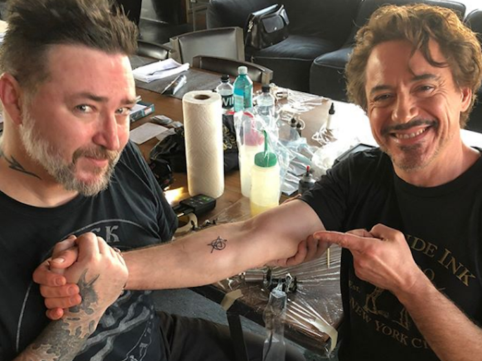
Robert Downey Jr.’s tattoos are tied to three parts of his public story: family, America and the Marvel role that changed his career. The clearest modern piece is the matching Avengers tattoo he got with five of the original cast members in 2018. Older reference photographs show Indio for his son and Susie Q for his wife, while a Details portrait makes the USA chest tattoo easy to identify.

The collection is worth documenting carefully because the Avengers ink is unusually well sourced. Downey has spoken about the session, entertainment outlets published photographs and the tattoo artist’s work was visible as it happened. The smaller family pieces deserve a different treatment: their lettering and placement can be described, but a soft image should not be turned into a complete private biography.

The Avengers tattoo turns a cast reunion into permanent ink

Robert Downey Jr. revealing his Avengers matching tattoo with tattoo artist Joshua Lord

In 2018, Robert Downey Jr. joined Scarlett Johansson, Chris Evans, Chris Hemsworth and Jeremy Renner in getting a shared Avengers tattoo. Mark Ruffalo was the only one of the original six who did not take part. The design combines the Avengers A with an arrow and a number associated with the original team, creating a compact emblem rather than a literal portrait of any one character.

Downey’s forearm image from the session is especially useful because it shows the tattoo being made. Joshua Lord worked on the design, and the photographs capture Downey’s reaction as the new ink was revealed. That makes the tattoo’s meaning unusually direct: it marks the shared experience of making the first Avengers films and the bond among the actors who carried that series.

The design also explains why the tattoo has lasted as a public image. It is small, graphic and readable at a glance, but it contains several layers for fans who know the cast history. The mark belongs to Downey’s career without being a piece of Iron Man costume design, and the shared version keeps the focus on the group rather than Tony Stark alone.

Indio and Susie Q keep the family names close

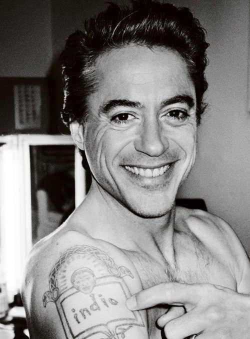
Robert Downey Jr. pointing to the Indio family tattoo on his shoulder

Older tattoo reference photographs show Downey pointing toward Indio, the name of his son, on his shoulder. The same references identify Susie Q as a tattoo connected with his wife, Susan Downey. The two pieces are best read together as family lettering: short names placed on the body as private relationships made visible.

Lettering tattoos can be deceptively difficult to document. A shoulder angle may cut off the first or last letter, while a black-and-white photograph can soften the edges enough to make a word appear heavier than it is. In this case the published labels and the visible lettering agree, so the names can be reported without inventing a longer explanation of when each was added.

These tattoos also sit apart from the Avengers design in scale and purpose. The Marvel piece commemorates a group and a professional era. Indio and Susie Q point toward home life. That contrast gives Downey’s collection a more human rhythm than a simple list of film-related symbols.

The USA chest tattoo uses plain lettering and a flag

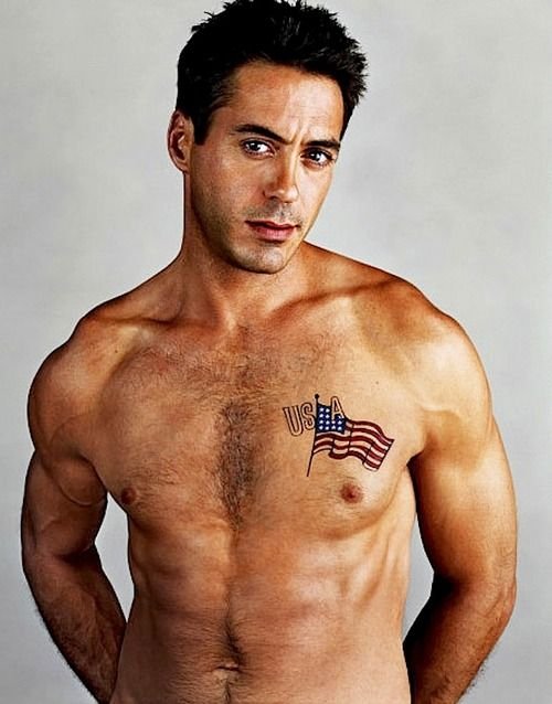
Robert Downey Jr. showing the USA and American flag tattoo on his chest

A Details magazine portrait shows Downey shirtless with a small American flag and USA lettering on the left side of his chest. The image is strong enough to establish the words, the flag and the placement. It does not, by itself, establish a specific political statement or a private event behind the design, so the tattoo is kept at that factual level.

The chest location makes the piece visible in a deliberate portrait while allowing it to disappear under ordinary clothing. The design is also visually plain compared with the Avengers emblem. There is no complicated character silhouette to decode: the flag and the three letters carry the image, and the photograph supplies the context.

That restraint is useful when celebrity tattoo lists begin to treat every visible symbol as a confession. Downey’s public image contains many possible stories, but a documented tattoo guide should separate what the camera shows from what the subject has actually explained. Here, the reliable description is enough.

What remains uncertain in the smaller marks

Other photographs show additional small marks around Downey’s arms and torso, but not every shape can be identified with confidence. Some online galleries repeat labels without a clear source, and a distant red-carpet photograph can make jewelry, clothing folds or shadows look like ink. Those details are left out rather than padded into a longer list.

The omission is deliberate. A guide becomes more useful when it gives strong attention to three documented groups: the Avengers cast tattoo, the Indio and Susie Q lettering, and the USA chest piece. Each has a clear visual reference and a sensible explanation. The remaining images can be revisited if a future interview or close photograph supplies better evidence.

Why Downey’s tattoo story is about people as much as roles

Downey’s best-known tattoo is connected with Iron Man, but the ink is technically a tribute to the people who made the Avengers films together. His family lettering moves the story in another direction, and the USA chest design adds a simple piece of personal imagery. The collection therefore resists a single theme.

The strongest reading is chronological and relational. A professional partnership produced the shared Avengers mark. Family names made intimate relationships legible. A flag and three letters created a direct visual statement without requiring a complicated backstory. The photographs show the designs, while the interviews and reported accounts explain where the evidence is strongest.

There is also a useful difference between the way these tattoos are photographed. The Avengers session gives readers a close, immediate view of fresh work, while the older family and flag images come from portraits made for other reasons. Age, lighting and pose can change how much of a tattoo appears on screen. That is why the inventory stays with the designs that can be named confidently and avoids turning every shadow on a shoulder into a new entry. Downey’s collection is documented best when the image, the wording and the source point in the same direction.

Ryan Gosling’s Tattoos Are Funny, Family-Focused and Slightly Homemade

Ryan Gosling’s real tattoos are much less polished than the fake ink he has worn for movie roles. His collection includes a homemade forearm design that was meant to be a monster hand dropping a bloody heart, the name Esme across his fingers, a barcode on the wrist, a Giving Tree image and a ghostly woman with a skeleton. The actor has spoken about several of them with a dry sense of humour, which is important context for a collection often treated as more mysterious than it is.

Film tattoos complicate the picture. The Place Beyond the Pines gave Gosling’s character an extensive tattooed look, and The Gray Man used a Sisyphus design and other character ink. Those images belong to the roles unless a source connects them to his actual body art. A useful guide keeps the real pieces separate from makeup, temporary transfers and character design.

The homemade monster hand still looks like a cactus

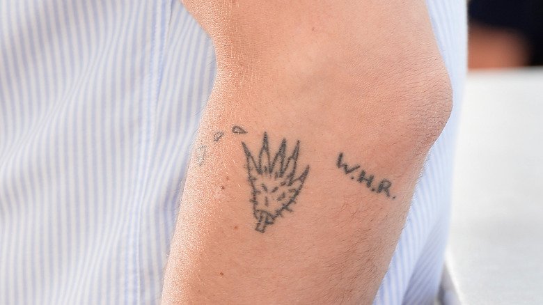
Ryan Gosling showing the homemade monster-hand tattoo on his forearm

Gosling’s most famous real tattoo is the self-applied forearm design that was supposed to show a monster hand dropping a bleeding heart. In The Guardian, he explained that he did it himself with a tattoo kit. The finished mark did not resemble the original plan as closely as he hoped, and the cactus comparison became part of its public story.

The humour is important because Gosling has pushed back against the idea that every tattoo needs a solemn explanation. He has said that a tattoo should never be too meaningful because a person may eventually dislike it, in which case it might as well make them laugh. That line fits the forearm piece: it is a permanent reminder of an impulsive process and an imperfect result.

The tattoo has also been described with different words in different galleries. Some viewers see a cactus, some see a spiky creature and some focus on the heart shape. Gosling’s own account supplies the strongest description of what it was intended to be. The photograph supplies the appearance, which is why both parts belong in the same section.

Esme puts his daughter’s name across the hand

Ryan Gosling showing Esme lettering across his fingers

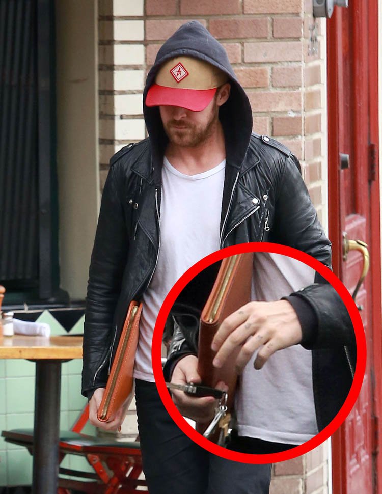
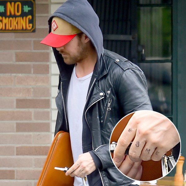
Photographs from 2015 show Esme written across the fingers of Gosling’s left hand. The name refers to his daughter Esmeralda, whom he and Eva Mendes welcomed in 2014. E! Online noted that it was not always possible to confirm whether the writing was permanent tattoo ink or a temporary marking, so the most careful account describes the visible tribute while keeping that small uncertainty in view.

The design is direct. It uses a family name rather than a symbol, and the hand makes it visible during ordinary gestures. Knuckle lettering also changes with movement, which explains why a single photograph may show the word more clearly than another. The meaning is well supported by the name and the family context, even if the exact permanence was not settled in the first reports.

Compared with the forearm piece, Esme is less comic and more openly affectionate. It also shows how Gosling’s tattoo record moved between private jokes and family references. The collection does not need one mood to hold together. The designs are connected by the fact that each carries a small story he has allowed the public to see.

The Giving Tree and ghostly woman add older visual references

Ryan Gosling raising his arm to show several real tattoos

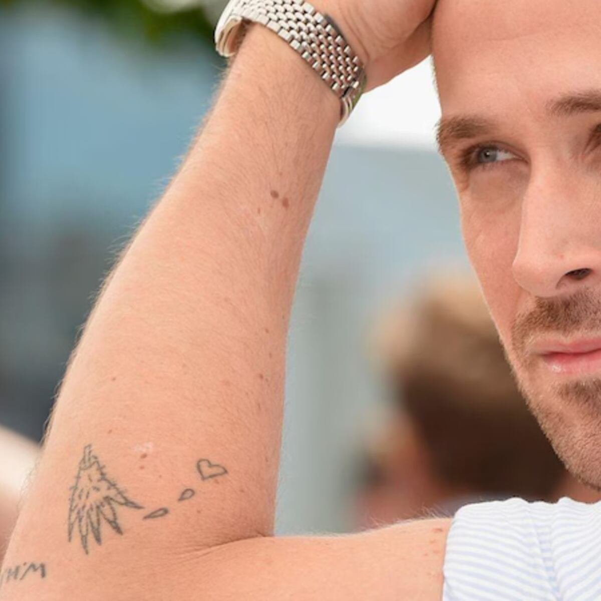
Tattoo references identify a Giving Tree design on Gosling’s left arm, connected with the children’s book his mother read to him and his sister. The design is an unusual choice because Gosling has also criticised the book’s story, describing it as a relationship where the tree gives everything away. That tension makes the tattoo more interesting than a simple childhood keepsake.

The same references describe a ghostly woman with a skeleton on the left inner arm, often associated with silent-film actress Theda Bara. That attribution is repeated in tattoo coverage, but Gosling has not supplied the same kind of first-person explanation for it as he did for the homemade forearm mark. It is therefore best presented as a reported identification rather than a confirmed private statement.

These pieces are harder to isolate in ordinary press photographs because sleeves, watches and camera angles cover the arm. The showcase image helps establish that several designs occupy the same general left-arm map, while the reference descriptions do the work of naming the older imagery. A careful article should not pretend that every line is equally clear.

The barcode stays in the category of homemade ink

Gosling also has a barcode-like mark on his left wrist, another design commonly described as homemade. He has joked about his tattoos and usually covers the wrist with a watch, so the piece appears less often than the forearm design. Its meaning has not been confirmed beyond the broader humour surrounding his DIY ink.

A barcode invites instant theories about identity, commerce or surveillance, but none of those explanations is supported by the sources used here. The responsible description is simpler: a barcode-like wrist tattoo, made or touched up by Gosling, with no settled public symbolism.

Real Gosling tattoos are not the same as movie tattoos

Ryan Gosling showing Esme lettering across his fingers

The distinction matters most with The Gray Man and The Place Beyond the Pines. Gosling’s character Sierra Six has a Sisyphus tattoo that serves the story, while Luke Glanton appears with a much larger collection of prison and biker-style ink. Those designs help build fictional people and should not be added to a list of Gosling’s permanent tattoos.

The real inventory is smaller and stranger: a failed monster-hand idea, family lettering, a barcode, a childhood-book image and a ghostly figure. Their unevenness is part of the appeal. Gosling’s own comments make room for jokes, uncertainty and designs that do not look the way they were first imagined.

The strongest guide keeps the evidence close to each piece. The DIY forearm tattoo has a first-person story. Esme has a clear family connection. The Giving Tree and ghostly woman are supported by tattoo references but deserve more cautious wording. That balance gives readers a useful map without turning movie makeup or speculation into fact.

Danielle Colby’s American Pickers Tattoos

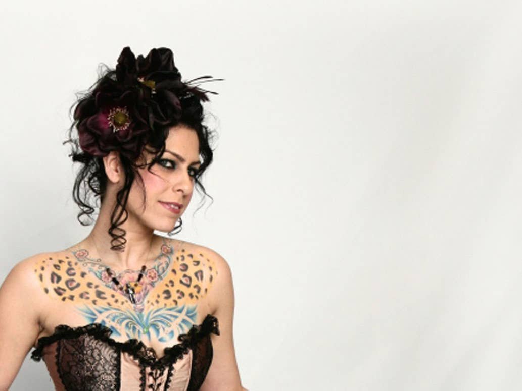
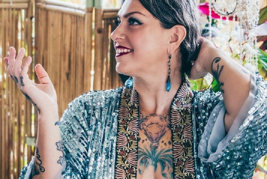
Danielle Colby’s tattoos are not a single sleeve built from one flash sheet. They are a long-running collection assembled around artists, family, bugs, music, heritage and the visual language of her burlesque work. Interviews describe more than thirty designs, but the exact count is less useful than the themes that can be documented. Her chest and stomach became a pagan suit of armor, her back was described as the body of a violin, her left arm developed an entomology theme, and her right arm carries a Frida portrait. Words appear too, including Irish Blood, English Heart and Hold Fast.

Colby has described herself as collecting tattoos rather than simply accumulating them. That distinction fits the evidence. She gives artists a theme, trusts their vision and lets separate pieces grow into a larger arrangement. A good guide therefore keeps each design beside its own location and source. It should not claim that every small flower, insect or portrait has a published explanation.

The pagan suit of armor turns Colby’s chest and stomach into one large project

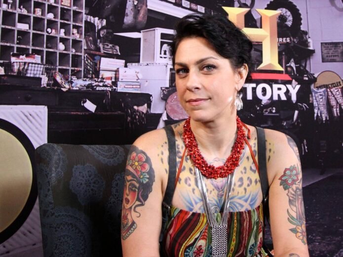
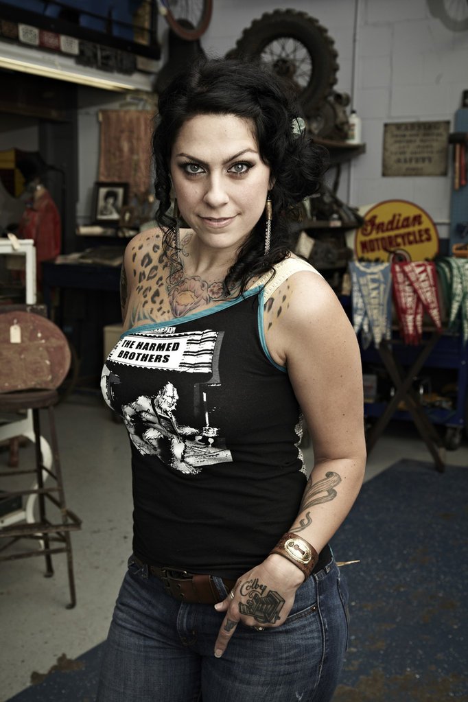
Danielle Colby tattoo map showing chest, arm, back and hand designs

Patrick Cornalo of Speakeasy Custom Tattoo constructed what Colby calls her pagan suit of armor across the chest and stomach. The phrase describes a connected body project rather than one isolated emblem. In her interview, she explains that she gives Cornalo a theme and trusts him to build around it. The result is a visual field that treats the torso as a surface with its own structure.

The armor language matters because it changes how the pieces should be read. A small chest tattoo can be understood on its own, but a suit of armor implies overlapping shapes, panels and symbols that belong together. Photographs may reveal only the upper chest or one side of the abdomen at a time. That limitation is why the broader project should be described carefully rather than reduced to a list of disconnected motifs.

Colby’s interest in vintage performance history also gives the torso work a fitting setting. She has spent years collecting burlesque costumes and documenting the women who wore them. The sources do not say that every armor detail copies a historical garment, but they do establish a consistent interest in themed visual worlds and the artists who create them.

The violin-shaped back is the collection’s most unusual piece of body mapping

Several tattoo profiles describe Colby’s back as a violin, with oversized F-holes placed on either side of the torso. The image is unusual because the body itself becomes part of the instrument’s outline. Rather than placing a small violin illustration on the skin, the design uses the back’s width and central line to suggest the proportions of a full instrument.

This is also the tattoo that most clearly shows why a backpiece needs specific photography. A front-facing television frame cannot establish the complete design. A portrait from behind can show the F-holes and the way the composition follows the shoulder blades, but even that may leave the lower section hidden by clothing or pose. The published descriptions are valuable because they give readers the concept when a single photograph cannot show every edge.

For design readers, the lesson is scale. The F-holes work because they are large enough to be recognised and placed symmetrically. The back does not become a blank space for random filler. It becomes an instrument-shaped field that changes the way the surrounding tattoos are understood.

Entomology gives the left arm a clear subject

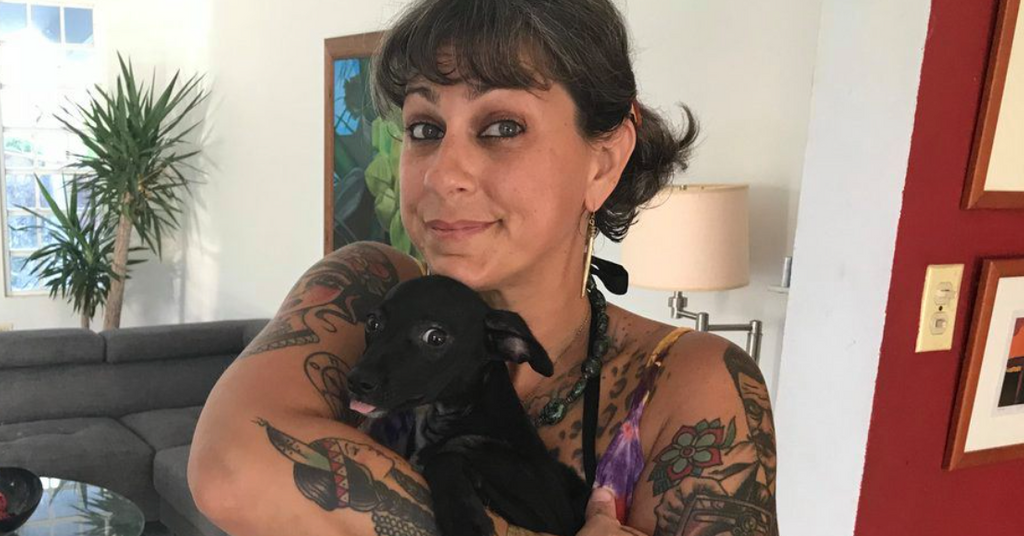
Danielle Colby showing colorful arm and shoulder tattoos

Colby told YuppiePunk that Chewie was finishing her left arm as an entomology project. Her explanation is direct: she loves bugs. That sentence is enough to establish the theme without assigning a private meaning to every insect. The arm is a collection of studies linked by subject matter and artist, not a puzzle that needs a symbolic answer for each wing or shell.

Insect tattoos also suit the way Colby talks about collecting art. They allow different shapes, textures and levels of detail to share one area. A beetle, moth or other insect can be rendered with delicate lines, while darker framing can connect it to the next piece. The arm can therefore grow over time without requiring every appointment to repeat the same composition.

Photographs of the arm should be read with attention to angle and lighting. Bright stage light can flatten fine legs and wings, while a turned forearm can hide the design’s edges. The interview is the strongest evidence for the entomology theme; the photographs are strongest for showing how much of the arm is covered.

Frida brings a named portrait to the right arm

Danielle Colby showing her right-arm tattoo work

Colby has identified a Frida portrait on her right arm as one of the visible pieces by Alex Strangler. Naming both the subject and the artist gives this tattoo a firmer place in the inventory than a generic reference to portrait work. The portrait can be discussed as a portrait because the interview does so, while the surrounding arm should still be described conservatively.

A portrait changes the rhythm of an arm collection. Insects depend on repeated small forms and natural detail. A face creates a central point that viewers recognise immediately. That contrast helps explain why the Frida piece can sit beside other imagery without making the arm visually uniform.

The design also shows the importance of artist relationships in Colby’s collection. She does not describe the work as a mass-produced set. She names the people making it and talks about trusting their vision. The tattoo’s identity therefore includes both the subject on the skin and the artist’s approach to rendering it.

Irish Blood, English Heart gives the shoulders a readable line of text

Danielle Colby showing leopard and butterfly chest tattoos

The words Irish Blood, English Heart are reported across Colby’s shoulders. Lettering works differently from the armor, violin and insects because the design can be read in a single glance. It provides a plain sentence across the upper body, while the surrounding imagery asks the eye to slow down and inspect detail.

The wording also connects to the Irish heritage Colby has discussed in interviews. The evidence supports the phrase and its placement. It does not require a larger claim about every family story in the collection. In tattoo writing, exact words are often more useful than a sweeping interpretation, especially when the wearer has already chosen language that states the connection directly.

Shoulder lettering is sensitive to posture. A raised arm stretches the line, while a relaxed pose can make the words easier to follow. Photographs from television appearances may show only part of the phrase, so a guide should use the published wording and avoid pretending that every frame offers the same view.

Hold Fast makes the knuckles part of the public introduction

Danielle Colby showing hand and arm tattoos

Colby told YuppiePunk that her knuckles read Hold Fast and that Chewie did the work. The phrase is short, legible and easy to notice whenever she reaches for an object or gestures on camera. It is also a useful reminder that her collection is not made only of large torso projects. Small lettering can carry as much visual identity as a full backpiece.

The words belong to a tradition of sailor and working-class tattoo language, but the cited interview does not give a private explanation for Colby’s choice. The accurate account is therefore simple: the knuckles say Hold Fast, and the artist is identified. Readers can respond to the phrase without the article pretending to know an unreported story behind it.

Why Colby’s tattoo collection works as a map rather than a checklist

Colby’s tattoos become easier to understand when locations and themes stay together. The torso is a pagan armor project. The back uses the shape of a violin. The left arm follows entomology, the right arm includes Frida, the shoulders carry Irish Blood, English Heart, and the knuckles say Hold Fast. Those are not interchangeable details, and each deserves its own visual evidence.

The collection also remains open. Colby has spoken about artists continuing work and about trusting them with a theme. New photographs may reveal additions or details that older coverage could not show. A responsible guide can record the documented designs without treating one article as a final official count.

For tattoo inspiration, the practical takeaway is the value of a strong organising idea. A back can become an instrument. An arm can become an insect study. A torso can take on armor, and small lettering can anchor the identity of the person wearing it. Colby’s work is compelling because the designs are specific, the artists are part of the story and the body is treated as a place where separate pieces can still belong together.

Steve-O’s Tattoos Are Built Around One Unmissable Backpiece

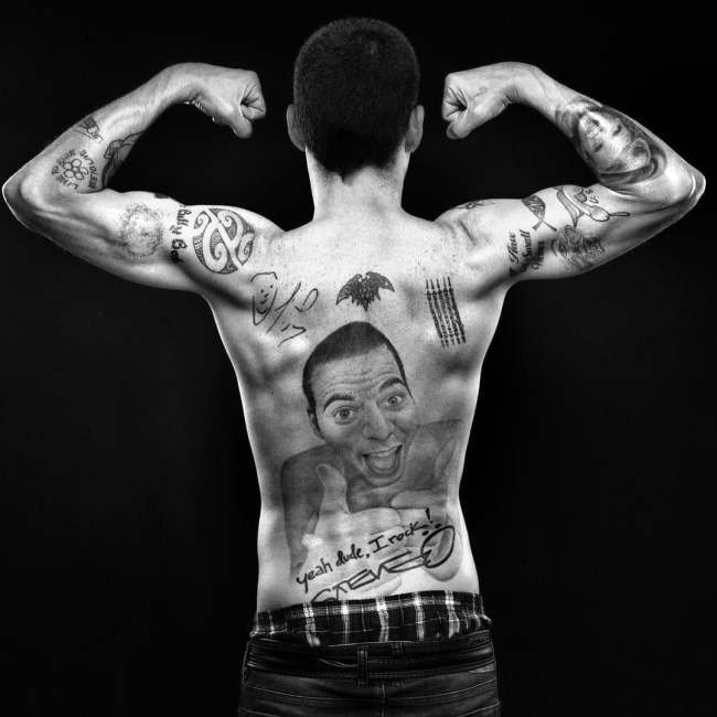
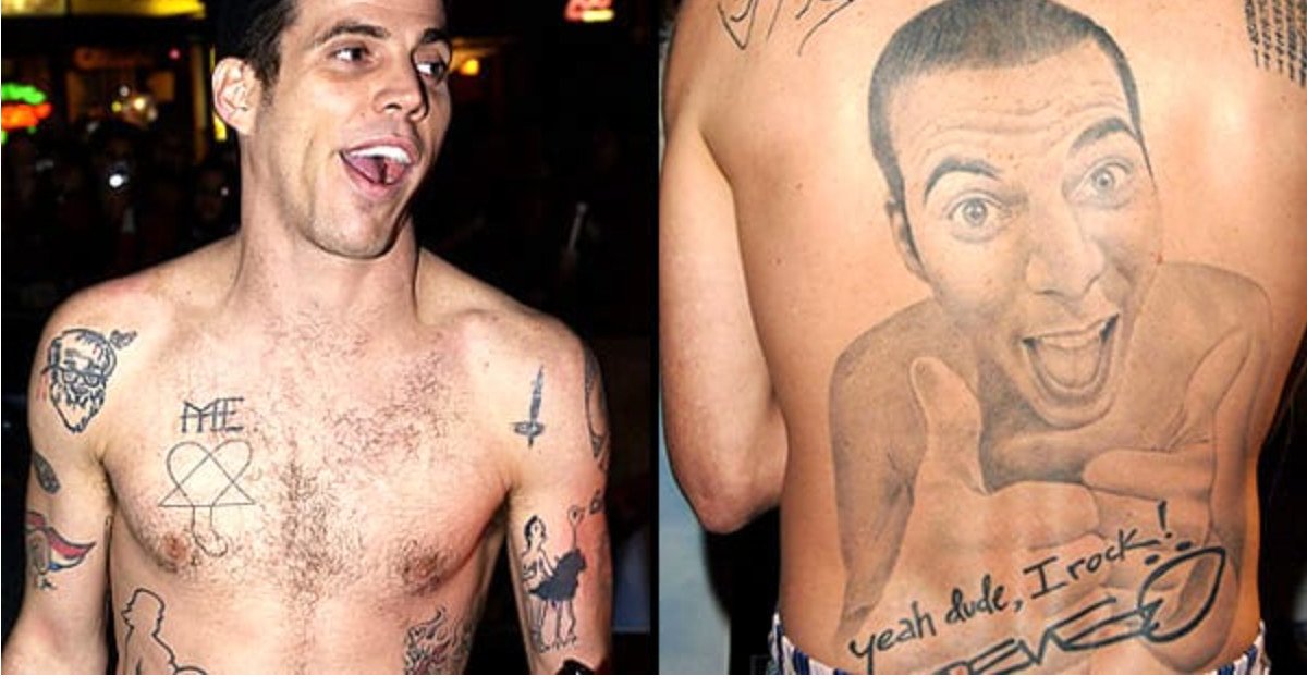
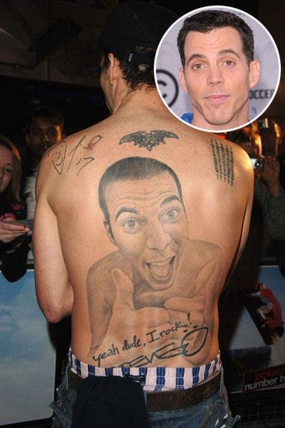
Steve-O’s tattoo history is not subtle, and one piece dominates published coverage: a huge back portrait of Steve-O himself, smiling and giving a thumbs-up. The image is surrounded by lettering, smaller symbols and the phrase yeah dude, I rock! It is a tattoo that behaves like a stage prop, but the story behind it is more revealing than the shock value alone. Steve-O has repeatedly treated body modification as part of his comic identity, and his interviews explain why the collection often aims for a reaction.

The best account separates the giant backpiece from the smaller marks on his hands, face, chest and shoulders. A photograph can show the scale of the portrait immediately. An interview is needed to explain the joke, the timing or the decision behind a specific word. Where the sources describe the design, this guide does so plainly. Where a small mark is only visible in a soft photograph, it is not given a made-up meaning.

The full-back self-portrait is Steve-O’s defining tattoo

Steve-O showing his full-back self-portrait tattoo

The back tattoo is a photorealistic portrait of Steve-O giving a thumbs-up. It covers most of the back and turns the performer’s own face into the central image. The composition is intentionally direct: the expression is broad, the gesture is unmistakable and the surrounding skin becomes a frame for the joke. The Daily Beast described it as a magnificent tattoo of himself, while earlier BME interview coverage discusses the piece as part of his wider approach to body modification.

It is tempting to call the portrait a simple act of vanity, but that misses the performance logic. Steve-O’s work has always relied on exaggerated commitment. Tattooing his own face across his back makes the punchline permanent and gives the audience something that can be understood instantly from a photograph. The image is not hiding behind symbolism. It is a recognisable version of Steve-O turned into a piece of body art.

The scale also changes the practical reading of the tattoo. This is not a small portrait tucked below a shoulder blade. It is a backpiece with enough room for shading, facial expression and the handwritten details around it. The central face remains the first thing the eye sees, while the lettering makes the design read like a personal poster rather than a conventional portrait.

Yeah dude, I rock!” finishes the backpiece with a punchline

Steve-O back tattoo with yeah dude I rock lettering

The phrase yeah dude, I rock! appears below the self-portrait, alongside a Steve-O signature. The wording is part of the image rather than a separate tattoo that happens to sit nearby. It tells the reader how to hear the portrait: the thumbs-up is boastful, but the boast is exaggerated enough to remain a joke.

Quoted words deserve care in a tattoo guide. The phrase should be preserved exactly, with its punctuation and informal voice, because changing it would flatten the personality of the design. The surrounding script and signature also help establish the era and the connection to Steve-O’s public persona. The back is not merely covered with random marks. It has been arranged as a single comic statement.

The lettering is also a useful example of how text works with a portrait. The face carries expression; the words carry the voice. Together they make the tattoo legible even for someone who does not know the rest of Steve-O’s body-art history. The image has an obvious subject and an obvious tone, which is why it remains the piece most often discussed in profiles.

Face and knuckle tattoos carry the smaller jokes closer to the camera

Steve-O showing face and hand tattoos

Steve-O’s face and hand tattoos are more difficult to document because small lettering changes the way a photograph reads. BME’s interview material records his willingness to choose words for the reaction they would create, while later coverage describes additional face-ink material as part of his public appearance. The exact list should not be inflated from one blurred portrait.

Hands and faces also make the designs unusually visible. A backpiece requires a shirtless photograph, but a knuckle tattoo appears whenever the performer gestures and a face tattoo remains part of an interview close-up. That visibility fits Steve-O’s approach to performance, where the body is often part of the bit. It does not mean every mark has a separate story available in print.

Readers comparing old and new photographs should allow for changes, cover-ups and differences in lighting. A hand can be partially hidden by a microphone, and a face can look different under stage makeup. The responsible inventory keeps the words that are directly reported and describes uncertain marks by location rather than pretending to decode them.

Smaller chest and shoulder ink fills out the larger body-art map

The surrounding tattoos matter because they keep the back portrait from being treated as Steve-O’s only design. Public photographs show additional symbols and smaller work across the shoulders, chest and arms. Some of those marks are visible without a reliable published explanation, so they are best used as visual context. They demonstrate how the large portrait sits within a wider, deliberately busy collection.

This wider map is not neat in the conventional sense. The designs vary in scale and tone, and some are comic while others are simply pieces of personal history. That unevenness is part of the appeal. Steve-O’s tattoos look like an accumulation of decisions made for different reasons, not one carefully branded sleeve.

How to read Steve-O’s tattoos without losing the joke

The collection works because the evidence and the performance point in the same direction. The back portrait is clear in photographs. The lettering supplies the voice. The hand and face work brings the joke into close view, and the smaller marks show that the body is covered by more than one headline design. The sources do not require a theory that explains every symbol.

For tattoo readers, the useful design lesson is scale and commitment. A self-portrait needs enough surface area for expression. Lettering needs space to remain readable. A cover-up or small face mark has different constraints. Steve-O’s work is memorable because it accepts those constraints and turns them into part of the performance. The result is unusually human: funny, excessive and impossible to mistake for generic celebrity ink.