Steve-O’s tattoo history is not subtle, and one piece dominates published coverage: a huge back portrait of Steve-O himself, smiling and giving a thumbs-up. The image is surrounded by lettering, smaller symbols and the phrase yeah dude, I rock! It is a tattoo that behaves like a stage prop, but the story behind it is more revealing than the shock value alone. Steve-O has repeatedly treated body modification as part of his comic identity, and his interviews explain why the collection often aims for a reaction.
The best account separates the giant backpiece from the smaller marks on his hands, face, chest and shoulders. A photograph can show the scale of the portrait immediately. An interview is needed to explain the joke, the timing or the decision behind a specific word. Where the sources describe the design, this guide does so plainly. Where a small mark is only visible in a soft photograph, it is not given a made-up meaning.
The full-back self-portrait is Steve-O’s defining tattoo
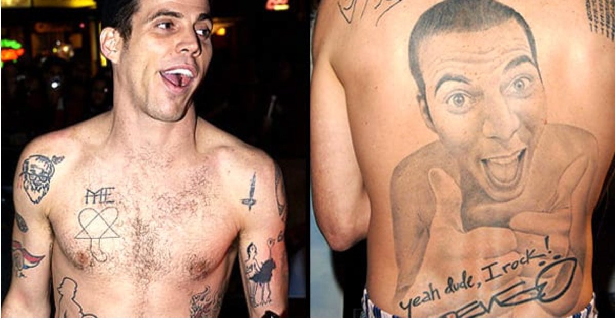
The back tattoo is a photorealistic portrait of Steve-O giving a thumbs-up. It covers most of the back and turns the performer’s own face into the central image. The composition is intentionally direct: the expression is broad, the gesture is unmistakable and the surrounding skin becomes a frame for the joke. The Daily Beast described it as a magnificent tattoo of himself, while earlier BME interview coverage discusses the piece as part of his wider approach to body modification.
It is tempting to call the portrait a simple act of vanity, but that misses the performance logic. Steve-O’s work has always relied on exaggerated commitment. Tattooing his own face across his back makes the punchline permanent and gives the audience something that can be understood instantly from a photograph. The image is not hiding behind symbolism. It is a recognisable version of Steve-O turned into a piece of body art.
The scale also changes the practical reading of the tattoo. This is not a small portrait tucked below a shoulder blade. It is a backpiece with enough room for shading, facial expression and the handwritten details around it. The central face remains the first thing the eye sees, while the lettering makes the design read like a personal poster rather than a conventional portrait.
“Yeah dude, I rock!” finishes the backpiece with a punchline
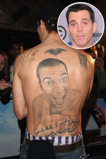
The phrase yeah dude, I rock! appears below the self-portrait, alongside a Steve-O signature. The wording is part of the image rather than a separate tattoo that happens to sit nearby. It tells the reader how to hear the portrait: the thumbs-up is boastful, but the boast is exaggerated enough to remain a joke.
Quoted words deserve care in a tattoo guide. The phrase should be preserved exactly, with its punctuation and informal voice, because changing it would flatten the personality of the design. The surrounding script and signature also help establish the era and the connection to Steve-O’s public persona. The back is not merely covered with random marks. It has been arranged as a single comic statement.
The lettering is also a useful example of how text works with a portrait. The face carries expression; the words carry the voice. Together they make the tattoo legible even for someone who does not know the rest of Steve-O’s body-art history. The image has an obvious subject and an obvious tone, which is why it remains the piece most often discussed in profiles.
Face and knuckle tattoos carry the smaller jokes closer to the camera
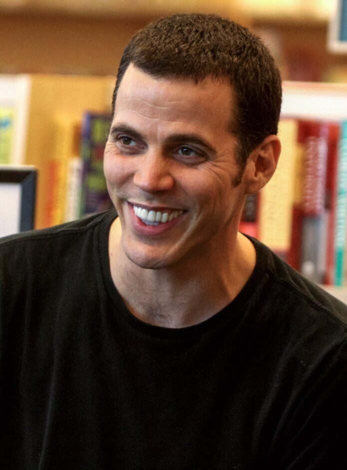
Steve-O’s face and hand tattoos are more difficult to document because small lettering changes the way a photograph reads. BME’s interview material records his willingness to choose words for the reaction they would create, while later coverage describes additional face-ink material as part of his public appearance. The exact list should not be inflated from one blurred portrait.
Hands and faces also make the designs unusually visible. A backpiece requires a shirtless photograph, but a knuckle tattoo appears whenever the performer gestures and a face tattoo remains part of an interview close-up. That visibility fits Steve-O’s approach to performance, where the body is often part of the bit. It does not mean every mark has a separate story available in print.
Readers comparing old and new photographs should allow for changes, cover-ups and differences in lighting. A hand can be partially hidden by a microphone, and a face can look different under stage makeup. The responsible inventory keeps the words that are directly reported and describes uncertain marks by location rather than pretending to decode them.
Smaller chest and shoulder ink fills out the larger body-art map
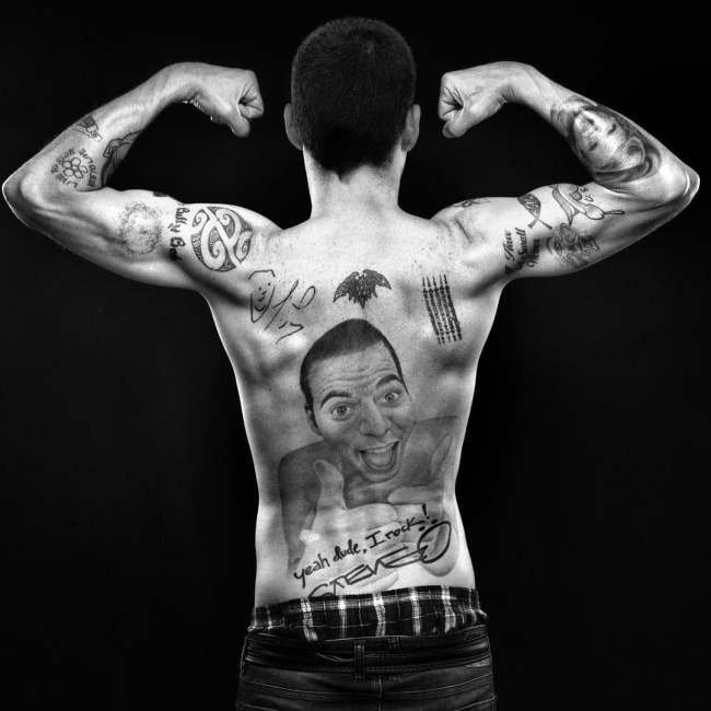
The surrounding tattoos matter because they keep the back portrait from being treated as Steve-O’s only design. Public photographs show additional symbols and smaller work across the shoulders, chest and arms. Some of those marks are visible without a reliable published explanation, so they are best used as visual context. They demonstrate how the large portrait sits within a wider, deliberately busy collection.
This wider map is not neat in the conventional sense. The designs vary in scale and tone, and some are comic while others are simply pieces of personal history. That unevenness is part of the appeal. Steve-O’s tattoos look like an accumulation of decisions made for different reasons, not one carefully branded sleeve.
How to read Steve-O’s tattoos without losing the joke
The collection works because the evidence and the performance point in the same direction. The back portrait is clear in photographs. The lettering supplies the voice. The hand and face work brings the joke into close view, and the smaller marks show that the body is covered by more than one headline design. The sources do not require a theory that explains every symbol.
For tattoo readers, the useful design lesson is scale and commitment. A self-portrait needs enough surface area for expression. Lettering needs space to remain readable. A cover-up or small face mark has different constraints. Steve-O’s work is memorable because it accepts those constraints and turns them into part of the performance. The result is unusually human: funny, excessive and impossible to mistake for generic celebrity ink.