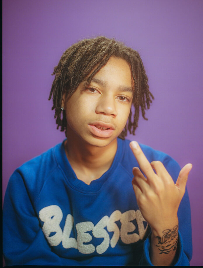
YBN Nahmir’s tattoos are not a random collection of filler. He talks about them as drawings, memories and pieces of Birmingham life that gradually found their way onto his arms, neck and wrist. The rapper has explained the stories in GQ’s Tattoo Tour, which makes it possible to separate what he actually said from the meanings people might otherwise guess from a photograph.
His first tattoo was his mother’s name. From there, the collection grew into a mix of cartoon influence, baseball and childhood references, spiritual imagery, family tributes and neighbourhood details. Nahmir also says he thinks about how the different areas should work together, with each arm developing its own feel while the neck helps connect the overall layout.
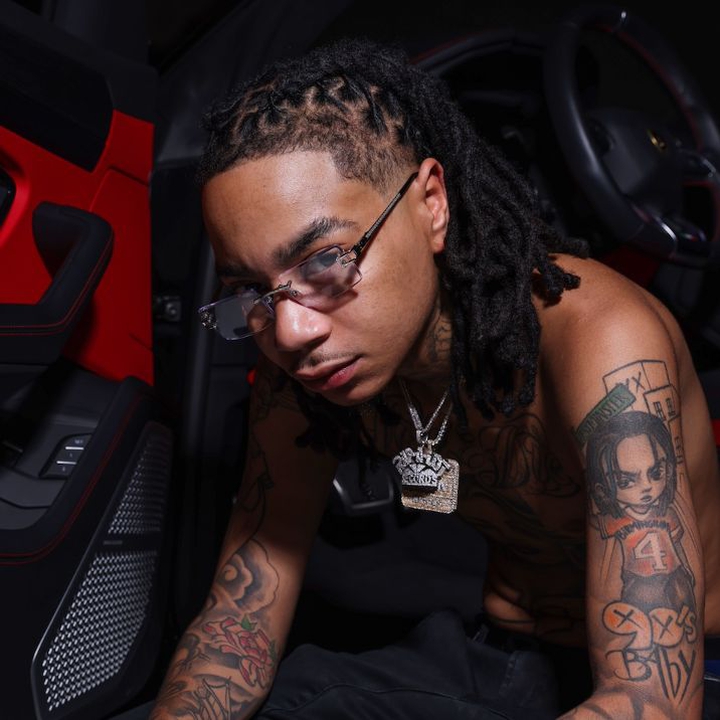
The 90s Baby arm piece carries his cartoon and sports influences
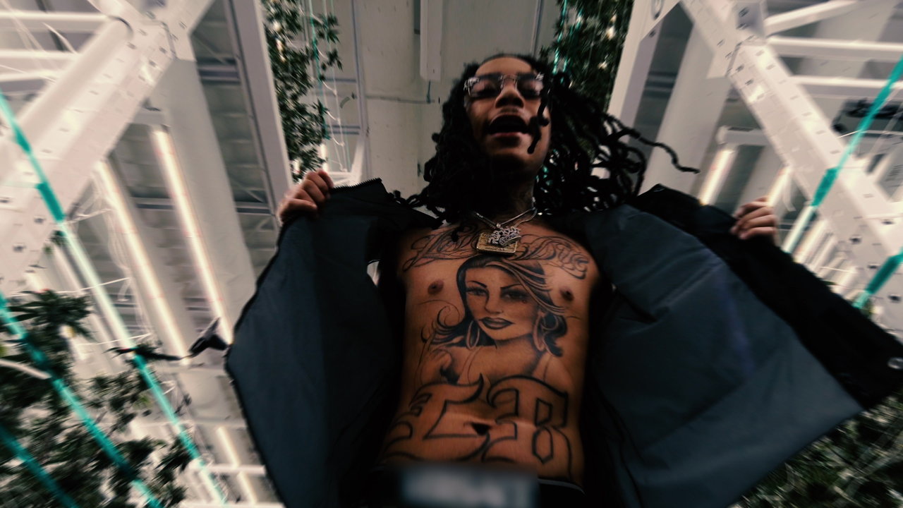
The neck work mixes protection with Birmingham details
Nahmir’s neck tattoos form a tighter group. He identifies an angel on the side of the neck, an Eye of Providence, Converse imagery and numbers connected to his block and street. The GQ close-up shows why these pieces need to be described from a near frame: hair, chains and clothing can hide the edges, while a straight-on concert photo may reduce the symbols to dark shapes.
The meaning he gives the neck is protection. Nahmir says the angel and the Eye of Providence represent something watching over him while he is outside, on the block, making music or simply moving through daily life. He also makes clear that some of the numbers and street details are personal references. Readers can name the visual elements without pretending to know every private association behind them.
The Converse tattoo adds an ordinary object to the group. It is not presented as a generic shoe design separated from his life. Nahmir names it alongside the block numbers and street reference, so it belongs to the same visual language as the rest of the neck: familiar objects, local details and symbols that make sense to him because of where and how he grew up.
Why the neck works as a connector. Nahmir says the neck helps bring the two arms together. He describes putting something represented on one side beside something represented on the other so the collection can flow down toward the centre of the body. That is a useful way to read the placement without claiming that every tattoo was planned in one sitting.
His tattoo artist, Hershel, is the person Nahmir credits with doing the neck and arms. He says Hershel is the only artist he lets work on him and mentions that the artist has also tattooed Blueface and Lil Skies. The artist credit matters because the collection has a consistent line and shading language even though the individual subjects vary.
Nahmir says he does not regret the tattoos. He talks about getting them at the right time and in the right places, and says he has no name he wants to cover. He also says he wants future work to connect with the middle of the neck, while keeping his face outside the plan. The collection is therefore still developing, but the existing pieces already have a clear structure: childhood imagery on the arms, protection and neighbourhood references at the neck, and family meaning running through both.
Family names and arm pieces keep the personal side close
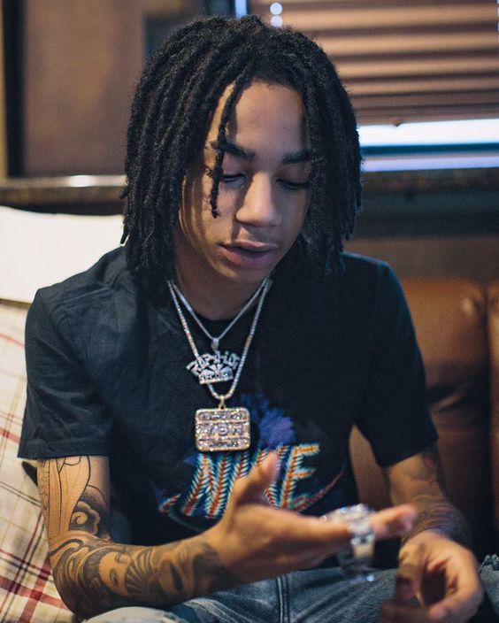
What makes YBN Nahmir’s tattoo record useful is the level of detail he supplies himself. The 90s Baby piece carries the cartoon and sports memories. Saint Mary, his mother’s name and the geisha imagery keep family close to the arms. The angel, eye, Converse and block references turn the neck into a personal set of markers. Those explanations give the photographs context without asking the reader to invent stories that Nahmir has never told.
Nahmir’s tattoos lean into quick, graphic shapes. The 90s Baby piece brings the childhood reference onto the arm, while the neck work changes the emphasis toward symbols and small marks that are visible in close-up. A tour photograph can show the placement, but the lighting may hide fine details, so the clearest images deserve more weight than distant performance shots.
The angel and Eye of Providence are visually recognisable, yet their personal meanings are not automatically confirmed by the design alone. The article names the symbols and locations, then keeps the interpretation measured. The Converse detail adds a pop-culture note to the map without needing to be connected to every other tattoo.
His collection is best understood as a changing set of references rather than a single planned composition. Different photographs reveal different pieces, and the timeline matters when later neck or arm work appears beside older lettering.
The neck designs also benefit from dated photographs. A mark that looks isolated in a tour image may sit beside newer lettering in a later portrait, while makeup and lighting can make a fine outline disappear. The visual record is strongest when the guide says which image supports which design rather than treating every photograph as proof of the same moment.
Nahmir’s tattoos are more interesting as a mix of references than as a single statement. Cartoon memories, sports details and religious-looking symbols sit beside modern lettering. Some have an obvious visual identity, while their private meanings remain unconfirmed. That distinction keeps the description clear without making the collection sound thinner than it is.
The best way to read the collection is to keep the images and the claims close together. A clear arm photograph can support a design name and location. A softer neck image may support only the existence of a mark. That may sound cautious, but it stops the article from presenting a guessed translation or an assumed meaning as a fact. Nahmir’s tattoos have enough documented variety without adding details the images cannot prove.
Reading the neck details in dated photographs
The neck marks are easiest to misread in stage lighting. A close portrait shows more than a distant tour image, and a later photograph may reveal additions that were not present earlier. Keeping those dates separate makes the visual catalogue clearer.
How the arm and neck pieces read together

Nahmir’s arm and neck tattoos are easier to understand when they are kept in their own groups. The arm work carries the cartoon and sports references, while the neck marks sit closer to the face and change how a portrait reads. A close-up can show a symbol, but it cannot automatically provide its meaning. The wording should name the design, location and evidence, then stop where the photograph stops.
Different eras also explain why online lists do not always agree. New lettering may appear beside an older symbol, and a soft performance image may hide a line that is obvious in a later portrait. That is not necessarily a contradiction. It is a reason to date the image and avoid promising a permanent count.
The collection has enough variety to be interesting without invented backstories. Cartoon memories, Birmingham identity and religious-looking marks all sit in the same overall layout, but the sources do not give every piece an equally clear explanation. Keeping the certainty levels visible makes the article more honest and more useful.
The smaller neck details also show why the same celebrity can look different from one appearance to the next. Hair, stage lighting and a turned head can hide one side while making another mark stand out. The safest description gives the reader the location and the clearest available photograph, then avoids pretending that the image proves a full count.
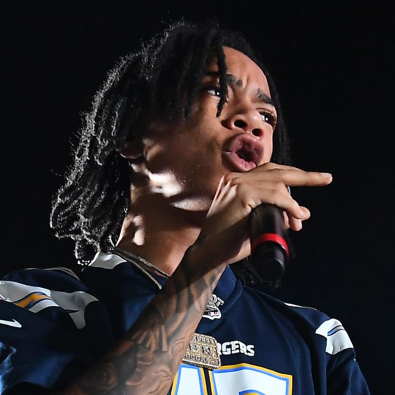
Nahmir’s tattoos have a loose, collected feel. Cartoon references sit beside sports imagery, lettering and symbols that seem to belong to different moments. That mix is more believable than a claim that every design was planned as one sleeve. The article gives the most space to pieces that can be named and shown, while uncertain marks stay clearly labelled.
The images should stay close to the sections they support. That makes the difference between a tattoo guide and a generic celebrity page. Readers can see the arm, neck or wrist detail while they are reading about it, rather than hunting through one unrelated gallery.
The 90s Baby piece also works as a snapshot of Nahmir’s age and influences when it was made. It is not the same kind of statement as the neck lettering or the eye symbol. The article keeps those ideas separate so readers can see the difference between a named phrase, a graphic mark and a design whose meaning has not been explained publicly.
Photographs from shows are useful for confirming that a tattoo exists, but they are often poor for reading detail. Coloured lights flatten black ink, motion blurs thin lines and a microphone can cover the wrist. That is why the uploaded close images matter. They give the sections a proper visual reference instead of asking a generic portrait to do the work.
Nahmir’s collection is best read as a set of memories and references that grew over time. The cartoon work, sports details and neck symbols do not need one grand theory. They are interesting because they are different, and the guide gives each confirmed group its own space.
The phrase “90s Baby” is useful because it can be read directly from the design, while the meaning of the smaller symbols remains less certain. The article keeps those certainty levels visible.