Athlete

Maxx Crosby’s Tattoos: Raiders Ink, Family Portraits and Sports Legends

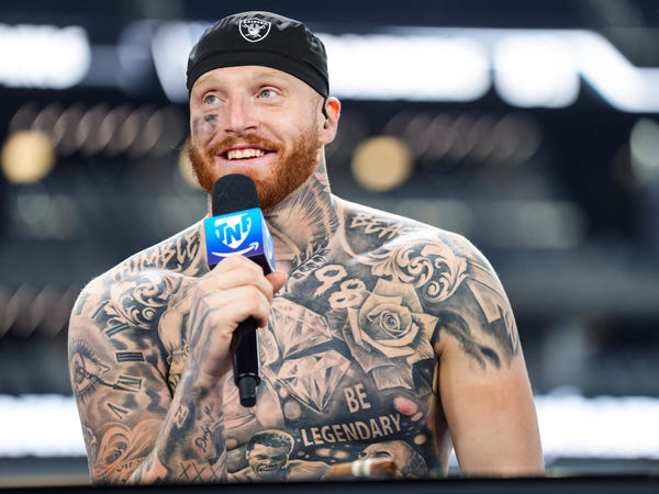
Maxx Crosby’s tattoos are basically a visual scrapbook of the people and things he cares about. His arms carry the Raiders, older family pieces and the rough beginnings of his sleeve. Across his chest and stomach, he has portraits of sports legends, family references, roses, diamonds and the words “Be Legendary.” None of it looks like one tidy plan drawn up years in advance. Maxx has said that his sleeve started out as random pieces, then gradually became something that worked together.

That slow build is the key to reading his ink. In GQ’s tattoo tour, he talks through his first tattoos, his great-grandmother, his mother and the portraits across his torso. Other reports cover the newer tribute work for Michael Jordan, Kobe Bryant and Muhammad Ali, as well as the Raiders imagery on his arm. The guide keeps those stories separate instead of treating every piece as one giant sports collage.

Maxx Crosby’s first tattoo was his name and birth year
Maxx Crosby tattoos: first wrist name and birth year tattoo

Maxx says his first tattoo was his surname and the year he was born, placed on his wrist when he was seventeen. He used his brother’s ID to get it, which gives the piece a very different feel from the huge chest work he wears now. It was a teenage decision, small enough to hide and personal enough to stay with him as the rest of his collection grew around it.

That early wrist tattoo matters because it sets up the way Maxx talks about his ink. He does not present the collection as a perfect catalogue. He remembers when he got pieces, who they were for and how the sleeve changed. The first design was straightforward: his own name and the year he entered the world. It is a marker rather than a performance of the image he later built as the Raiders’ defensive star.

The wrist also shows why older photographs are useful. A jersey cuff or athletic tape can hide the original lettering, while a close interview image may reveal it for a moment. The tattoo is not the largest piece on his body, but it anchors the timeline. Everything else came after that first decision to put a private detail where he could still see it.

The great-grandmother portrait was made for his mother
Maxx Crosby tattoos: great-grandmother forearm portrait

One of the most personal tattoos in Maxx’s collection is the portrait of his great-grandmother on his forearm. He has explained that she was very close to his mother and died when he was young, so the tattoo was chosen for both of them. That context gives the portrait a clear emotional centre. It is not simply an old-fashioned face in a sleeve; it is a family image with a specific reason for being there.

The forearm placement makes the portrait visible when Maxx is working out, talking to reporters or standing on the sideline. Around it sit other pieces that were added at different times. The portrait therefore has to be read as its own tattoo, even when a photograph makes the whole arm look like one continuous black-and-grey panel.

Maxx has also spoken about regretting some of his younger decisions and becoming more selective later. That does not erase the earlier tattoos. It explains why the great-grandmother portrait stands out. The design has a person and a story attached to it, while some of the surrounding marks are remembered more as part of the gradual process of filling the sleeve.

The image is clearest when the arm is uncovered. Game photographs can flatten the details under stadium lighting, and tape can cover the lower forearm. A proper tattoo reference should show the face and the surrounding linework clearly, rather than using a distant action shot where the portrait becomes an unidentifiable patch of ink.

His chest and torso carry tributes to Jordan, Kobe and Ali
Maxx Crosby tattoos: Jordan Kobe and Ali torso tattoo

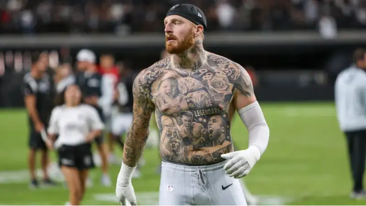
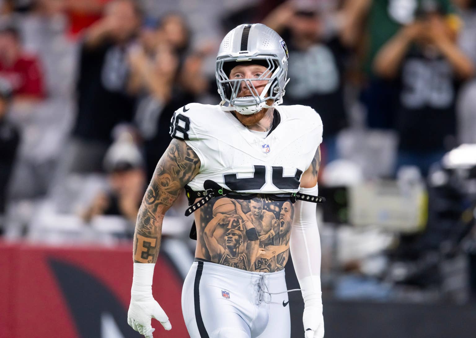
The biggest change in Maxx’s tattoo collection came with the large torso composition honouring Michael Jordan, Kobe Bryant and Muhammad Ali. Those portraits sit across the chest and stomach, surrounded by shading, lettering and other decorative elements. Sports coverage has described the work as a tribute to athletes who influenced him, while photographs show how the portraits are arranged around the words “Be Legendary.”

The phrase gives the centre of the tattoo a clear visual anchor. It sits across the torso instead of being tucked away as a tiny motto, so it reads alongside the portraits and the number 98 associated with Maxx’s playing identity. A photograph from the field can show the full composition, but a closer interview image is better for studying the faces and the smaller shapes around them.

There are also roses, diamonds and a tattoo connected with his daughter Ella Rose. Reports about the newer torso work describe those details as part of a family addition rather than random filler. The rose works visually with the name, while the diamonds and surrounding shading make the large portrait panel feel finished rather than like four separate photographs pasted together.

This is where the timeline becomes important. Maxx has said his rookie-year sleeve looked terrible because he kept adding one random tattoo and then another. The torso pieces belong to a more deliberate phase. They are still busy, but the images, lettering and spacing have a clearer relationship. The body of work looks planned because the later tattoos were designed to connect parts that had been built separately.

The portraits should not be treated as proof that every tattoo on Maxx’s body has the same meaning. The sources are strongest about the athletes and the daughter tribute. Other faces and symbols are visible, but they should be described carefully when no direct explanation is available. A good tattoo guide can identify a portrait without inventing a speech from the person pictured.

The Raiders sleeve grew from random pieces into a team record
Maxx Crosby tattoos: Raiders sleeve tattoo

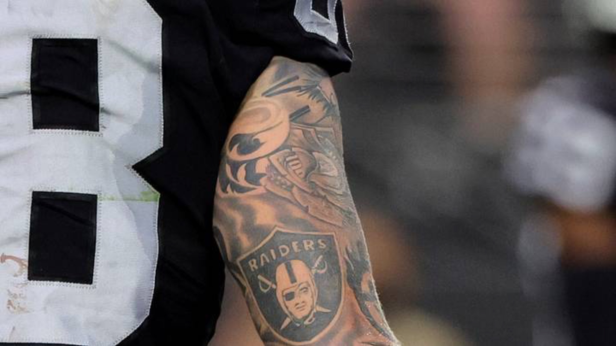
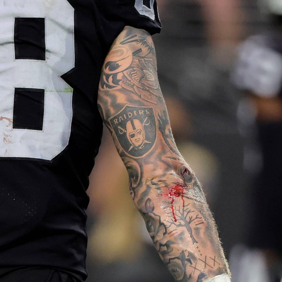
Maxx’s arm sleeve carries the most obvious football imagery. The Raiders shield appears on the upper arm, surrounded by portraits, numbers, lettering and darker traditional-style elements. Some photographs show the logo clearly during games, while others reveal how much work sits above and below it. The sleeve is not only a team badge. It is a mixture of Maxx’s football identity and the tattoos he picked up before the arm had a finished shape.

He has been open about the sleeve’s early messiness. In GQ, Maxx described his rookie-year arm as a collection of separate choices that did not yet fit together. That is useful because it explains the contrast between older small tattoos and later large-scale work. The arm did not appear fully designed overnight. It was built by adding pieces, then finding a way to make the empty spaces work.

Other arm tattoos include a tree, Roman numerals, lettering and smaller symbols that are easiest to see in close-up sports photography. The Raiders shield has the clearest public identity, but the surrounding ink is what makes the sleeve look like Maxx’s rather than a simple piece of team merchandise.

There is a practical side to photographing the arm too. Pads, gloves and jersey sleeves cover large sections during games. A sideline image might show the lower arm while hiding the shoulder, or the shoulder while the wrist is taped. That is why several photographs are needed before calling the sleeve complete. One picture can prove a design exists, but it cannot always show the placement of the neighbouring work.

Maxx has also worked with tattoo artists in Las Vegas, including Carlos at Hart & Huntington. That studio connection belongs to specific sessions and should not be stretched into a claim that one artist created the entire sleeve. His collection developed over years, and the artist history is just as layered as the designs.

The smaller tattoos fill in the family and recovery timeline.

Not every important piece on Maxx’s body is large. The wrist name and birth year, the great-grandmother portrait and the daughter reference give the collection a family timeline, while the Raiders logo and sports portraits cover the public side of his identity. Other small tattoos appear around the arms and torso, but a careful inventory should separate what Maxx has explained from what a photograph only shows as a dark mark.

His recovery story also matters when the tattoos are discussed. Maxx entered rehab for alcoholism in 2020, and later coverage connected parts of his public identity with a more focused approach to football and family. That does not mean every tattoo is a recovery symbol. It simply gives the later family and motivation pieces a date and a wider setting.

The words “Be Legendary” are a good example. They are visible and easy to quote, but the phrase does not need a grand theory attached to it. It works as a personal motto and as part of the torso layout. The portraits beside it give the words a sports context, while the family tattoo adds something more private.

Seen as a whole, Maxx Crosby’s tattoos move from teenage lettering to family portraits, from a rough early sleeve to a more connected torso composition, and from ordinary small marks to the Raiders imagery that fans now recognise. The work is busy, but it is not meaningless. Each area has its own story, and the photos are strongest when they are used to show the exact pieces being discussed.

There is no reliable reason to force a fixed tattoo count onto the collection. New work, cover-ups and added shading can change the total, and game photography rarely shows every area at once. The useful version is a visual map: wrist name and birth year, great-grandmother on the forearm, Raiders sleeve, sports legends across the torso, family references, roses, diamonds and the central “Be Legendary” lettering.

That map gives readers more than a quick list. It shows how Maxx’s ink grew with him, including the rough early choices and the later pieces that carry family, football and personal ambition. The collection looks most honest when the older and newer stages are allowed to sit together.

Israel Adesanya’s Tattoos Tell Stories About Nigeria, Anime and Fighting Himself

Israel Adesanya’s tattoos are easy to spot, but they make more sense when you slow down and look at the different chapters they represent. There is Nigerian identity across his chest, childhood comics on his arm, anime imagery over his stomach, and newer work around his neck. Some pieces have a clear story because Adesanya has explained them himself. Others are simply designs he liked at the time. That distinction matters, because he has never pretended that every mark needs a grand explanation.

In GQ’s Tattoo Tour, Adesanya says he got his first tattoo at 22 and kept his early ink quiet around his family. He also says he sometimes chooses a design because it looks cool, then lets its meaning reveal itself later. That relaxed attitude is useful when reading his collection. The confirmed details are interesting enough without inventing a private message for every shadow and symbol.

The Broken Native tattoo puts Nigeria and Africa across his chest

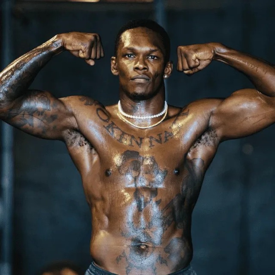
Israel Adesanya tattoos: high-resolution chest and torso photograph showing Broken Native, Africa and surrounding ink

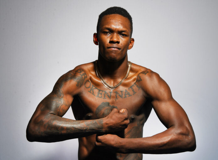
The phrase “Broken Native” is the easiest starting point. It runs across the top of Adesanya’s chest in large, old-style lettering, so it reads clearly even in a fight photograph. Under the words sits a large black-and-grey composition built around Africa, a lion-like silhouette and an outline of Nigeria. It is a big piece, and it has the visual weight of a personal flag rather than a small decorative tattoo.

Adesanya has connected the design to his Nigerian roots and to the route that took him from Lagos to New Zealand. The word native is doing more than describing a birthplace. It points to the feeling of carrying one home while building another. He has also spoken about the dance crew and the people around him before his fighting career became the centre of his public identity. The tattoo sits across his chest because it is meant to be seen, not tucked away as a private footnote.

The map, lion and lettering work as one chest composition.

The chest tattoo is sometimes reduced online to a map of Africa, but that misses the way it is put together. The heavy lettering forms a top border. The continent gives the middle of the design its broad shape, while the darker figure and smaller details pull the eye toward the centre. It is not a clean logo. The shading is deliberately rougher, which suits the phrase and the story behind it.

Photographs taken at different times show why one image is not enough. A front-facing gym photograph makes the lettering easy to read. An octagon photograph can show how the design bends with his chest and disappears under the arms. The ink also changes with lighting and distance, so a careful description should name the visible parts without claiming that every faint mark has a confirmed meaning.

Deadpool and the anime tattoos make the ribs and stomach personal

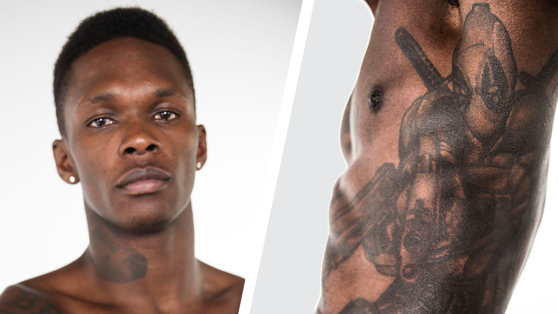
Israel Adesanya tattoos: GQ Tattoo Tour frame showing the side and rib Deadpool tattoo

Adesanya’s side and stomach work is where the collection becomes more playful. GQ shows a Deadpool-style figure on the ribs, with the character’s swords and comic-book attitude spread along the side of his body. The tattoo is much harder to see in an ordinary fight photograph because his arm and trunks cover sections of it. A shirtless studio frame gives a better idea of the scale, running from the ribs toward the hip.

Deadpool fits the way Adesanya talks about his ink. It is not presented as a solemn memorial. It is a character he enjoys, and the pose and placement let the tattoo carry some attitude without needing a speech attached to it. That does not make it shallow. Favourite characters can be part of somebody’s identity, especially when they have been following those characters since before they were famous.

Avatar and Naruto meet in the stomach piece.

The stomach tattoo brings together two parts of Adesanya’s pop-culture world. He identifies the upper imagery with the Ocean and Moon Spirit from Avatar: The Last Airbender, while the lower design includes the seal associated with Naruto’s Nine-Tails. He has explained that Avatar’s ideas about mastering the elements connected with his own training. That is a much stronger piece of evidence than a caption that simply says “anime tattoo.”

The design is also a good example of why placement changes how people read a tattoo. The spirits sit in the centre of the torso, where the shapes can be read as a balanced pair. The Naruto seal sits below, making the whole area feel like a stacked panel rather than one single illustration. Sweat, shadows and body movement can blur the edges, so a clear photograph is important before anyone tries to identify the smaller marks around it.

The stomach ink is detailed, but not every detail has a published explanation.

There are plenty of internet lists that attach a meaning to every line in Adesanya’s anime work. The safer version is narrower. He has spoken about Avatar, imagination and the emotional pull of those stories. He has shown the Naruto influence. The exact personal reason for every surrounding shape is not equally well documented. A useful tattoo guide can still describe the composition, direction and placement without filling the gaps with guesses.

Calvin and Hobbes give the bicep tattoo a childhood reference

Israel Adesanya tattoos: separate weigh-in photograph showing the chest lettering and stomach tattoo map

Inside Adesanya’s right bicep is a tattoo of Calvin and Hobbes. It is one of the most revealing designs in his collection because the reason is straightforward: he read the comics when he was younger and liked what they represented. In the GQ interview, he talks about the power of imagination and the way those stories stayed with him. The tattoo turns a childhood habit into something he carries into adulthood.

The bicep is a smart location for a design like this. It can disappear when he is wearing a shirt, then show up clearly when he raises his arm or poses for a fight photograph. That is different from the chest lettering, which announces itself immediately. The two pieces show that his collection is not built around one level of visibility. Some tattoos are public identity. Others are closer to a private reminder that happens to be photographed from time to time.

Comic art sits beside the fighter’s working body.

The image matters here because Calvin and Hobbes can be mistaken for a dark patch when the arm is bent or the photograph is compressed. A closer frame separates the characters from the surrounding sleeve work. The line quality is lighter than the solid lettering on his chest, and the placement gives the figures a little room to breathe.

There is no need to turn the design into a prediction about Adesanya’s personality. The confirmed link to the comics is enough. It shows that he is comfortable putting a fun, recognisable reference beside much heavier cultural and family imagery. That mixture is one reason the tattoo map feels like a person’s collection rather than a planned brand package.

The neck and hand tattoos show Israel’s newer visual language

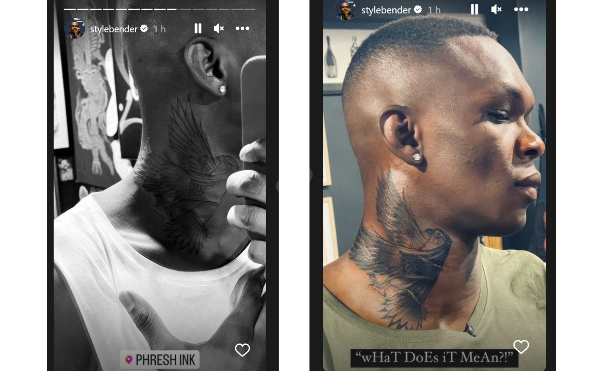
Israel Adesanya tattoos: public reveal image clearly showing the eagle on the side of the neck

Adesanya has also added more visible work around his neck. A later reveal shows a large eagle tattoo on the side of his neck, with the wings spreading upward and the head angled across the skin. The photograph circulated with people asking what it meant, but the image itself proves the design and placement more confidently than it proves a private explanation. It is better to call it an eagle and leave the symbolism open unless Adesanya explains it directly.

The neck is a different commitment from the early pieces he could cover at home. It changes the outline of his face and shows up in interviews, weigh-ins and everyday photographs. That visibility may be part of the point, but it would be speculation to claim a single reason for the timing. The practical fact is enough: the newer eagle makes the tattoo collection harder to hide and gives the head and shoulders a stronger silhouette.

Small marks and the word “Okenna” need careful reading.

Photographs also show smaller lettering and symbols around Adesanya’s shoulders, hands and torso. The word “Okenna” is visible across the upper chest in some training images, while other pictures make the surrounding designs easier to see. A tattoo list should separate what can be read from what is only suggested by a blurry frame. The same rule applies to small hand marks, which can be partly covered by wraps, gloves or the angle of a photograph.

That is the useful way to approach Adesanya’s ink. The Africa and Nigeria composition has a clear cultural connection. The Deadpool, Avatar, Naruto and Calvin and Hobbes pieces have identifiable source material and, in several cases, explanations from Adesanya himself. The eagle and smaller newer pieces are visually clear but less fully explained. Keeping those categories separate makes the article more honest and the tattoos more interesting.

Seen together, the collection moves between heritage, imagination, humour and the physical life of a fighter. The chest announces where Adesanya comes from. The ribs and stomach show the stories he grew up with. The bicep keeps a childhood comic close, and the neck work makes the later version of his visual style impossible to miss. His tattoos do not need one tidy theme. Their variety is the theme.

Rhea Ripley’s Tattoos Trace Her Rise From Evolution to WWE Stardom

Rhea Ripley’s tattoos are part of her wrestling identity, but they are not only stage decoration. The collection includes a date linked to her career, horror references, mythic female figures, a scorpion, hand work and large leg pieces. WWE’s own tattoo photography and WWE Tattooed video provide unusually strong evidence because Ripley discusses the journey while the cameras show the designs. Other accounts add dates and newer pieces, but the official material should remain the foundation.

Her collection has grown alongside her public career. Early tattoos are linked with milestones and influences, while later work covers more of the arm, thigh, torso and chest. That expansion explains why quick lists often miss important details. A single entrance photograph may show one side of the body, while an official gallery can reveal the hand, leg and torso pieces separately. The article therefore keeps the designs in groups that match the available images.

The arm collection mixes daggers symbols and heavy black work

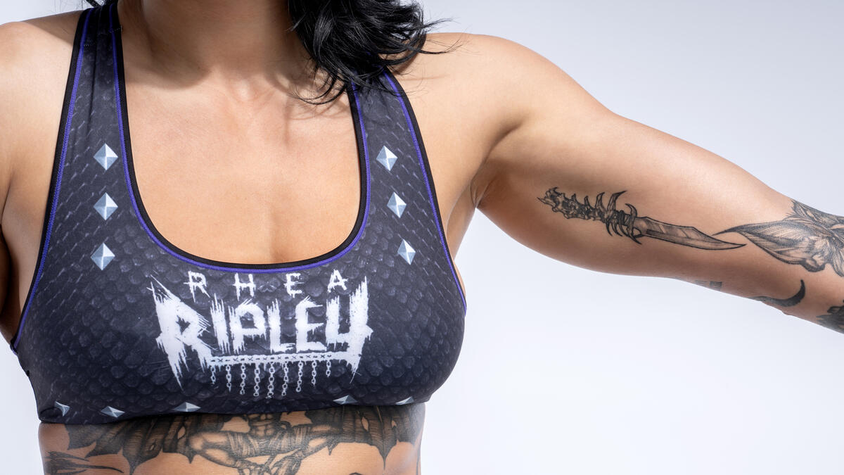
Rhea Ripley tattoos: Rhea Ripley dagger and arm tattoo collection

Ripley’s arms carry some of the most immediately recognisable parts of her collection. WWE photography shows a stylised dagger on the forearm alongside darker linework and smaller symbols. The designs do not all point to one confirmed story, but they share a strong visual weight. Black ink, sharp edges and compact shapes suit the aggressive presentation she brings to the ring without reducing the tattoos to a costume accessory.

The dagger is a clear example of a design that can be described without guessing. It has a defined outline, a readable position and enough contrast to survive a sports photograph. It may suggest danger or strength to a viewer, but this guide should not assign a personal meaning unless Ripley has done so. The fact that she chose a blade and placed it on a visible part of the forearm is already useful information.

The surrounding marks make the arm feel built over time. Some designs sit close enough to read as a cluster, while others leave open skin between them. That spacing keeps the collection from becoming a single black block and gives each image room to be recognised. A close frame also shows how jewelry, wrist movement and ring gear can change the way the tattoo appears during a match.

Ripley’s arms are often the first part of her tattoo map viewers notice because wrestling gear leaves them exposed. That visibility can create the impression that the arms contain everything, when the official gallery shows a much wider collection. The forearm work is important, but it is one chapter in a tattoo record that also moves down the legs and across the side of the body.

The arm tattoos also connect with the mood of her horror-inspired pieces. Sharp lines and dark shading can make a symbol feel ominous even when the source does not identify a story. That is why visual description is better than a generic claim that every design represents rebellion. The source shows the ink. Ripley’s interviews explain the broader passion for tattooing.

The scorpion is one of Ripley’s clearest standalone designs

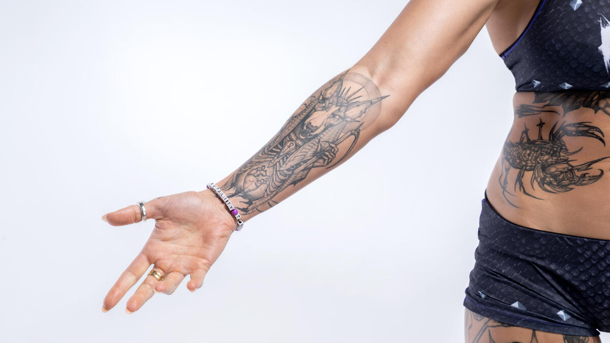
Rhea Ripley tattoos: Rhea Ripley scorpion side tattoo

The scorpion on Ripley’s side is one of the easiest tattoos to isolate in the official photographs. Its segmented body, legs and pincers create a strong outline that follows the curve of the torso. Unlike a small mark hidden among the arm work, the scorpion reads as a complete image in its own right. It has the kind of silhouette that remains recognisable even when the photograph is viewed quickly.

A scorpion naturally invites symbolic readings about danger, defence and survival, but those meanings should not be presented as Ripley’s confirmed explanation without a source. The design already fits the visual language of her collection: it is dark, precise and slightly threatening. Its placement on the side also changes how it is seen. A front-facing ring photograph may hide it, while a profile pose or a dedicated tattoo session reveals the whole body.

The scorpion also shows how tattoo placement affects wrestling presentation. Ripley moves constantly, and the torso stretches when she poses or performs. A design on the side can look compressed in one image and extended in another. A good guide compares the photographs rather than treating every change of angle as a different tattoo.

Her body art is often discussed alongside her ring character because the two share a dark, confrontational mood. That connection is understandable, but the tattoo record should still keep the person and performance separate. The scorpion existed as ink, not just as part of an entrance look. It remains visible in ordinary portraits and official studio images when the character presentation is reduced.

The hand and thigh work carries the collection into mythic imagery

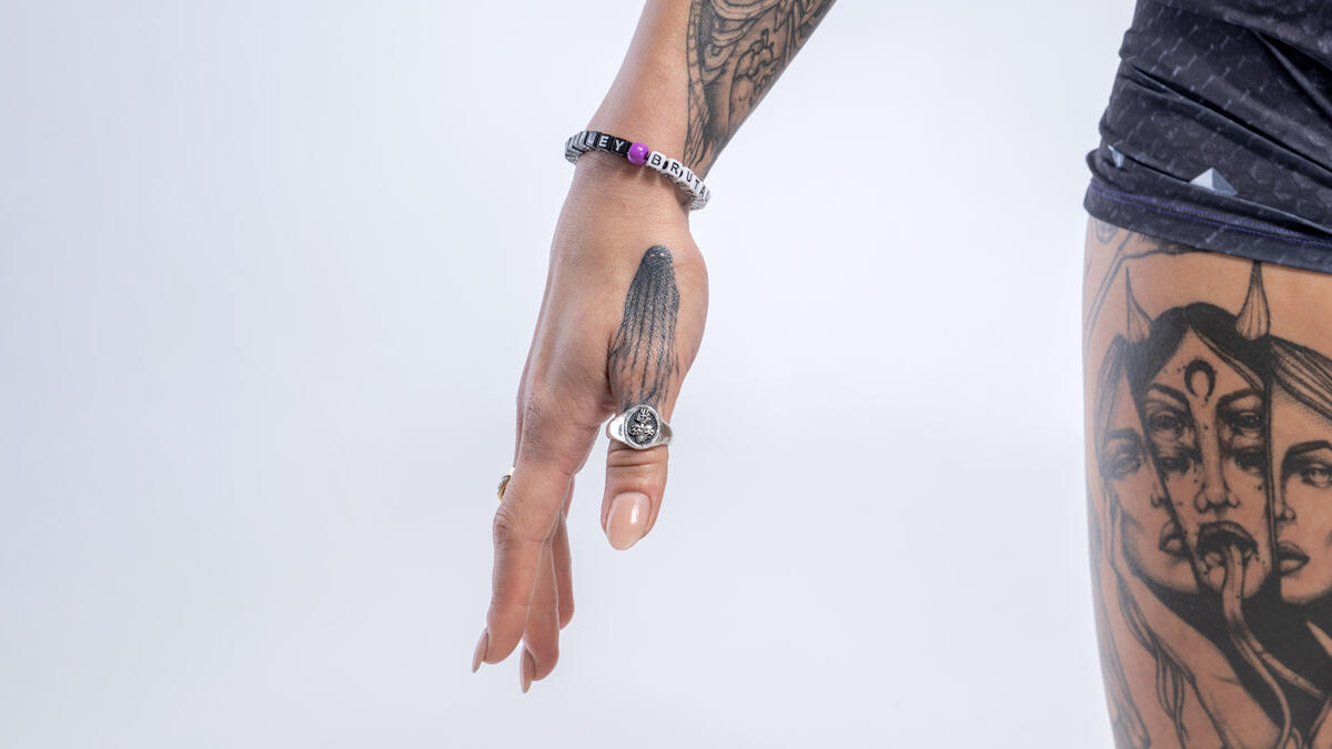
Rhea Ripley tattoos: Rhea Ripley hand tattoo and three-faced woman thigh design

Another WWE image brings together the hand and thigh tattoos. The back of the hand carries a linear design near rings and bracelets, while the upper thigh shows a three-faced woman with flowing hair and a crescent moon. Those pieces expand the collection beyond the obvious dagger and scorpion. They also demonstrate why hand and thigh tattoos deserve their own visual coverage rather than being squeezed into a general paragraph about full-body ink.

The three-faced woman is a particularly striking figure. The faces create repetition, while the hair and crescent give the design a mythic or night-time mood. The image supports a description of the figure and its placement. It does not establish whether the design is a specific goddess, a personal portrait or an original tattoo composition. Calling it a three-faced woman with a crescent is more accurate than choosing a name the source does not provide.

Hand tattoos have a different practical history. They are exposed constantly, so they become part of gestures, photographs and the visual shorthand of a performer. The linear design on Ripley’s hand is not as large as the thigh image, but it can be more visible in everyday pictures. Rings and bracelets may obscure part of it, which is why a close official photograph is better evidence than a distant entrance shot.

The thigh pieces are harder to see in regular WWE coverage because shorts and ring gear control the frame. When they are shown, however, they add scale to the collection. A design that covers a broad section of the upper leg cannot be understood from a cropped waist-up portrait. This is one reason Ripley’s tattoo guide needs several images rather than one generic celebrity photograph.

Medusa and horror references give the tattoos their darker mood

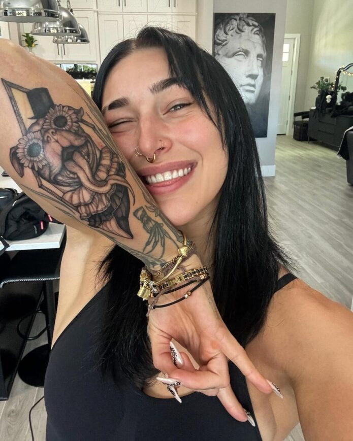
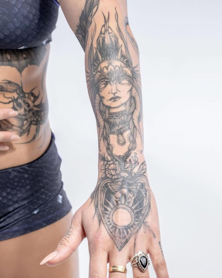
Rhea Ripley tattoos: Rhea Ripley Medusa-inspired sleeve tattoo

Medusa is one of the most recognisable ideas associated with Ripley’s tattoo collection. The close image shows a female face framed by braided or snake-like hair, ornamental detail and floral elements that continue toward the hand. The design is intricate rather than a simple symbol. Fine lines, dot shading and the surrounding shapes make it look like a portrait built into a larger sleeve.

The Medusa reference fits the horror vocabulary that appears elsewhere in Ripley’s tattoos. WWE’s Halloween coverage has highlighted her Freddy Krueger glove and other spooky Superstar designs, while her wider collection includes grim and monstrous imagery. These sources support the claim that horror is an important visual influence. They do not mean that every dark tattoo is a direct movie reference, so the individual designs should remain separate.

The Medusa image also shows how a sleeve can be arranged around the body. The face gives viewers a focal point, while the hair and decorative marks fill the spaces around it. The sun-like detail near the hand changes the direction of the design and makes it feel connected to the wrist rather than ending abruptly at the forearm. These are tattoo-specific details that disappear when the collection is described only as “a sleeve.”

Ripley has spoken about loving tattoos from a young age, with both parents also having ink. That family background gives the collection a starting point, but it does not supply a meaning for each later design. Her tattoos can be personal, aesthetic and tied to horror at the same time. The useful distinction is between the documented influence and the meanings that remain private.

The date tattoo on her wrist is the clearest personal milestone. Reports identify Roman numerals for 10.28, linking the date with her 2012 Riot City Wrestling tryout and the 2018 WWE Evolution event. That design turns career history into a small piece of lettering and numbers. It is a stronger meaning claim than the usual symbolic guesses because the reported events are specific and connected to Ripley’s professional path.

That date also explains why the collection is more than a visual mood board. Some tattoos preserve milestones, some reflect horror interests and some simply build a body map that suits her taste. Newer pieces continue to appear, including a large chest addition and a reported Italian phrase, so any guide should be dated rather than treated as a final count. The photographs show what can be seen now, while interviews and wrestling coverage explain the moments that carry the strongest evidence.

Rhea Ripley’s tattoos are best read as a growing archive of wrestling milestones, dark imagery and personal style. The arms carry daggers and symbols. The scorpion stands alone on the side. The hand and thigh pieces add mythic figures, and the Medusa and horror designs give the collection its recognisable mood. The 10.28 date connects the ink directly to her career. Together, those details make a more useful guide than a generic list, while leaving private meanings private where Ripley has not supplied them.