Musician

The Stories Written Across Keke Palmer’s Tattoos

Keke Palmer’s tattoos make more sense as a set of distinct choices than as one neat visual theme. Her collection moves between a large illustrated side piece and short pieces of lettering placed where clothes can hide them. The photographs are not equally sharp, and a visible phrase does not automatically explain why she chose it. This guide sticks to the designs that can be checked against tattoo-specific photographs and Palmer’s own public clarification, and leaves the guesses out.

One detail worth keeping in view is scale. The side design takes up a substantial area of her ribcage, while the lower-back and under-bust tattoos depend on close framing to read. That difference changes what a useful photograph looks like: a red-carpet image may establish that a tattoo is present, but a closer source image is needed to describe its lines or wording. The four sections below use separate photographs for separate designs, rather than recycling one general portrait to stand in for the whole collection.

The butterfly and flower cover Palmer’s right side
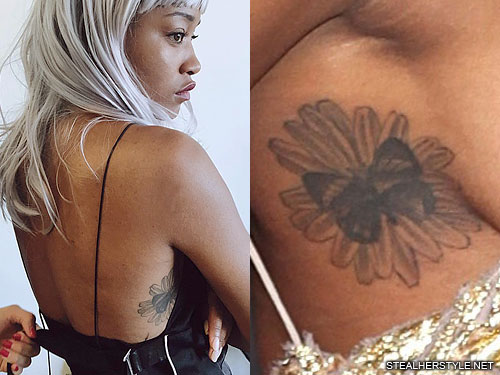
Keke Palmer tattoos: large butterfly and flower tattoo on the right side of Keke Palmer’s ribcage

The largest clearly documented design in this group is a butterfly resting on a flower along Palmer’s right side and ribcage. TattooFilter describes the subject as flowers and butterflies on her side; Steal Her Style’s tattoo-specific page identifies the composition as a butterfly on a flower and notes the black-and-gray treatment. Those descriptions agree on the essential visual facts: an insect-and-flower pairing, placed on the side of the torso, with the butterfly providing the most immediately legible shape.

The arrangement matters more than an invented symbolic reading. A butterfly is often assigned a stock meaning in celebrity roundups, but the sources used here do not establish that Palmer selected this particular design to represent transformation, grief, or a turning point. The flower and butterfly can be described as a composition without claiming access to a private explanation. Its scale also gives the tattoo a different presence from her small lettering: it occupies a broad area of skin and is visible in some fashion photographs when the cut of a garment exposes her side.

Recent coverage again drew attention to a large rib-cage tattoo when Palmer appeared in a sheer Versace look at the 2025 Vanity Fair Oscar party. That report helps establish that the side work remained visible years after the older tattoo-specific photograph. The event photo is not a substitute for a close image of the exact flower-and-butterfly design, so this guide relies on the dedicated tattoo photograph for the design description and treats the red-carpet report as date-and-placement context only.

Renaissance Woman” sits across the lower back
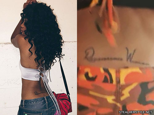
Keke Palmer tattoos: Renaissance Woman lettering tattoo on Keke Palmer’s lower back

Palmer’s lower-back lettering reads Renaissance Woman. The phrase was not left to guesswork: after people questioned what the script said, Palmer corrected the reading publicly. She also supplied the sense she intended, describing a woman with knowledge or ability across more than one field. The tattoo’s text therefore has stronger evidence behind it than a phrase inferred from a soft event photograph.

The wording suits the range of work Palmer has taken on as an actor, singer, dancer, host, and performer. That connection is not only an editor’s clever caption; it follows the explanation attached to the phrase when she showed the fresh tattoo. Still, the article does not turn a line of lettering into a complete autobiography. The source supports a self-description and a placement. It does not prove that every later project or public reinvention was planned around the tattoo.

Lower-back tattoos are often photographed casually, with clothing, posture, or distance obscuring part of the lettering. The image placed here is a tattoo-specific source image, which is why it is more useful for reading the phrase than a general portrait. Even then, the sensible description is simply the words and their location. The design is typographic rather than pictorial, and the statement does its work through the language Palmer chose rather than through elaborate ornament.

A proverb runs beneath the bust
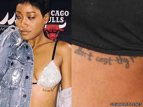
Keke Palmer tattoos: Don’t cast thy pearls before swine quote tattoo beneath Keke Palmer’s bust

A separate tattoo sits beneath Palmer’s bust and carries the phrase Don’t cast thy pearls before swine. The source photograph is close enough to show that this is a line of text, not a decorative flourish. It is an old proverb, commonly used to describe the choice not to offer something valuable where it will not be appreciated. The phrase can be explained in ordinary terms, but no cited interview ties it to one particular relationship or episode in Palmer’s life.

That distinction is useful because tattoo coverage often takes a familiar saying and immediately turns it into a personal confession. Here the placement and visible wording are supportable; a detailed private backstory is not. The tattoo can be read as a compact statement about discernment without claiming that Palmer meant a specific person, project, or public disagreement. Keeping those limits clear makes the guide more informative, not less: readers get the exact design and do not have to sort fact from a made-up origin story.

The placement also explains why it is absent from many ordinary photographs. Clothing usually covers the area, so the tattoo appears only in images with a particular neckline or crop. The dedicated image is therefore important to the section; a photograph of Palmer’s face or a generic red-carpet appearance could not document a design positioned beneath the bust. It is a different piece from the larger side tattoo, and it should be understood on its own terms rather than folded into one broad “body art” description.

The inner-arm quotation is a different kind of lettering
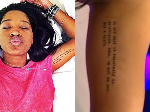
Keke Palmer tattoos: Aristotle quotation tattoo on Keke Palmer’s inner arm

Palmer has another text tattoo on her inner arm, a line commonly circulated as We are what we repeatedly do. Excellence, then, is not an act, but a habit. The dedicated photograph records the placement and the wording as reproduced in tattoo coverage. The familiar attribution to Aristotle needs more care: the sentence is widely associated with him, but it is a later summary of an idea connected with his writing, not a verbatim line from the surviving Nicomachean Ethics. Naming that distinction avoids repeating an attractive but misleading attribution as a fact.

Palmer has discussed encountering the quotation and responding to its message. That offers a modest, relevant piece of context: the words resonated with her enough to be carried on her arm. It does not require a grand claim that the tattoo predicts her career or explains every success. Its placement is practical as well as personal. The inner arm can be shown deliberately and covered in everyday clothes, a different kind of visibility from the exposed side design.

These two pieces of lettering also work differently from each other. “Renaissance Woman” is a short self-description, while the longer inner-arm text states a principle about practice and repetition. Their locations give each phrase room to be read, but the designs remain visually restrained. In photographs, the exact line can be harder to inspect than a bold illustration, which is why a close tattoo image matters more than a distant event shot. The article keeps the quoted wording in its own section and does not use it as a catch-all explanation for the rest of Palmer’s tattoos.

Taken together, these four documented pieces show range rather than a single fixed motif: one large natural illustration and three text designs, spread across the side, lower back, under-bust, and inner arm. Their visibility depends on clothing and camera distance, and the strongest evidence is not the same for every item. Palmer’s public correction makes the lower-back lettering unusually clear; the side design is documented by tattoo-specific image records; and the two smaller inscriptions are best handled as visible wording with no invented private story. That is a more accurate map than a list that assigns a symbolic meaning to every line of ink.

The placement makes these tattoos easier to read as a group. The butterfly and flower work covers a broad area, while the lettering pieces need a closer look. A wide photograph can establish the overall shape, but it will not always show the small words clearly. That is why the close-up images belong beside the sections that name them.

Keke’s collection also has a useful mix of decorative and personal ink. The flower and butterfly design is visually busy, the back lettering is direct, and the quotations depend on the exact wording. None of those pieces needs an invented backstory. The photograph establishes the design, and the reported context explains only what the sources actually connect to it.

Older photographs should be read alongside newer ones rather than treated as a permanent final count. A cover-up, a faded line or a change in styling can make the same tattoo look different. Keeping the dates and locations visible gives readers a much better guide than a list that treats every image as if it came from the same session.

That balance is worth keeping in the finished article. Readers can see the larger shapes first, then use the close photographs to check the words, placement and changes. It keeps the page useful without pretending that every mark has a documented meaning.

A later portrait confirms the side placement
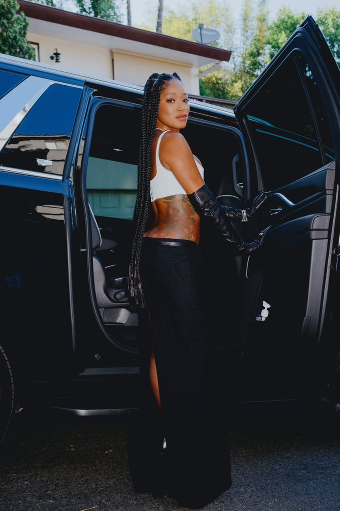
Keke Palmer showing the side tattoo placement

A later public photograph confirms that the side tattoo remains part of Palmer’s visible tattoo map. It is not a replacement for the tighter image used to identify the butterfly and flower, because the crop shows less fine detail. It is still useful for scale and placement: the tattoo sits along the side of the torso and reads as a large piece rather than a small mark hidden near the waist.

That difference between a detail photograph and a wider portrait is worth keeping. The close image tells readers what the design looks like, while the newer photograph shows how the tattoo sits with Palmer’s clothes, posture and overall styling. Neither image needs an invented meaning added to it.
Jay Park’s Tattoos Tell the Story of Seattle, Music and the Road Up

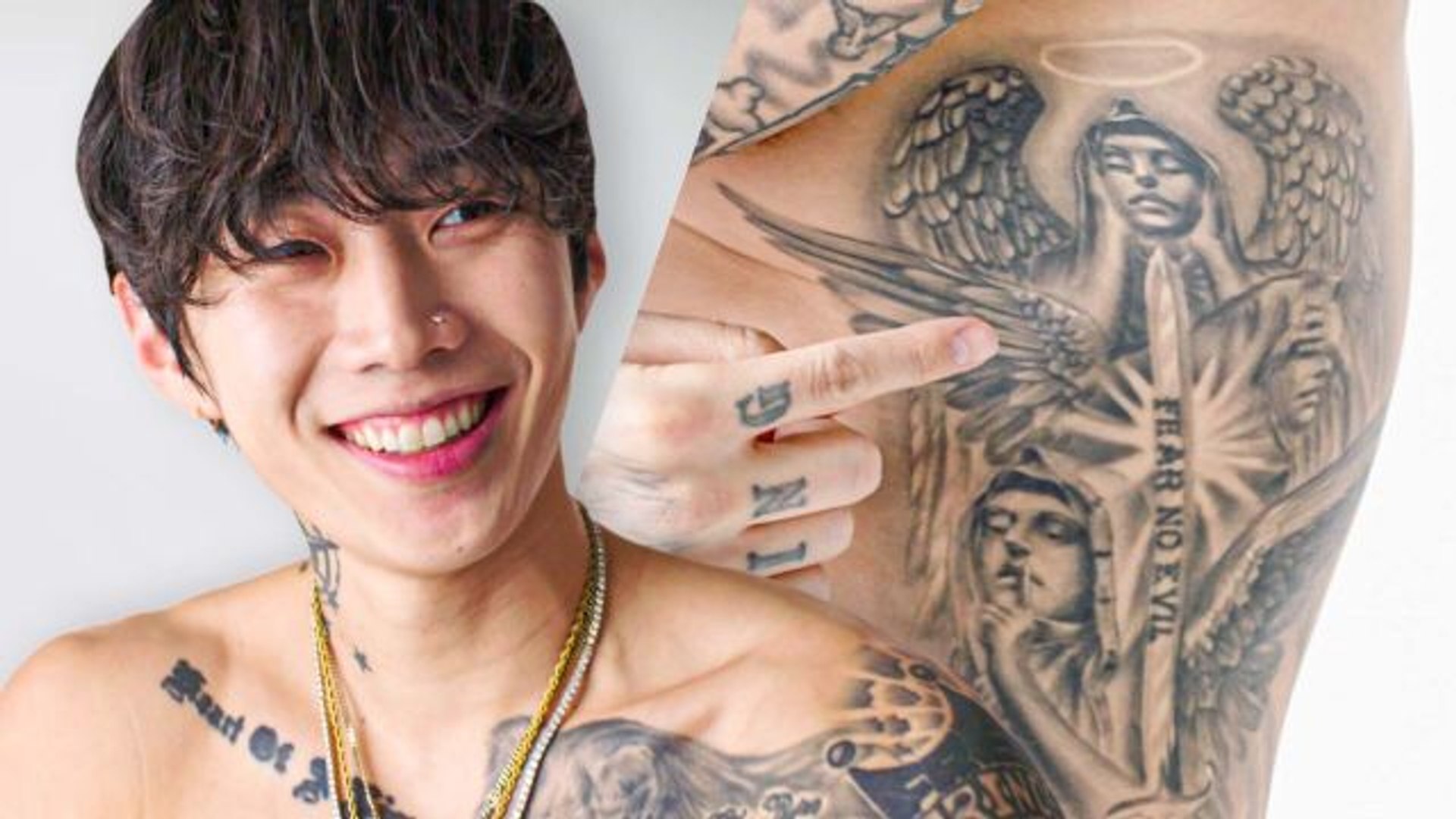
Jay Park’s tattoos are easy to spot, but they make more sense when you follow the story behind them. He has ink tied to his Seattle b-boy years, his music, his family, his faith, his fans and the people who helped him move from dance into a full music career. The collection is spread across his neck, chest, ribs, arms, hands, legs and back, so a single shirtless photograph never tells the whole story.

Jay has also talked about the tattoos himself. In GQ’s tattoo-tour videos, he explains which pieces hurt, which ones he forgets about and why certain words or images matter. Other published tattoo breakdowns identify the designs and dates, but they do not all carry the same level of proof. This guide keeps Jay’s own explanations beside the visual details instead of inventing a meaning for every star or line.

The first AOM tattoo sits behind Jay Park’s ear

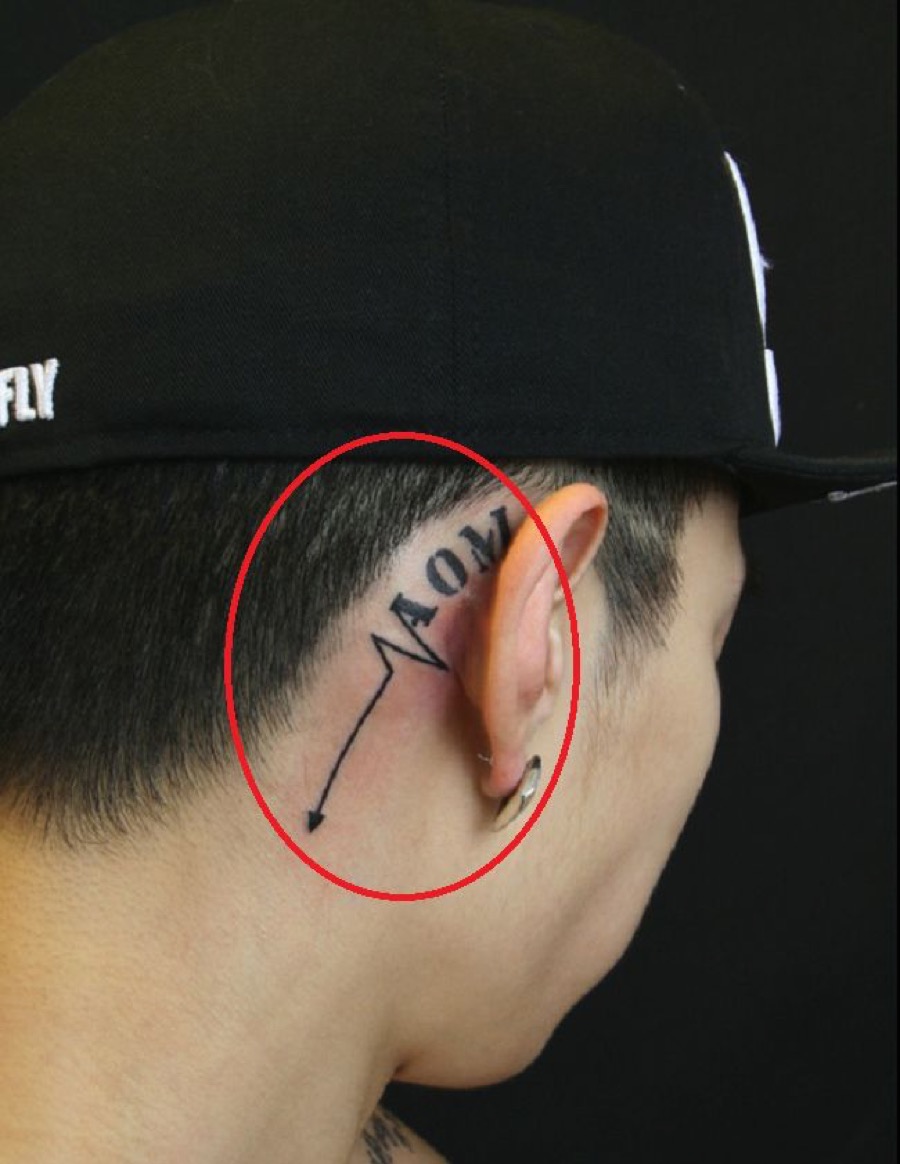
Jay Park tattoos: AOM crew tattoo behind the right ear

Jay’s first tattoo is the small AOM mark behind his right ear. AOM stands for Art of Movement, the Seattle b-boy crew connected with his early dance life. In an interview, Jay said the piece took about fifteen minutes. That detail sounds almost casual, but it explains why this tattoo matters: it connects the later singer and label founder to the crew and the street-dance world he came from.

The placement is discreet compared with the large work on his chest and arms. It can disappear under hair or a cap, then show up clearly when he turns his head. That makes it a useful starting point for the collection. Jay did not begin with a giant chest panel. He began with a short piece of lettering tied to the people he was moving with at the time.

A second AOMG tattoo appears elsewhere in the wider inventory, and the names are easy to mix up. AOM refers to Art of Movement, while AOMG is the record label Jay later founded. They belong to different stages of his career. The tattoos can be discussed together because both are part of his working identity, but they should not be treated as the same inscription.

Jay’s angel tattoo covers the back of his head

Jay Park tattoos: angel and rib tattoos shown in Jay Park tattoo tour

The large angel on the back of Jay’s head is one of his most dramatic pieces. It is not a tiny symbol that only appears in a close-up. The design runs across the rear of the head and upper neck, with wings and a central figure that become easier to read when he turns away from the camera. The scale also explains why the tattoo became such a talking point in Korean entertainment coverage, where heavily tattooed performers have often had to cover their ink on television.

Jay has said this was the most painful tattoo he had received. He credited tattoo artist Sanlee with the work and posted about it in 2016, joking that his hair would grow back. That combination of pain, size and placement gives the design a clear timeline. The angel was not simply another mark added between shows; it was a major session that changed the back of his head.

Angel imagery is often given a ready-made meaning online, but Jay’s own comments are more useful here. He has referred to angels watching over him and connected parts of his collection with belief and protection. The photograph shows the wings and the placement. His comments supply the personal context. There is no need to claim that every feather represents a separate idea.

The lion, family dates and chest lettering build Jay’s front panel

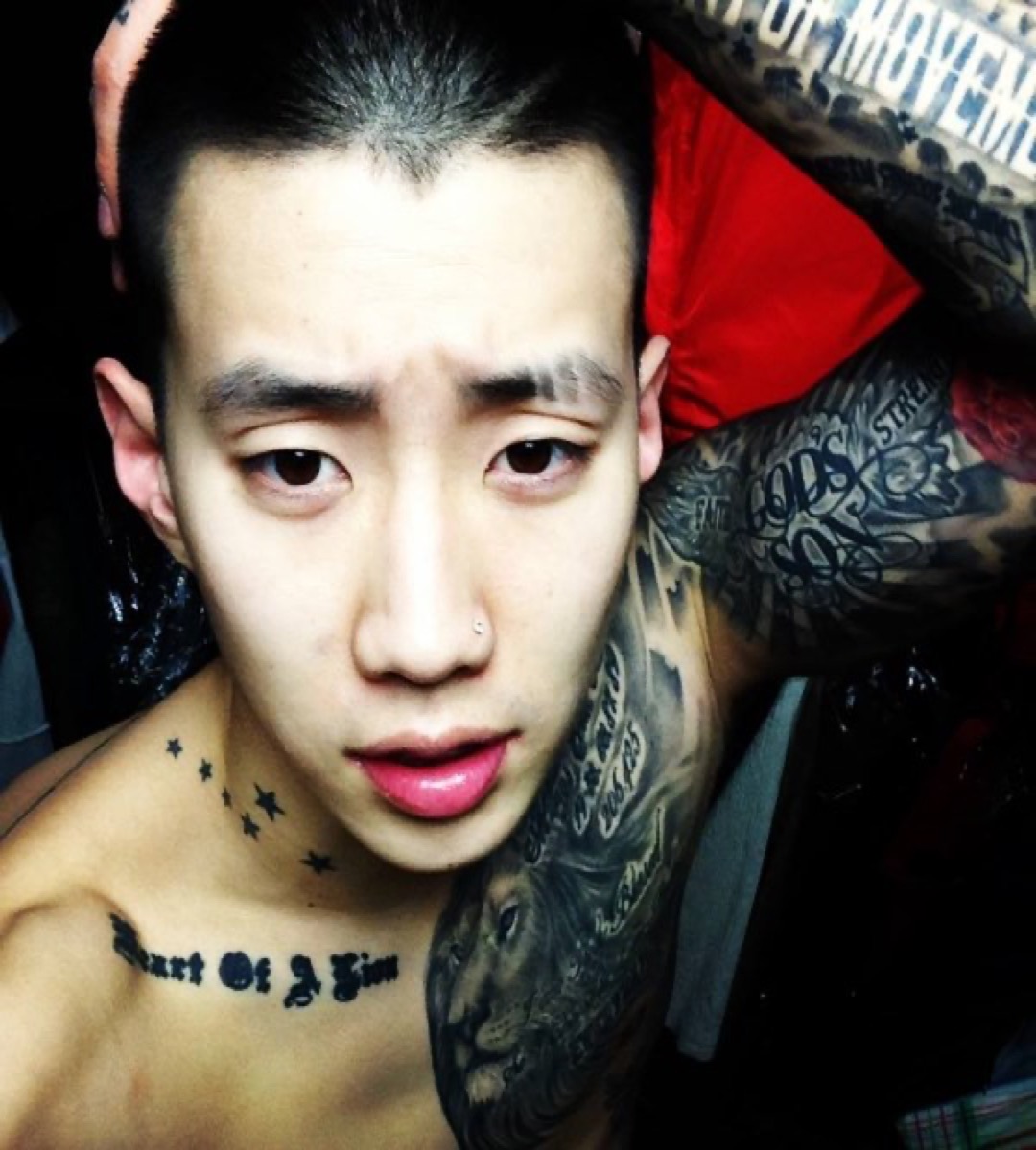
Jay Park tattoos: lion chest tattoo and chest lettering

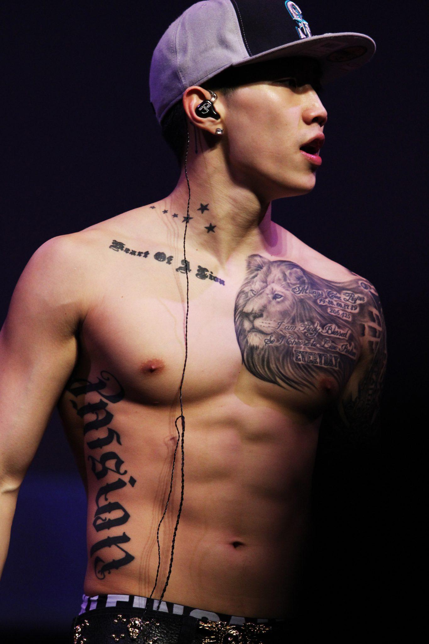
Jay’s chest is where several of the collection’s ideas meet. The most obvious piece is the lion across the right side of his chest and shoulder. It sits beside script, stars and other lettering, so it can look like one enormous tattoo when he is photographed onstage. A closer view shows separate elements layered around the animal rather than one flat block of ink.

Near the lion, Jay has lettering that includes “Heart of a Lion”, along with lines such as “I am Truly Blessed” and “Always Come Proper.” Some of those phrases have been explained as reminders about his attitude and the way he wants to carry himself. The wording is visible, while the exact weight of each phrase comes from Jay’s interviews and the way tattoo coverage has recorded his explanations.

Jay has also described a chest tattoo connected to the birthdays of his mother, father, brother and himself. That is one of the clearest family stories in the collection. The dates are not there as random numbers, and they do not need a more dramatic explanation. They are a compact family record placed beside the lion and the music-related lettering.

The front panel also includes the phrase “Start of J Park” and small stars near the collarbone. Photographs show how the pieces sit across the upper chest, but the arrangement changes with posture. A performance shot can stretch the lettering, while a selfie can make the lion look larger because the camera is closer to one side of the body.

Stars, the compass and Seattle references mark the neck and collarbone

Jay Park tattoos: neck stars and compass tattoo group

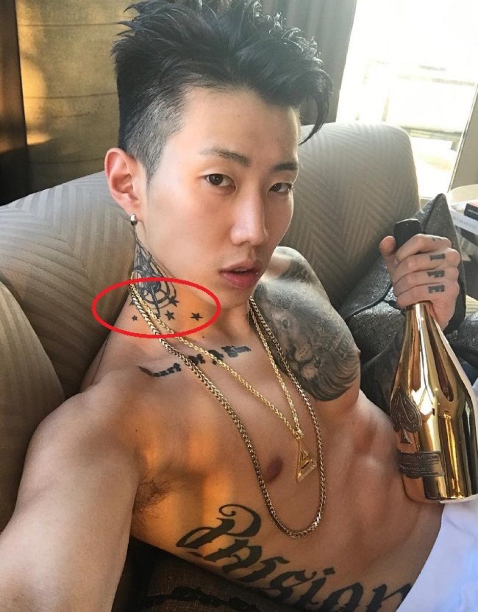
The stars climbing from Jay’s collarbone toward his neck are among the easiest small tattoos to recognise. They sit beside darker script and a compass-style design, creating a narrow vertical group rather than a full neck blanket. The stars are visible in older performance photographs and in close selfies, although their edges can look softer when the light is low.

Jay has explained the compass in a way that is more personal than the usual tattoo dictionary meaning. He described it as a reminder to follow his heart and also connected it with the Seattle Mariners. That Seattle link matters because the collection repeatedly returns to where he grew up. The compass is not just a generic travel image. It sits beside the AOM references, the family dates and the phrasework tied to his own route through music.

Published tattoo inventories also identify numbers connected with Seattle area codes, including 206 and 425. Those numbers are easiest to check in a clear upper-body photograph. They should be dated because the neck and shoulder pieces have appeared in different stages, with later additions making the original layout harder to isolate.

The neck group shows why Jay’s tattoos work visually even when the designs are small. The stars create movement up the body, the compass gives the group a central object and the lettering fills the flatter spaces around the collarbone. The image can establish that arrangement. Jay’s own explanation is what lets the Seattle reference stay specific instead of becoming a vague claim about “home.”

Jay’s arms and hands carry the music, b-boy and AOMG lettering

Jay Park tattoos: Jay Park hand and arm lettering tattoos

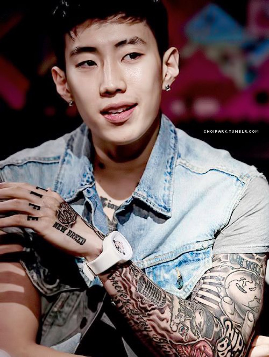
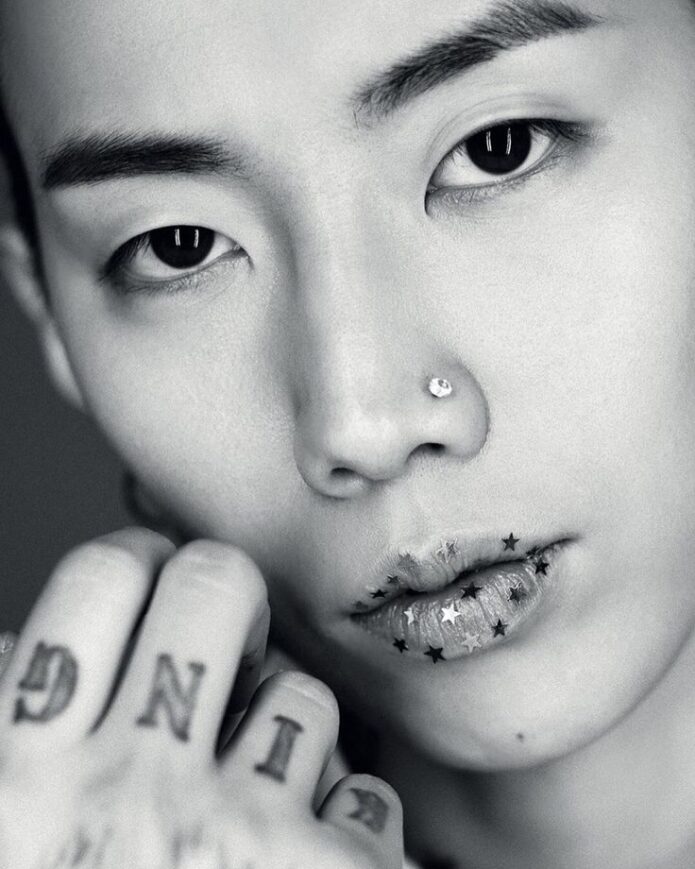
Jay’s arms contain the largest amount of lettering in the collection. The left arm has been photographed with “Hip Hop Bboy Life,” “Art of Movement,” “New Breed,” “Live Free” and other phrases, while the hands carry words such as “King”, “The Good Life” and “New Breed.” Not every inscription is equally clear in every image, but the overall pattern is consistent: the arms hold the vocabulary of his music and dance career.

“New Breed” connects with Jay’s first Korean studio album, released in 2012. “Art of Movement” points back to the crew that shaped his early identity. Those are not interchangeable pieces. One is an album reference and the other is a crew reference, even though both sit inside the same career timeline.

There is also a microphone, musical notes, a rose, a caricature of Jay with a Korean flag and a tattoo described as “Forever Stay Grindin.” These pieces give the arms a scrapbook quality. Jay’s collection is not built around one neat style. It jumps between bold lettering, small symbols, portrait work and traditional tattoo subjects, but the subjects keep circling back to music, movement and the people he values.

The hands are particularly easy to misread because rings and movement cover the ink. Close photographs show knuckle lettering, small shapes and a crowned lion that Jay has associated with the idea of being a king. A distant stage image may show only dark marks. It should not be used to claim a complete hand inventory when the fingers are folded or partly hidden.

Jay’s legs and back add another layer. Tattoo coverage lists AOMG and musical notes on the right leg, along with a microphone, rose, feather and eye, while another angel appears on the left leg. His upper back carries “JWALKERZ,” a tribute to his fanbase. These pieces extend the same themes found on the arms, but the locations are harder to photograph together, which is why an honest guide should call them a documented inventory rather than promise one perfect current count.

What Jay Park’s tattoo timeline shows

Jay Park tattoos: full upper-body tattoo timeline and lion placement

Jay’s tattoos developed in stages. The AOM mark belongs to his b-boy beginning. The family birthdays and lion make the chest personal, while the album and crew lettering turn his arms into a record of the work that followed. The angel on the head and legs shows how the collection became larger and more demanding over time.

The designs also explain why older images are still useful. A photograph from the early 2010s can show the first chest lettering or the Seattle stars before later additions changed the balance. A newer tattoo-tour video can explain a design that older galleries could only describe from a distance. Neither image should be treated as a complete map of every year.

Jay has said his tattoos represent things that matter to him, and that is a better way to read the collection than searching for a secret meaning in every symbol. Some pieces have direct explanations. Others are visually clear but personally unexplained. The difference does not make the less-explained tattoos uninteresting; it simply keeps the guide honest.

Seen together, the ink follows a fairly clear path: dance, Seattle, family, faith, music, albums, labels, fans and the physical work of building a career. The lion and angels make the collection immediately recognisable, while the small AOM, compass and star pieces give it a timeline. The arm lettering fills in the working history between those larger images.

That mix is what makes Jay Park’s tattoos worth breaking down one by one. They are not a random collection of unrelated flash designs, but they are not one perfectly planned sleeve either. They grew as his life and career changed. The best photographs show where each piece sits, and Jay’s own explanations tell us which stories are actually his.

Lil Meech’s Tattoos Carry BMF, Family and Loyalty Stories

Lil Meech’s tattoo collection is tied closely to family, loyalty and the BMF story, but it is more detailed than one famous neck piece. He has portraits, lettering, symbols and larger blackwork spread across his upper body. Some designs are easy to read in a photograph. Others only make sense when he explains why they are there. His GQ Tattoo Tour is the most useful source because Meech talks through the pieces himself instead of leaving every mark to guesswork.

The BMF neck tattoo connects Lil Meech to his father’s story

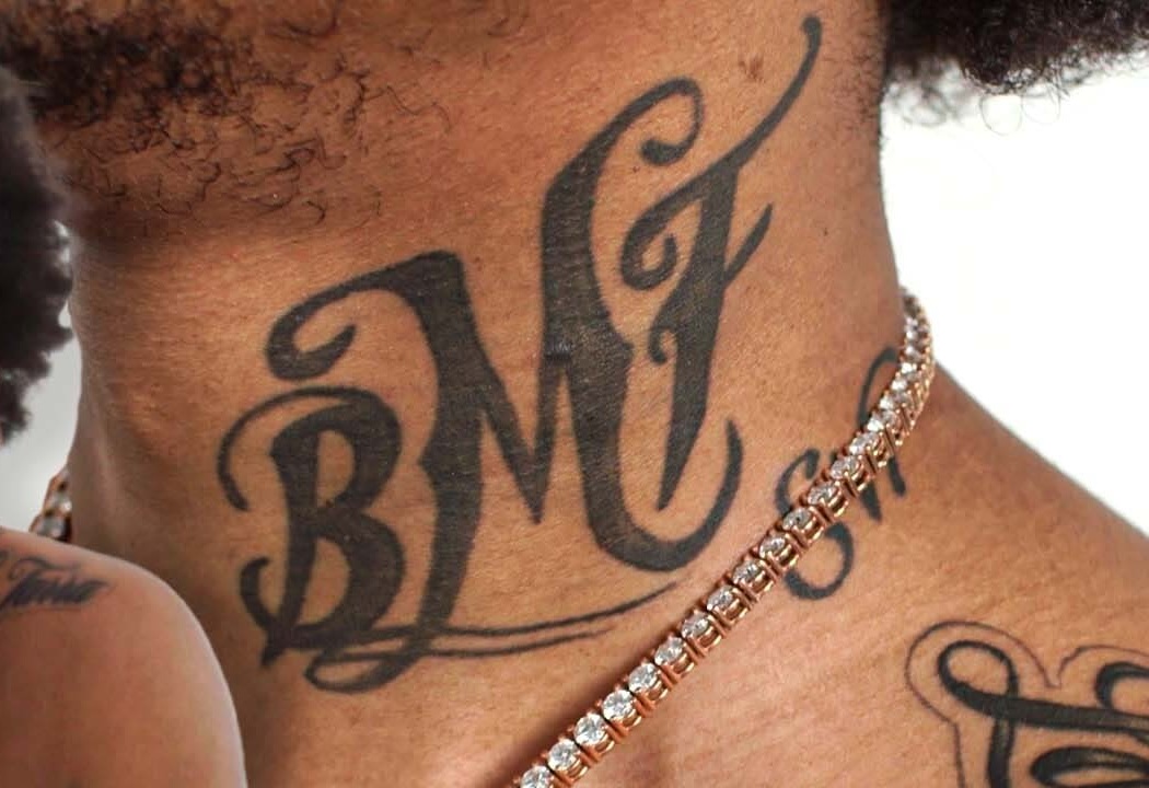
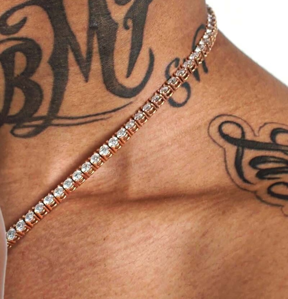
Lil Meech tattoos: Close crop showing the BMF neck tattoo

The BMF neck tattoo is the first thing most people notice. In GQ’s tattoo tour, he explains that the initials refer to Black Mafia Family, the organisation associated with his father, Demetrius “Big Meech” Flenory. This is not a mysterious set of initials that needs a clever interpretation. Meech says what it stands for, and the placement makes the connection impossible to miss.

He also admits that the neck tattoo became complicated once he started acting. A neck tattoo can be covered for a role, but it takes more time and makeup than hiding ink on an arm or shoulder. Meech talks about regretting the placement for that practical reason. That detail gives the piece a more honest story. It is both a proud family reference and a tattoo that can make certain jobs harder.

The lettering is heavy and deliberately visible. It sits high enough to appear above a shirt collar in some photographs, which means it became part of his public image quickly. The tattoo also explains why dates matter when people discuss his collection. A later photograph may show a new piece beside it, but the BMF letters remain the anchor point.

His mother and Big Meech were his first tattoos

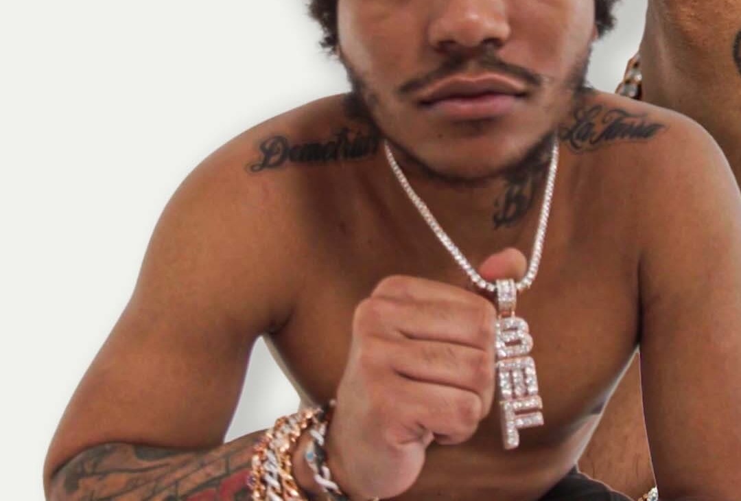
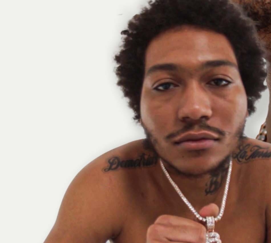
Lil Meech tattoos: Shoulder and upper-body lettering visible in the Tattoo Tour image

Meech says his first tattoos were connected with his parents, and he places those early decisions around the age of fifteen or sixteen. That timing matters because these were not designs added after he became famous. They belong to the beginning of the collection, before the BMF television series and the larger public conversation around his family.

The portraits of his mother and father turn the upper body into a family record. Portrait tattoos are difficult to get right because a small change in the eyes or mouth can make the likeness feel different. In the Tattoo Tour footage, the faces sit among lettering and other blackwork rather than appearing as isolated studio flash. The surrounding ink makes them feel like part of a personal wall of references.

He describes his parents with real affection, but the image does not prove a separate meaning for every line around the portraits. The careful reading is simple: these are family tributes, and Meech identifies the people they represent. There is no need to invent a second story for every shadow or decorative mark.

The parent tattoos also show how his style developed. Early portraits can look slightly separate from later pieces because they were added at different times. That does not make the collection messy. It shows a teenager starting with the people closest to him, then building outward as his life and career changed.

The lion and boss of all bosses pieces honour Big Meech

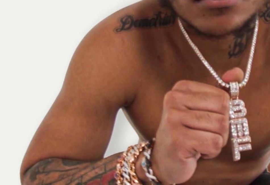
Lil Meech tattoos: Distinct chest and upper-body tattoo detail

The lion tattoo is one of the stronger images in the collection. Meech explains that he sees his father as a lion and a king, so the animal works as a direct tribute rather than a generic symbol of toughness. The tattoo took roughly six or seven hours, which gives some idea of the scale and the commitment involved.

A lion tattoo can mean almost anything when it is separated from its owner. Here, the explanation is much clearer. Meech connects it to Big Meech’s character and position in his family story. The design is still a lion on the skin, but the personal meaning comes from the way he describes his father.

Nearby lettering includes the phrase “boss of all bosses”, another expression Meech links with Big Meech. It sounds grand on its own, but in this context it is part of the language he grew up hearing around his father. The phrase and the lion work together: one is an animal portrait, the other is a direct piece of wording.

The combination also gives the upper body a clear visual rhythm. The portrait-style elements carry the face and eyes, while the words create long dark lines that guide the eye across the skin. This is why one distant photograph is not enough to catalogue the area. A close view shows the lettering, while a wider frame explains where the pieces sit around each other.

Death Before Dishonor and Blood Makes You Related tattoos

Lil Meech tattoos: Face, neck and lettering detail from the Tattoo Tour frame

Loyalty is another repeated idea in Lil Meech’s ink. During the GQ tour he points out the “Death Before Dishonor” wording, often shortened in tattoo discussions to DB4D. The phrase is blunt and easy to read. It does not need a long symbolic explanation because the wording already tells the reader what value it is meant to express.

Another line reads “blood makes you related, loyalty makes you family.” That sentence sits naturally beside the family portraits and the BMF references. It gives the collection a second definition of family, one based on conduct and loyalty rather than only genetics. Meech’s own explanation is enough to connect the words with the way he thinks about the people around him.

These inscriptions are also useful examples of why tattoos should be read from more than one angle. The photograph establishes the words and approximate placement. Meech supplies the context. Neither one needs to be stretched into a claim about every other design. A readable sentence can carry its own meaning without turning the whole body into a single slogan.

The lettering appears bold enough to survive ordinary event photography, but smaller details can disappear under shadows or jewellery. That is why the close-up image belongs beside this section. It lets readers see the actual forms of the letters instead of relying on a typed transcription alone.

Zasa Lil Zippo and the tattoos that are harder to cover

Lil Meech tattoos: Separate arm and side-ink crop for the smaller lettering and alias discussion

Some of the most personal labels in the collection are smaller. Meech discusses “Lil Zippo”, a nickname connected with his father, and “Zasa,” one of the names associated with Big Meech. These pieces do not have the same immediate visual impact as BMF across the neck, but they add detail to the family story.

Nicknames work differently from portraits. A portrait shows a face, while a name can feel like a private reference that has been made public. The wording also changes how the collection is photographed. A broad shot may establish that the writing is there, but only a tighter crop shows the font, spacing and exact placement.

Meech also talks about the practical side of getting ink around the neck, elbow and side. Some areas heal awkwardly, and some are difficult to cover when he is working. Those comments do not identify a new tattoo by themselves, but they explain why the collection can look different from one photograph to the next. Skin angle, healing and clothing all change what the camera can show.

Seen together, Lil Meech’s tattoos move through a pretty clear set of ideas: parents, Big Meech, BMF, loyalty and the names that carry family history. The collection is busy, but the individual pieces are not interchangeable. The BMF neck tattoo is a public identity marker. The portraits are family tributes. The lion and boss wording honour his father in different visual languages. The loyalty phrases state values, while Lil Zippo and Zasa preserve names that mean something inside the family story.

The safest guide is the one that keeps those pieces separate. Meech has explained a lot of the important tattoos himself, so there is no reason to fill the gaps with invented symbolism. The photographs show the designs, the Tattoo Tour supplies the stories, and the changing views of his body explain why more than one clear image is needed to understand the full map.

There are also small practical details that are easy to miss in a quick gallery. The neck lettering sits differently when Meech turns his head, portraits lose detail when a chain crosses them, and dark clothing can hide the edges of an upper-body piece. A good tattoo guide therefore needs both a wider frame and close crops. The wider view shows how the collection sits together; the close view lets the reader check the words and lines for themselves.

That balance keeps the writing grounded. It is fair to call these tattoos family-centred because Meech repeatedly explains the connection. It would be too much to assign a private story to every small mark that appears beside them. The designs are interesting enough without invented backstory, and the best photographs leave room for the reader to see the work rather than burying it under vague claims.

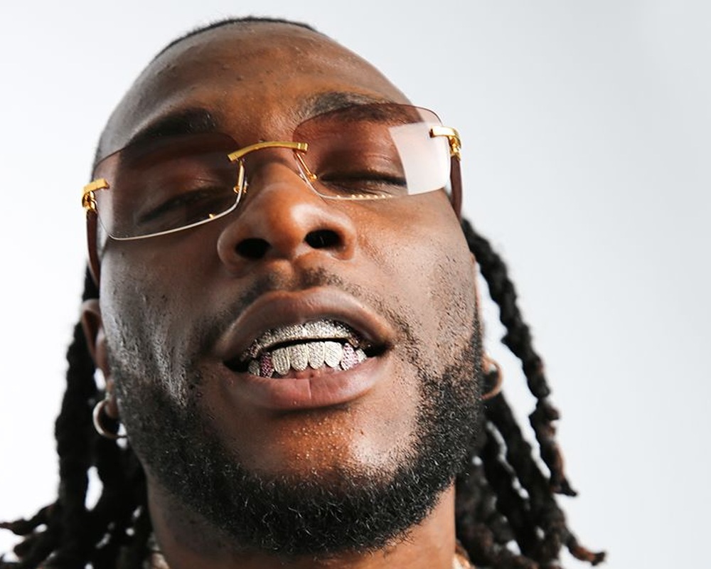
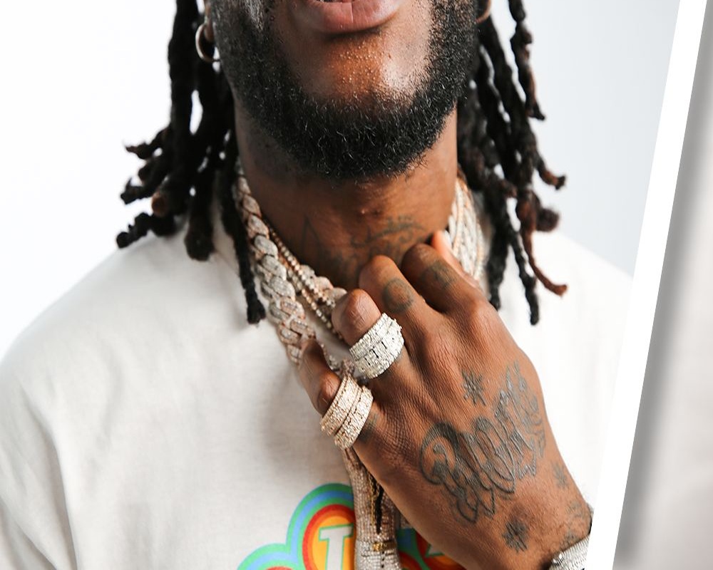
Burna Boy’s Tattoos: Fela Kuti, Family and the Ink Behind the Music

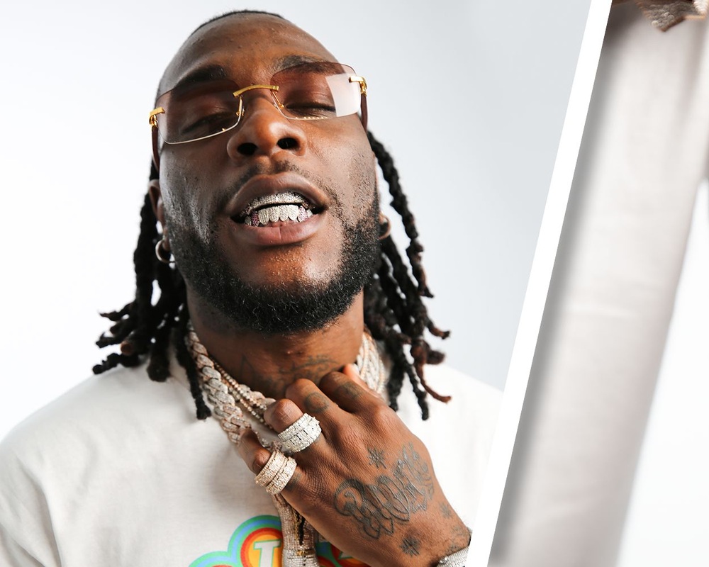
Burna Boy’s tattoos are a mix of faith, family, music and Nigerian identity. He has lettering on his hands, portraits on his arms, names worked into a graffiti-style wall and symbols that point back to home. The useful thing about his GQ Tattoo Tour is that Burna explains many of the designs himself. That gives the collection a lot more shape than a simple list of what can be seen in a concert photo.

Psalm 38 and the Rock Star hand tattoo show Burna Boy’s early ideas

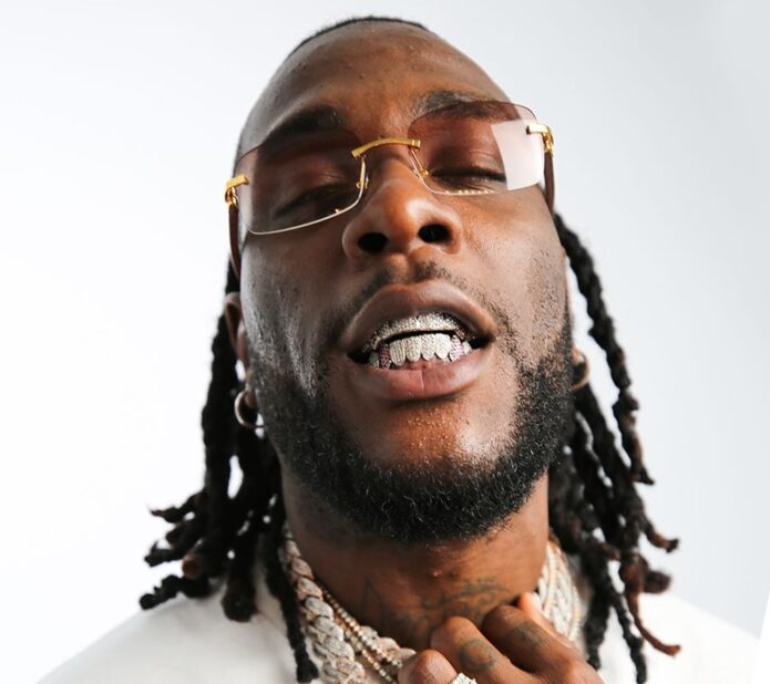
Burna Boy tattoos: Close tattoo-tour crop showing Burna Boy’s neck and upper-body lettering

Burna starts his tattoo tour with Psalm 38. He says the passage came from a dark place and that the words felt like a song he could have written himself. That explanation is unusually direct. The tattoo is not being presented as a random Bible reference or a decorative piece of lettering. It belongs to a particular period and carries the memory of how he felt then.

He then shows the hand tattoo that reads “Rock Star.” The clever part is the way the lettering changes when he turns his hand. From one angle it reads “rock,” from another it reads “star,” and together the two views make the full phrase. That makes the design work as both a readable label and a small piece of movement.

Another finger tattoo says “God’s love.” Burna describes that as the fuel of the earth. Again, the useful information comes from what he says rather than a guess based on the words alone. The hand pieces are small, but they are placed where they can be seen during performances, interviews and photographs.

These early tattoos also show the difference between a design and its timing. Psalm 38 carries a specific emotional memory, while Rock Star is closer to a public description of the artist he was becoming. The two ideas sit next to each other without needing to be forced into one story.

Family names turn the wall tattoo into a personal map

Burna Boy tattoos: Hand and finger tattoo detail from Burna Boy’s GQ Tattoo Tour

One of Burna Boy’s larger pieces is built like a wall. He describes it as brickwork with the word “family” worked into the surface, along with the names of family members scattered through the design. It reads less like a single picture and more like a collection of names that he carries with him.

The wall matters because the letters are not arranged like a neat list. The names are spread around the brick shapes, so the tattoo has a rough, layered look. A photograph can show the overall idea, but close detail is needed to separate one name from another. That is why this section needs a hand and upper-body image rather than a generic portrait.

Burna also describes a bleeding heart that still shines. His explanation is that something can look bright while still carrying pain. The contrast is simple and memorable: the shine does not cancel out the bleeding. The image gives the collection an emotional piece without turning it into a vague statement about suffering.

There is a balance between the personal names and the graphic surface. The brick wall gives the area structure, while the names make it private. It feels more like a family noticeboard than a polished emblem. That roughness suits the way Burna talks about the tattoo, as something filled with people rather than one perfect symbol.

Fela Kuti tattoos and ariwo ju sit at the centre of Burna Boy’s musical tribute

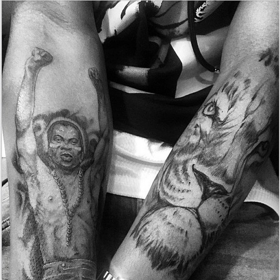
Burna Boy tattoos: Distinct arm photograph showing portrait and lion tattoo work

The Fela Kuti portrait is one of the clearest statements in Burna Boy’s collection. He calls Fela his hero and says he was the best musician who ever lived. The portrait is therefore not just a famous face placed on the arm. It records a musical influence that Burna has spoken about repeatedly.

Under the portrait is the phrase “ariwo ju.” Burna explains that it was a nickname Fela and Maganda used for each other. That small line makes the tribute more specific. The portrait identifies the person, while the words connect the piece with a phrase from Fela’s own world.

The arm photograph also shows why people can misread tattoo coverage when they only see a stage image. A sleeve or forearm may be partly hidden by a shirt, jewellery or a microphone. A close crop reveals the portrait and nearby work, while a wider photograph helps explain how the image sits on the arm.

Burna’s admiration for Fela is also part of the wider story of his music. The tattoo does not prove that every other design is a political statement, but it does show that musical history matters to him. Fela is a named influence, and the ink gives that influence a permanent place on his body.

The Nigerian coat of arms and omo niger tie the collection to home

Burna Boy tattoos: Wide tattoo-tour crop showing the arm and hand lettering together

Burna points out the Nigerian coat of arms in the Tattoo Tour. He explains the three rivers meeting and identifies the River Niger in the design. Beneath it, the words “omo niger” mean child of Nigeria. The tattoo is a straightforward piece of national identity, but the details give it more depth than a flag or a simple country name.

The coat of arms works visually because it has a recognisable shape and several smaller elements inside it. On skin, those details can disappear when the photograph is soft. A wide body shot shows that the symbol exists, but the sharper image lets readers see why Burna describes the individual parts.

This is where the collection connects to the phrase African Giant too. Burna’s tattoos often carry his Nigerian identity alongside his music identity, rather than separating the two. The designs do not all use the same style, but they keep returning to home, family and the people who shaped him.

That does not mean every piece needs an invented national meaning. The coat of arms and omo niger wording are the designs he explains. Other nearby lines can be described by what is visible until he gives them a separate story.

African Giant and the smaller symbols complete the body-art story

Burna Boy tattoos: Separate face and upper-body crop for the collection’s smaller symbols

The phrase “African Giant” has also been photographed across Burna Boy’s abdomen. It is closely tied to the album and to the public identity he built around that era. Unlike the small finger words, this is a large piece of lettering meant to be read across the torso.

His catalogue also includes a hydroplane, a tribute to his first album “L.I.F.E: Leaving an Impact For Eternity,” a memorial to his best friend Gambo, and a symbol connected with the people who found him. These designs cover different parts of his story: travel and possibility, the beginning of his recording career, friendship and the team around him.

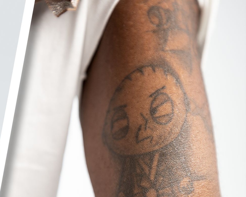
One of the more unusual pieces is Scarface Stewie from Family Guy. Burna says he cannot explain the full reason for getting it and that only people who knew him in 2010 would understand. That uncertainty is part of the record. A tattoo can be real and clearly visible without having a public explanation attached to it.
He also gives a useful warning at the end of the tour: do not jump into a tattoo and make sure it is something you can live with. His own collection includes serious family portraits, national symbols, album references and a cartoon character whose original joke is private. That mix is exactly what makes it interesting.

Seen together, Burna Boy’s tattoos are not one neat sleeve with one message. They move from Psalm 38 to Rock Star, from family names to Fela Kuti, from the Nigerian coat of arms to African Giant. Some pieces are about faith, some about music, and some are simply records of friends, albums or an earlier version of himself. The clearest guide keeps each tattoo beside the image and explanation that actually support it.

The collection also rewards a slower look at placement. Burna’s hand tattoos are always close to the camera when he handles a microphone, while the larger arm work can vanish under a sleeve. The torso lettering needs a different kind of photograph because the words stretch across a wider area. Those changes are not evidence that a tattoo has disappeared; they are simply the result of clothing, posture and the way a picture was taken. Dates matter as well. A design connected with an early album belongs to a different stage of his career from the African Giant lettering or a later tribute. Reading the tattoos in that order makes the collection feel like a timeline rather than a random gallery. It also keeps the descriptions honest. When Burna gives a name or explanation, it can be reported directly. When a photograph only shows a dark outline, the safer description is the visible shape and location, not a confident story about private meaning. That approach leaves room for the tattoos to be personal without pretending every detail has been explained publicly.

That is why the best images show the ink clearly while leaving the surrounding story in Burna’s own words.

The photographs make the separate designs easier to compare, especially when clothing hides part of the collection.

Trey Songz’s Tattoos Tell Stories About Family, Faith and Weathering Storms

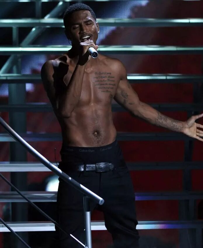
Trey Songz’s tattoos are unusually easy to connect to his own words. In his GQ Tattoo Tour, he explains where the designs came from, who they represent and why some of them have stayed on his skin even after the circumstances changed. The collection includes a teenage cross, a family prayer, angel wings across his back, a storm-and-sun design, initials and a relationship tattoo he has not covered. They do not all look alike, but they share one habit: Trey says he helped draw or shape most of them himself.

The first cross tattoo carries a Tupac-inspired message

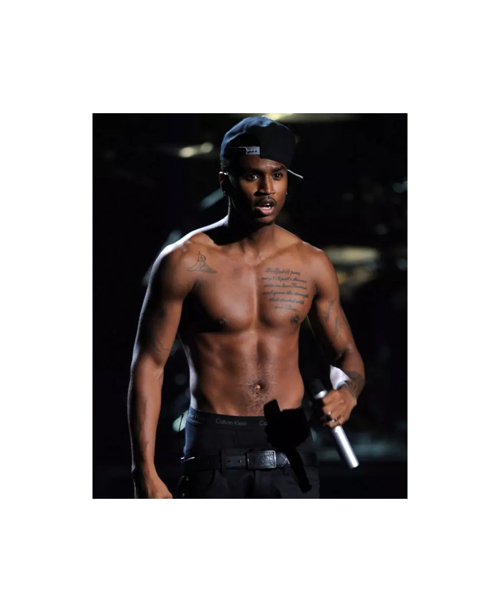
Trey Songz tattoos: Different published photograph showing Trey Songz’s shoulder and arm tattoo coverage

Trey says his first tattoo was a cross on his right arm reading “Only God Can Judge Me.” He got it when he was around sixteen or seventeen. The line was partly a way of nodding to Tupac, whose music and image had a major influence on him. It was also a practical choice because he thought his mother might be less angry if the teenage tattoo carried a religious message.

The story is funny in the way Trey tells it, but the design still marks an important beginning. This was not a fully planned sleeve or a piece commissioned after fame. It was a young person choosing a phrase that connected faith, music and a little bit of rebellion. He says his mother was still mad, which makes the memory feel more real than a polished origin story.

The cross is also a good reminder that placement changes how a tattoo is read. On the arm, the image can be seen in photographs and performances, but it can also be hidden by a sleeve. The words carry most of the meaning, while the cross gives the phrase a clear visual anchor.

A chest prayer brings Trey Songz’s family into one design

Trey Songz tattoos: Distinct performance photograph where the chest prayer and arm ink are visible

Trey calls the chest prayer his favourite tattoo. He wrote the prayer himself, and the wording brings several family references together: April is his mother, Forrest is his younger brother and Rose is his grandmother. The sentence begins, “To God I pray may April’s showers rain on her Forrest and grow the strength that started with one Rose.”

The wording is personal without being difficult to follow. April’s name becomes a shower of rain, Forrest becomes the person that needs to grow strong and Rose becomes the family starting point. It is a wordplay-heavy way of fitting multiple people into one piece, and Trey explains the links clearly enough that the design does not need invented symbolism.

The chest gives the prayer room to run across the body. Unlike the short phrase on his arm, it needs a wider photograph before the reader can understand its rhythm. A close image also matters because script tattoos can look like dark lines when the photograph is small or poorly lit.

Trey says he worked with the artist rather than simply selecting a finished design. That fits his wider description of the collection. He liked drawing as a child, and he says most of his tattoos came from ideas that resonated at home and were developed with the artist.

Angel wings on the back grew from his grandmother’s warning

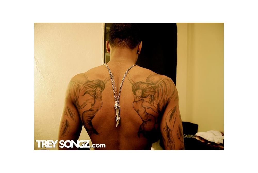
Trey Songz tattoos: Separate studio photograph showing the full angel back composition

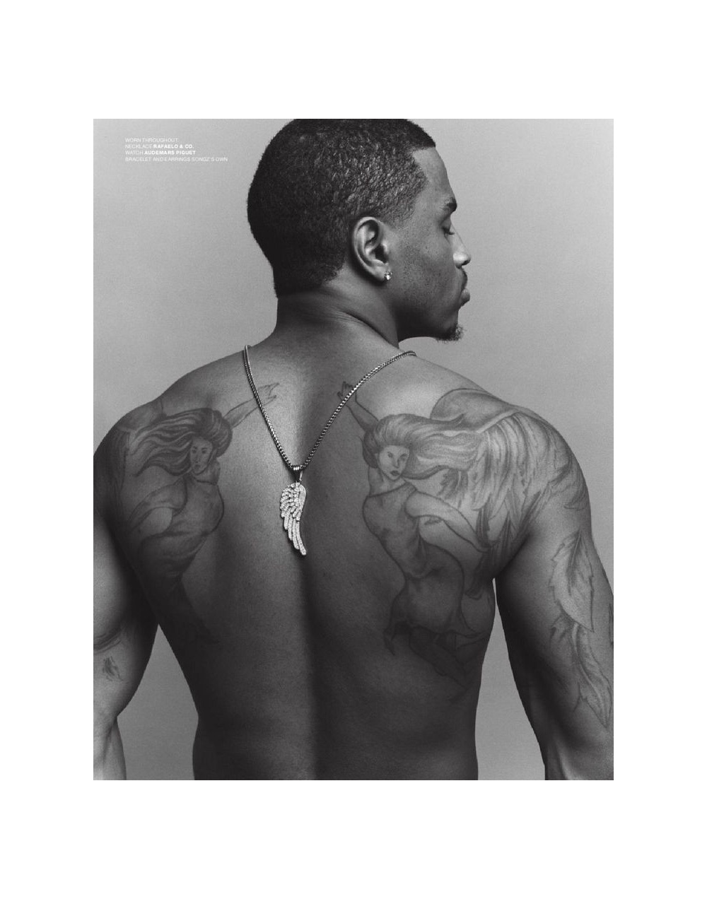
The angel wings on Trey Songz’s back are the most recognisable part of his collection. He says his grandmother always told him to “watch your back” whenever he left the house, even if he was only going out for a few minutes. He turned that repeated warning into a visual idea: angels watching over him.

The wings are not presented as perfectly untouched feathers. Trey describes them as weathered from fighting through storms, with leaves falling away while the angels remain. That detail changes the mood of the design. They are not just decorative wings placed across the shoulder blades. They represent protection that has survived difficult periods.

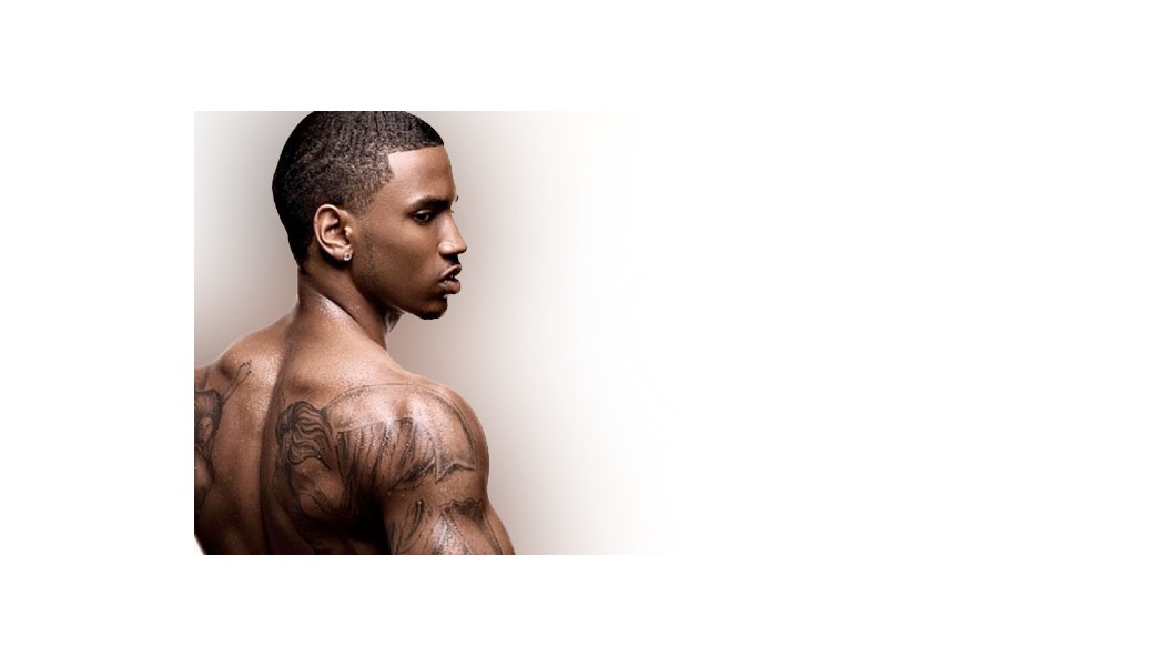
The back is also a placement that needs more than one photograph. A rear studio portrait shows the full symmetry, while a three-quarter view reveals how the wings move across the shoulders and down the upper arms. Those are genuinely different views of the same tattoo, not separate designs, so the article keeps the composition together rather than pretending every visible feather is its own tattoo.

Trey credits the artist Nelly with building the strongest bond around his body art, and he says the back tattoo dates from 2008, shortly after he cut his braids. The date gives the wings a place in his career timeline. They belong to an early stage of the public Trey Songz image, before some of the later lettering and relationship ink.

The storm tattoo turns hardship into a visual timeline

Trey Songz tattoos: Distinct close photograph of the Through the Storm wrist design

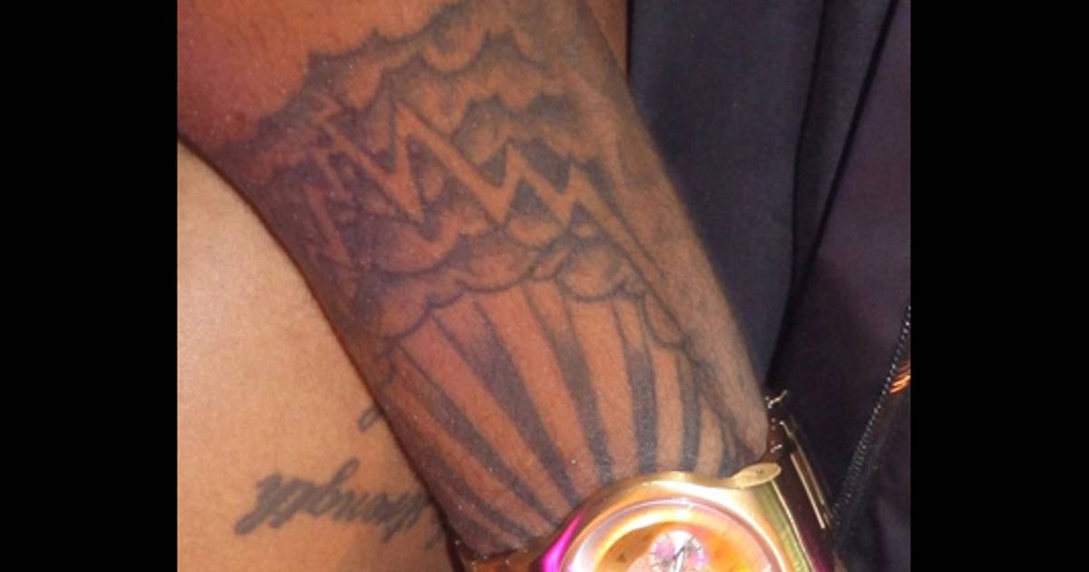
On another part of the collection, Trey describes a storm with the sun shining at the end. His explanation is simple: if you make it through the storm, the sun will shine. The Through the Storm tattoo has clouds, lightning and rays, so the picture carries its message even before he explains it.

This design works differently from the family prayer. The prayer names specific people, while the storm is a more general image of endurance. It can hold different experiences without needing to identify one private event. Trey’s own wording keeps the interpretation grounded in perseverance rather than turning the tattoo into a claim about a particular crisis.

The wrist and arm are practical places for a design that he wants to see often. At the same time, a wrist tattoo is easy for a camera to distort. A watch, bracelet or stage lighting can hide parts of the outline. The BET photograph is useful because it shows the design as a real piece of ink instead of relying on the transcript alone.

The weather language connects back to the angel wings, but the tattoos should still be treated as separate designs. One is about his grandmother’s warning and protection; the other is about getting through hardship. The shared storm idea creates a visual conversation without proving that they were designed as one planned set.

Family initials and relationship ink keep the collection personal

Trey Songz tattoos: Separate profile photograph showing the back and shoulder tattoo placement

Trey also has a group of initial tattoos for the women who raised him. He names his grandmother, other grandmother, aunts and mother as the people represented. The letters are not as visually loud as the wings or chest prayer, but the idea behind them is just as direct. He was raised mostly by women, so the initials create a compact family record.

There is also a wrist tattoo made with a former girlfriend. It combines their initials with an infinity sign. Trey jokes that the infinity symbol is tricky because they are no longer together, but he has not covered it. His explanation is more thoughtful than the joke: changing the piece would require something that meant more than the love they shared at the time.

That is a useful detail about cover-ups. Leaving a tattoo in place does not necessarily mean the relationship is current, and changing it does not erase the fact that it once mattered. Trey treats the design as part of his history. The photograph identifies the initials and symbol, while his interview explains why the tattoo has remained.

Put together, the collection moves from a teenage Tupac reference to a family prayer, then into protection, recovery and personal relationships. Trey’s tattoos are not simply decoration around a famous singer’s body. They are sketches of the people and ideas he wanted close to him at different ages.

He ends his tattoo tour with practical advice: study the artist, make sure the work is genuinely good and remember that the change is permanent. That advice fits his own collection. The cross, prayer, wings, storm, family initials and infinity mark all came from real moments, and each one still carries a trace of the person Trey was when he chose it. The images show the placement; his explanations supply the meaning; neither needs to be padded with guesses.

The placement changes how the collection is photographed. A back piece needs a rear portrait, a chest prayer needs a front view, and a wrist design is easiest to read in a tight close-up. Those are different photographs, not repeated versions of one image. Clothing, chains, lighting and posture can hide an important line, so a careful guide uses the clearest genuinely separate frame for each tattoo group rather than stretching one picture across the whole page.

That distinction matters when looking at older celebrity tattoo photographs. A picture from one album era may show the wings clearly but hide the wrist, while a later performance shot may reveal the prayer and arm lettering but leave the back covered. The collection should be read as a timeline of separate choices, not as proof that every mark was designed in one sitting. Trey’s own comments make the strongest details clear, especially when he names the people, dates or memories behind a tattoo. For the smaller marks, the responsible approach is to describe what the photograph actually shows and leave private meanings private.

Separate photographs make the placement and lettering easier to read without recycling the same frame.

SZA’s Tattoos: Ctrl, LANA, Kirituhi and the Designs She Has Shown

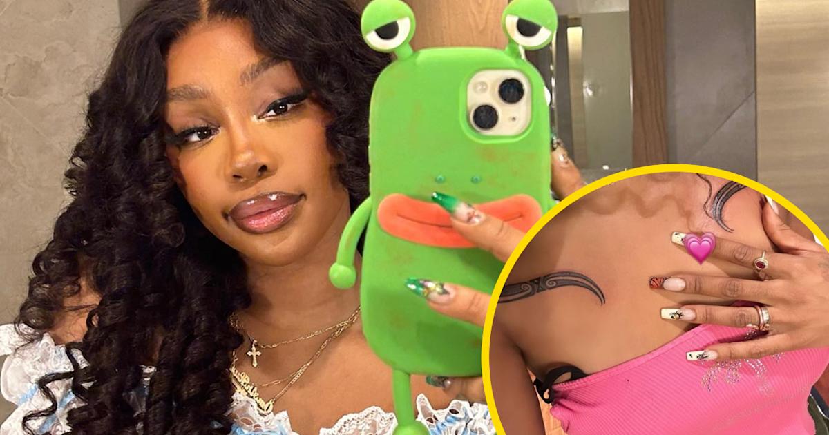
SZA’s tattoos have changed with her music, and they don’t all belong to the same visual style. There are tiny finger inkings, a readable album title, a childhood name across the lower back, a light bulb on the hip, a butterfly on the arm and newer work that carries family history across the chest. Some pieces are easy to spot in a concert photograph. Others only appear when she turns her body toward the camera or posts a close-up herself.

The useful way to read SZA’s collection is to separate the tattoos she has explained from the ones that are simply visible. She has given a clear story for the “Ctrl” forearm tattoo, the “LANA” lower-back lettering, the Morse-code SOS mark and the Māori-inspired kirituhi pieces. Other designs, such as the light bulb and butterfly, are well documented visually but do not have a confirmed explanation from SZA. The difference matters. A good tattoo guide can describe a design without pretending to know a private reason behind it.

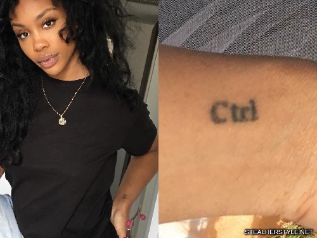
SZA’s Ctrl forearm tattoo marked a new chapter in her career

SZA tattoos: clear close-up of SZA’s Ctrl forearm lettering

The word “Ctrl” is tattooed on SZA’s left forearm in simple black lettering. It is small, direct and easy to read when her arm is uncovered. The tattoo was connected with her debut studio album, which arrived in 2017, and it appeared before the release. That timing gives the piece a clear place in her career timeline: it was not a random word added years later, but a mark attached to the project that introduced her to a much wider audience.

SZA has spoken about the idea behind the album title. In an interview, she described control as something she wanted, chased and struggled to hold. The tattoo works because the word has several meanings at once. It can refer to the album, but it also reflects the tension in the songs between wanting certainty and accepting that life will not always provide it.

The placement on the forearm makes the lettering easy to show in photographs and performances. It is not hidden beneath a shoulder or tucked around the hip. It sits in a place that can be seen when she holds a microphone, rests her hand near her waist or poses with her arm bent. The design itself stays plain, which keeps the focus on the word rather than on decorative framing.

Fans have copied the title as their own tattoo, but SZA’s version is tied to her release history. That is why the date and the lettering belong together. A reader looking at the ink is seeing both a piece of body art and a small piece of the Ctrl era.

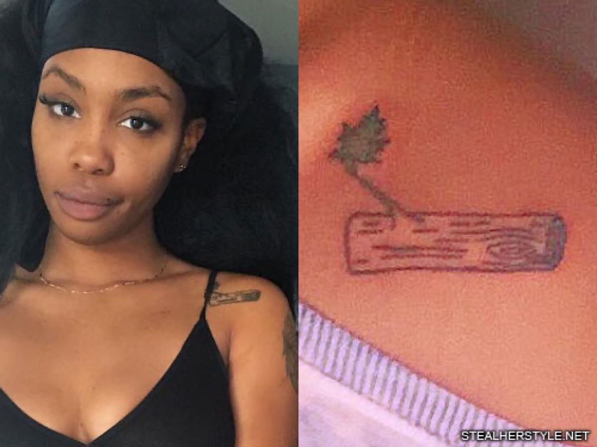
A floral branch sits across SZA’s upper chest

SZA tattoos: clear close-up of SZA’s branch and flower chest tattoo

SZA has a small tattoo across the upper chest that is often described as a branch or leafy floral design. The image shows a horizontal shape with a flower at one end and wood-grain lines inside the main form. It sits near the collarbone, where the design can be covered by a strap or revealed by a lower neckline.

The tattoo has a lighter feel than the dense black lettering on her back. Its outline is thin, and the composition depends on the relationship between the branch, the flower and the open skin around it. From far away it can look like a short bar or a small decorative mark. In a closer view, the organic details become easier to separate.

There is no dependable first-person explanation for the exact flower or branch. That means it should not be labelled as a memorial, a family symbol or a reference to one of SZA’s songs without stronger evidence. It is enough to say that the piece adds a small nature motif to the chest and sits apart from the newer kirituhi tattoos.

The placement also shows why SZA’s tattoos can disappear from ordinary press photographs. Hair, jewellery and clothing often cover the collarbone. A clear image of the chest is more useful than a red-carpet portrait where only one end of the design is visible.

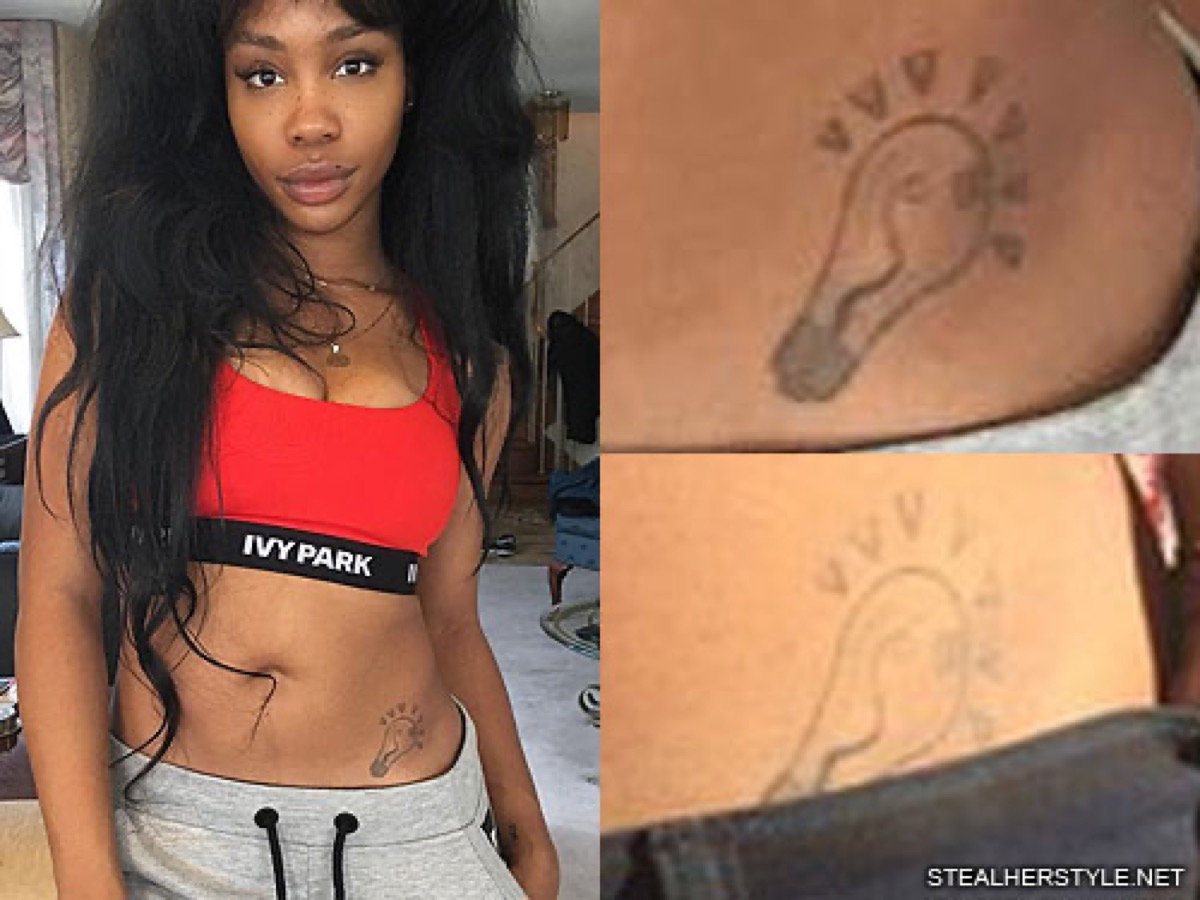
The light bulb tattoo on SZA’s hip is small but easy to recognise

SZA tattoos: clear close-up of SZA’s light bulb hip tattoo

The light bulb on SZA’s left hip is one of the more playful designs in her collection. It has a rounded bulb, a narrow base and short lines around the top suggesting that it is switched on. The shape is drawn in a simple outline style rather than filled with heavy colour. That keeps it readable even though the tattoo itself is fairly small.

Light bulbs are often used as shorthand for an idea or a moment of inspiration, but that general association is not the same as a confirmed meaning from SZA. The photograph establishes the design and the placement. It does not tell us whether she chose it because of music, creativity, a private joke or simply because she liked the shape.

The hip is a very different canvas from the forearm. It is normally covered, so the bulb appears in older personal photographs and fashion images rather than in every public appearance. When it is visible, it gives the collection a softer interruption between larger areas of skin. The tattoo feels almost like a margin note beside the body rather than a headline piece.

Its outline also appears to have softened in some photographs. Lighting and image quality play a part, but the basic shape remains clear. That is why the bulb belongs in a detailed inventory even though it does not carry a long documented story.

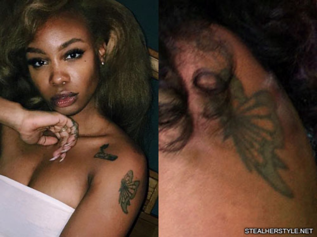
SZA’s butterfly tattoo brings a traditional flash shape to the arm

SZA tattoos: clear close-up of SZA’s butterfly upper-arm tattoo

The butterfly on SZA’s upper left arm is a more recognisable traditional-style image. The wings are dark and patterned, with a compact body in the centre. It sits high enough on the arm to show when she wears a strapless top, but it can disappear beneath a sleeve or behind her hair in a casual photograph.

Butterflies are common tattoo subjects, which can make people rush to assign a meaning such as transformation or freedom. Those ideas may fit the general symbol, but SZA has not publicly confirmed that one of them is the reason for this particular piece. The strongest description is visual: a butterfly, placed on the upper arm, with bold wing shapes and a darker outline.

The style is noticeably different from the fine lettering of “Ctrl” and the simple light bulb. That difference is part of the appeal. SZA’s tattoos are not arranged like a single sleeve with one artist or one strict colour palette. They look collected over time, with each design keeping its own character.

The butterfly also shows how a small tattoo can change depending on the pose. In a close portrait it becomes a clear focal point near the shoulder. In a full-body stage photograph it may be reduced to a dark patch. A useful reference needs the closer view so readers can see the wing pattern rather than guessing from a distant outline.

The snake tattoo curls across SZA’s finger

SZA tattoos: clear close-up of SZA’s snake finger tattoo

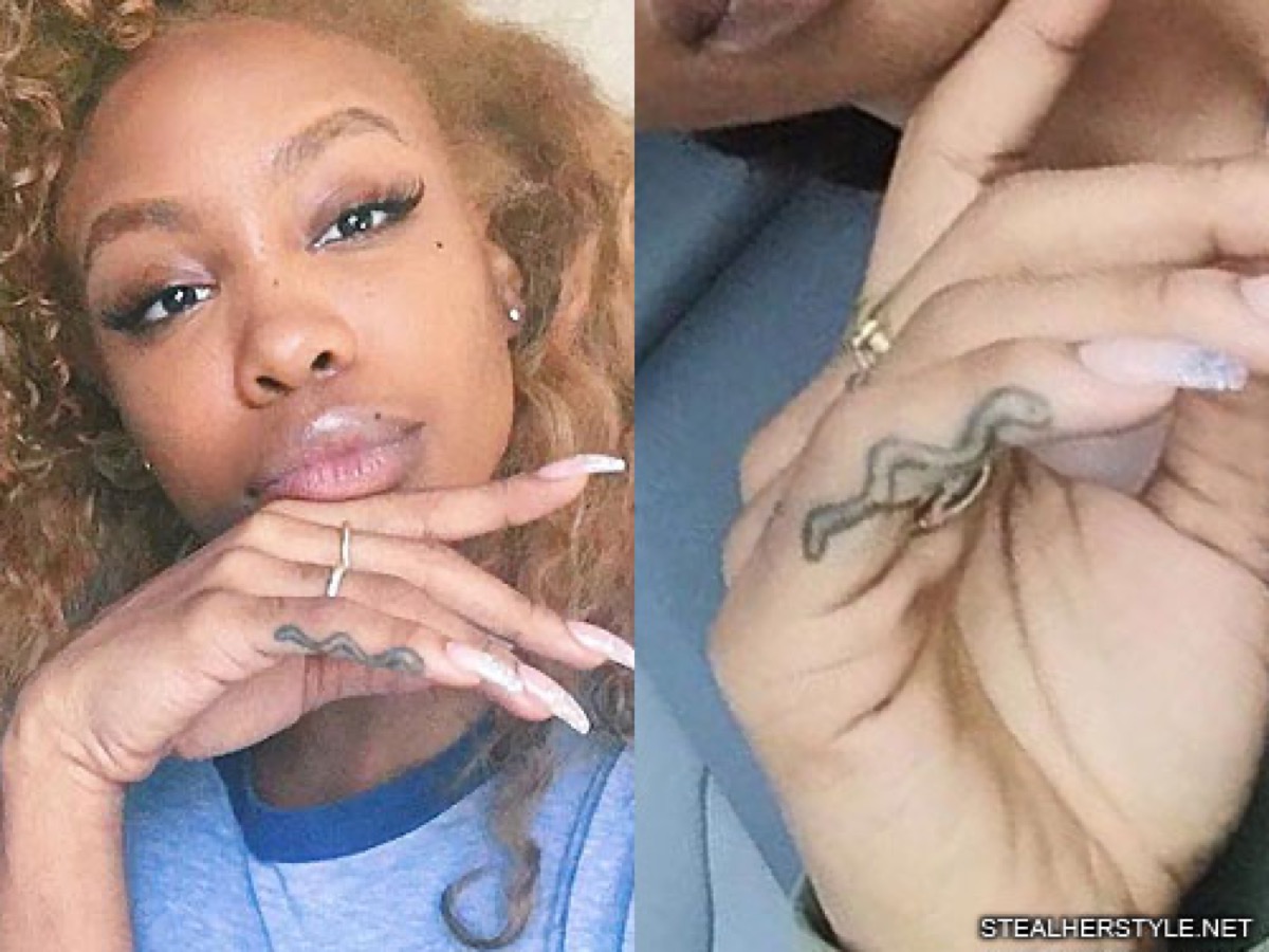
SZA has a small snake tattoo on a finger of her right hand. The design follows the narrow space along the digit, so the body of the snake appears to curl rather than stretch in a straight line. Its scale is much smaller than the butterfly or the chest lettering, but the subject remains recognisable in a close-up.

Finger tattoos are difficult to document because hands are constantly moving, and rings or long nails can cover the design. SZA’s snake is clearest when her hand is held close to the camera. In wider images it can look like a loose squiggle or a shadow across the finger. The close-up makes the head, body and curved outline easier to identify.

There is no confirmed explanation from SZA for this snake. Snakes can represent renewal, danger, protection or simple admiration for the animal. Those possibilities are common tattoo language, not facts about her. The image gives us enough to discuss the design without forcing a symbolic conclusion.

The snake adds another small natural form to a collection that already includes a butterfly, a branch and a light bulb. It also gives the hands a little more visual movement. When the finger bends, the tattoo appears to coil with it, which is one of the reasons finger ink can look different from one photograph to the next.

LANA is SZA’s earliest and most personal tattoo story

SZA tattoos: clear close-up of SZA’s LANA lower-back lettering

The gothic lettering across SZA’s lower back reads “LANA”. She has said it was her first tattoo and that she got it when she was 13. Lana is a nickname connected with her first name, Solána, so the design is both a name tattoo and a piece of teenage history.

SZA has been honest about having mixed feelings about it. She has joked that she partly regrets the decision while still being attached to the memory. That makes the tattoo more interesting than a polished story about loving every mark forever. It is a permanent reminder of a younger version of herself, including the impulsiveness that came with getting tattooed so early.

The placement is commonly called a lower-back tattoo or tramp stamp, but the phrase should not obscure the actual design. The lettering is large enough to read across the lower back, and the gothic shapes give it a heavier look than the clean “Ctrl” type. It also became associated with the cover art for her song “Sobriety”, which brought the tattoo into her music imagery.

This is one of the strongest examples of a tattoo where the meaning is genuinely documented. SZA has supplied the age, the name connection and the ambivalence. There is no need to add an invented explanation. The story is already personal enough: a nickname, a teenage decision and a tattoo that stayed with her into adulthood.

Kirituhi tattoos honour both sides of SZA’s family

SZA tattoos: clear view of SZA’s kirituhi chest and shoulder tattoo

In 2024, while in New Zealand, SZA received kirituhi tattoos from Māori tattoo artist Leroy Roberts of Maia Ink. She shared that one side represented her mother’s lineage and the other represented her father’s. That explanation gives the chest and shoulder work a clear family purpose, unlike several of her earlier small tattoos whose meanings have never been stated.

Kirituhi is often described as Māori-style tattooing created outside the strict lines of traditional tā moko. The distinction matters because cultural tattoo terms are not interchangeable. SZA’s own post and the artist’s involvement provide the immediate context for the pieces, while the photographs show bold, curved black forms placed across the chest and shoulder area.

The newer work is visually stronger than the tiny hip and finger pieces. The lines have more weight, and the placement follows the shape of the upper body instead of sitting like a small isolated sticker. It also changes how older tattoos are seen. The chest branch remains a separate design, while the kirituhi forms create a larger frame around it.

SZA’s collection now covers several different moments: a childhood name, a breakthrough album, small nature pictures, a light bulb, a snake and a family tribute made while travelling. Some designs have a clear story. Some have only a clear image. That is not a weakness. It is the honest shape of a tattoo record built over years.

The best way to follow her ink is to keep the designs beside the evidence that supports them. “Ctrl” belongs to the album period. “LANA” belongs to her early teens. The kirituhi pieces belong to her New Zealand trip and family history. The butterfly, snake, branch and light bulb can be described carefully without pretending that every small mark comes with a public explanation.

Doja Cat’s Tattoos: The Bat Skeleton, Scythe, Hand Ink and More

Doja Cat’s tattoo collection grew quickly, but it does not look random. Her newer work leans into bones, insects, blades, strange little creatures and long pieces of text. Some designs are tiny enough to disappear under a sleeve. Others are impossible to miss, like the bat skeleton that runs across her back. She has also shown tattoos that were mistaken for demonic symbols, then explained the artwork in her own way. That mix of shock, art history and personal symbolism is what makes the collection worth mapping carefully.

There is no reliable permanent tattoo count. Doja has added new pieces in bursts, and several dramatic designs have appeared in photos before the details were widely reported. This guide sticks to tattoos that can be seen clearly or have been discussed by Doja, her artists or reliable coverage. Temporary forehead writing from the 2024 Grammys is kept separate because it was a fashion moment rather than permanent ink.

Doja Cat’s bat skeleton covers the back from shoulders to spine

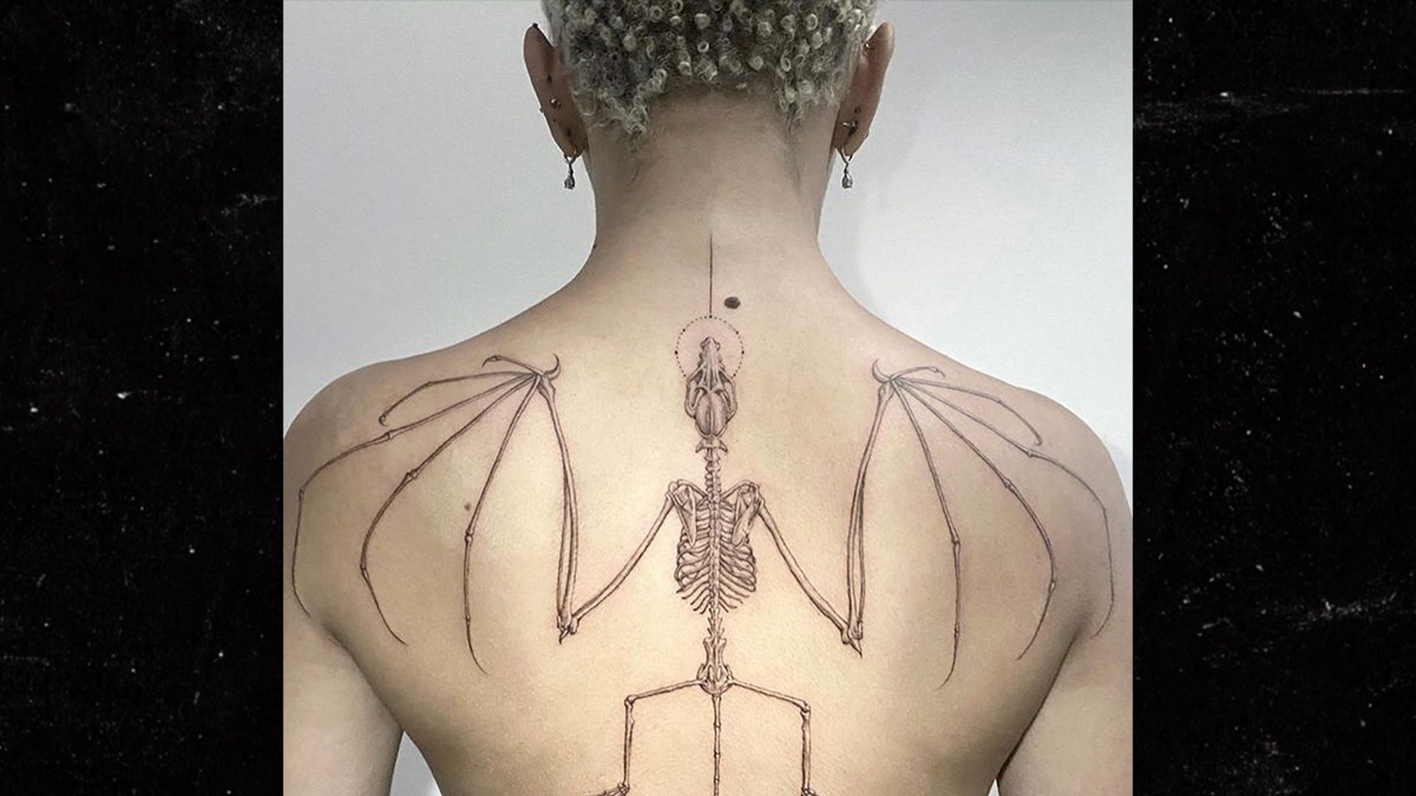
Doja Cat tattoos: large clear view of Doja Cat’s bat skeleton back tattoo

The bat skeleton is the largest and most striking tattoo Doja Cat has shown. It starts high on the back, with the skull near the upper spine, then opens into a wide pair of wings across the shoulder blades. The ribs, joints and long wing bones are drawn in a fine, delicate style rather than packed with heavy black shading. From a distance, the shape reads like a symmetrical creature. Up close, the small bones give it an almost anatomical feel.

Doja revealed the design in 2023 and connected it to a passage about bats representing death as a form of letting go, followed by transition and new beginnings. That is one of the rare occasions when she supplied a clear explanation. The meaning does not have to be stretched into a claim about every other tattoo. It belongs to this piece, and the visual fits the idea of leaving an old shape behind and moving into something new.

Mr. K at Bang Bang Tattoo is associated with the back piece. His linework is easy to recognise in the repeated, narrow contours of the wing bones and rib cage. The tattoo is also a good example of why a full-body photograph matters. A close crop of the skull misses the wing span, while a distant shot can make the centre look smaller than it really is.

The lower part of the design continues down the spine, and later photographs show a small spider near the lower back. The spider sits apart from the bat rather than being swallowed into the skeleton. That separation gives the back a loose vertical rhythm: a large central creature, then a small insect lower down. It is a more considered arrangement than a simple single emblem.

The monster tattoo on Doja’s arm is an art reference, not a generic devil

Doja Cat tattoos: clear view of Doja Cat’s illustrated monster and cautionary arm quote

Doja’s controversial forearm tattoo was often described online as demonic, but she gave a more specific explanation. The image comes from a 17th-century illustration connected with Fortunio Liceti’s work on unusual forms in nature. The figure is strange and unsettling, with a body that looks deliberately distorted. That source matters because the design is not just a stock devil copied from a flash sheet.

She explained that the image was about imperfection and the way nature can produce forms that look wrong to a viewer while still being part of its creative process. That context changes how the tattoo reads. The horns, limbs and odd proportions may look theatrical at first glance, but the reference is closer to a historical curiosity than a declaration of religious allegiance.

The same arm has other fine-line work around it, including a key and script. The pieces do not all have one confirmed meaning. A key can be described as a key without deciding what it unlocks, and a line of text can be quoted without inventing the event that supposedly caused it. Doja’s collection rewards that kind of restraint because the designs are unusual enough to invite wild guesses.

In photographs, the monster works best as a vertical image. The viewer can follow the body from the upper arm down toward the forearm and see how the surrounding lines frame it. A cropped face shot is not enough evidence for the piece. The tattoo needs a clear arm photograph where the source drawing and the placement can actually be compared.

The sword-through-an-eye tattoo sits across Doja Cat’s hand

Doja Cat tattoos: high-detail close-up of Doja Cat’s sword-through-eye hand tattoo

The hand tattoo is one of Doja’s most intricate small-scale pieces. A sword runs through a realistic eyeball on the back of the hand, with fine ornamental lines spreading toward the fingers. Small dot clusters sit near the nails, while numbers including 9 and 5 appear within the surrounding design. It is busy without becoming a solid block of black ink.

The eye is the centre of the composition. Its round iris gives the hand a focal point, and the sword creates a strong vertical line from the wrist toward the fingers. The surrounding flourishes keep the design from looking like a single sticker placed on the skin. They also make the tattoo change shape when Doja moves her hand or wears long nails.

Mr. K is associated with this newer group of work as well. Reports place the reveal alongside the back bat and lower-back spider, which makes the three designs part of the same period of experimentation. Doja has not supplied a complete explanation for every number, dot or ornamental mark. The safest reading is therefore visual: an eye, a blade, fine geometry and small finger details, all arranged to look slightly surreal.

This tattoo shows why ordinary event photographs can be misleading. Jewellery, nails and hand position can hide the blade or make the eye look like a ring. A straight-on close-up is much more useful for anyone trying to understand the actual tattoo. The image also makes clear that the piece is on the hand, not the wrist or forearm, a distinction that gets lost in casual captions.

The antelope skull and other wrist details stay deliberately fine

Doja Cat tattoos: clear view of Doja Cat’s bat, lower-back spider and surrounding fine-line work

Before the giant back tattoo, Doja showed a fine-line antelope skull on her left wrist. The skull is narrower and more delicate than the later bat, with the long horns giving it a recognisable outline. Brian Woo, also known as Dr. Woo, is associated with the tattoo. His style often uses thin lines and small dots, and those qualities are visible in the clean shape of the skull.

Doja did not give a confirmed personal meaning for the antelope design. That is worth preserving. Skull imagery can suggest mortality, memory or change, but those are general associations rather than Doja’s own explanation. The design can stand on its visual qualities: a long horned skull, a narrow wrist placement and enough negative space for the lines to breathe.

Other wrist and arm marks appear in the same photographs. Some look like eyes, some like small geometric symbols and some are too soft to identify. They should not be folded into the antelope skull just because they are nearby. Kesha-style inventory lists can become unreliable when a blurry dot is promoted into a named tattoo. The wrist is a good example of why a clean photo and a cautious caption matter.

The fine-line approach also changes how the tattoos are seen over time. A thick traditional outline normally stays readable from across a room. A small wrist skull depends on contrast, lighting and camera distance. It may disappear beneath a bracelet in one photograph and become the sharpest detail in another. That is not a contradiction; it is simply how small wrist ink behaves in pictures.

Doja Cat’s scythe tattoo runs behind the ear toward the temple

Doja Cat tattoos: side profile clearly showing Doja Cat’s scythe behind the ear

The scythe behind Doja’s ear is one of her most visible head tattoos. The handle runs down behind the ear and the blade arcs upward toward the temple. It follows the curve of the head, so the full shape is easiest to see in a side profile or a three-quarter photograph. From the front, only a thin dark line may show.

She revealed the piece around the 2023 MTV Video Music Awards, where her shaved head and light makeup made the tattoo unusually easy to see. The scythe matched the gothic styling of the event, but the placement is not just a costume detail. A head tattoo changes the way a person is photographed. Turning the head can reveal the blade, hide the handle or make it appear to merge with the hairline.

The design also sits near her spider-themed styling from that period. A spider earring and web-inspired clothing made the overall look feel deliberately connected, but that does not prove the scythe has one fixed meaning. It is better to describe the historical associations of the shape only as possibilities. The permanent fact is the design, the location and the date it became publicly visible.

Unlike the huge back tattoo, the scythe is not meant to be read from across a room. It rewards a close side view. That makes a high-resolution image important. A tiny red-carpet thumbnail can turn the blade into a stray shadow, while a clear profile shows exactly how the tattoo wraps around the ear.

Alan Watts quotes give the arms a different kind of intensity

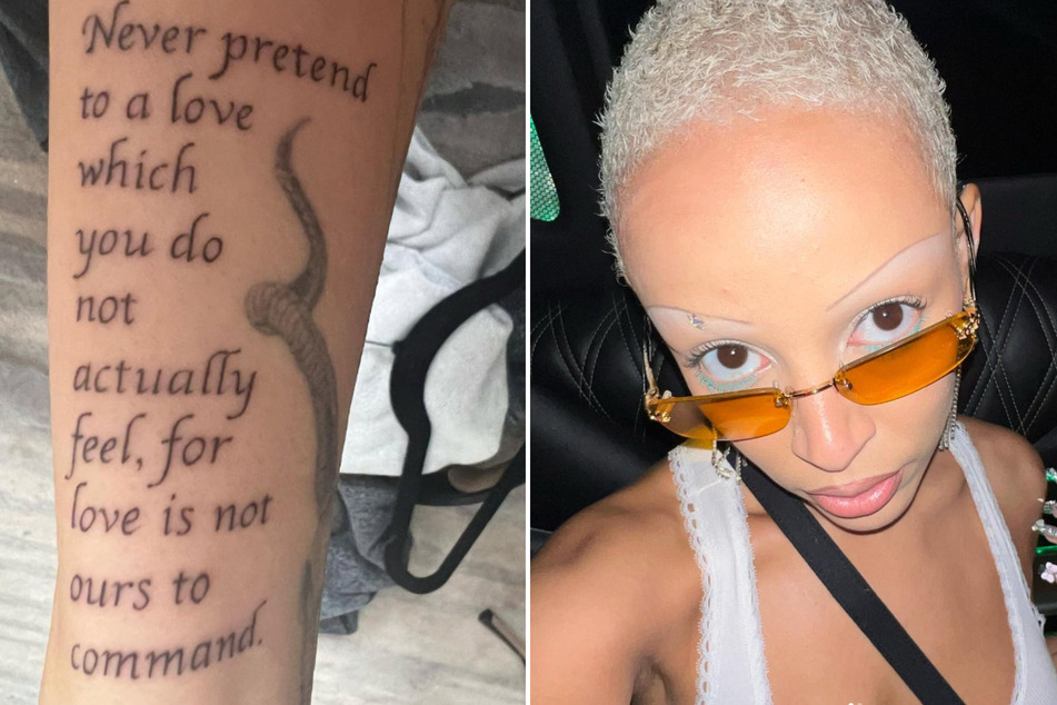
Doja Cat tattoos: clear close-up of Doja Cat’s Alan Watts quote tattoo

Doja later showed a group of text tattoos linked to words from philosopher Alan Watts. One clearly photographed arm quote begins, “Never pretend to a love which you do not actually feel, for love is not ours to command.” The lettering runs vertically down the arm, and a snake-like drawing sits beside it. The mix of narrow script and illustration makes the piece feel more like a page of marginal notes than a conventional slogan.

Other reported lines deal with pain, fear, faith and the way problems can settle when they are left alone. The wording should be checked against the photograph because long script is easy to misread, especially when it curves around an arm. A tattoo guide should reproduce the visible sentence accurately and keep the quote in context rather than turning a few words into a broad diagnosis of Doja’s life.

The quotes mark a shift from the anatomical and gothic images. A bat skeleton can be understood through its shape. A long sentence asks the reader to slow down and read. It also changes the way the arm moves. When Doja bends her elbow, the line breaks and the words become part of the body’s movement rather than a flat block of text.

The cautionary arm quote from “Gretel & Hansel” is another major piece. Its wording warns children to be careful with gifts and people who offer them. Coverage places the sentence beside a key and a strange figure. Those details make the tattoo feel like a small illustrated story, but the source of the quote is more secure than any claim about the exact life event that inspired it.

There are also smaller designs in Doja’s catalogues: a spider, a snake, an Om symbol, a small number four and additional short quotations. Some have been photographed clearly. Others only appear in secondary lists or event images. The sensible approach is to separate the confirmed pieces from the uncertain ones and to keep the article current as her collection changes.

Doja Cat’s tattoos are not a tidy set of matching symbols. They jump from a bat’s anatomy to a historical monster, from a sword piercing an eye to a fine wrist skull, then across the head with a scythe and down the arm in philosophical text. The common thread is her willingness to use the body as a place for strange images and difficult ideas. Some meanings come directly from her. The rest should be left at the level of design, placement and evidence.

That distinction also keeps temporary body art out of the permanent list. The name of designer Dilara Findikoglu written across Doja’s forehead at the Grammys was a memorable fashion choice, but it was not the same thing as the bat, scythe or hand tattoos. Makeup, rhinestones and temporary ink can look convincing in a photograph. They still need to be labelled correctly.

Kesha’s Tattoos: Palm Eye, Tiger, Skull and the Ink Behind the Chaos

Kesha’s tattoos are as restless as her music. They move from tiny hand marks to bright traditional pieces, from a dollar sign tied to an old stage name to odd little pictures that look as if they were chosen because they made her laugh. Some designs are easy to see in a close-up. Others only show up when she turns her hands toward the camera or lifts an arm onstage. That makes a sensible guide more useful than a grand total. The exact count changes with new work, faded ink and tattoos that are covered by hair, clothing or makeup.

What can be said with confidence is that Kesha has built a collection with a very particular mood. There are eyes, planets, animals, lettering, old-school flash shapes and small personal references. She has talked openly about some of them, while other designs are best treated as visual observations rather than stories with a confirmed meaning. The sections below separate those two things. A photograph can show the shape and location. An interview can explain why it matters. One does not automatically prove the other.

Kesha’s palm eye is one of her clearest visible tattoos

Kesha tattoos: clear close-up of Kesha's palm eye tattoo

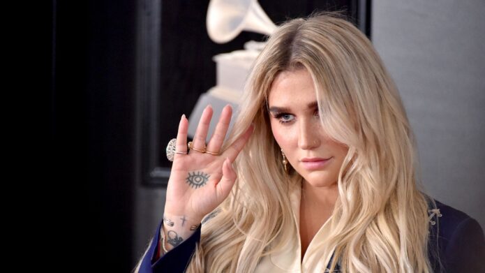
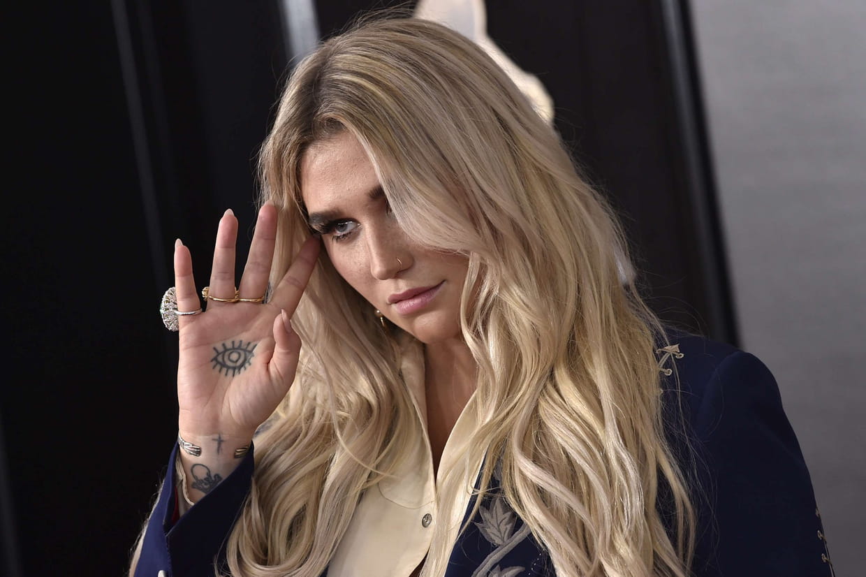
The eye on Kesha’s palm is one of the tattoos people notice first because it appears whenever she opens her hand toward a camera. A close photograph shows a dark, graphic eye set into the palm, with small marks and older lines around it. The placement is unusual for a reason that is mostly practical: palm tattoos are difficult to keep looking fresh. The skin is constantly moving, washing and rubbing against other surfaces, so fine details can soften faster than they would on an upper arm or shoulder.

That softening is part of why different photographs can make the design look slightly different. In one image the eye reads as a strong black symbol. In another, the surrounding lines and the angle of the hand change its proportions. The tattoo is still recognisable, but it is not a fixed logo photographed under identical conditions. Anyone trying to copy it would need to think about the hand’s shape, how the palm folds and how much detail will survive in that location.

The same close-ups show that the palm is not an isolated blank space. Small marks run across the hands and wrists, and a few are difficult to separate from shadows or old, faded ink. It is safer to call the central design an eye and describe the nearby marks only when they are sharp enough to identify. There is no reliable reason to assign one sweeping mystical meaning to every line. The image gives us a clear design and a clear placement; that is already enough to make it interesting.

Kesha has also used the hand as part of her visual identity onstage. A palm turned toward the audience can look like a tiny flash card, while a hand resting at her side can hide almost everything. That changing visibility explains why the tattoo appears prominently in some portraits and barely registers in others. It is a small piece with a surprisingly strong photographic effect.

The Saturn palm tattoo and the hidden hand designs

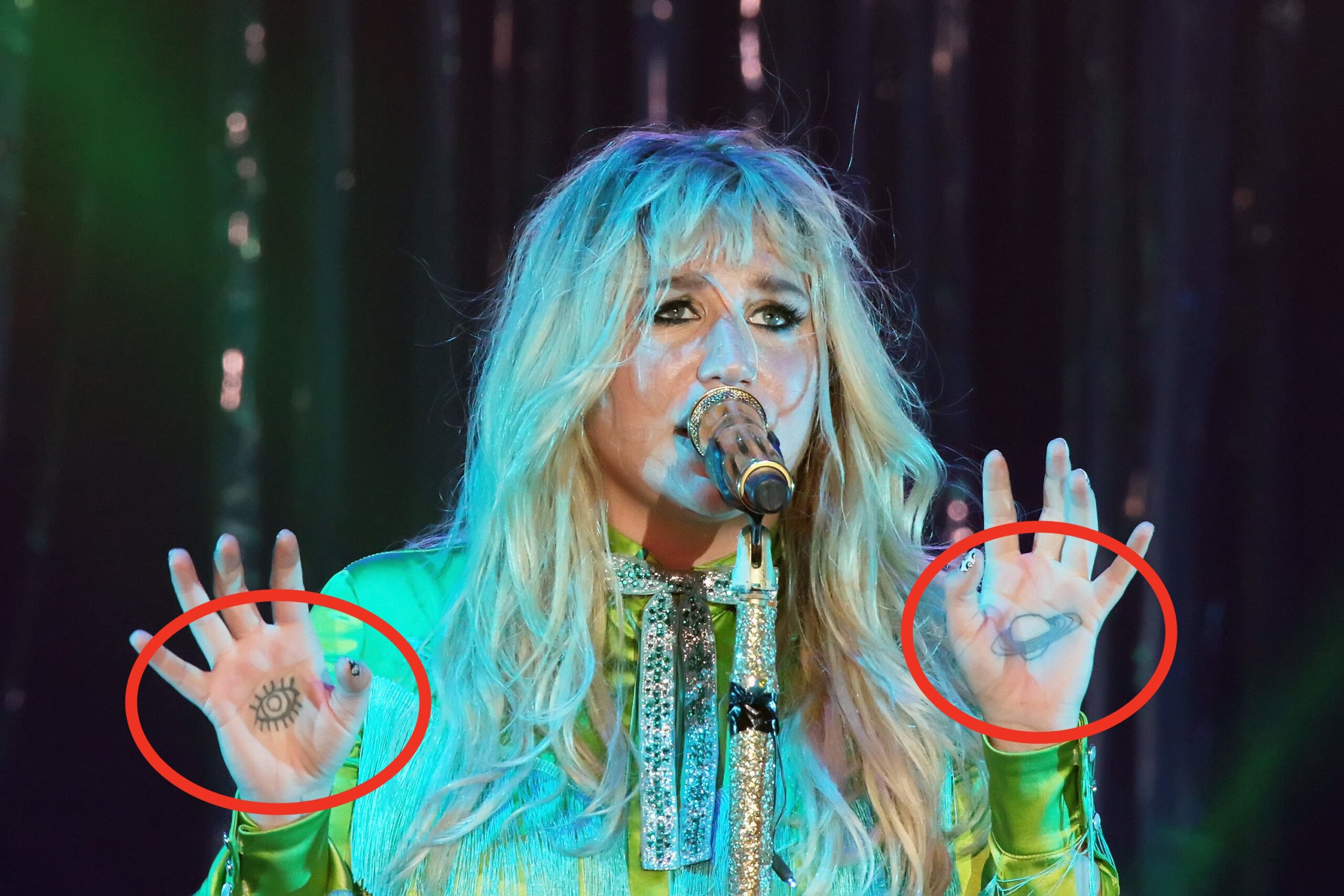
Kesha tattoos: Kesha's palm eye and Saturn hand tattoos visible in a stage photograph

A second palm image shows a planet-like Saturn design, with a ring cutting across the shape. It sits on the other hand from the eye tattoo, giving the pair a loose visual conversation without making them a matching set. The planet is the kind of design that can be read quickly even when the photograph is not perfectly sharp. A round body, a sweeping ring and a dark outline are enough to establish the subject.

The Saturn design has often been discussed alongside other small hand tattoos, including tiny symbols on the fingers and marks near the wrists. Those pieces change the rhythm of the collection. Instead of one giant sleeve, Kesha’s hands work more like a patchwork of compact images. There is empty skin between them, which lets each symbol stay legible instead of disappearing into a solid block of ink.

Her relationship with small symbols also connects with the old dollar-sign identity attached to the name Ke$ha. The dollar sign was part of the spelling associated with her early career, and interviews have linked the mark to that period of her life. That does not mean every circular or star-like shape on her hands is another reference to money. It simply gives one documented symbol a place in the timeline. The useful distinction is between a design she has explained and a mark that only resembles something from her branding.

The hands are hard to catalogue because photographs catch them at different distances. A wide stage shot may show the planet and eye clearly while losing the tiny finger work. A beauty portrait can show the fingers but blur the palm. Kesha’s collection should therefore be read as a set of dated snapshots rather than a permanent inventory. The Saturn palm remains one of the strongest pieces in that group because its outline survives even when the rest of the hand is busy.

There are also visual hints of nautical and old-school imagery in the wider collection. Anchors and other small flash-style motifs have been reported in tattoo catalogues, but not every catalogue agrees on the exact count or placement. Where the photograph is soft, the honest description is simply a small mark near the hand or wrist. That may sound cautious, but it stops a blurry shape from turning into a made-up backstory.

Skull, rainbow and whale ink make the forearm playful

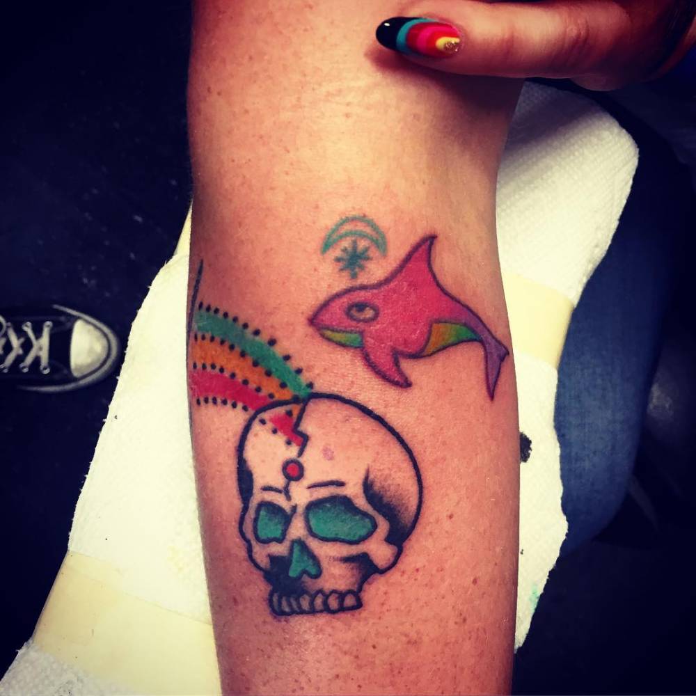
Kesha tattoos: close-up of Kesha's skull, rainbow and whale forearm tattoos

Kesha’s forearm work has a brighter, stranger energy than the hand pieces. One close-up shows a colourful group that includes a skull, rainbow-like colour and a small whale or sea creature. The designs use clear outlines and compact shapes rather than realistic shading. They look closer to collected flash tattoos than to one continuous scene, which lets the arm carry several unrelated ideas at once.

The skull is not presented as a grim, heavily shaded portrait. Its shape is compact and graphic, with colour around it that changes the mood. The rainbow detail keeps the group playful, while the nearby blue animal gives the arm a little movement. These are useful details for anyone studying the tattoo style: the designs rely on instantly readable silhouettes, bright accents and enough open skin for the pictures to stay separate.

TattooFilter’s catalogue connects some of this work with artist Walter McDonald. That information helps with attribution, but it does not automatically reveal what each image means to Kesha. A skull can be a favourite flash image, a joke, a reminder or simply a design she liked that day. The photograph confirms the skull and the surrounding colour. It does not confirm a private explanation.

The whale is especially easy to overinterpret because sea imagery can suggest travel, freedom or a connection with water. None of those ideas should be presented as fact without a direct comment from Kesha. It is enough to say that the small sea creature adds a softer note to a group otherwise built from bold symbols. The contrast is what makes the forearm memorable.

When the arm is photographed from farther away, these pieces can merge into a single colourful patch. A closer frame shows the separation between them and makes the outlines easier to follow. That difference matters for tattoo references. A reader looking for a skull tattoo needs the close crop, not a generic red-carpet portrait where the colours are only tiny specks.

The tiger hand and crescent finger tattoo

Kesha tattoos: close-up of Kesha's tiger hand and crescent finger tattoo

The tiger on Kesha’s hand is one of the most recognisable animal tattoos in the collection. The close-up shows the face in a traditional, black-lined style, with the eyes and muzzle doing most of the work. It is not a hidden micro tattoo. The tiger takes up enough of the hand to read immediately, but its placement still lets the fingers move naturally around it.

A small crescent appears on a finger in the same group of photographs. The curved shape is much quieter than the tiger, and that contrast is part of the appeal. One design is an obvious face; the other is a tiny mark that can disappear when the hand turns. The pair shows how Kesha mixes loud and understated pieces without trying to make every tattoo compete for attention.

TattooFilter associates the tiger work with artist Derrick Snodgrass. That gives the image a useful production detail. It also helps explain why the linework feels deliberate rather than like an accidental collection of doodles. The artist credit is supported by the catalogue, while the personal meaning of the tiger is not clearly established. Readers can appreciate the drawing without being told it represents a specific personality trait.

The tiger also demonstrates why body placement changes the way a tattoo ages visually. The back of the hand is exposed to sunlight, washing and constant motion. Strong outlines help the animal remain readable, but small interior details can soften. The photographed version should therefore be treated as a record of how it looked at that time, not a promise that every line will stay identical.

Other animal references have been reported in Kesha’s collection, including a panther and another tiger in wider catalogues. Those listings should stay separate from the hand tiger unless a photograph or interview ties them together. A celebrity tattoo guide becomes much more useful when it distinguishes a confirmed close-up from a design that appears only in a secondary list.

Live Free lettering turns the knuckles into a message

Kesha tattoos: clear close-up of Kesha's LIVE FREE knuckle lettering

The words “LIVE FREE” across Kesha’s knuckles are among the most direct tattoos in her collection. Each letter occupies its own small space, so the phrase only becomes complete when both hands are shown together. A close-up makes the arrangement clear and also shows how the lettering sits beside the tiger, crescent and other small symbols.

Coverage of the tattoo places the work in the period when Kesha was publicly rebuilding her confidence and direction. The phrase fits that moment, but the wording itself is the part that can be stated with certainty. It is not necessary to invent a speech about freedom or claim that the inscription explains every other tattoo. The message is visible, the placement is visible and the timing is reported. That is a solid enough story.

Knuckle lettering has a practical limitation: the letters are exposed, small and spread across moving joints. They can fade or blur, especially if the original design uses thin lines. Kesha’s version stays readable because the words are short and the letters are placed with enough space between them. The phrase also photographs well in a hand shot, which is why it appears more clearly than many of her smaller wrist marks.

The live-free wording connects loosely with the collection’s other flashes of humour and independence, but it should not be treated as a master key for every symbol. Her tattoos include animals, planets, lettering and colourful pieces that do not all point in one direction. The charm is in that mix. The designs feel collected over time rather than planned as one brand exercise.

There are other unusual pieces in reports about Kesha, including a dead-fish tattoo matching one worn by Big Freedia after they spent time together around the song “Chasing Rainbows.” That matching design has a clear documented connection because the two artists discussed it. A spaceship, shark, panther and additional tiger imagery have also appeared in interviews and tattoo catalogues. Each belongs in the wider timeline, but the exact placement and current condition should be checked against a sharp photograph before being treated as settled.

Kesha’s tattoos are interesting because they refuse one neat explanation. The eye and Saturn make the hands feel cosmic. The tiger and skull bring in traditional flash. The rainbow and whale keep the forearm playful, while “LIVE FREE” gives the knuckles a plain spoken message. Some pieces have a story attached to them. Others are simply good designs that she chose to keep. The best way to read the collection is to name what the camera can actually show, add the context Kesha has provided, and leave the gaps alone.

That approach also leaves room for change. New tattoos may appear, old ones may fade and a design that was visible during one tour may be covered in the next. Kesha’s collection works best as a living map rather than a final count. If the image is clear, describe the design and location. If an interview supplies the meaning, include it. If neither is available, the tattoo can still be appreciated without a polished guess attached to it.
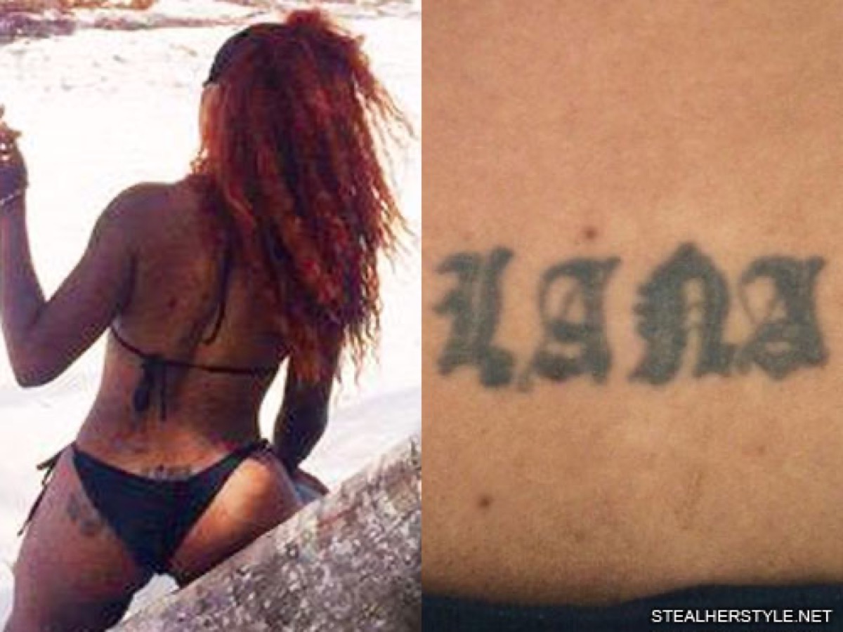
Cody Johnson’s Tattoos: Texas, Family and the Ink He Got on the Road

Cody Johnson’s tattoos are easy to underestimate if you only notice the ink on his hands when he is wearing a pearl-snap shirt. There is a lot more going on. His collection runs across his back, chest, arms, hands and even the bottom of one foot. The designs are not a random pile of flash. They point back to his family, his East Texas home, his old band, his work on the road and the country music that shaped him.

Johnson has explained unusually specific details about the collection during tattoo tours and interviews. That makes it possible to describe the obvious shapes and the stories behind them. His own stories identify the people, places and decisions behind several pieces. Where a photograph only shows a design, the description stays visual. Where Johnson has given a reason, that reason is included without dressing it up as something deeper than he said.

The timeline matters as well. Some of the tattoos were done when Johnson was travelling with his band and tattoo artist Buffalo Jake. Others came from particular points in his family life or his career. The result is a body map that feels personal without needing one grand explanation for every piece.

The back cross marks the beginning of Cody Johnson’s tattoo story

Cody Johnson tattoos: the tattooed arm sleeve and hand logos

Johnson says his large cross on his back was his first tattoo. It is the starting point for the whole collection, and he has called it his worst tattoo when looking back at it. That comment is useful because it makes the piece feel like an early decision rather than a perfectly planned centrepiece. It came first, before the sleeve, the logos and the family designs that now make the collection much denser.
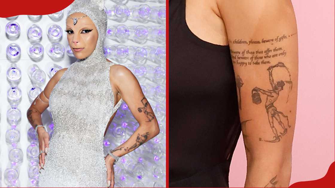
The cross is also tied to a scar from neck surgery. During the tattoo tour, Johnson points out the scar above the tattoo and jokes that scars count as tattoos too. The scar is obviously not ink, but it becomes part of the story because it sits close to the first piece and changes how that area is read. A photograph can show both marks, while Johnson’s explanation supplies the personal timeline.

It is tempting to describe the cross as a complete statement of faith, but the available interviews do not require that much interpretation. The confirmed details are its size, its placement, its position as Johnson’s first tattoo and the way he talks about the result now. Those facts are enough to make it interesting. Early tattoos often carry the history of a person’s taste at that moment, even when the wearer later laughs at the execution.

That early back piece also explains why a current photograph should not be treated as a complete inventory. Clothing hides most of the back during performances, and later tattoos draw attention toward his hands and arms. The cross belongs in the guide because Johnson names it himself, even if it is not the design most readers notice first.

Hand logos turn Cody Johnson’s handshake into a personal code

Cody Johnson tattoos: the Texas map chest tattoo and visible hand ink

The tattoos on Johnson’s hands are small compared with the arm work, but they carry some of the clearest explanations in the collection. One is the old Rockin’ CJB logo, referring to the Cody Johnson Band. Another is the CoJo logo used across his wider camp, including merchandise and buses. These marks connect the person holding the guitar to the working organisation that helped build his career.

Johnson says he put the logos on his hands so that the message would be present whenever he shook somebody’s hand. His explanation is about accountability. The marks remind him who he represents, the people he works hard for and the standards he wants to live up to. That is a more specific meaning than simply calling them branding tattoos. They are visible reminders attached to an everyday gesture.

The hand placement changes the feel of the designs. A logo on an upper arm can disappear under a sleeve, but a hand tattoo follows Johnson into interviews, performances and introductions. It is almost impossible to separate the ink from the way he presents himself as a working musician. The design may be compact, yet the placement gives it a public role.

Hand tattoos also fade and soften faster than ink in areas protected by clothing. That is worth keeping in mind when comparing photographs. A later image can make a small logo look lighter or less precise without proving that the design was replaced. The safest description is the symbol Johnson identifies, the hand placement and the band or brand context he gives it.
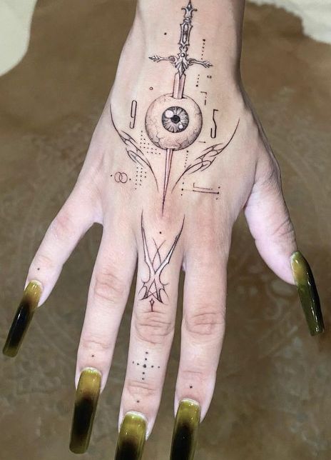
The same close-up views show that the hand work sits beside larger pieces running up the arm. That contrast is part of the appeal. The logos are graphic and compact, while the sleeve uses feathers, flowers and larger shapes. Together they make the hand look like the starting point of a much bigger composition rather than a separate collection of tiny marks.

Brandi, Clara Mae and Cori appear in the arm sleeve

Cody Johnson tattoos: the close-up hand tattoos and logo shapes

Johnson’s arm tattoos are where the collection becomes most obviously about family. He has a piece with his wife Brandi’s name, surrounded by flowers that bloom around her birthday. The floral framing gives the lettering a softer edge, but the important fact is the connection he explains himself. This is not an anonymous script tattoo that fans have assigned to a relationship. Johnson identifies the name and the reason for the surrounding flowers.

Another design is a sunshine tattoo for his daughter Clara Mae. Johnson says Clara designed the image for him. That detail changes how the piece should be read. It is not just a sun chosen from a catalogue. The design carries the physical mark of a child’s idea, which is exactly why a simple image can matter so much inside a larger sleeve.

He also has a tattoo linked to his daughter Cori, who was born close to Valentine’s Day. The reported design uses Valentine’s imagery, giving the arm another family marker without copying the Brandi or Clara Mae pieces. The three tattoos are worth discussing separately because they refer to different people and use different visual cues: lettering and flowers for his wife, sunshine for Clara Mae and a Valentine’s reference for Cori.

That separation makes the sleeve easier to understand. It is not one generic family tribute spread across the arm. It is a set of individual pieces added at different moments, each with its own image and relationship. The photographs show how the designs sit together, while Johnson’s explanations keep the meanings from being flattened into a sentimental caption.

The arm also includes larger traditional and illustrative elements around the family tattoos. Feathers and darker outlines give the sleeve more weight, especially when the tattoos are photographed beside a guitar or stage clothing. These surrounding details should be described as visible parts of the sleeve, not automatically assigned a private meaning. The documented family pieces have clear explanations; the rest can remain visual.

Texas tattoos, Resistol and the foot line finish the map

Cody Johnson tattoos: the heavily tattooed hand and visible lettering detail

Johnson’s connection to East Texas appears directly in the tattoo inventory. A forearm piece combines Texas pine trees with the words Native ETX. He explains that the design marks where he is from and the place he will continue to call home, no matter how many countries or cities he visits to play music. The wording gives the tattoo a plain, strong purpose. It is a home marker, not a vague claim about being a country singer.

There is also a Texas outline filled with red bricks over his heart. Johnson has connected that piece with his time working at a state penitentiary as a corrections officer. The brick pattern makes the outline different from a simple state silhouette. It adds a reference to the environment where he worked before his music career became his full-time life. The chest placement gives the design extra weight, but the meaning still comes from the story he tells about the job and the state.
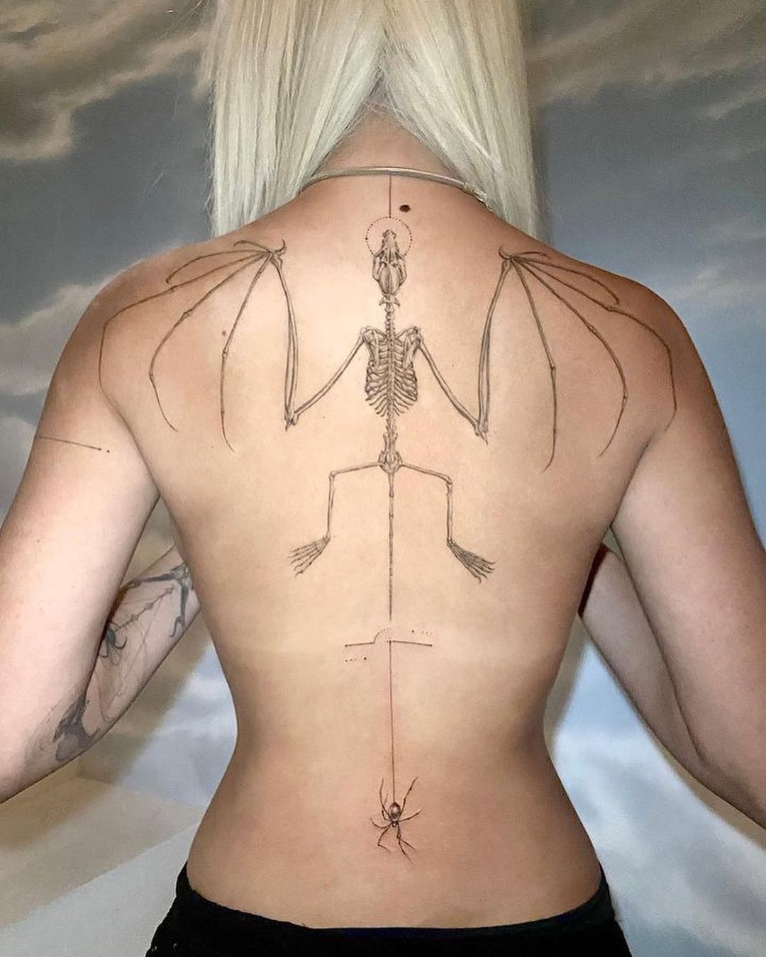
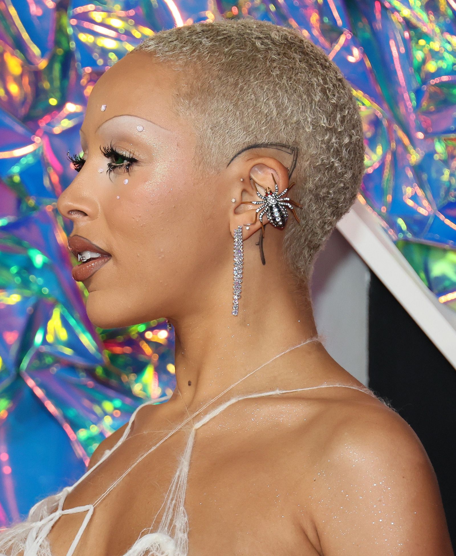
A Resistol hat logo records another part of his working life. Johnson got it after securing a hat deal, so it belongs to the part of the collection connected with his career and western identity. The logo is more direct than the family pieces. It names a brand that became part of his public image and his relationship with the country audience. It should be described as a logo tattoo rather than turned into a larger theory about commercial success.

The strangest placement is the bottom-of-the-foot tattoo. Johnson says he and Buffalo Jake were talking on his bus about body parts the artist had never tattooed. When Jake mentioned the sole of the foot, Johnson decided to try it after a show. The finished mark is a line connected to Waylon Jennings’s song “I’ve Always Been Crazy” and the lyric about having one foot over a line.

Johnson has joked that the session tickled and that the final result includes a few rough marks around the stronger line. That makes the tattoo memorable because it is both deliberate and slightly ridiculous. It also fits the way several of his tattoos were made on the road: a conversation turns into an idea, and the idea becomes permanent before anyone has time to overplan it.

Put together, the cross, hand logos, family sleeve, Texas designs, Resistol mark and foot line give Cody Johnson’s collection a clear shape. The tattoos move from early faith imagery to band identity, family, home and country music history. Some pieces are large and easy to photograph, while others need a close-up or a story from Johnson himself. That is why a useful guide needs more than a generic portrait. Each section should name the design, locate it, show it clearly and keep the explanation tied to what he has actually said.

The collection is still capable of changing. New work, fading ink and cover-ups can alter the map, and different shirts reveal different areas. The most reliable way to follow it is to keep dated photographs beside the specific tattoos they show. Johnson’s own accounts give the guide its strongest details, while the images let readers see how the separate pieces sit together on the body.

The arm sleeve carries separate family tattoos, not one giant tribute

Cody Johnson tattoos: Brandi lettering and the detailed right-arm sleeve

The sleeve deserves a closer breakdown because the family pieces are not one blended design. Johnson describes Brandi’s name and birthday flowers, Clara Mae’s sunshine and Cori’s Valentine’s Day mark as separate tattoos. The arm photograph shows how they share the same area while keeping different shapes, line weights and colours.

The visible lettering is especially useful in a close view. It gives the sleeve a human scale that a distant stage photograph loses. The flowers around Brandi’s name soften the script, while the sunshine and Valentine’s design read more like personal symbols. Johnson has supplied the relationships behind the pieces, but the photographs still matter because they show how the symbols sit beside the larger work.

Native ETX is a tattoo about home rather than a generic Texas slogan

Cody Johnson tattoos: Texas chest map and visible hand tattoo detail

The Native ETX forearm piece should have its own entry because it is more specific than a general Texas reference. Johnson uses the words alongside pine-tree imagery to identify East Texas as home. He has said that playing around the world does not change where he considers himself to be from.

The pine trees give the lettering a landscape around it. That matters visually: this is not simply a set of initials written across bare skin. It combines a place abbreviation with a regional image, so readers can understand why it belongs beside the family tattoos as its own design. The placement also makes sense for a touring musician because the forearm is visible while he performs and plays guitar.

The Texas chest map and hand ink need separate close views

Johnson’s Texas outline filled with red brick is a chest tattoo, while the smaller hand marks sit much closer to the camera in the same kind of photograph. They should not be treated as one piece. The map records Texas and his former corrections work; the hand designs record the Cody Johnson Band, the CoJo identity and the accountability he associates with a handshake.

A wide portrait can prove that both areas are tattooed, but it cannot show every edge clearly. A closer chest view makes the red-brick fill visible, while a hand image lets readers see why the logos are readable marks rather than anonymous dark shapes. Separating the images also prevents the featured portrait from doing work it cannot do.

The map has a different emotional register from the career logos. One points to a state and a former job; the other points to the working team Johnson built around his music. Both are public-facing tattoos, but they tell different parts of the story.

G-Eazy’s Tattoos: Oakland Codes, Neck Ink and the Stories Behind the Symbols

G-Eazy’s tattoos are easy to read as a collection because so many of them sit on his arms, neck and forearms. The designs are small enough to work as separate pieces, but they still build a recognisable map when he wears short sleeves. There is a thorned rose on the neck, a wolf on the bicep, theatre masks, an Oakland area code, lettering and a skull tied to one of his music projects.

Some of the meanings are reported clearly. The 510 is connected with Oakland and the years G-Eazy spent around Berkeley and North Oakland. The “LIFE IS GRAND” quote is explained as a reminder to enjoy life even when things are difficult. Other designs, such as the rose and sword, are easier to describe visually than interpret personally. That difference matters. A good tattoo guide should separate what the photograph shows from what the artist has actually explained.

The rose on G-Eazy’s neck is small but impossible to miss

G-Eazy tattoos: both tattooed arms with anchor, portrait, number and traditional designs

The rose on the left side of G-Eazy’s neck is one of the first pieces people notice because it sits so close to his face. It has a stem, two leaves and visible thorns, so it reads as a proper flower rather than a vague black mark. The design is compact, but the placement makes it part of his public silhouette. A collar can hide the lower edge, while a bare neck makes the whole shape stand out.

Rose tattoos are often given broad meanings such as beauty, love or new beginnings. Those associations can be mentioned as general symbolism, but they are not automatically G-Eazy’s reason. The available tattoo inventory describes the design and offers a conventional reading; it does not give a detailed first-person explanation from him. The careful version is to name the rose, describe the thorned stem and leave the private meaning open.

The neck placement also changes how the rose works beside the rest of his style. G-Eazy often dresses in dark jackets and shirts, so the tattoo appears as a small break in a mostly monochrome look. It is not a large traditional rose spreading across the throat. It is a neat side-neck mark that can disappear when his hair falls forward or when he wears a high collar.

That small scale is useful when comparing photographs from different years. A red-carpet image may show the rose clearly while losing the forearm designs. A performance photo may catch his hands and arms but place the neck in shadow. The rose is therefore a good example of why one portrait cannot stand in for a complete tattoo inventory.

LIFE IS GRAND turns a forearm quote into a daily reminder

G-Eazy tattoos: forearm lettering, cherries, portraits and other visible arm tattoos

The words LIFE IS GRAND sit on the inside of G-Eazy’s left forearm near the elbow fold. The lettering is direct and easy to recognise. It does not depend on a complicated illustration or a hidden reference. When his arm bends, the phrase can break across the crease, but when he straightens it the words read as one short statement.

Body Art Guru’s account gives the quote a straightforward meaning: even with setbacks, life is still something to enjoy and value. That makes this one of the more useful entries in the collection because the design and the reported idea match. The tattoo is not just identified by a fan looking at a blurred photograph. The wording is readable, and the explanation is tied to the phrase itself.

Forearm lettering is also practical for an artist who performs. It can be covered by a sleeve or shown when he rolls up a shirt. That gives the quote a private and public quality at the same time. It is visible enough to become part of his image, but it is not as exposed as a tattoo placed across the face or front of the neck.

The phrase sits among other small pieces rather than taking over the whole arm. The nearby moon and figure create a more illustrative area, while LIFE IS GRAND stays plain. That contrast makes the lettering easy to pick out. It also stops the arm from looking like one dense sleeve. Each tattoo keeps its own border and visual job.

There is no need to dress the quote up with a larger theory. The point is already there in the words. G-Eazy’s collection includes designs about place, family, music and personal outlook. LIFE IS GRAND covers the last category in the most literal way. It is a short reminder, set in a location he can see whenever he looks down at his arm.

The 510 tattoo keeps Oakland close to G-Eazy’s arm

G-Eazy tattoos: upper-arm portrait and detailed forearm tattoo collection

The number 510 appears on the back of G-Eazy’s right forearm. It is the area code associated with Oakland and nearby parts of the East Bay, so the design functions as a hometown marker rather than a random number. The placement is useful too. It can be seen when he turns his arm, but it does not dominate the front of the forearm or compete with the larger illustrated pieces.

The story behind it reaches back to childhood. Coverage says G-Eazy spent part of his early life with his grandparents after his mother left his father, moving between Berkeley and North Oakland. That context gives the number more weight than a generic city tattoo. It points to the places and people connected with his upbringing, particularly the grandparents who helped raise him.

Numbers can be tricky in photographs. A blurred image may make a 510 look like a date or a private code. In this case, the area-code explanation is documented, so the guide can be specific without guessing. It is a small piece with a clear geographic reference and a personal history behind it.

The Oakland connection also fits G-Eazy’s public identity as a Bay Area rapper. The tattoo is not a substitute for his music, but it sits comfortably beside the career story. A place can be part of an artist’s work without every song or design being reduced to a slogan. The number simply keeps one part of home close to the skin.

It is worth separating 510 from other number tattoos or sports references that may appear in later photographs. Tattoo collections change, and a new mark can be added near an older one. The safest catalogue keeps this design as its own entry: three numbers, right forearm, Oakland connection, childhood and grandparents in the supporting account.

The B and D skull connects the smaller arm marks to his music

G-Eazy tattoos: close view of visible arm, wrist and neck tattoo details

The cartoon skull on the inner right forearm is more detailed than its small size first suggests. The letters B and D form the eyes, an ampersand works as the nose and a sword appears across the forehead. It is a playful image, but the parts are not random. The design is reported as a reference to G-Eazy’s B & D EP.

That connection is what makes the skull different from a generic skeleton tattoo. The image works as a piece of branding, but it still looks like a drawing rather than a logo pasted onto the arm. The letters are built into the face, so a reader can understand the music reference only after looking closely at the tattoo itself.

The piece also shows how G-Eazy uses small arm tattoos to hold career markers. The 510 points outward to Oakland. B & D points inward to a specific release. Both use compact symbols and numbers or letters, but one is geographical while the other is musical.

Other reported designs add more contrast. The left forearm includes comedy and tragedy masks, while the right side has been catalogued with a sword, a Batman symbol, an angel and a devil. A pin-up girl and a figure with an umbrella also appear in the broader inventory. Not all of those pieces carry a confirmed personal explanation, so they should be described by location and design rather than given invented meanings.

The angel and devil pairing is easy to understand visually as a contrast between two sides of a person. That does not prove a private story, but it does explain why the designs are often discussed together. The masks work in a similar way, with a happy face and a sad face creating a simple emotional pair. G-Eazy’s arm tattoos are full of these compact opposites: place and project, comedy and tragedy, angel and devil.

His tattoo map is strongest when the entries stay specific. The neck rose is a thorned flower. LIFE IS GRAND is forearm lettering. 510 is an Oakland code tied to family and childhood. The B and D skull turns an EP title into a little cartoon face. That is enough to make the collection interesting without claiming that every line has a secret meaning.

Put together, the tattoos give G-Eazy a visual language that feels connected to where he came from and what he makes. The designs are not one giant sleeve and they are not all the same style. They move between lettering, numbers, animals, theatre imagery and music references. A clear photo can show the ink. The strongest sources can explain the stories. The rest is best left as honest description.