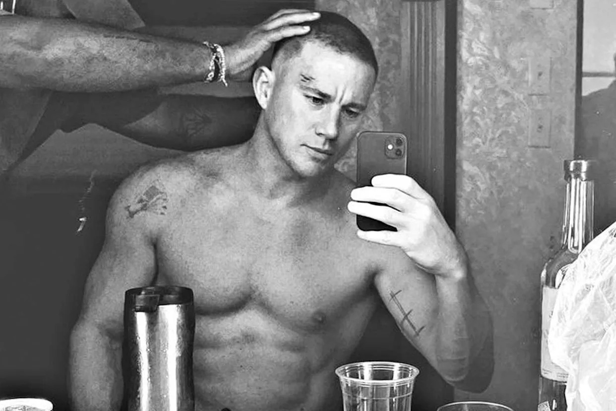
Jay Baruchel does not have the kind of tattoo collection that needs a made-up list of twenty designs. The pieces that have been properly described are more focused than that: a red maple leaf over his heart, the word Rodell on his right forearm, and a Celtic cross on his upper right arm. They are three different-looking tattoos, but they sit in the same emotional neighbourhood: Canada, his mother’s family, and his Irish heritage.
That is what makes Baruchel’s ink interesting. The story is not hidden behind a complicated symbol system. He has talked about the tattoos himself, and the details are unusually straightforward. The maple leaf came from feeling homesick while he was working in California. Rodell is his mother’s maiden name. The cross represents the Irish side of that family. There is enough there for a strong tattoo guide without padding the page with guesses.
The maple leaf, Rodell and Celtic cross tell one family story
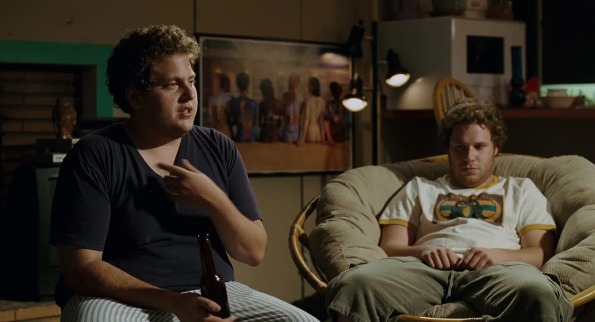
The clearest image in Baruchel’s tattoo record is the red maple leaf on his left pectoral, placed over the heart. It is the tattoo people sometimes assumed was a prop when they spotted it in films such as Knocked Up. Baruchel later explained that it was real, and that he had it done in California during a particularly homesick trip. That small detail gives the design its real meaning. It is not just a flag symbol; it is a Canadian reminder he kept close while working away from home.
The placement does a lot of the talking. A maple leaf on the chest could have been treated as a loud patriotic statement, but putting it over the heart makes it feel more personal. The design is also simple. There is no date, banner or large background competing with the leaf. The red ink is easy to spot in an open shirt or a shirtless film scene, while the small scale keeps it from turning into a full chest piece.
Baruchel’s own description matters more than any symbolic theory. He did not say that every line of the leaf represented a separate memory, and there is no need to invent one. The reliable version is enough: he missed Canada, he was in California, and he chose to put the image over his heart. That is a clean piece of tattoo storytelling because the design, location and meaning all line up.
There is also a funny part to the tattoo’s public life. It became visible through acting work, which meant people first encountered it as part of a film scene. Some viewers assumed the production had added the leaf for the character. In reality, the movie simply happened to show something Baruchel already had. That mix-up is one reason the tattoo has been mentioned repeatedly in interviews and profiles.
The next confirmed piece is the forearm lettering reading “Rodell”. Baruchel told CinemaBlend that it is his mother’s maiden name. He explained that she is one of eight children, most of them girls, and that he wanted to honour the side of the family connected to his grandfather’s surname. It is a very direct tribute: a family name, written on the arm, with no invented code needed to explain it.
Rodell is a family tattoo before it is a lettering tattoo. The typeface and exact shape matter visually, but the reason he gave for choosing the word is the part that turns it into more than decoration. He wanted the name to stay present. That is especially clear in the way he described it as a tribute to that side of the family rather than as a random surname he liked the look of.
The right forearm is a practical place for that kind of piece. It can be covered easily for work, but it is also visible when he wears a short-sleeved shirt or gestures during an interview. The position helps explain why photographs sometimes show the tattoo only partly. A turned wrist, folded arm or sleeve can hide lettering quickly. Descriptions should therefore stick to the word Baruchel identified instead of pretending that every detail of the ink is equally sharp in every photograph.
He also joked that his mother was not thrilled every time he got tattooed. That comment gives the piece a bit of personality without changing its meaning. Rodell is still a family tribute, but it was not presented as a solemn public monument. It sounds more like Baruchel: affectionate, slightly cheeky and grounded in a real family detail.
The third documented design is the Celtic cross on his upper right arm. Baruchel described it as representing his mother’s Irish side of the family. It belongs beside Rodell because he discussed the two tattoos in the same conversation. One carries the family name; the other points to the Irish branch of the family background.
It is important not to stretch that explanation further than he did. The cross can be described as a heritage tattoo, but the interview does not require us to turn it into a complete statement about religion or personal belief. Baruchel has publicly described himself as probably agnostic, and the safest reading is the one he supplied: the cross honours his mother’s Irish family. The design can carry that connection without a bigger claim being placed on it.
Upper-arm placement also means the cross is harder to document than the maple leaf. A jacket or ordinary T-shirt sleeve can hide it, and a photograph taken from the front may show only part of the upper arm. That is why a written interview is especially useful here. The photograph can help establish the general location, while Baruchel’s own words explain why the design is there.
Put together, the three tattoos form a small family map. The maple leaf marks Canada and home. Rodell keeps his mother’s family name on his forearm. The Celtic cross acknowledges the Irish side of that same family. The images are different, but the thread running through them is familiar: place, parents and ancestry.
That does not mean every future photograph will show the full collection. Tattoos can be hidden by clothes, softened by old image compression or changed over time. It also does not mean rumours about additional marks should automatically be added to the list. A good tattoo guide separates a design Baruchel has named from a shape someone thinks they can see in a distant event photograph.
The maple leaf is the strongest visual anchor because it has been photographed clearly and explained directly. The arm tattoos are better documented through his interview comments and repeated descriptions of their placement. Those are different kinds of evidence, and keeping them separate makes the article more trustworthy, not less interesting.
Baruchel’s collection is therefore best read as a set of personal markers rather than a catalogue of flashy body art. The chest piece says where he feels at home. The forearm lettering keeps a family name in view. The upper-arm cross recognises an Irish connection. None of those tattoos needs a dramatic invented backstory. Their appeal is that the real explanations are simple and specific.
There is a nice contrast between the visibility of the maple leaf and the quieter arm pieces. The leaf became part of his screen image because films exposed it. Rodell and the cross usually need a closer photograph or an interview to enter the conversation. That difference has shaped how people talk about the tattoos, but it does not change their meanings.
So, if you are looking for Jay Baruchel’s confirmed tattoos, start with the three he has actually explained: the red maple leaf over his heart, Rodell on the right forearm and the Celtic cross on the upper right arm. They cover Canada, family and Irish heritage in a few clean designs. The record is compact, but the personal detail behind it is strong.
There is another reason to keep the list tight. A lot of celebrity tattoo pages treat every shadow, crease or bit of costume ink as a confirmed design. Baruchel’s case is easier to handle because the strongest sources name the pieces directly. The maple leaf appears in photographs and in his own explanation. Rodell is identified in the interview while he points to the forearm. The Celtic cross is explained in the same breath as the family connection. That is a better foundation than a long gallery of uncertain screenshots.
The timeline also matters. The interviews that explain these tattoos are from the period when Baruchel was promoting films and talking openly about how much Canada mattered to him. A later photograph can show less skin, different clothing or a changed body shape without proving that the tattoos disappeared. Unless there is clear evidence of a cover-up or removal, the sensible wording is that these are the designs he publicly described, not that every future photograph must show them.
For readers trying to identify the pieces in older movie stills, the maple leaf is the easiest starting point. Look to the left side of the chest and remember that the image can be flipped depending on the camera angle. The forearm lettering needs a closer view because a turned wrist can make the word look shorter than it is. The cross is the hardest to check in casual pictures because the upper arm is usually covered. Those practical details help separate a real identification from a hopeful guess.
What comes through most clearly is that Baruchel chose tattoos tied to people and places he already cared about. The designs are not presented as a fashion phase or as a collection built for shock value. They are quiet reminders that happen to be visible when the right photograph or interview comes along. That makes the three confirmed tattoos more useful to document carefully than to bury under an exaggerated count.