LeBron James’s tattoos are easy to spot on court and surprisingly easy to misread online. The collection has grown over many seasons, so photographs show different versions of it. Some designs have a clear story behind them; others are simply visible ink. This guide sticks to what the pictures and published reporting can actually establish.
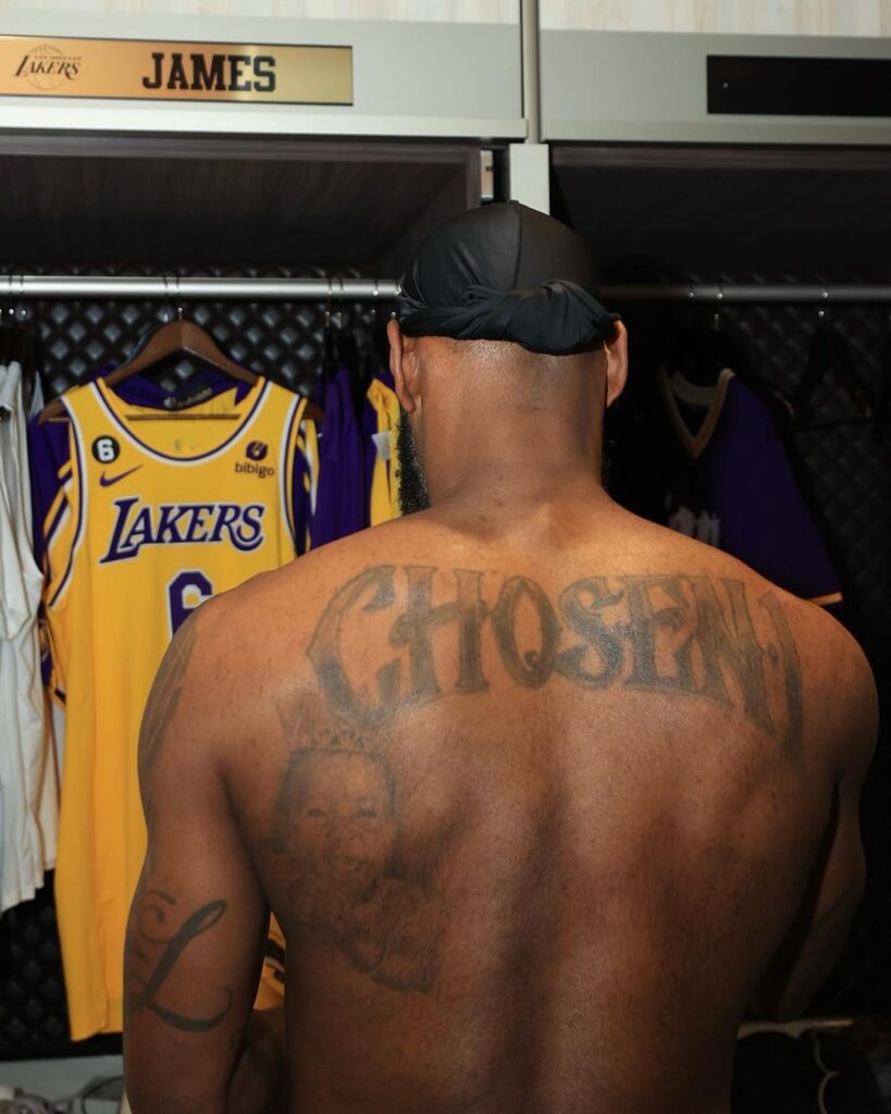
The “Chosen 1” across his back
James also has “Witness” on one calf and “History” on the other. GQ described the pair in its 2014 profile. The photographs currently available for those two pieces are small or too soft to use as quality replacements, so this section keeps the documented detail without inserting a blurry image. That is better than stretching a poor photograph until it fills the page.
Across the collection, the most reliable details are often the simplest ones: the exact words, the part of the body, and the source that identifies them. James has many more pieces than a short list can capture, and their appearance changes across seasons and photographs. A tattoo inventory should keep those differences visible instead of repeating generic explanations for every design.
The back piece is the tattoo people notice first, but the surrounding work gives it context. The words sit high and wide, so a photograph from the side can hide one shoulder while a straight-on image shows the scale. The lettering is not a small autograph. It is part of a large back composition that has to be read across the body.
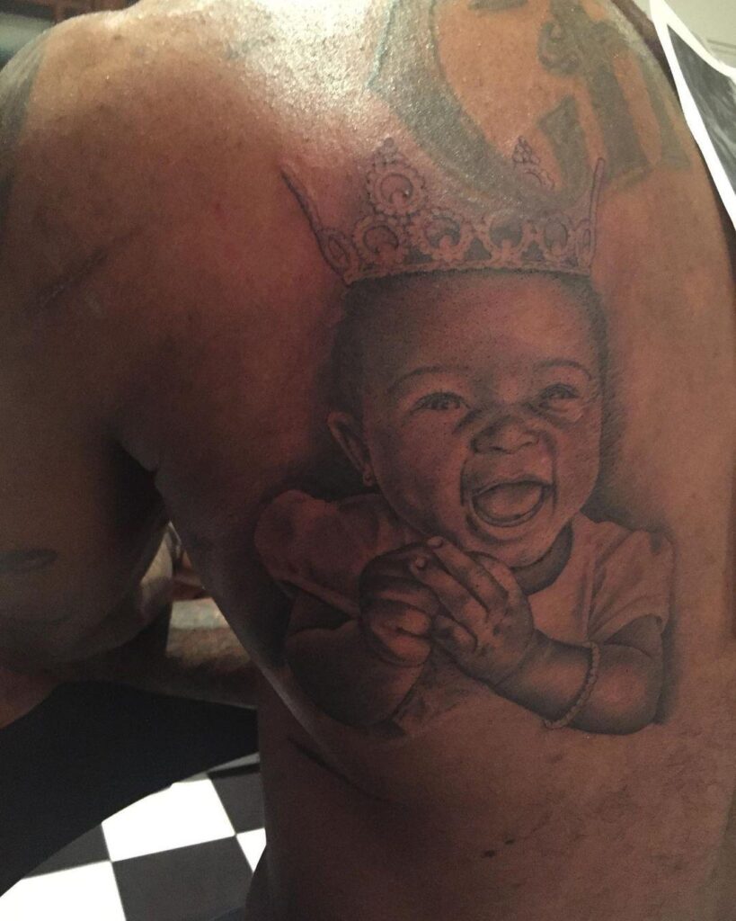
The portrait below it deserves the same care. A face tattoo can be easy to identify when the photograph is sharp, but the source still needs to establish who the portrait represents. When the coverage names a family member, that fact belongs beside the image. When the image only looks familiar, it is better to describe the face and placement without assigning an identity.
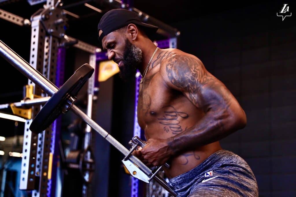
LeBron’s arm tattoos carry more of the hometown language. Akron appears in the collection alongside numbers, names and short pieces of lettering. Those marks work differently from the chest and back images because the forearms are photographed in motion, during games, interviews or celebrations. A sleeve can look crowded in one frame and surprisingly open in another simply because the arm is turned.
The lion designs add another visual thread. A lion on the chest and another on the leg or arm should not be collapsed into one entry just because both use the same animal. Placement, scale and surrounding lines are what separate them. The photographs show how one lion is framed by the chest work, while the other belongs to a different section of the collection.
Family names and portraits are the most personal-looking pieces, but the article should still avoid guessing beyond the reported connection. A name can be confirmed by readable lettering. A portrait can be confirmed by the source that identifies it. The tattoo itself cannot tell us every private conversation behind the choice.
The calf lettering is a good example of why image quality matters. A distant sports photograph may show a dark strip of ink but not enough detail to read the words. A high-resolution crop gives the reader a fair chance to see the actual script. If the letters remain uncertain, the wording should be described as uncertain rather than silently corrected into a cleaner phrase.
Dates matter here as well. LeBron has added tattoos across different stages of his career, and a current photograph does not automatically explain when a design appeared. The collection has expanded around older pieces, so a new image may show an addition that was not present in an earlier article. A good guide treats that as a timeline rather than a contradiction.
That timeline is what ties the collection together. The back lettering is large and public, the Akron references keep the hometown visible, the lions add a repeated animal motif, and the names and portraits bring family into the map. The tattoos do not all have the same style, but they do share a habit of making people, places and personal phrases visible.
The combination of large lettering and small details also changes how the tattoos read in public. A sleeveless jersey may reveal an arm while covering the chest, and a studio portrait may do the opposite. That is why no single photograph should be asked to prove the whole collection.
The strongest entries are the ones where the design, placement and source agree. The back words can be read in a clear image, the Akron references can be located on the arm, and the family work can be kept beside the photograph that actually shows it. That approach gives each tattoo its own weight.
There is plenty of room for interpretation in the overall style, but the individual entries should stay grounded. LeBron’s collection is interesting precisely because it combines public identity with private family references. The pictures show the map; the reporting supplies the context.
It is a collection that becomes clearer as the images get closer and the dates stay attached to each design.
That is the useful distinction between a tattoo list and a proper visual guide for readers.
Family portraits give the collection its personal centre
LeBron’s family portraits are more than decorative filler. The photographs show faces and placement clearly, while the names and dates give the pieces a personal timeline. They sit beside basketball and hometown references but should not be folded into those sections.
Akron and basketball references occupy their own space
The Akron work ties the collection to home. A close arm photograph shows the lettering and the body location, while the wider story explains why the reference matters. It is a different kind of tattoo from the Chosen 1 back piece and from the family portraits.
The calf lettering and tribute work complete the map
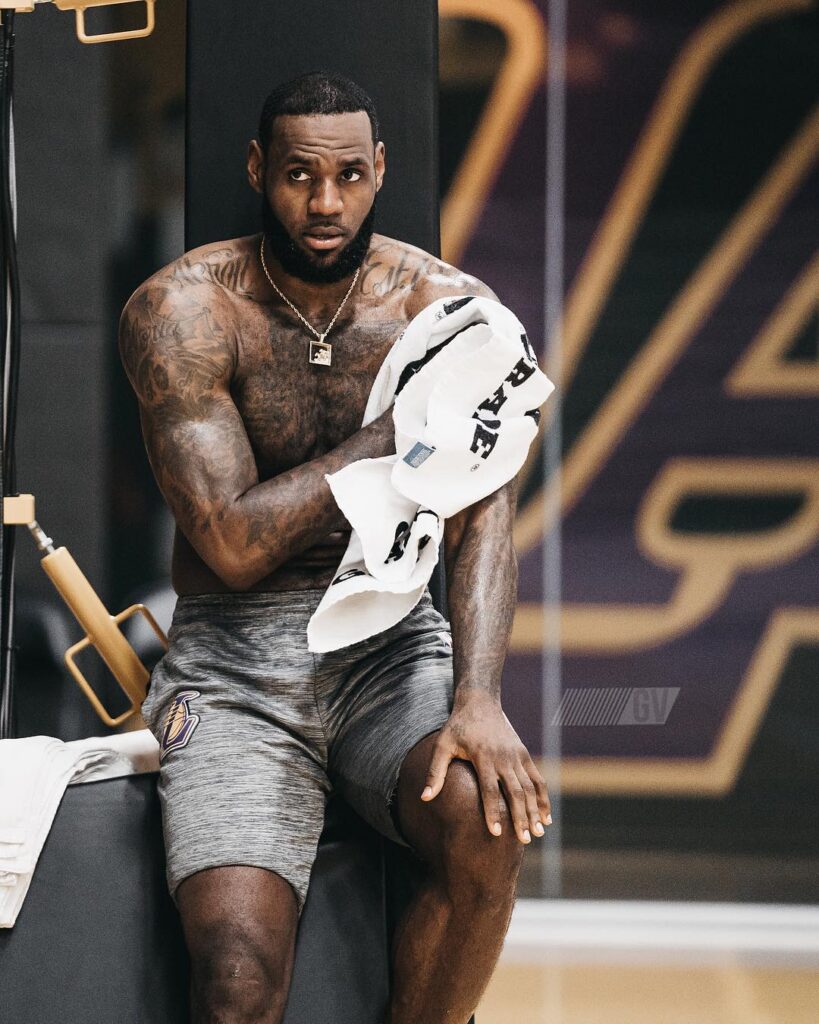
The lower-leg designs are easy to miss in a basketball photograph. A seated portrait may hide the calf, and a uniform can cover it completely. The tattoo deserves its own image because the placement changes how readers understand the overall collection.
The Chosen 1 back piece works as the main anchor:
The Chosen 1 design is large enough to define the whole tattoo map. It occupies the back, so it disappears beneath a shirt in everyday photographs and then becomes the focus of a shirtless portrait. The image needs to show the complete composition rather than a cropped shoulder. That scale is part of the tattoo’s identity.
The number one and the wording also connect the piece to James’s basketball career, but the design is not simply a jersey graphic. The placement gives it a personal centre, and the surrounding details make it read as a tribute to ambition and home. The article keeps those observations beside the photograph instead of attaching a private meaning that the sources do not establish.
Family work brings the collection back to people:
James’s family portraits and names create a different mood from the basketball references. They occupy the arms and body in smaller, more intimate designs. A close image helps readers distinguish a face, a name or a date from the surrounding filler. It also makes clear that the collection has been added to over time rather than planned as a single session.
The family pieces are especially important because they explain why the collection cannot be reduced to sports branding. James has public tattoos connected with Akron, the Lakers and basketball history, but the family work shows the private side of the map. Those sections should not be merged just because the tattoos appear in the same portrait.
Akron lettering keeps home visible:
The Akron reference is one of the clearest location tattoos in the collection. It is a literal place name, but its position and lettering still matter. A wide photograph can show where it sits on the arm, while the close crop makes the word readable. The two views answer different questions and should not be treated as interchangeable.
The same principle applies to the lion and other large motifs. A photograph can establish the figure and placement, while the reporting supplies whatever context James has actually given. It is better to say that a design is associated with home or family than to write a polished explanation that no source supports.
Small lettering and tribute details need their own images:
The calf lettering and tribute pieces are easy to miss in a game photograph. Shorts, socks and movement can hide the lower leg, while a hand or forearm may be outside the frame. That is why each section uses a distinct uploaded image rather than repeating the featured portrait.
James’s tattoo record changes as his life changes. New work appears around older pieces, and a dated image may show an arrangement that looks different from a later one. The strongest guide stays specific about the design, names the body area and uses cautious language where the meaning has not been confirmed.
That combination makes the collection feel personal, dated and visually clear.