
Kylie Jenner’s tattoos are easy to miss because most of them are tiny. She has never built a full sleeve or covered herself in giant blackwork. Instead, her collection is made up of fine red lettering, small black symbols, dates, matching pieces and a few designs that have changed as her life changed. A wrist or ankle tattoo can disappear under jewellery, a dress strap or a phone held at the wrong angle, which is why old photographs often reveal something that newer pictures hide.
The timeline is more interesting than a simple count. Kylie’s first tattoos arrived when she was young, then the designs began to mark friendships, relationships, family and the birth of her daughter. Some have been altered rather than removed. Others were created as matching tattoos and now carry a different history because the relationships around them changed. This guide keeps those stages separate and uses confirmed placement and wording instead of guessing at every tiny mark.
The red heart on Kylie’s arm started the collection
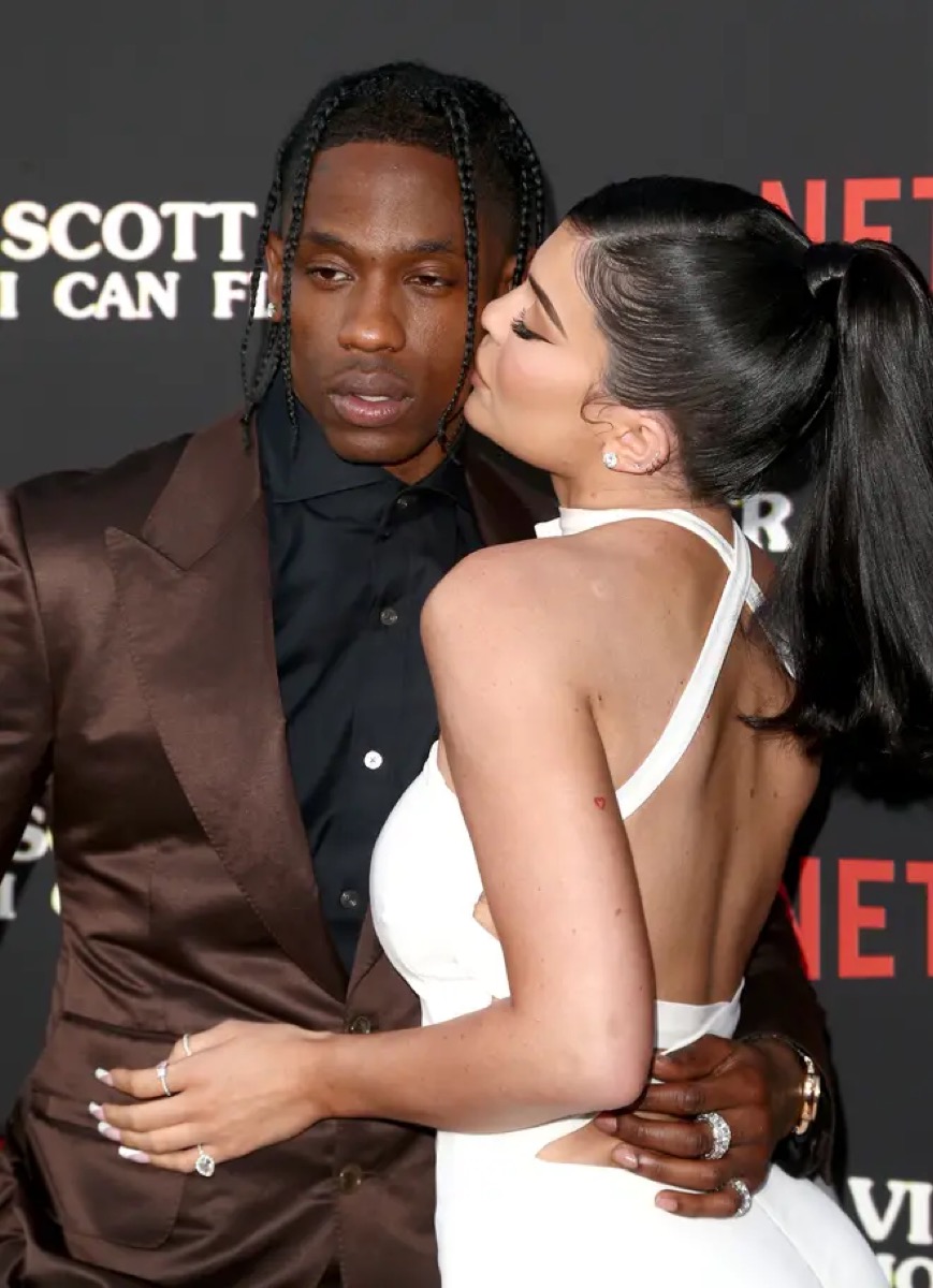
Kylie’s small red heart is one of the earliest pieces in her tattoo timeline. It sits on the back of her left arm, above the elbow area, and uses the thin red ink that became a running feature of her collection. The outline is simple: two curves meet in a point, with no heavy shading or decorative frame around it.
The heart appeared around Kylie’s 18th birthday and is often described as her first tattoo. That date matters because it places the piece before the later lettering, relationship references and family tributes. It is not a large statement tattoo. It looks more like a private mark that happens to be visible when she wears sleeveless clothing.
There is no confirmed story explaining why she chose a heart instead of another symbol. It is tempting to treat it as a romantic message, but the photograph only proves the design and the location. A heart can be a birthday choice, a family reference, a simple favourite shape or a reminder of something she never discussed publicly. The honest description is the strongest one.
The red ink also gives the heart a softer appearance than black tattoos. In older photographs it looks bright and clean. In later images it can be harder to see because red pigment fades into the skin under flat lighting. That difference does not necessarily mean the tattoo was removed. It may simply be a question of age, camera settings and how closely the arm was photographed.
Mary Jo is Kylie’s family tattoo in her grandfather’s handwriting
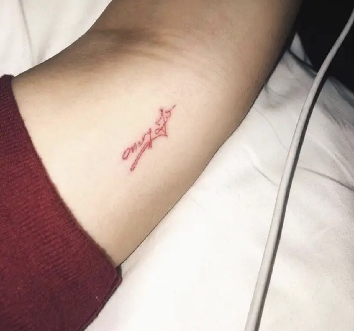
The words “Mary Jo” sit on Kylie’s inner arm in red ink. Mary Jo is her grandmother, and Kylie said the lettering was copied from her grandfather’s handwriting. That makes the tattoo much more specific than the small heart. It is not just a name placed on the skin; it is a family connection represented through somebody else’s handwriting.
The letters are delicate and compact, which fits the style Kylie preferred during this period. The name does not take up the whole forearm, and the thin red lines allow it to sit quietly beside her other small pieces. A close-up is needed to see the handwriting properly because a wide portrait turns the tattoo into a tiny red dash.
This is one of the clearest meanings in Kylie’s tattoo record. The source of the lettering and the family relationship have both been reported, so there is no reason to decorate the story with invented symbolism. The important detail is the choice to use her grandfather’s hand rather than a standard tattoo font.
Some later images make the tattoo look lighter than it did when new. Red ink can lose contrast over time, especially on a frequently exposed arm. That is part of the piece’s timeline. The design is still there, but it may not look identical to the fresh tattoo shown in the original reveal.
The matching M tattoo belonged to Kylie and Jordyn Woods
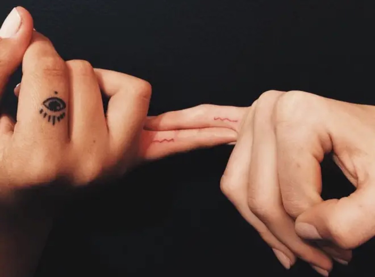
Kylie and Jordyn Woods got matching red “M” tattoos on their fingers in 2016. The letter is small, placed on the inside of the finger, and designed to be noticed only when the hand turns toward the camera. It is exactly the kind of tattoo that can look like a smudge in a group photograph, then become obvious in a close-up.
At the time, the piece recorded a close friendship. The tattoo did not need a large image or a complicated emblem because the shared letter did the work. Matching tattoos are often made to be seen together, and the small scale allowed both friends to wear the design without making it the centre of their public image.
The later breakdown of their friendship changed the context, but it did not erase the original timeline. A tattoo can belong to a real period of closeness even when the relationship no longer looks the same. That is why the piece should be dated rather than described as a current friendship symbol.
Finger tattoos also have practical problems. The skin bends, the letters are small and handwashing can make fine lines fade. Kylie’s red “M” has appeared more clearly in some photographs than others. A reader comparing images should allow for that change rather than assuming a faded picture shows a different letter.
The ankle tattoos changed from T to LA
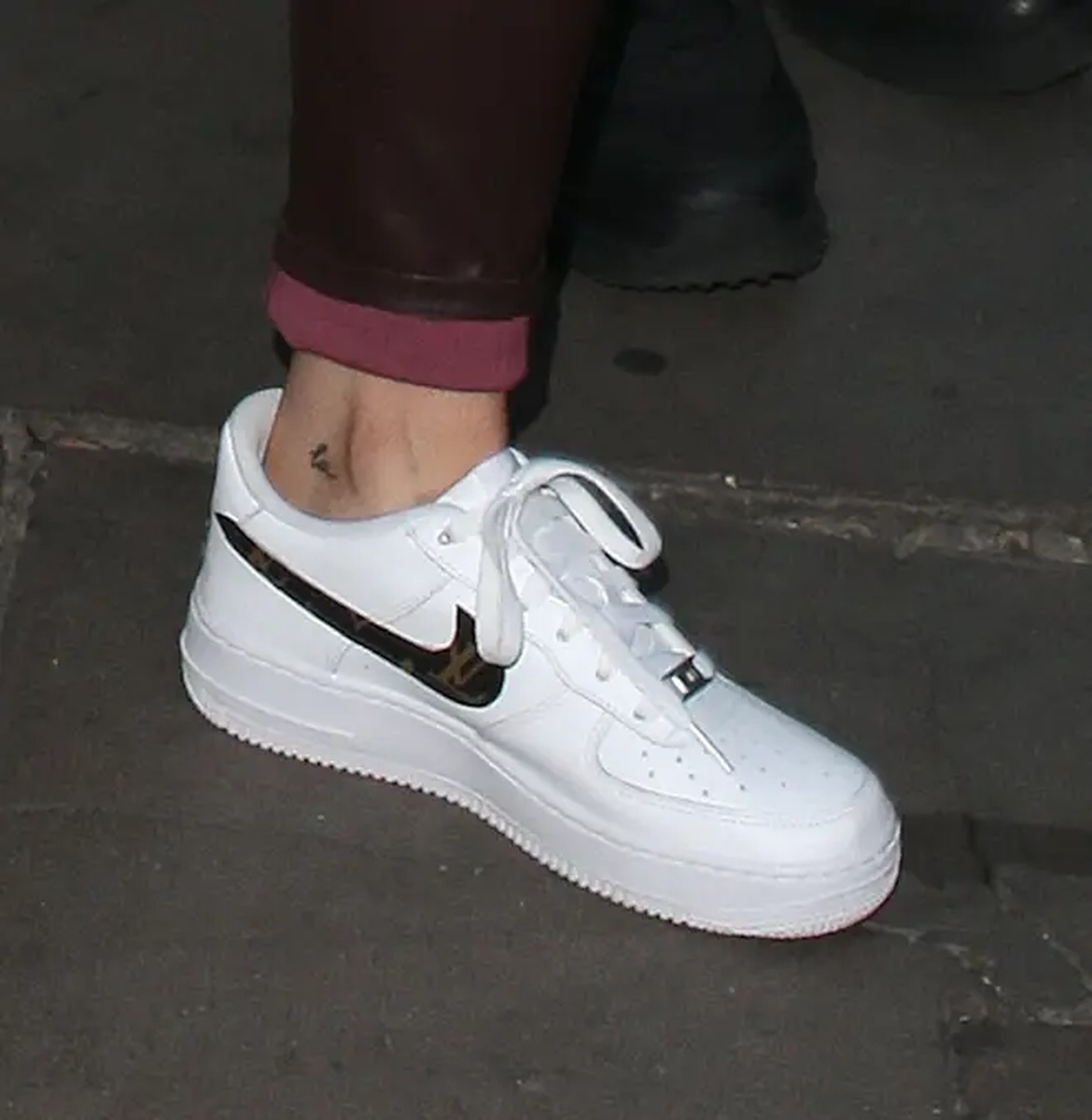
Kylie originally had a tiny lowercase “t” on the inside of her ankle, associated with her relationship with Tyga. After the relationship ended, the tattoo was altered to read “LA”, a reference to Los Angeles. The change is one of the most revealing details in her collection because the skin shows a visible edit rather than a completely new design.
The original letter was small and black, with a simple handwritten shape. The later version uses the same general area but turns the meaning toward home. A cover-up or alteration does not make the first tattoo disappear from the timeline. It shows how a person can take a design connected to another chapter and give it a different meaning.
The new reading also fits Kylie’s habit of choosing compact lettering. She favours tattoos that can sit under clothing, appear in a holiday photograph or be shown with a quick ankle close-up. The piece is easy to overlook when she is wearing boots or high heels, which is why the before-and-after record is more useful than one isolated image.
There is a lesson here for anyone considering a relationship tattoo. Kylie’s ankle design became part of a different story because the original letter could be adapted. That does not make cover-ups simple, but it does make this one of the most carefully documented changes in her collection.
Kylie and Travis Scott matched butterfly tattoos

In 2017, Kylie and Travis Scott revealed matching butterfly tattoos above their ankles. Kylie’s butterfly sits on the back of her right leg, while Travis had a corresponding design on the opposite side. The tattoos are tiny, black and easy to hide, which suits the rest of Kylie’s fine-line collection.
The butterfly was linked to Travis’s song “Butterfly Effect”, giving the matching tattoo a direct connection to his music. The design was not explained as a generic symbol of transformation in the original coverage. Its most specific context was the song and the relationship period in which both tattoos appeared.
Matching tattoos change meaning when the surrounding relationship changes, but the ink itself still records what happened at the time. The butterfly is therefore best described as a dated shared design rather than a statement about Kylie’s current relationship status. That keeps the tattoo history accurate without pretending that a photograph can tell us how she feels years later.
The ankle placement also affects the way the butterfly looks. When Kylie points her foot or stands on her toes, the design stretches with the skin. A flat photograph can make the wings look uneven, while a relaxed ankle shows the proportions more clearly. That is why a full-resolution close-up is more useful than a distant event image.
Stormi’s name and the 4:43 birth-time tattoo

Kylie has two tattoos tied to her daughter Stormi. One is the name “Stormi”, placed on the back of the arm and created as a matching tattoo with Travis Scott and her friend Anastasia Karanikolaou. The other is the tiny black “4:43” tattoo on the inside of Kylie’s forearm, marking the time Stormi was born.
The name tattoo was made during Travis’s birthday celebrations in 2019. The shared design connects the three people to Stormi, while the small lettering keeps the tribute understated. It is not a large portrait or a decorative birth announcement. The name is the whole point.
The time tattoo is even more compact. The numbers are written in a tiny, clean font and sit where they can be covered by a sleeve or bracelet. Unlike a date, “4:43” records a precise moment. That level of detail makes the piece feel personal without requiring a long explanation.
These tattoos also show how Kylie’s collection moved from relationship symbols toward motherhood and family. The earlier “M”, “t” and butterfly were connected with friends or partners. The later lettering and numbers focus on her daughter. The shift is visible in the subject matter even though the tattoo style stays small and restrained.
Before sanity is Kylie’s most unusual wording

Kylie’s hip tattoo began with the phonetic spelling of “sanity”. She later added the word “before”, so the phrase reads “before sanity.” The lettering sits on the hip in red ink, which makes it less visible than her arm tattoos but gives it a clear place in her early tattoo timeline.
Kylie later explained that the original word was a reminder to keep her sanity. Adding “before” changed the sentence and gave the design a new edge. It is a good example of how her tattoos are not frozen at the moment they first appear. The wording can be edited, and the edit becomes part of the story.
The hip placement makes the tattoo difficult to photograph casually. It appears in holiday pictures, swimwear images and selected close-ups rather than in every red-carpet appearance. That limited visibility may be why some lists describe it as one piece while others separate the original word from the later addition.
Kylie’s tattoos are small, but they are not empty of detail. The red heart marks the beginning. “Mary Jo” carries a family handwriting connection. The matching “M” and butterfly document friendships and relationships. “LA” shows a redesign, while “Stormi” and “4:43” mark motherhood. “Before sanity” records a sentence that changed as Kylie did.
That is why the collection works better as a timeline than as a simple list. The designs are delicate, but the subjects are specific: a grandmother, a daughter, a city, an old friendship, an old relationship and a personal reminder. Some meanings are confirmed. Others belong to the image alone. Keeping those categories separate gives Kylie’s tattoos a clearer story and avoids turning tiny marks into generic decoration.