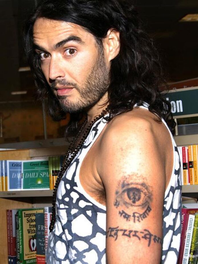
Russell Brand’s tattoos have never looked like an afterthought. They sit right in the middle of his public image: spiritual, theatrical, a bit messy in places and tied to different points in his life. You’ll see Sanskrit lettering, a long prayer on the forearm, religious imagery and smaller marks that are easy to miss when his hair, jewellery or clothes get in the way.
That mix is what makes his ink interesting. It isn’t one neat sleeve built around a single style. Some pieces are clearly explained, some are easy to identify but harder to interpret, and some only show up in older photographs. So the useful way to look at Brand’s tattoos is piece by piece, keeping the design and placement separate from any bigger theory about what he believes.
The Sanskrit “go with the flow” tattoo is Brand’s clearest piece
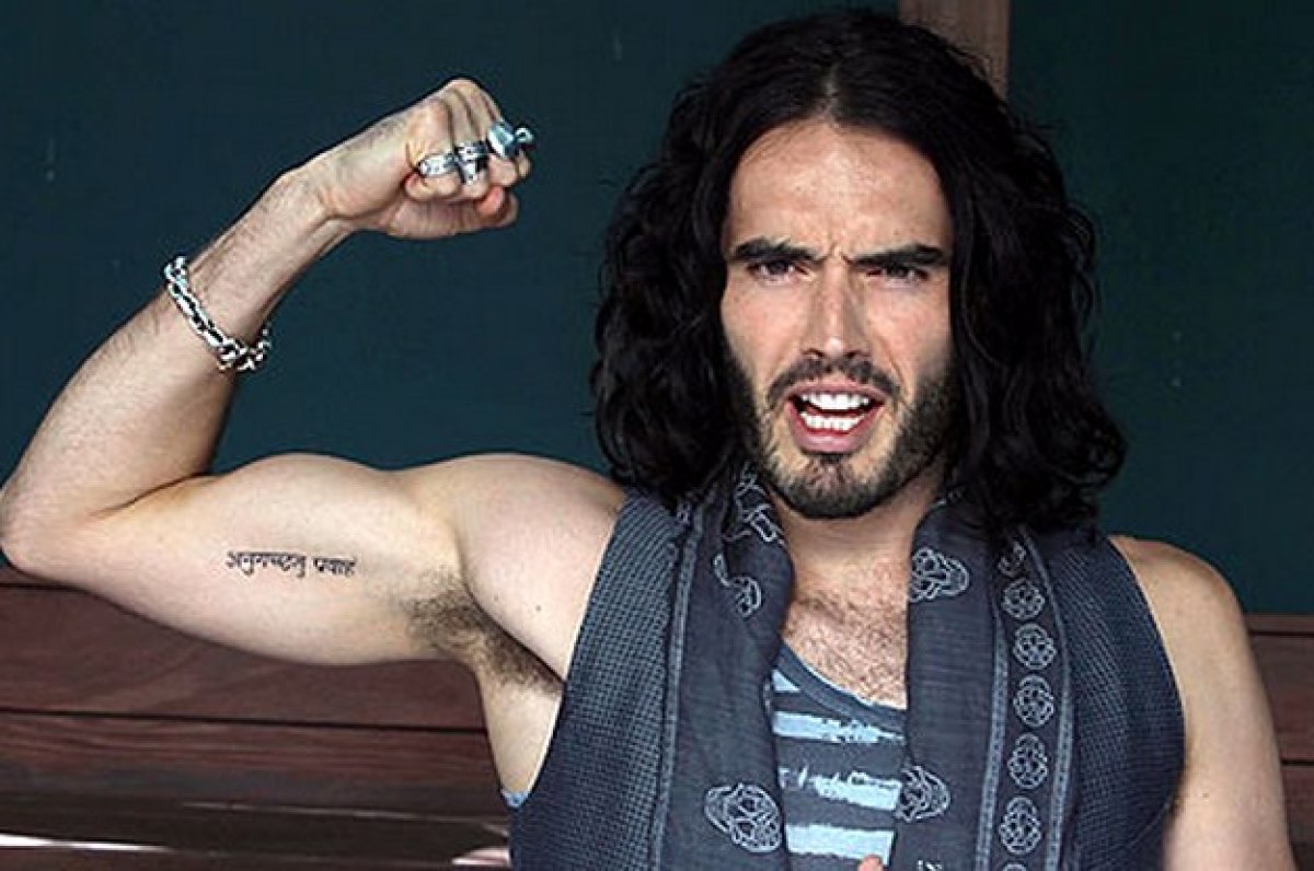
The Devanagari script on Brand’s upper arm is the tattoo most people recognise first. It is commonly translated as “go with the flow”, and the dark lettering sits along the inside of the bicep. In a sleeveless photo it reads quickly as a clean strip of black ink, but a closer look shows how much the shape depends on the individual characters and the spacing between them.
The wording fits Brand’s long-running interest in Indian religion, yoga and meditation, but the tattoo doesn’t need a grand explanation to work. The phrase is short, memorable and visually strong. It runs with the arm instead of sitting like a small badge, so it becomes part of the way the bicep looks when he raises or bends it.
There is also a relationship story attached to it. Brand and Katy Perry were reported to have matching Sanskrit tattoos during their marriage. That context belongs to that period of their lives; it shouldn’t be presented as a current statement about the relationship. The ink stayed visible after the marriage ended, which is one reason the design keeps turning up in celebrity tattoo coverage.
Photos can make the script look slightly different from one year to the next. Lighting, skin tone, the angle of the arm and the sharpness of the original file all change how the characters read. The safest description is the reported translation and the visible placement, rather than pretending a soft photograph proves every detail of the spelling.
Brand’s other marks sit around the lettering, but the Sanskrit line still has its own identity. It is narrower and more regular than the larger religious images elsewhere on his arm. That contrast gives the area a bit of balance: a compact line of text beside looser, more illustrative work.
The matching tattoo story belongs to an earlier chapter
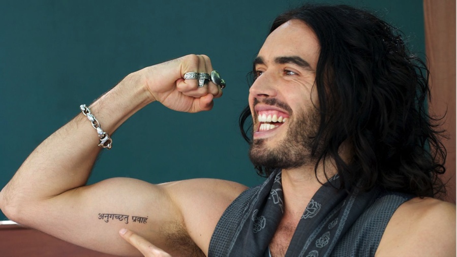
A wider arm photograph shows why placement matters here. The phrase sits on the bicep rather than floating in a close-up, and the arm position makes the lettering curve slightly with the muscle. The frame also shows the bracelet, vest and jewellery that often appear around it, which is useful context when comparing older photos.
The matching design is a good example of how a tattoo can have more than one layer. Visually, it is a line of Sanskrit. Historically, it became connected with Brand’s marriage to Perry. Those are related facts, but they aren’t the same thing. The design can be described without turning it into a complete biography of the relationship.
It’s also worth separating the original decision from later interpretations. A phrase like “go with the flow” can sound like a perfect summary of Brand’s later spiritual interests, but that doesn’t prove every idea people attach to it. What the photographs show is a dark script on the inner arm. What reports add is the translation and the matching-tattoo background.
The wider view makes the scale easier to judge. This is not a tiny wrist mark that disappears in a crowd shot. It takes up enough of the bicep to act as a visual anchor, while still leaving room for other designs around it. That is why using several genuinely different photographs works better than repeating one close-up with a different crop.
The forearm prayer is long, readable and tied to recovery
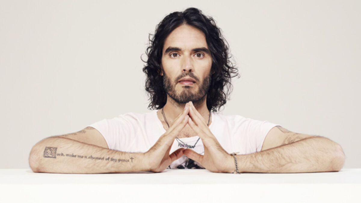
Brand’s forearm carries a much longer piece of text: a version of the prayer usually written as “Lord, make me a channel of thy peace.” Some reports use “God” rather than “Lord,” but the main point is clear in the photographs: it is a sentence-length inscription running along the arm, with a small cross at the end.
This tattoo needs a proper arm photograph because a distant portrait turns it into a blurry strip. In the seated image, Brand’s forearms rest in front of him and the lettering can be read as part of the composition. The placement is practical as well as personal. It follows the long, narrow space of the forearm, giving the sentence room to breathe instead of squeezing it into a small patch of skin.
The wording is often discussed alongside Brand’s recovery from drug and alcohol addiction and his interest in twelve-step work. That connection is supported by the way the prayer has been reported, but it still shouldn’t be stretched into a claim that every part of the tattoo is a private diary entry. The inscription is a spiritual sentence. The recovery context helps explain why it matters, but the design can stand on its own.
The small cross is easy to lose in a low-quality image, even though it changes how the line reads. Without it, the tattoo looks like a quotation. With it, the text has a clearer prayer-like finish. Details like that are why the image matters just as much as the wording.
Brand’s styling can make the forearm look busier than it is. Beads, bracelets and patterned clothing often sit close to the tattoo, and strong sunlight can flatten the lettering. A sharp, wide image gives readers the placement; a close frame is better for the actual words.
The prayer’s wording is clearer in a close-up
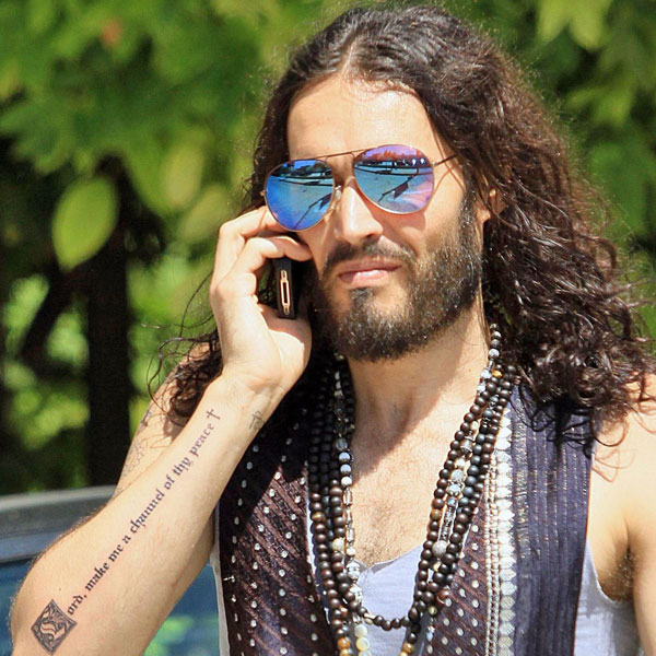
A second photograph shows the same forearm inscription from a different setting and angle. It is not there to pad out the page or pretend Brand has two separate prayer tattoos. It gives the lettering another useful view: the words stretch along the arm, the cross sits at the end, and the design remains readable even when his hand is turned toward the camera.
The phrase is commonly linked to the Prayer of St. Francis and to recovery culture. Brand has spoken about addiction, sobriety and the twelve steps, so the connection is understandable. Still, the careful version is the best one: the tattoo uses prayer language that fits themes he has discussed publicly. Anything more personal than that needs a direct quote from Brand.
The lettering also has a different feel from the Sanskrit. The Sanskrit is compact and graphic, while the prayer is conversational and sentence-like. It makes the forearm look almost like a line from a notebook. That difference is part of the appeal of Brand’s collection: the tattoos don’t all try to sound or look the same.
The eye and Krishna imagery give the arm a more graphic side
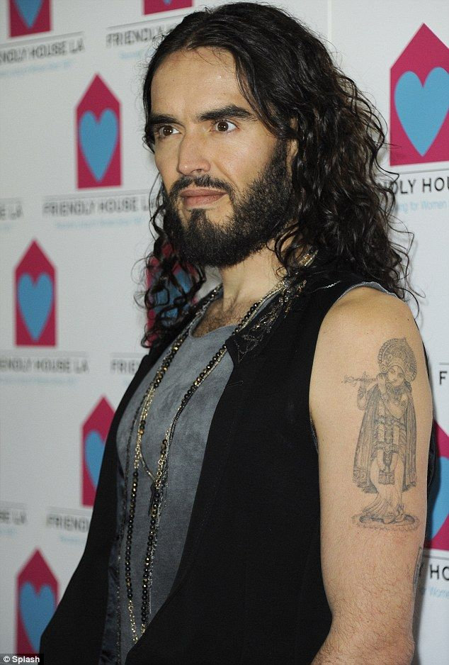
Brand has also been photographed with larger religious imagery on the upper arm, including a Krishna figure and Sanskrit lettering. This work is more illustrative than the short bicep phrase. Instead of one clean line, the image uses a figure, shading and surrounding text to make the arm feel like a small panel of artwork.
Reports and older photographs also describe an eye tattoo with Sanskrit beneath it. The eye has a much bolder visual impact than the prayer text: it reads as a graphic symbol before the viewer has time to think about its meaning. When the hair or clothing covers the edges, it can be hard to tell exactly where one design ends and another begins, so placement descriptions should stay cautious.
Brand’s interest in Hare Krishna and Hindu thought is well known, which gives the religious imagery a clear public context. It still doesn’t prove a hidden meaning for every line or figure. A Krishna image, an eye and a Sanskrit phrase can sit together because Brand liked the ideas and the look, without forming one secret code.
The arm image also shows how much scale changes the feel of a tattoo. The figure is big enough to hold attention from across a room, while the lettering asks the viewer to move closer. That mix of instant recognition and smaller detail is common in Brand’s ink.
Not every mark attributed to Brand is equally easy to verify. Older lists mention smaller symbols, a “33” wrist tattoo and a word tattoo reported as “Ecstasy,” while other photographs focus almost entirely on the arm pieces. These details can be discussed as reported tattoos, but they shouldn’t be described with the same certainty as the Sanskrit phrase or the forearm prayer unless a clear photograph supports them.
This is where the date of a picture really matters. Brand’s hair, jewellery and clothes can hide the wrist or hip, and an image from one stage of his life won’t necessarily show the full collection. Tattoos also soften, fade or change under different lighting. A missing mark in one photo is not proof that it was removed.
The arm pieces are the easiest place to start because they appear repeatedly in interviews and event photography. The smaller tattoos need more patience. A close-up may show a mark clearly but say nothing about its meaning, while an interview may explain the meaning without giving readers a useful view of the design.
That split between visual evidence and personal explanation is worth keeping. The photograph can establish the shape, colour and placement. Brand’s own words can explain a phrase or a spiritual reference. Everything else should be labelled as an interpretation rather than slipped in as fact.
Seen together, the tattoos move between text and image, private memory and public style. The Sanskrit line carries the relationship history and the “go with the flow” translation. The forearm prayer brings in recovery and service. The Krishna and eye imagery gives the collection a more graphic, spiritual edge, while the smaller reported marks add a timeline around the bigger pieces.
That’s why the best Russell Brand tattoo guide needs more than one generic portrait. Each photograph should do a different job: one shows the Sanskrit clearly, another shows its scale on the bicep, two make the long forearm prayer readable, and the upper-arm image shows how the religious artwork sits on the body. The writing can then stay relaxed and specific instead of filling space with vague claims about transformation.
Brand’s ink is personal, but it is also very visible. The lettering invites people to ask what it says, and the larger religious images give his arms an instantly recognisable look. There’s no need to force every piece into one polished story. The interesting part is the mix: clear phrases, open-ended symbols and tattoos gathered across different chapters of his life.