Musician

Cody Johnson’s Tattoos: Texas, Family and the Ink He Got on the Road

Cody Johnson’s tattoos are easy to underestimate if you only notice the ink on his hands when he is wearing a pearl-snap shirt. There is a lot more going on. His collection runs across his back, chest, arms, hands and even the bottom of one foot. The designs are not a random pile of flash. They point back to his family, his East Texas home, his old band, his work on the road and the country music that shaped him.

Johnson has explained unusually specific details about the collection during tattoo tours and interviews. That makes it possible to describe the obvious shapes and the stories behind them. His own stories identify the people, places and decisions behind several pieces. Where a photograph only shows a design, the description stays visual. Where Johnson has given a reason, that reason is included without dressing it up as something deeper than he said.

The timeline matters as well. Some of the tattoos were done when Johnson was travelling with his band and tattoo artist Buffalo Jake. Others came from particular points in his family life or his career. The result is a body map that feels personal without needing one grand explanation for every piece.

The back cross marks the beginning of Cody Johnson’s tattoo story
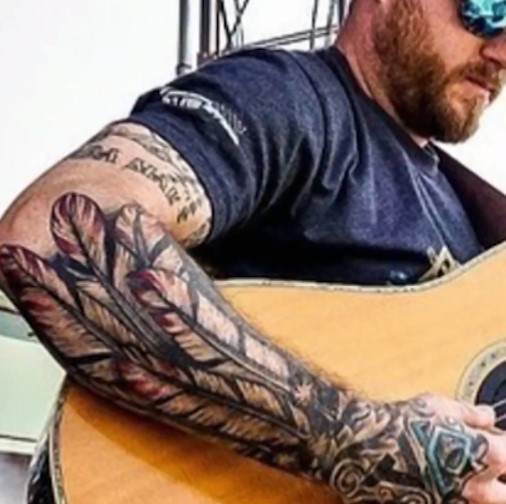
Cody Johnson tattoos: the tattooed arm sleeve and hand logos

Johnson says his large cross on his back was his first tattoo. It is the starting point for the whole collection, and he has called it his worst tattoo when looking back at it. That comment is useful because it makes the piece feel like an early decision rather than a perfectly planned centrepiece. It came first, before the sleeve, the logos and the family designs that now make the collection much denser.

The cross is also tied to a scar from neck surgery. During the tattoo tour, Johnson points out the scar above the tattoo and jokes that scars count as tattoos too. The scar is obviously not ink, but it becomes part of the story because it sits close to the first piece and changes how that area is read. A photograph can show both marks, while Johnson’s explanation supplies the personal timeline.

It is tempting to describe the cross as a complete statement of faith, but the available interviews do not require that much interpretation. The confirmed details are its size, its placement, its position as Johnson’s first tattoo and the way he talks about the result now. Those facts are enough to make it interesting. Early tattoos often carry the history of a person’s taste at that moment, even when the wearer later laughs at the execution.

That early back piece also explains why a current photograph should not be treated as a complete inventory. Clothing hides most of the back during performances, and later tattoos draw attention toward his hands and arms. The cross belongs in the guide because Johnson names it himself, even if it is not the design most readers notice first.

Hand logos turn Cody Johnson’s handshake into a personal code
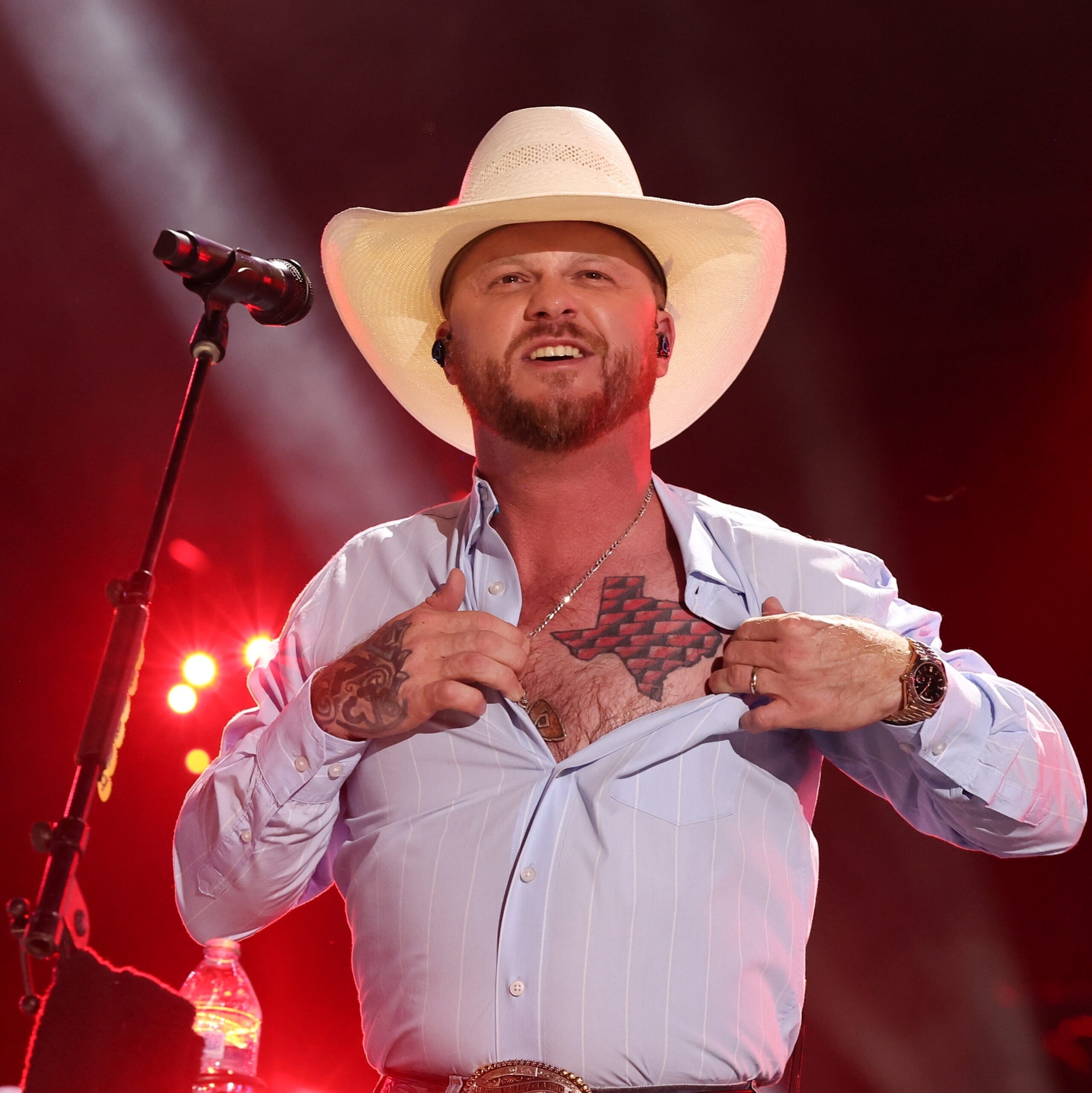
Cody Johnson tattoos: the Texas map chest tattoo and visible hand ink

The tattoos on Johnson’s hands are small compared with the arm work, but they carry some of the clearest explanations in the collection. One is the old Rockin’ CJB logo, referring to the Cody Johnson Band. Another is the CoJo logo used across his wider camp, including merchandise and buses. These marks connect the person holding the guitar to the working organisation that helped build his career.

Johnson says he put the logos on his hands so that the message would be present whenever he shook somebody’s hand. His explanation is about accountability. The marks remind him who he represents, the people he works hard for and the standards he wants to live up to. That is a more specific meaning than simply calling them branding tattoos. They are visible reminders attached to an everyday gesture.

The hand placement changes the feel of the designs. A logo on an upper arm can disappear under a sleeve, but a hand tattoo follows Johnson into interviews, performances and introductions. It is almost impossible to separate the ink from the way he presents himself as a working musician. The design may be compact, yet the placement gives it a public role.

Hand tattoos also fade and soften faster than ink in areas protected by clothing. That is worth keeping in mind when comparing photographs. A later image can make a small logo look lighter or less precise without proving that the design was replaced. The safest description is the symbol Johnson identifies, the hand placement and the band or brand context he gives it.

The same close-up views show that the hand work sits beside larger pieces running up the arm. That contrast is part of the appeal. The logos are graphic and compact, while the sleeve uses feathers, flowers and larger shapes. Together they make the hand look like the starting point of a much bigger composition rather than a separate collection of tiny marks.

Brandi, Clara Mae and Cori appear in the arm sleeve
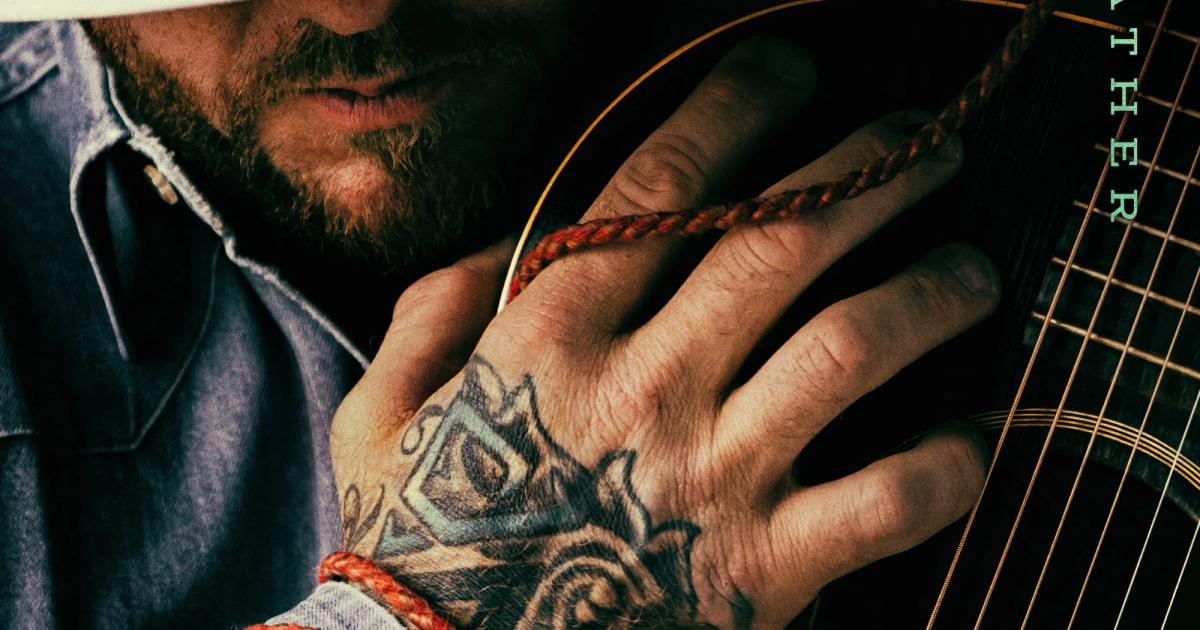
Cody Johnson tattoos: the close-up hand tattoos and logo shapes

Johnson’s arm tattoos are where the collection becomes most obviously about family. He has a piece with his wife Brandi’s name, surrounded by flowers that bloom around her birthday. The floral framing gives the lettering a softer edge, but the important fact is the connection he explains himself. This is not an anonymous script tattoo that fans have assigned to a relationship. Johnson identifies the name and the reason for the surrounding flowers.

Another design is a sunshine tattoo for his daughter Clara Mae. Johnson says Clara designed the image for him. That detail changes how the piece should be read. It is not just a sun chosen from a catalogue. The design carries the physical mark of a child’s idea, which is exactly why a simple image can matter so much inside a larger sleeve.

He also has a tattoo linked to his daughter Cori, who was born close to Valentine’s Day. The reported design uses Valentine’s imagery, giving the arm another family marker without copying the Brandi or Clara Mae pieces. The three tattoos are worth discussing separately because they refer to different people and use different visual cues: lettering and flowers for his wife, sunshine for Clara Mae and a Valentine’s reference for Cori.

That separation makes the sleeve easier to understand. It is not one generic family tribute spread across the arm. It is a set of individual pieces added at different moments, each with its own image and relationship. The photographs show how the designs sit together, while Johnson’s explanations keep the meanings from being flattened into a sentimental caption.

The arm also includes larger traditional and illustrative elements around the family tattoos. Feathers and darker outlines give the sleeve more weight, especially when the tattoos are photographed beside a guitar or stage clothing. These surrounding details should be described as visible parts of the sleeve, not automatically assigned a private meaning. The documented family pieces have clear explanations; the rest can remain visual.

Texas tattoos, Resistol and the foot line finish the map
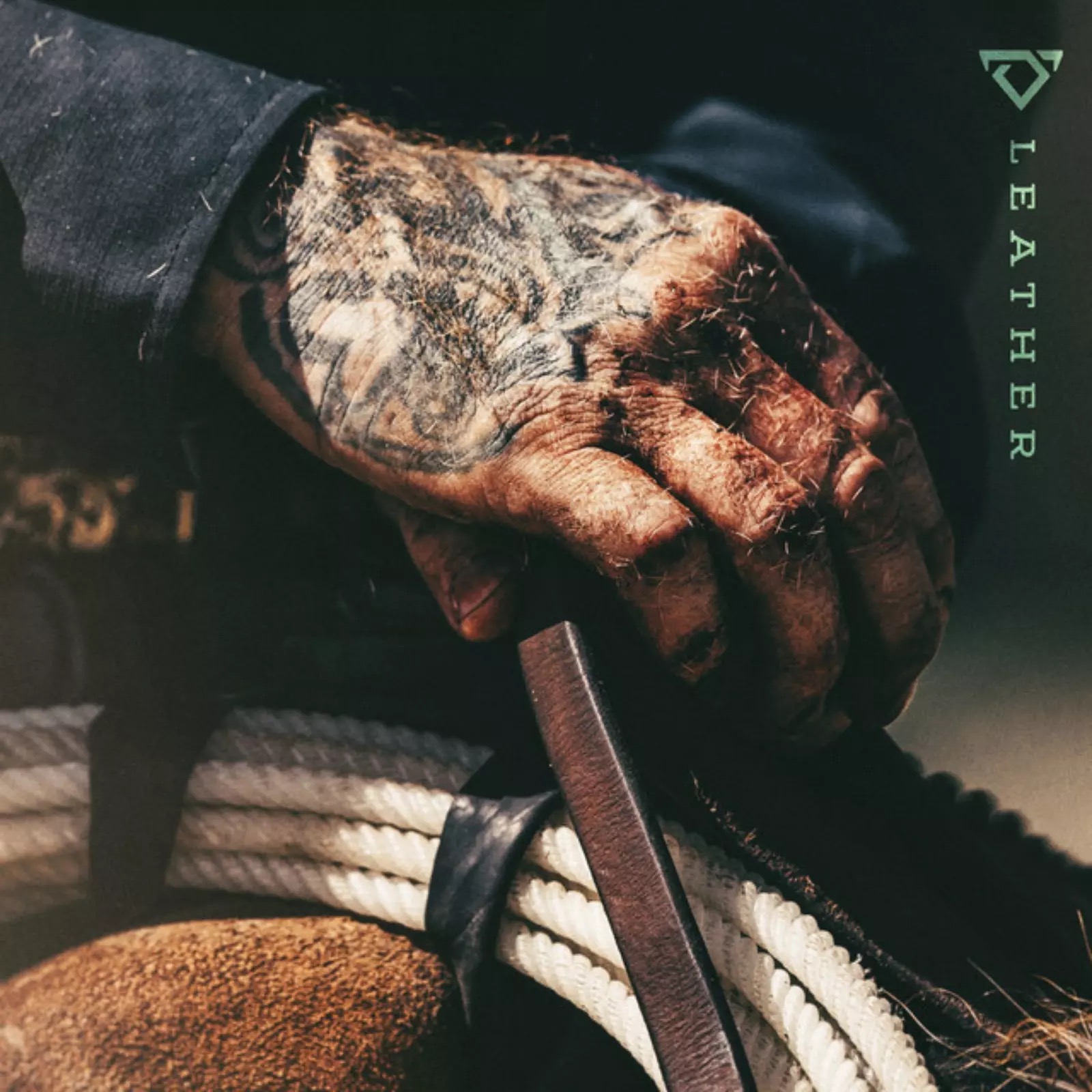
Cody Johnson tattoos: the heavily tattooed hand and visible lettering detail

Johnson’s connection to East Texas appears directly in the tattoo inventory. A forearm piece combines Texas pine trees with the words Native ETX. He explains that the design marks where he is from and the place he will continue to call home, no matter how many countries or cities he visits to play music. The wording gives the tattoo a plain, strong purpose. It is a home marker, not a vague claim about being a country singer.

There is also a Texas outline filled with red bricks over his heart. Johnson has connected that piece with his time working at a state penitentiary as a corrections officer. The brick pattern makes the outline different from a simple state silhouette. It adds a reference to the environment where he worked before his music career became his full-time life. The chest placement gives the design extra weight, but the meaning still comes from the story he tells about the job and the state.

A Resistol hat logo records another part of his working life. Johnson got it after securing a hat deal, so it belongs to the part of the collection connected with his career and western identity. The logo is more direct than the family pieces. It names a brand that became part of his public image and his relationship with the country audience. It should be described as a logo tattoo rather than turned into a larger theory about commercial success.

The strangest placement is the bottom-of-the-foot tattoo. Johnson says he and Buffalo Jake were talking on his bus about body parts the artist had never tattooed. When Jake mentioned the sole of the foot, Johnson decided to try it after a show. The finished mark is a line connected to Waylon Jennings’s song “I’ve Always Been Crazy” and the lyric about having one foot over a line.

Johnson has joked that the session tickled and that the final result includes a few rough marks around the stronger line. That makes the tattoo memorable because it is both deliberate and slightly ridiculous. It also fits the way several of his tattoos were made on the road: a conversation turns into an idea, and the idea becomes permanent before anyone has time to overplan it.

Put together, the cross, hand logos, family sleeve, Texas designs, Resistol mark and foot line give Cody Johnson’s collection a clear shape. The tattoos move from early faith imagery to band identity, family, home and country music history. Some pieces are large and easy to photograph, while others need a close-up or a story from Johnson himself. That is why a useful guide needs more than a generic portrait. Each section should name the design, locate it, show it clearly and keep the explanation tied to what he has actually said.

The collection is still capable of changing. New work, fading ink and cover-ups can alter the map, and different shirts reveal different areas. The most reliable way to follow it is to keep dated photographs beside the specific tattoos they show. Johnson’s own accounts give the guide its strongest details, while the images let readers see how the separate pieces sit together on the body.

The arm sleeve carries separate family tattoos, not one giant tribute
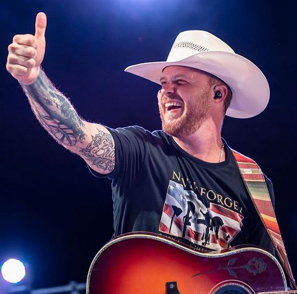
Cody Johnson tattoos: Brandi lettering and the detailed right-arm sleeve

The sleeve deserves a closer breakdown because the family pieces are not one blended design. Johnson describes Brandi’s name and birthday flowers, Clara Mae’s sunshine and Cori’s Valentine’s Day mark as separate tattoos. The arm photograph shows how they share the same area while keeping different shapes, line weights and colours.

The visible lettering is especially useful in a close view. It gives the sleeve a human scale that a distant stage photograph loses. The flowers around Brandi’s name soften the script, while the sunshine and Valentine’s design read more like personal symbols. Johnson has supplied the relationships behind the pieces, but the photographs still matter because they show how the symbols sit beside the larger work.

Native ETX is a tattoo about home rather than a generic Texas slogan
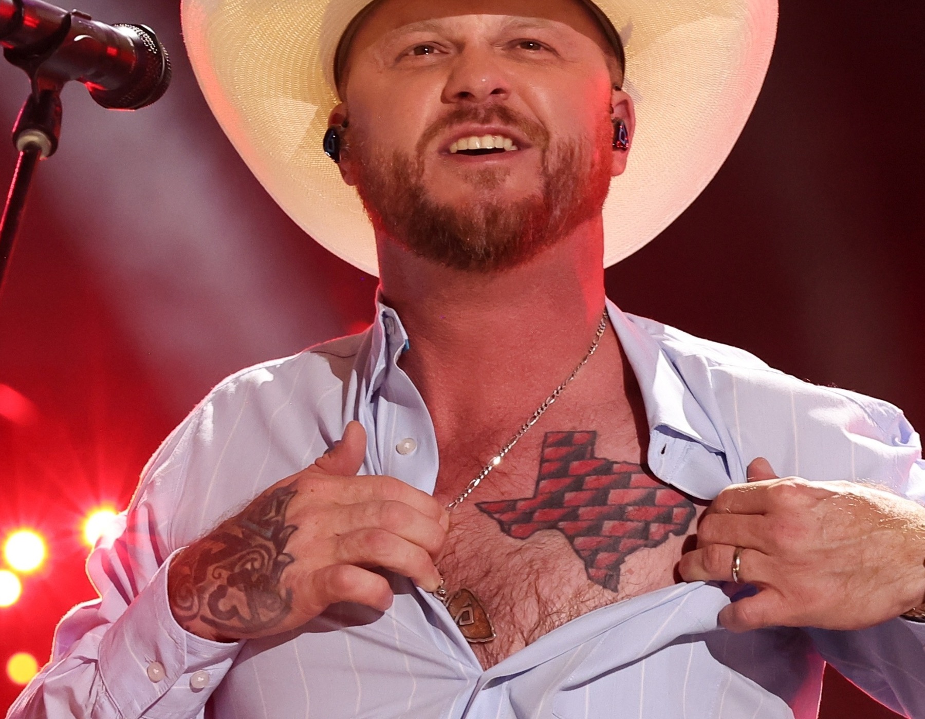
Cody Johnson tattoos: Texas chest map and visible hand tattoo detail

The Native ETX forearm piece should have its own entry because it is more specific than a general Texas reference. Johnson uses the words alongside pine-tree imagery to identify East Texas as home. He has said that playing around the world does not change where he considers himself to be from.

The pine trees give the lettering a landscape around it. That matters visually: this is not simply a set of initials written across bare skin. It combines a place abbreviation with a regional image, so readers can understand why it belongs beside the family tattoos as its own design. The placement also makes sense for a touring musician because the forearm is visible while he performs and plays guitar.

The Texas chest map and hand ink need separate close views

Johnson’s Texas outline filled with red brick is a chest tattoo, while the smaller hand marks sit much closer to the camera in the same kind of photograph. They should not be treated as one piece. The map records Texas and his former corrections work; the hand designs record the Cody Johnson Band, the CoJo identity and the accountability he associates with a handshake.

A wide portrait can prove that both areas are tattooed, but it cannot show every edge clearly. A closer chest view makes the red-brick fill visible, while a hand image lets readers see why the logos are readable marks rather than anonymous dark shapes. Separating the images also prevents the featured portrait from doing work it cannot do.

The map has a different emotional register from the career logos. One points to a state and a former job; the other points to the working team Johnson built around his music. Both are public-facing tattoos, but they tell different parts of the story.
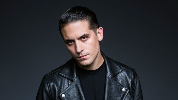

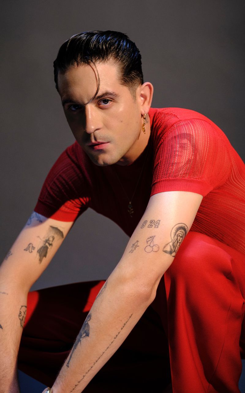
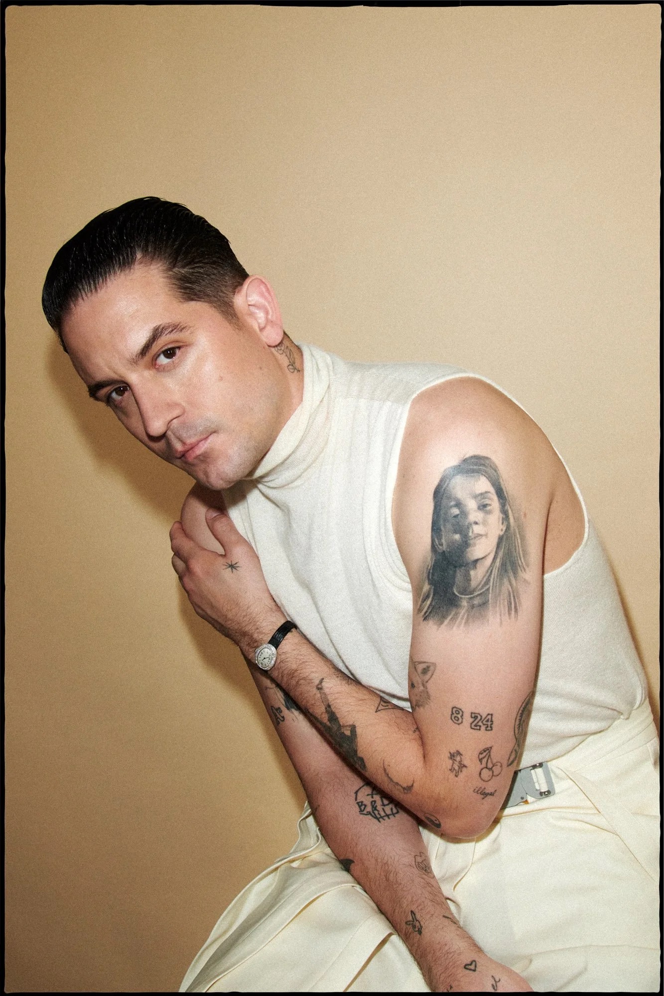
G-Eazy’s Tattoos: Oakland Codes, Neck Ink and the Stories Behind the Symbols

G-Eazy’s tattoos are easy to read as a collection because so many of them sit on his arms, neck and forearms. The designs are small enough to work as separate pieces, but they still build a recognisable map when he wears short sleeves. There is a thorned rose on the neck, a wolf on the bicep, theatre masks, an Oakland area code, lettering and a skull tied to one of his music projects.

Some of the meanings are reported clearly. The 510 is connected with Oakland and the years G-Eazy spent around Berkeley and North Oakland. The “LIFE IS GRAND” quote is explained as a reminder to enjoy life even when things are difficult. Other designs, such as the rose and sword, are easier to describe visually than interpret personally. That difference matters. A good tattoo guide should separate what the photograph shows from what the artist has actually explained.

The rose on G-Eazy’s neck is small but impossible to miss

G-Eazy tattoos: both tattooed arms with anchor, portrait, number and traditional designs

The rose on the left side of G-Eazy’s neck is one of the first pieces people notice because it sits so close to his face. It has a stem, two leaves and visible thorns, so it reads as a proper flower rather than a vague black mark. The design is compact, but the placement makes it part of his public silhouette. A collar can hide the lower edge, while a bare neck makes the whole shape stand out.

Rose tattoos are often given broad meanings such as beauty, love or new beginnings. Those associations can be mentioned as general symbolism, but they are not automatically G-Eazy’s reason. The available tattoo inventory describes the design and offers a conventional reading; it does not give a detailed first-person explanation from him. The careful version is to name the rose, describe the thorned stem and leave the private meaning open.

The neck placement also changes how the rose works beside the rest of his style. G-Eazy often dresses in dark jackets and shirts, so the tattoo appears as a small break in a mostly monochrome look. It is not a large traditional rose spreading across the throat. It is a neat side-neck mark that can disappear when his hair falls forward or when he wears a high collar.

That small scale is useful when comparing photographs from different years. A red-carpet image may show the rose clearly while losing the forearm designs. A performance photo may catch his hands and arms but place the neck in shadow. The rose is therefore a good example of why one portrait cannot stand in for a complete tattoo inventory.

LIFE IS GRAND turns a forearm quote into a daily reminder

G-Eazy tattoos: forearm lettering, cherries, portraits and other visible arm tattoos

The words LIFE IS GRAND sit on the inside of G-Eazy’s left forearm near the elbow fold. The lettering is direct and easy to recognise. It does not depend on a complicated illustration or a hidden reference. When his arm bends, the phrase can break across the crease, but when he straightens it the words read as one short statement.

Body Art Guru’s account gives the quote a straightforward meaning: even with setbacks, life is still something to enjoy and value. That makes this one of the more useful entries in the collection because the design and the reported idea match. The tattoo is not just identified by a fan looking at a blurred photograph. The wording is readable, and the explanation is tied to the phrase itself.

Forearm lettering is also practical for an artist who performs. It can be covered by a sleeve or shown when he rolls up a shirt. That gives the quote a private and public quality at the same time. It is visible enough to become part of his image, but it is not as exposed as a tattoo placed across the face or front of the neck.

The phrase sits among other small pieces rather than taking over the whole arm. The nearby moon and figure create a more illustrative area, while LIFE IS GRAND stays plain. That contrast makes the lettering easy to pick out. It also stops the arm from looking like one dense sleeve. Each tattoo keeps its own border and visual job.

There is no need to dress the quote up with a larger theory. The point is already there in the words. G-Eazy’s collection includes designs about place, family, music and personal outlook. LIFE IS GRAND covers the last category in the most literal way. It is a short reminder, set in a location he can see whenever he looks down at his arm.

The 510 tattoo keeps Oakland close to G-Eazy’s arm

G-Eazy tattoos: upper-arm portrait and detailed forearm tattoo collection

The number 510 appears on the back of G-Eazy’s right forearm. It is the area code associated with Oakland and nearby parts of the East Bay, so the design functions as a hometown marker rather than a random number. The placement is useful too. It can be seen when he turns his arm, but it does not dominate the front of the forearm or compete with the larger illustrated pieces.

The story behind it reaches back to childhood. Coverage says G-Eazy spent part of his early life with his grandparents after his mother left his father, moving between Berkeley and North Oakland. That context gives the number more weight than a generic city tattoo. It points to the places and people connected with his upbringing, particularly the grandparents who helped raise him.

Numbers can be tricky in photographs. A blurred image may make a 510 look like a date or a private code. In this case, the area-code explanation is documented, so the guide can be specific without guessing. It is a small piece with a clear geographic reference and a personal history behind it.

The Oakland connection also fits G-Eazy’s public identity as a Bay Area rapper. The tattoo is not a substitute for his music, but it sits comfortably beside the career story. A place can be part of an artist’s work without every song or design being reduced to a slogan. The number simply keeps one part of home close to the skin.

It is worth separating 510 from other number tattoos or sports references that may appear in later photographs. Tattoo collections change, and a new mark can be added near an older one. The safest catalogue keeps this design as its own entry: three numbers, right forearm, Oakland connection, childhood and grandparents in the supporting account.

The B and D skull connects the smaller arm marks to his music

G-Eazy tattoos: close view of visible arm, wrist and neck tattoo details

The cartoon skull on the inner right forearm is more detailed than its small size first suggests. The letters B and D form the eyes, an ampersand works as the nose and a sword appears across the forehead. It is a playful image, but the parts are not random. The design is reported as a reference to G-Eazy’s B & D EP.

That connection is what makes the skull different from a generic skeleton tattoo. The image works as a piece of branding, but it still looks like a drawing rather than a logo pasted onto the arm. The letters are built into the face, so a reader can understand the music reference only after looking closely at the tattoo itself.

The piece also shows how G-Eazy uses small arm tattoos to hold career markers. The 510 points outward to Oakland. B & D points inward to a specific release. Both use compact symbols and numbers or letters, but one is geographical while the other is musical.

Other reported designs add more contrast. The left forearm includes comedy and tragedy masks, while the right side has been catalogued with a sword, a Batman symbol, an angel and a devil. A pin-up girl and a figure with an umbrella also appear in the broader inventory. Not all of those pieces carry a confirmed personal explanation, so they should be described by location and design rather than given invented meanings.

The angel and devil pairing is easy to understand visually as a contrast between two sides of a person. That does not prove a private story, but it does explain why the designs are often discussed together. The masks work in a similar way, with a happy face and a sad face creating a simple emotional pair. G-Eazy’s arm tattoos are full of these compact opposites: place and project, comedy and tragedy, angel and devil.

His tattoo map is strongest when the entries stay specific. The neck rose is a thorned flower. LIFE IS GRAND is forearm lettering. 510 is an Oakland code tied to family and childhood. The B and D skull turns an EP title into a little cartoon face. That is enough to make the collection interesting without claiming that every line has a secret meaning.

Put together, the tattoos give G-Eazy a visual language that feels connected to where he came from and what he makes. The designs are not one giant sleeve and they are not all the same style. They move between lettering, numbers, animals, theatre imagery and music references. A clear photo can show the ink. The strongest sources can explain the stories. The rest is best left as honest description.

Damiano David’s Tattoos Tell a Rock Story in Ink

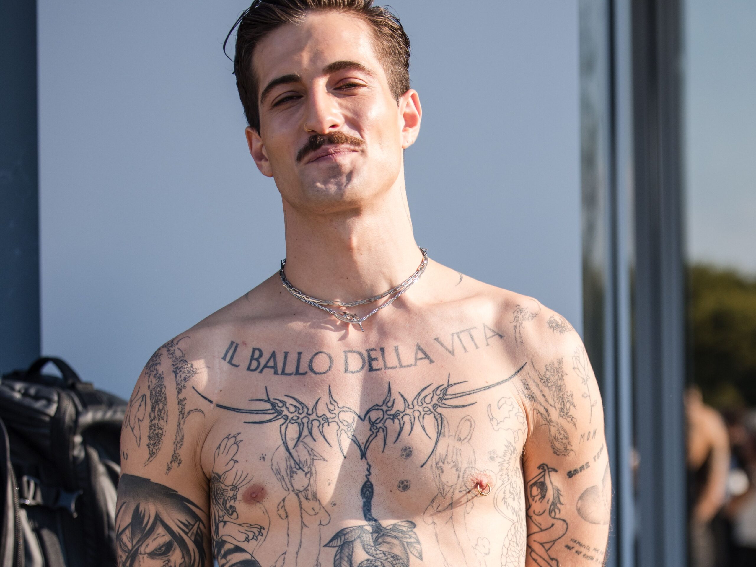
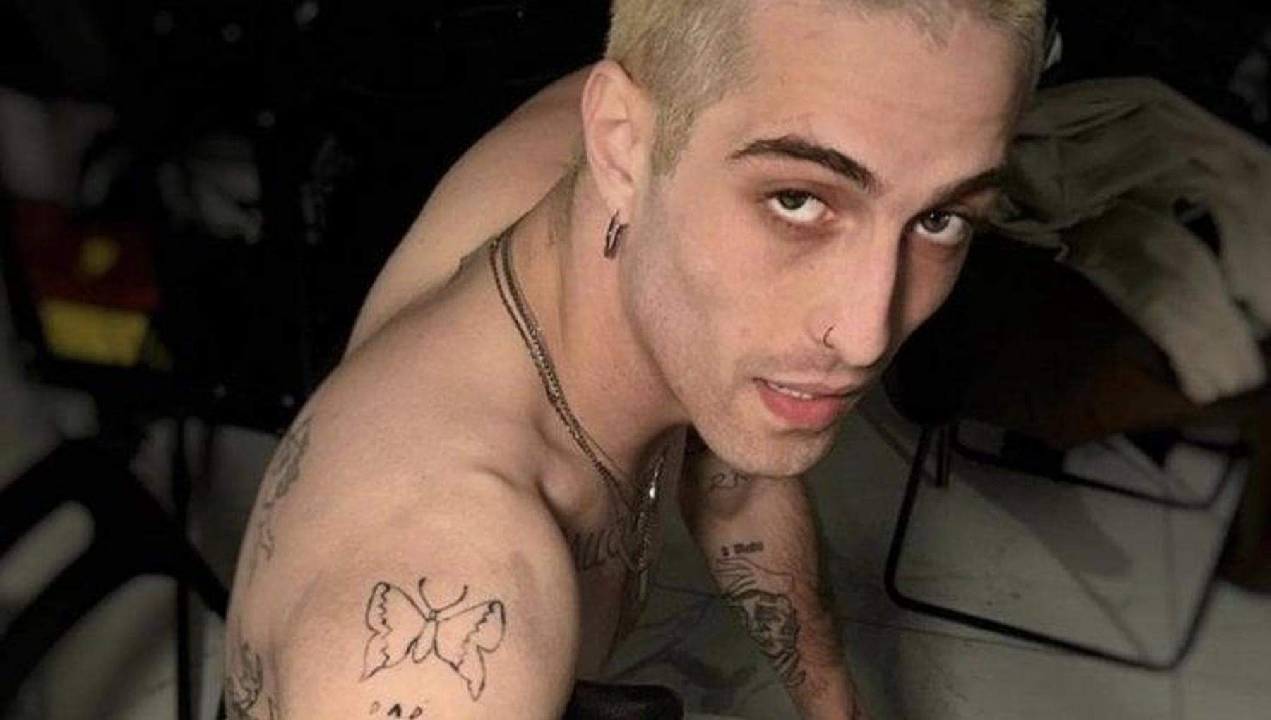
Damiano David’s tattoos are part of his stage identity, but they are not all there for the same reason. Some point straight back to Måneskin. Others are private jokes, old ideas, anime references or pieces he has never fully explained. That mix is what makes the collection worth slowing down for. The big chest lettering is easy to spot. The smaller marks around it need a much closer look.

He also talks about the tattoos in a way that feels pretty relaxed. In one interview he admits that the heart around his nipple came out crooked, then says he likes it anyway. He has spoken about the pain of the ribs and the long session needed for the back. Elsewhere, coverage has picked out a childhood school theme, a manga character and words tied to the band’s early career. The safest guide keeps those confirmed stories separate from fan guesses.

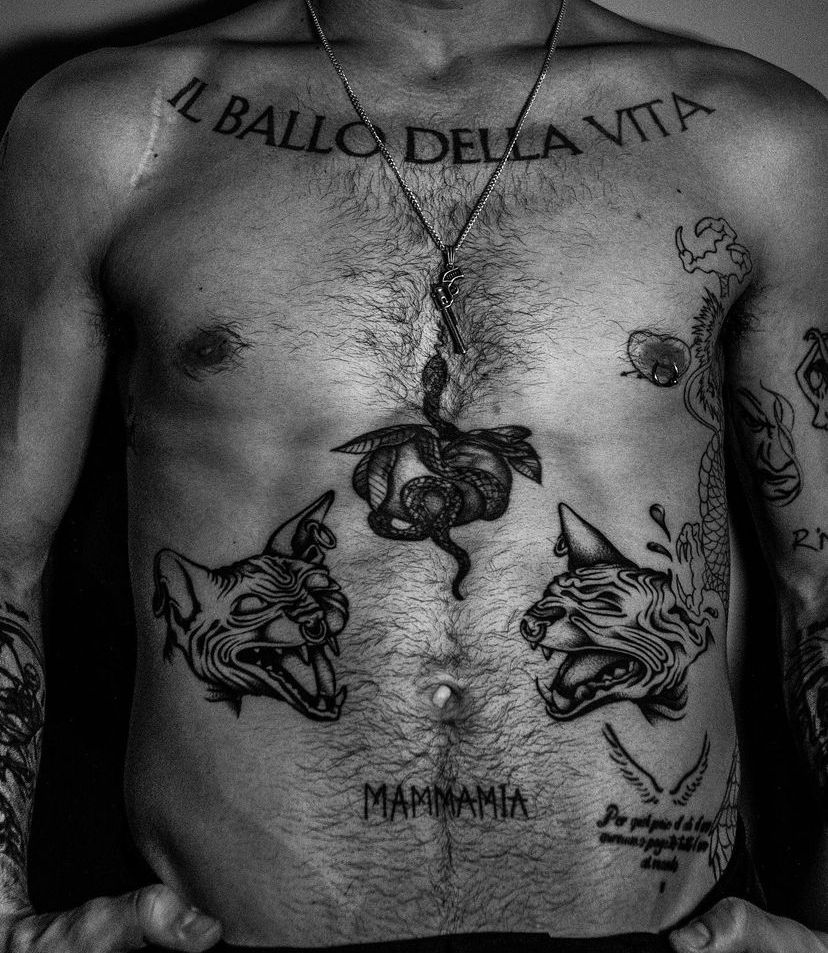
Il ballo della vita chest tattoo is the collection’s loudest headline

Damiano David tattoos: Large Il ballo della vita lettering across the upper chest

The most recognisable piece is the large Il ballo della vita lettering across Damiano’s upper chest. The phrase is the title of Måneskin’s first album, released in 2018, so the tattoo is tied directly to the band’s breakthrough period. It is not a vague piece of Italian lettering that fans have translated after the fact. The connection to the album is documented, and Damiano has described the tattoo as one of the designs people know best.

Its placement does a lot of the visual work. The letters stretch across the chest and sit where an open shirt or bare stage outfit will reveal them immediately. Unlike a small wrist symbol, this one reads from a distance. It also works with Damiano’s performance style because the words stay visible while he moves, sings and turns toward the crowd.

The phrase translates roughly as “the dance of life,” but the important point is the album connection. The tattoo carries the band’s first chapter with it. Damiano has said that fans have copied the design, which gives the lettering an extra layer of responsibility. It is no longer just a private reminder of a record; it has become one of the visual signs people associate with Måneskin.

There are other marks around the chest, including the small crooked heart near the nipple and additional linework. Those pieces should not be swallowed by the headline tattoo. The album words are a bold block of text. The heart is a smaller, messier story from a group session. They share the same area, but they have different origins and should be described as separate entries.

The tattoo has also changed how Damiano’s solo image is read. He is now promoting music outside the band as well, but the lettering still points to the group that made him famous. It does not erase the solo work. It shows that his body art carries more than one era at once.

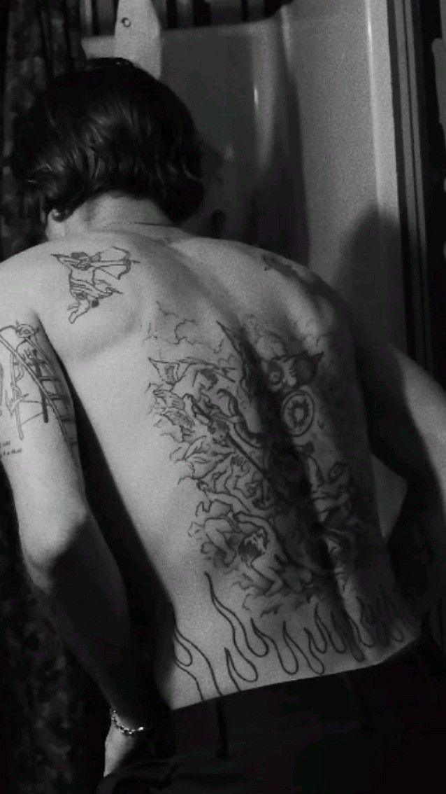
Damiano David’s back tattoo turns the Icarus idea into a full-body image

Damiano David tattoos: Large back tattoo with wings and dark illustrative linework

His back piece is much harder to understand from an ordinary concert photograph. It covers a large area and becomes most visible when he is shirtless or leaning forward for a camera. Coverage links the wings on his back and hip with the myth of Icarus, a figure associated with ambition, flight and the danger of going too far. That reference is reported, but the entire composition should not be assigned a detailed meaning that Damiano has not personally explained.

The scale is the main fact. This is not a tiny pair of wings tucked behind the shoulder. The tattoo takes up the back and uses dense dark shapes that move with the spine and shoulder blades. In a soft image, the separate forms collapse into one black area. A sharper photograph shows why the piece needs its own section rather than being mentioned as an afterthought.

Damiano has said the back session took more than twelve hours, which gives readers a useful sense of the commitment involved. Long sessions also explain why a back tattoo can look unfinished in one photograph and much more developed in another. The work may have been completed in stages, or different lighting may reveal different parts of the same design.

The Icarus association fits the way Damiano talks about music and performance, but it is still better to keep the wording measured. The wings are visible. The myth reference is documented. The private emotional meaning behind every line is not. That distinction lets the image carry the drama without turning it into a made-up confession.

It also sits apart from the very public chest lettering. The chest says the album title in plain language. The back is more symbolic and less immediately readable. Together they show the range of his tattoo choices: direct words in one place, a large mythic image in another.

The Eren Jaeger anime tattoo brings a different kind of drama to his arm

Damiano David tattoos: Eren Jaeger shown in human and Titan forms on the upper arm

One of Damiano’s clearest newer additions is the Eren Jaeger tattoo on his upper arm. The design shows the character from Attack on Titan in both human and Titan forms, which gives the piece a built-in contrast. It is not just a logo or a small reference for fans to decode. The tattoo uses the character’s changing forms as the image itself.

Italian coverage connects the tattoo with a session by artist Gabriele Anakin at Wisdomless Club. Damiano revealed the work after a trip to Japan, and the timing makes the anime connection easy to understand. The tattoo is a record of an interest he wanted to keep close, but the image does not need an invented explanation about exactly what every part represents.

The upper-arm placement gives the design room to breathe. A character portrait needs more space than a tiny word, especially when the artist is showing two versions of the same figure. The black linework can be read more clearly when the arm is lifted or turned toward the camera. In a stage photograph, the tattoo may be hidden by a sleeve, jewellery or strong coloured lighting.

This piece also shows that Damiano’s collection is not limited to rock symbols or traditional portrait ideas. He has room for a modern manga reference beside album lettering, mythological imagery and small personal marks. That variety feels deliberate even when the tattoos were added at different times.

The safest description is the simplest one: Eren Jaeger, shown in human and Titan forms, on the upper arm, documented after a Japan-related period and associated with Gabriele Anakin. The photo proves the design and placement. The wider emotional meaning belongs to Damiano, and no source gives enough detail to fill that gap confidently.

The torso lettering, snake and self-done marks make the smaller tattoos count

Damiano David tattoos: Torso lettering, snake, MAMMAMIA and surrounding designs

The rest of the torso is where the collection starts to feel more personal and less like a set of headline pieces. Photos show MAMMAMIA, a snake, feline or animal imagery and additional lines of text around the stomach and ribs. Some of the writing connects naturally with Måneskin’s music, while other designs are only securely described by what appears in the photograph.

Damiano has also talked about tattoos he did himself on his thighs. Those pieces matter because they do not have the polished look of a studio-centred chest statement. They preserve an earlier, more impulsive side of his relationship with ink. A self-done tattoo can be technically uneven and still be important because of when it was made and what the person wanted to remember.

The little heart around the nipple belongs in this section too, even though it has become one of the most repeated stories about his tattoos. Damiano says he got it with the other Måneskin members and laughs about the crooked result. That quote is useful because it gives the design a real voice. The heart does not need a grand meaning added to it. The band session and his acceptance of the imperfect line are enough.

The childhood school theme on his calf works differently. It preserves a piece of writing about wanting to become a rockstar. That tattoo links the child he was with the career he eventually built. It is one of the clearer examples of a design carrying a timeline rather than just a picture. The words matter because they existed before the international success.

His ribs are reportedly among the more painful areas he has had tattooed. That detail explains why the torso pieces should not be treated as random decoration. They involve difficult placements, long sessions and designs that are sometimes only visible when he chooses to show them. A concert photo can prove that ink is present, but it rarely captures the full lettering or the edge of a design.

There are also smaller marks whose meanings remain open. A guide can name the visible subject, locate it and attach the strongest available evidence without pretending that every symbol has a confirmed backstory. That approach is especially important with a heavily tattooed musician because new pieces, cover-ups and partial photographs can change the map quickly.

Put together, Damiano David’s tattoos move between public and private. Il ballo della vita announces the band. The back turns Icarus into a large dark image. Eren Jaeger brings anime into the collection, while the heart, childhood writing and self-done thigh work keep the whole thing loose and human. The photographs show the designs. His interviews explain the pieces he has actually chosen to explain. The rest is best left as careful visual description.

Halsey’s Tattoos: Hand Ink, Matchsticks, Numbers and Song References

Halsey has the kind of tattoo collection that rewards a close look. There are obvious pieces on the hands and arms, tiny numbers on the knuckles, bits of lettering, little red symbols and designs that only show up when a sleeve moves. The collection has grown across different eras, so it is better read as a scrapbook than as one carefully planned sleeve.

Some meanings are easy to trace because Halsey has talked about them. Others are simply visible in photographs. This guide keeps those two things separate. A number can be named without inventing a story for it, and a phrase can be connected to a song without claiming that every nearby line has the same meaning.

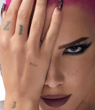
Halsey’s hand tattoos bring the numbers and three Xs into focus

Halsey tattoos: Hand and knuckle tattoos

The hand is one of the busiest parts of Halsey’s tattoo map. Close photographs show small marks around the fingers and knuckles, including 929, 17 and the group of three Xs. They are tiny designs, but they change the whole look of the hand because they sit where rings, nails and gestures keep bringing them into view.

The three Xs have one of the clearest personal explanations. Halsey has connected them with herself and two brothers, turning the three matching marks into a family reference. There is also a playful connection to the Xs used on parental-advisory labels. That makes the tattoo work on two levels: it is a simple visual trio, but it also carries a private family count that Halsey has chosen to make visible.

The number 17 is another hand tattoo that has been explained in published coverage. Halsey has described it as a lucky number and linked it to the year their career began to change. Numbers are easy to misread in a quick photograph, especially when the hand is turned or jewellery sits across the knuckles, but this one has been repeatedly identified as 17 rather than left as a guess.

The 929 mark is more date-like. It is commonly tied to September 29, Halsey’s birthday, which gives it a neat place in the collection: three Xs for family, 17 for a formative year and 929 for a personal date. The designs are small enough to live together without becoming one large picture. They look like notes written around the hand.

There are other tiny symbols close to the fingers and palm. Some are visible in one photograph and hidden in the next. That is why a responsible list does not turn every dot into a separate tattoo with a confident meaning. The hand is moving, the images are cropped differently and several marks are too small to read clearly. The confirmed entries are enough to make the placement interesting without stretching the evidence.

Halsey’s hand work also shows why scale matters. A small tattoo does not mean a small story. The three Xs take up very little skin, but the family explanation gives them more weight than a much larger decorative line. At the same time, not every tiny mark needs a dramatic explanation. Some are simply visual choices, and the collection feels more believable when both kinds are allowed to sit together.

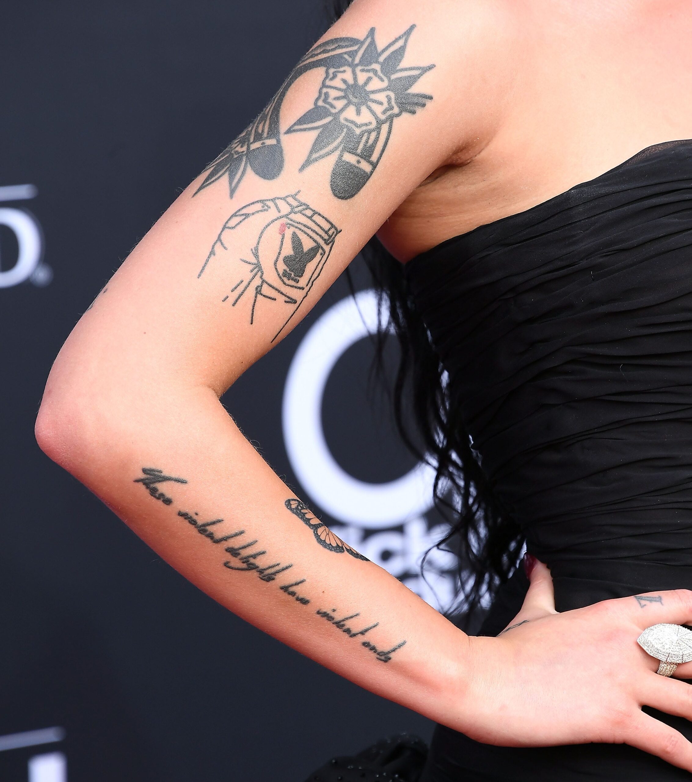
The arm collection mixes flowers, script and small standalone designs

Halsey tattoos: Arm tattoo collection

Halsey’s arms carry a loose mix of flowers, script and simple black illustrations. The designs do not all share one style. Some are delicate, some are heavier, and some use colour instead of sticking to plain black ink. The result feels collected over time rather than planned as one matching sleeve.

Floral tattoos appear among the most visible arm pieces. They soften the stronger lettering and give the arm a changing rhythm as it moves from shoulder to forearm. A flower can be described by its shape and placement even when its private meaning is unknown. Halsey’s public tattoo conversations explain some pieces directly, but they do not give a personal biography for every petal.

Lettering is another recurring choice. Halsey has used song titles, short phrases and compact numbers in places where the words can be read at close range. The lettering tends to work like a handwritten note rather than a huge chest statement. That suits a collection filled with references to music, memory and identity without making every tattoo look like album merchandise.

The arm photographs also show how tattoos change when they sit beside one another. A matchstick can look almost like a line in a larger drawing from a distance, while a close-up shows that it is a separate little object. The same is true of numbers and short script. Halsey’s collection has plenty of negative space, so each mark can keep its own edge instead of being swallowed by a solid sleeve.

Some tattoos are matching pieces. Halsey has discussed tattoos connected with friends and fans, including designs made through shared experiences. Matching ink does not always mean identical placement or identical personal meaning, so the useful point is the relationship around the design, not a claim that every person involved carries the exact same story forever.

The arm is also where old and new tattoos can be hardest to separate. A cover-up can leave a darker patch, while a new piece can make an older line look like part of a larger composition. Readers comparing photographs should pay attention to dates, sleeve length and lighting. A tattoo guide that treats every image as if it were taken on the same day will miss how much the collection has shifted.

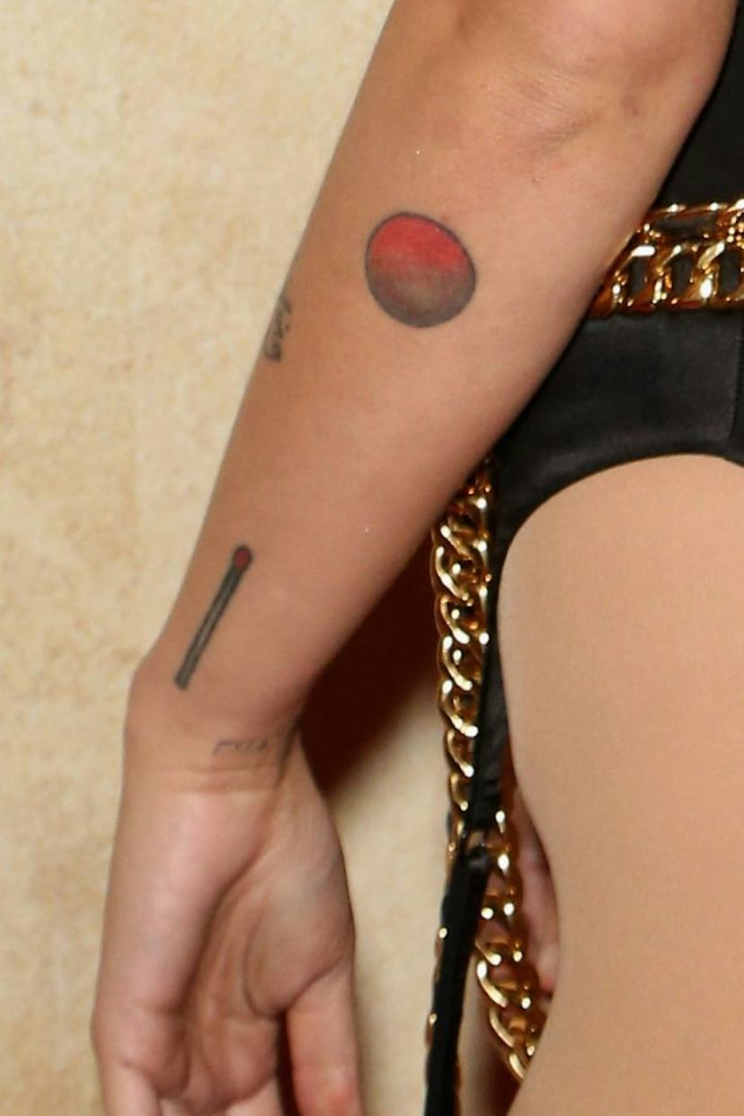
The matchstick and Mars symbol show Halsey’s taste for small graphic ink

Halsey tattoos: Matchstick and Mars forearm tattoos

The matchstick is one of the easiest Halsey tattoos to recognise once you know where to look. It is a narrow design with a red tip, placed among other small marks on the arm. The shape is simple enough to read in a photograph without needing a close crop, but it still has a little drama: a tiny flame-ready object sitting beside more delicate ink.

Near it is a circular Mars symbol with a red-to-black look in published photographs. The two designs make a good pair for understanding Halsey’s visual taste. Neither needs a large realistic portrait or heavy shading. They rely on clean outlines, compact colour and recognisable shapes. That gives the arm a graphic quality, almost like a page of small illustrations.

It is tempting to assign a large meaning to the Mars image, especially because Halsey’s music often deals with identity, conflict and changing moods. The safer approach is to describe what has actually been reported. The symbol is there, the colour is visible and the placement is clear. If Halsey has not given a definitive personal explanation in the source being used, the guide should not manufacture one.

The matchstick is also a good example of why a tattoo inventory needs images beside the text. A written description alone could mean a realistic match, a cartoon match or a single red line. The photograph narrows it down. Readers can see the scale and the way it sits against other arm tattoos, which is much more useful than a vague sentence about a “meaningful symbol.”

Halsey has several small designs that work in this same register: compact, readable and easy to place beside a larger tattoo. They are not filler. They make the collection feel personal because they look like choices made one at a time. The different sizes also keep the arm from becoming visually flat. A long script line leads the eye, then a tiny object interrupts it.

Some of the arm pieces have colour while others have faded toward grey or black. That does not necessarily mean one is newer. Lighting, camera processing and skin tone can change how the ink appears. The safest dating clues come from the publication date and the surrounding outfit or event, not from guessing that a pale red mark must be old.

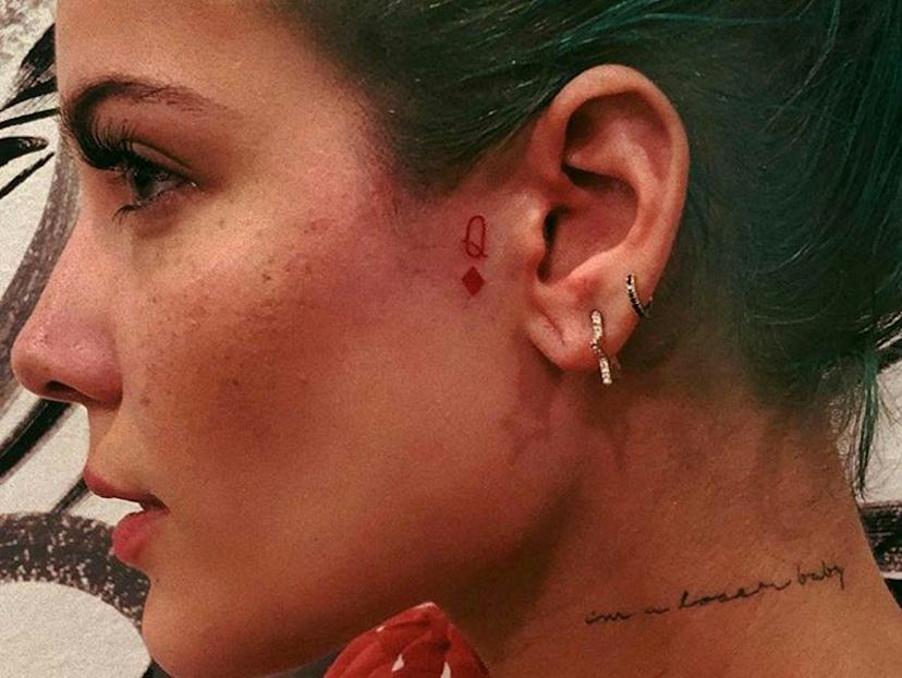
Neck lettering and tiny face ink sit outside the arm collection

Halsey tattoos: Neck and face tattoos

Halsey’s neck and face tattoos give the collection a more visible edge. A small queen-of-diamonds symbol has been photographed near the ear, while the words I’m a loser baby appear in red script along the side of the neck in published close-ups. These pieces are easy for readers to notice because they sit near the face, but they are still small and can disappear under hair, makeup or a change of camera angle.

The neck phrase is a good example of Halsey using short text as a mood rather than a full explanation. The wording is memorable, but the photograph cannot tell us every reason it was chosen. It is enough to identify the phrase, colour and location. The tattoo can be connected to Halsey’s public style without pretending that the image reveals a private diary entry.

The queen-of-diamonds mark is similarly compact. Its outline reads quickly, which is why it appears in portraits where a larger arm tattoo would be hidden. Small face-adjacent designs also change how the whole portrait feels. They become part of the expression, even though they are only a few lines of ink.

Halsey has also been photographed with other small marks around the face, neck and hands. Some are clear enough to describe, while others are too soft to separate from makeup or shadow. The distinction is important. A tattoo guide should not promise a complete count when the photographs do not support one. It is better to list the identifiable pieces and mark the rest as uncertain.

The wider collection includes other documented designs linked to music, family, relationships and personal dates. A right-forearm phrase reading Heaven in Hiding has been connected with Halsey’s music, and tattoo coverage has discussed pieces associated with albums and relationships. Those references should be dated because Halsey’s collection has changed. A cover-up, a new matching tattoo or a faded line can alter the map.

That is what makes Halsey’s tattoos worth looking at as a group. The collection is not built from one repeated symbol. It moves between family marks, numbers, song references, flowers, planetary imagery and tiny graphic objects. Some pieces have a clear story, some have a clear design but no confirmed meaning, and some only become visible in a well-lit close-up. The best guide gives each category its proper weight.

The featured portrait at the top of this article is separate from the tattoo photographs. It gives readers a clean view of Halsey’s face, while the four body images show the hand, arm, forearm and neck details discussed in the text. That separation keeps the page attractive without pretending that a general portrait is evidence for a particular tattoo.

Halsey’s collection keeps changing, so dates matter. A photograph from the early career period may show fewer designs, while later images reveal new hand marks, fresh lettering or changes around the arm. The most useful way to read the collection is to stay specific: name the tattoo, locate it, show it clearly and explain only the meaning Halsey or a strong source actually supports.

Kendrick Lamar Tattoos: The Cover-Up, TDE Mark and Earlier Forearm Ink

Important timeline: the widely photographed Hustle Like You Broke lettering was an earlier right-forearm tattoo. Later photographs show a darker abstract cover-up over that area. The newer images below are included so the article does not present the old lettering as Kendrick’s current design.

Kendrick Lamar is not covered in the kind of instantly readable body art that turns every photograph into a tattoo inventory. Much of his ink is seen in short glimpses: a sleeve pulled back on stage, a forearm exposed during an interview, or an older photograph that catches a mark before clothing covers it again. That makes accuracy more important than padding the list with guesses. The strongest evidence comes from Kendrick himself, especially when he explained the large message on his right forearm. A second useful record is an early photograph labelled as his TDE tattoo. Other marks can be seen, but they should stay in the category of visible details rather than being given invented names or meanings.

This guide separates what Kendrick has personally explained from what photographs show. It also keeps dates in view. An arm photographed in 2012 does not automatically prove that every later image shows the same arrangement, and a blurred stage picture is not enough to identify a tiny symbol. The result is a shorter but more dependable map of Kendrick Lamar’s tattoos, centred on the pieces that can be connected to a source.

Hustle Like You Broke was an earlier forearm tattoo

Kendrick Lamar tattoos

The clearest tattoo in Kendrick Lamar’s public record is the large script message running along his right forearm: Hustle Like You Broke $. The wording is not a fan’s interpretation of a photograph. Kendrick identified it during a 2018 Vanity Fair conversation, after pulling up his long-sleeved shirt and showing the interviewer the tattoo. He also explained where the phrase came from. Top Dawg, the head of Top Dawg Entertainment and one of the central figures in Kendrick’s career, had told him to keep the mentality of someone who had not escaped the need to work.

That context gives the lettering a practical meaning. It is not presented as a secret lyric or as a decorative piece chosen because the words sounded tough. Kendrick described it as a reminder not to become comfortable. The dollar sign at the end makes the line look like a compact slogan, but his explanation is about discipline rather than a promise of wealth. The important part is the verb implied by the phrase: keep hustling. That is why the tattoo fits so closely with the way Kendrick talks about his work, where long hours and constant revision matter as much as public success.

The placement also suits the message. The forearm is visible when Kendrick performs, gestures or rolls up a sleeve, so the lettering can appear without requiring a shirtless photograph. It is long enough to follow the arm instead of sitting as a small isolated word near the wrist. In the available image, the script sits within a larger field of dark ink, with smaller marks and bands breaking up the space below it. The photograph is useful for placement and scale, but it should not be used to claim that every surrounding shape has a known name.

There is a difference between reading the tattoo and explaining it. A viewer can make out the main phrase because the letters are large and arranged along the forearm. The smaller symbols near the wrist are less secure. They may be clear in one close-up and lost in another because of lighting, angle or the way Kendrick is holding his arm. The responsible description is therefore specific about the script and cautious about the rest. The message is confirmed; the full catalogue of nearby marks is not.

The phrase also says something about Kendrick’s relationship with Top Dawg Entertainment without turning the tattoo into a company logo. Top’s advice is part of the story, but Kendrick’s choice to carry the wording on his skin makes it personal. It records a working philosophy that existed before the biggest awards and remained relevant after them. That is a more grounded reading than calling the tattoo a generic symbol of ambition. The source gives us the speaker, the wording and the reason. It does not require an extra layer of symbolism.

In later photographs, the forearm can look different depending on the sleeve, the crop and the lighting. Black ink compresses easily in a low-resolution stage shot, and the lettering may be partly hidden by a watch or cuff. Readers comparing images should look for the long text along the right forearm rather than expecting one identical pose each time. The line’s scale and direction are more reliable identifiers than the exact shade of the surrounding skin or the amount of secondary ink visible in the frame.

This is also the tattoo that most clearly connects Kendrick’s visible collection to his public work ethic. He has spoken repeatedly about writing, studying and throwing away material that did not meet his standard. The forearm message gives that attitude a physical address. It is close to the hand that writes and gestures, and it can be read as a daily instruction without needing a private biography attached to every word. The documented explanation is enough.

The TDE tattoo is a separate mark of Kendrick’s label world

Kendrick Lamar tattoos

An older photograph from a 2012 Kendrick Lamar event is labelled Kendrick TDE Tattoo. The image shows a compact, dark tattoo on his upper arm, with the surrounding skin and nearby ink visible in the frame. TDE refers to Top Dawg Entertainment, the label and creative home that shaped Kendrick’s rise alongside artists such as Jay Rock and Schoolboy Q. The label connection is clear from the photograph’s caption and from Kendrick’s wider career history, but the image does not provide a long first-person explanation of when he chose the mark or what private feeling he attached to it.

That distinction matters because a small emblem is easy to overread. A reader can reasonably identify the mark as the TDE tattoo when the photograph is paired with its original label. It would be a step too far to claim that the design represents every member of the label, a particular album or a specific turning point unless Kendrick or the artist has said so. The safest description is that it is a visible sign of his connection to the company and the people around it during the early part of his career.

The photograph is valuable for another reason: it shows how different Kendrick’s tattoo record looks when viewed across time. The early TDE mark is compact and sits on the arm like a badge. The later forearm message is much larger and uses a full line of lettering. They do not create one perfectly planned sleeve. Instead, they show a collection built in stages, with some pieces tied to relationships and working life and others simply recorded by the camera without a public explanation.

Placement helps keep the two tattoos separate. The TDE mark is shown higher on the arm, while the Vanity Fair interview draws attention to the long message on the right forearm. A crowded photograph can make the upper arm and forearm seem like one continuous dark shape, particularly when Kendrick is wearing short sleeves. Comparing the location of each piece prevents the common mistake of treating every visible patch of ink as part of the same design.

The label tattoo also reflects the fact that Kendrick’s public identity was never built in isolation. TDE was not just a logo attached after fame arrived. It was the working network behind his early releases, tours and collaborations. Even without a detailed quote about the tattoo itself, its placement on the arm makes sense as a compact mark of belonging. That interpretation stays close to the evidence. It recognises the label relationship without pretending the photograph reveals a private story that has not been published.

There are smaller marks around the arm in early images, including dark lines and shapes that can look different from one angle to the next. Some tattoo catalogues and fan pages assign names to those details, but the available primary and editorial material does not consistently confirm them. This is where a good tattoo guide has to stop. A blurry shape is not automatically a symbol, and a visible symbol is not automatically a message. The TDE mark can be listed because the photograph names it. The uncertain surrounding marks should remain described as surrounding ink.

The image also shows why the word documented is useful. Kendrick has more visible ink than the two major pieces discussed here, but not every design has a reliable published label. That does not make the other marks imaginary. It means their inclusion requires a different level of confidence. A photograph can prove that ink is present. It cannot always prove a design name, date or meaning. The TDE image gives readers a concrete reference while leaving room for that honest limit.

What the photographs can and cannot identify

Kendrick’s tattoo history is a good example of why a celebrity tattoo article should not turn every dark patch in a photograph into a named design. The forearm lettering has a confirmed phrase and a confirmed explanation. The TDE tattoo has a useful photograph and a clear label. The smaller marks have visual evidence but not enough consistent reporting to support a confident inventory. Keeping those categories separate makes the article more useful to anyone trying to compare placement or recognise the pieces in later photographs.

It also explains why the number of images should follow the evidence rather than a fixed quota. One close photograph can show the forearm message better than several distant stage shots. Another image can establish the upper-arm TDE mark. Adding a generic portrait would not improve the tattoo guide, even if it made the page look busier. The featured photograph is therefore separate from the tattoo figures: it identifies Kendrick clearly, while the body images do the harder job of showing the ink.

Kendrick’s visible tattoos are connected by work, loyalty and self-discipline, but the sources do not justify turning that into a neat symbolic system. The right forearm carries a phrase he explained himself. The TDE mark points to the label family that helped build his career. The rest remains a changing field of smaller details that needs sharper photographs or direct comments before it can be named. That balance gives readers a useful guide without making the ink say more than Kendrick has actually said.

The abstract cover-up is the current visual landmark on the right forearm

Kendrick Lamar tattoos

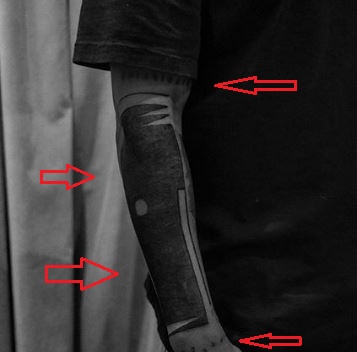
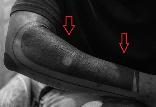
Later photographs show a broad abstract black design occupying the right forearm. The cover-up is denser than the old lettering and changes the whole balance of the arm. Instead of a readable sentence running down the skin, the newer work uses dark bands, shaded blocks and lighter breaks that follow the bend from elbow toward wrist. That is why a recent image can look like a solid sleeve even though the close-up reveals separate sections.

The available tattoo coverage describes this as a cover-up of the earlier phrase and money design. Kendrick has not publicly explained the meaning of every curve in the new work, so the visual description should stay visual. The image proves the placement, scale and change in surface. It does not prove that each dark shape represents an album, a lyric or a private event.

The change is useful for dating photographs. If the forearm shows large script, the image belongs to the earlier stage of Kendrick’s tattoo record. If it shows the heavy abstract field, it belongs to the later stage. Clothing and lighting can make the two versions look closer than they are, particularly when the elbow is bent or the sleeve covers the upper edge.

A cover-up is still part of the story even after the original design has disappeared. The older tattoo explains why Kendrick’s arm looked different in interviews and performances, while the newer design explains what viewers see now. Treating both as current would be inaccurate. Treating the old one as irrelevant would also lose the clearest first-person meaning attached to the arm.

The bands and small marks need closer photographs than a stage shot

Kendrick Lamar tattoos

The close-up views of the newer arm show smaller elements around the main dark area: narrow bands, lettering-like marks near the edges and small shapes near the wrist. These details are real visible ink, but they are not all confidently named by independent sources. They should be grouped as surrounding marks rather than turned into a long list of invented symbols.

This is where image quality changes the reading. A distant performance photograph compresses black ink into one patch. A close photograph separates the arm into planes and lets the reader see where one band ends. It also shows why two angles may appear to reveal different tattoos. The forearm is curved, and a mark hidden on the inside can disappear when Kendrick turns outward.

The safest wording is specific about what the photograph actually shows. The newer work is a dark abstract cover-up with bands and smaller marks around it. The exact meaning of those smaller marks remains unconfirmed. That is more useful than assigning a symbolic story to every blurred line, especially when the tattoo has changed over time.

Bad Bunny’s Tattoos Connect Puerto Rico, Music and Private Memories

Bad Bunny’s tattoos are tied to the same subjects that run through his music: Puerto Rico, memory, romance, playfulness and the tension between public confidence and private feeling. He has never needed one fixed tattoo style. The collection moves from small album references to large chest imagery, from a clean outline of Puerto Rico to a playful forearm group that includes a vase and cartoon flowers. The strongest accounts identify designs visually and connect some of them with his records, but not every piece has a confirmed first-person explanation.

That distinction matters because Bad Bunny’s tattoos are often photographed in dramatic settings. A campaign image can make a small tattoo look like the centre of the body, while a casual thigh photograph may reveal a design that disappears under stage clothing. The most useful guide therefore combines close images, reliable reporting and a clear separation between what a source identifies and what a reader might merely imagine.

The chest tattoos mix numbers animals and personal symbols

Bad Bunny tattoos: Bad Bunny chest tattoos including horse and number 10

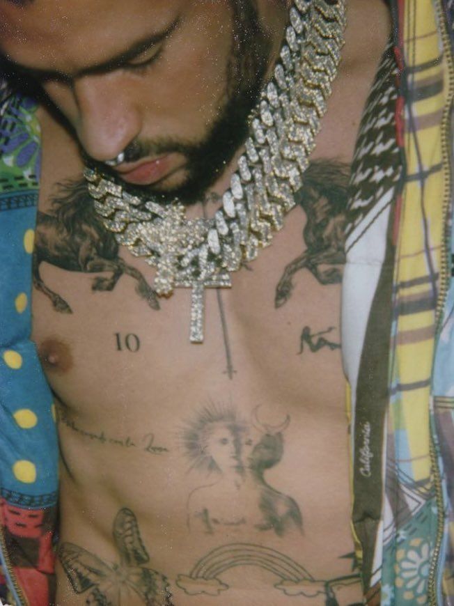
Bad Bunny’s chest is one of the most recognisable parts of his tattoo map. Published photographs show the number 10, animal imagery, a small reclining figure and a sun-and-moon face among the designs. Later campaign photography also shows a horse and the number 1994, a direct-looking reference to his birth year. The chest does not read as one single illustration. It is a group of symbols placed around the body so that each can remain visible when a different pose changes the frame.

The horse is a good example of why dates and images need to be kept together. The Calvin Klein coverage shows the tattoo clearly in a portrait made for a campaign, while the number gives readers a concrete detail that can be named without adding a guessed story. The image proves the horse and the year are there. It does not establish whether the horse represents freedom, speed, a childhood memory or something else. The safe description is stronger because it stays with what the evidence supports.

The number 10 has also attracted attention because it is so plain. Numbers can refer to birthdays, sports, personal milestones or private codes, and Bad Bunny has not publicly assigned one meaning to every numeral visible on his body. The value of the photograph is its placement and scale. The number sits among more illustrative forms, creating a contrast between clean typography and the softer shapes around it.

The sun-and-moon design adds another layer of visual contrast. It gives the chest a symbolic centre without turning the whole collection into a single spiritual statement. A guide can call it a dual-face sun and moon tattoo because that is what the image shows. It should not claim a detailed cosmology unless Bad Bunny has explained one. In a collection built around music, personal style and changing public imagery, restraint is more useful than a decorative paragraph of invented symbolism.

The chest also shows how the singer uses negative space. The tattoos are separated rather than packed into a solid block, and that keeps the individual marks legible. The result feels closer to a patchwork of memories than a traditional full chest plate. Different photographs reveal different sections, so the body map should be read across several images rather than from one cropped portrait.

The thigh tattoos hold the Puerto Rico outline heart and Saturn

Bad Bunny tattoos: Bad Bunny thigh tattoos including Puerto Rico outline and Saturn

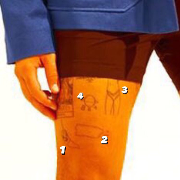
The thigh group contains some of the clearest connections between Bad Bunny’s music and his identity. El Pais describes a sad heart associated with Un Verano Sin Ti, the outline of Puerto Rico and a Pokemon Go logo. The three designs sit within a part of the body that can remain hidden in normal clothing, which makes them feel less like stage branding and more like pieces Bad Bunny can reveal when he chooses.

The Puerto Rico outline is particularly direct. It is a geographic symbol, not a vague tropical motif, and it places home at the centre of the collection. Bad Bunny’s music has repeatedly returned to the island, its language and its social life, so the tattoo fits a much larger public identity without requiring a private explanation. The shape can be described precisely, while the wider emotional importance is supported by his interviews and the way journalists discuss his work.

The sad heart works differently. It is connected with an album image and carries a feeling that is more emotional than geographic. The design does not need to be treated as a permanent diary entry about one relationship. Album imagery can hold several meanings at once, and listeners may connect with it through the record even if the tattoo’s private context changes over time. What matters for the tattoo record is the clear link to Un Verano Sin Ti and the placement on the thigh.

Another thigh photograph shows a fine-line Saturn beside three letter Bs. The planet is a small but distinctive design, and its placement next to the letters gives the group an unusual balance. The image also shows why close crop photography is important. A broad campaign photograph can reveal that the thigh is tattooed, but the Saturn and the letters need a tighter frame before the design can be named responsibly.

The thigh work is not all one era or one visual language. The Puerto Rico outline is stark and geographical, the heart is graphic, the Pokemon reference points to gaming culture, and Saturn adds a more delicate line. Together they look like a personal archive. The designs sit near each other without becoming a single logo, which is typical of a collection that has grown as Bad Bunny’s music and public life changed.

The forearm moves between realistic ink and cartoon flowers

Bad Bunny tattoos: Bad Bunny vase and cartoon flower forearm tattoos

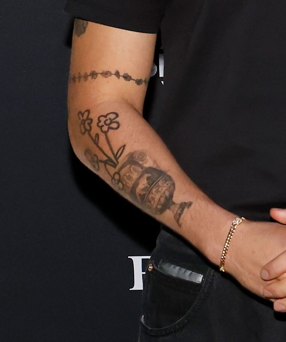
An Allure photograph focuses on a different part of the collection: a forearm with a realistic vase near the wrist and cartoon-like flowers climbing the arm. This pairing is one of the clearest examples of Bad Bunny allowing contrasting styles to share the same body. The vase has a more traditional illustrative feel, while the flowers are lighter, stranger and more playful. Neither design needs to be forced into the same meaning.

The arm group also explains why generic lists of celebrity tattoos are not enough. Saying that Bad Bunny has flowers does not tell readers how those flowers sit beside the vase, how much open skin remains around them or how the scale changes from the wrist upward. The photograph gives the visual relationship. The written account can then describe the contrast without pretending that the flowers are merely decoration.

Cartoon tattoos can be wrongly treated as jokes, especially when the wearer has a serious public image. Bad Bunny’s collection resists that split. He can carry a playful flower group and a politically meaningful Puerto Rico outline without one cancelling out the other. The lighter imagery may reflect humour, taste or a private memory, but the sources do not establish one fixed explanation. The accurate point is that the work gives the forearm a different mood from the darker sword and angel pieces elsewhere.

The vase is useful for a different reason. It gives the forearm a recognisable anchor and shows how a realistic object can sit inside a more relaxed group. The design appears close enough to photograph that its outline and location can be described confidently. It is a reminder that tattoo coverage should mention the actual object, not collapse every black-and-grey mark into the word sleeve.

Placement changes the way these pieces are read on stage. A wrist and forearm tattoo can flash into view when a microphone is lifted or a sleeve moves, then disappear again. A thigh tattoo requires a deliberate reveal. That difference helps explain why photographs from campaigns, concerts and social posts show different parts of the collection. No single image is a complete catalogue.

The sword and angel designs add a more traditional tattoo vocabulary

Bad Bunny tattoos: Bad Bunny sword and angel arm tattoos

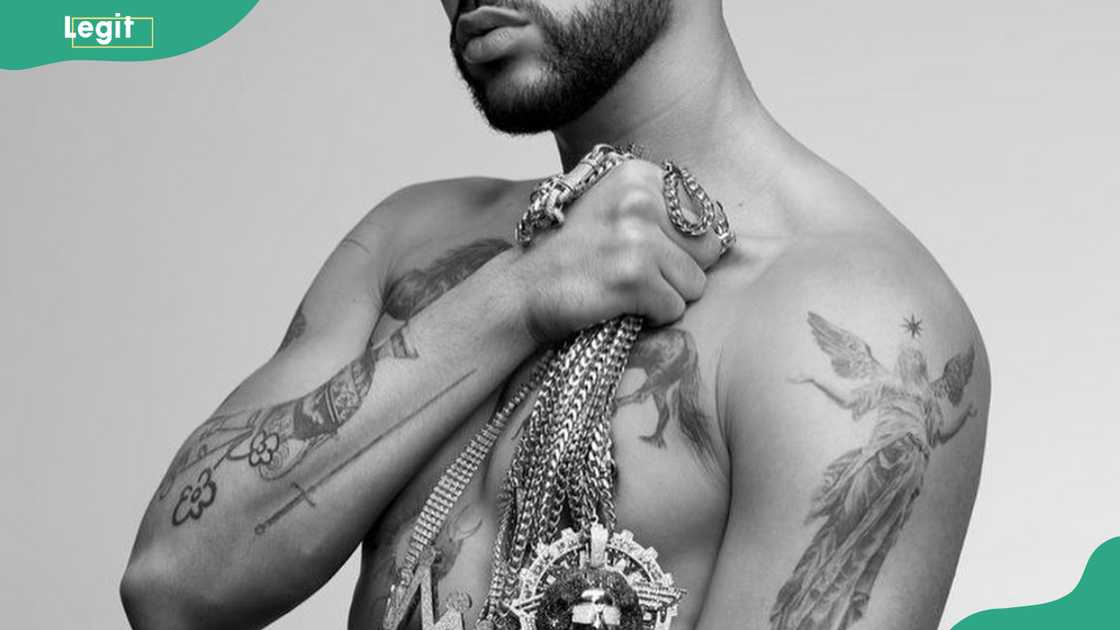
Other coverage identifies a sword on one arm and an angel with a star on the other. These are more familiar tattoo subjects than the album heart or the Saturn letters, but they still deserve specific description. The sword has a strong vertical line and reads clearly in the published image. The angel and star create a more figurative group, with the star acting as a small focal point above the figure.

Legit.ng attaches symbolic readings such as bravery, resilience and protection to these designs. Those interpretations are useful as reported context, but they should not be presented as if Bad Bunny personally gave a full explanation for every part of the image. A sword can be a traditional emblem, a reference to a story or simply a design he liked. The photograph establishes the design. The article can mention the reported reading while keeping the source level visible.

The sword also balances the playful arm work. Beside the vase and cartoon flowers, it makes the collection look deliberately mixed. Bad Bunny does not appear to be building a single traditional sleeve with one consistent theme. He is collecting designs from different visual worlds, including music, geography, gaming, romance and familiar tattoo symbols.

The YHLQMDLG bunny logo belongs in the same music-linked conversation. The album title became a recognisable visual identity, and tattoo catalogues show a small bunny-head design paired with the letters. It is important to distinguish a fan-inspired tattoo from Bad Bunny’s own ink when images circulate online. The singer’s tattoo can be discussed as an album reference, while a tattoo idea page may only show designs made by fans. That distinction prevents borrowed images from being mislabelled as celebrity photographs.

Bad Bunny’s tattoo record is therefore broad without needing a single invented story. The chest holds numbers, a horse and animal imagery. The thighs carry Puerto Rico, the sad heart, Pokemon and Saturn. The arms move between vase, flowers, sword and angel, while music-linked logos connect the skin to his catalogue. Some meanings are documented, especially the relationship between tattoos and albums or Puerto Rico. Others remain private. That balance is what makes the collection interesting: it is specific enough to map, but personal enough that the photographs do not explain everything.

The best way to read the tattoos is as a set of identities that overlap. Bad Bunny is Puerto Rican, a musician, a gaming fan, a performer and a person with private memories that do not all need public captions. The images show how the designs are placed and how their styles differ. The reporting supplies context where it exists. Everything else should remain clearly labelled as interpretation rather than fact.